Benvenuto nelle Font Più Popolari — dove popolarità e qualità si incontrano. Qui trovi i font più scaricati e usati dell'anno. Se cerchi scelte sicure per logo, web o social, inizia da qui.
Ogni font top si distingue per equilibrio, leggibilità e versatilità. Troverai sans serif moderne, script eleganti, serif vintage e display minimalisti.
-
( گالری فانت فارسی پژوهش آريانا - only compatible with Farsi and Arabic )
A cursive, handwritten-style font with elegant curves and fluid motion.
 Scaricare 136 Downloads@WebFont
 -
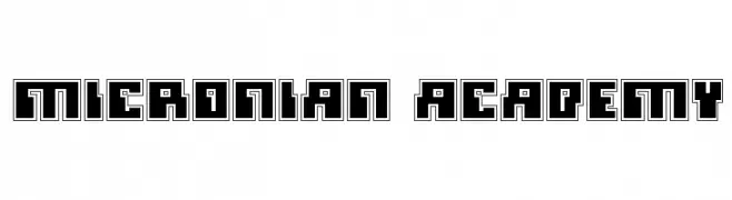
( Fonts by Daniel Zadorozny - www.iconian.com )
A bold, geometric font with a futuristic, digital aesthetic.
![Micronian Academy font caratteri gratis]() Scaricare 136 Downloads@WebFont
Scaricare 136 Downloads@WebFont -
( Fonts by PutraCetol Studio )
A bold, playful, and cartoonish hand-drawn font with exaggerated curves.
![Savage Garden font caratteri gratis]() Scaricare 136 Downloads@WebFont
Scaricare 136 Downloads@WebFont -
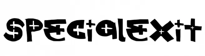
( Fonts by a Max Infeld - XEROGRAPHER FONTS - xerographer.blogspot.com . Personal-use only. For commercial use please contact owner. )
A bold and playful font with quirky, artistic characters.
![SpecialExit font caratteri gratis]() Scaricare 136 Downloads@WebFont
Scaricare 136 Downloads@WebFont -
( Fonts by Daniel Zadorozny - www.iconian.com )
A bold, italicized font with a futuristic and dynamic design.
![Phaser Bank Bold Italic font caratteri gratis]() Scaricare 136 Downloads@WebFont
Scaricare 136 Downloads@WebFont -
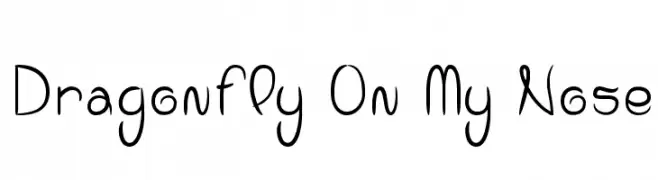
( Fonts by www.dcoxy.com )
A playful, handwritten font with smooth curves and a whimsical style.
![Dragonfly On My Nose font caratteri gratis]() Scaricare 136 Downloads@WebFont
Scaricare 136 Downloads@WebFont -
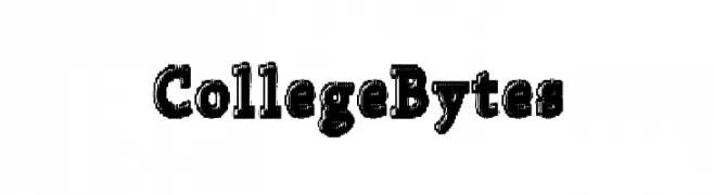
( Fonts by a Max Infeld - XEROGRAPHER FONTS - xerographer.blogspot.com . Personal-use only. For commercial use please contact owner. )
A bold, textured slab serif font with a vintage collegiate style.
![CollegeBytes font caratteri gratis]() Scaricare 136 Downloads@WebFont
Scaricare 136 Downloads@WebFont -
( Fonts by Daniel Zadorozny - www.iconian.com )
A bold, angular font with a futuristic, dynamic slant.
![Phaser Bank Rotalic font caratteri gratis]() Scaricare 136 Downloads@WebFont
Scaricare 136 Downloads@WebFont -
( Fonts by www.junkohanhero.com )
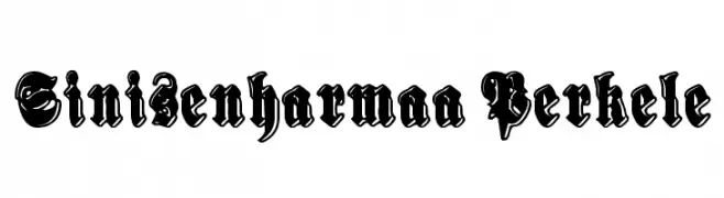
An ornate blackletter font with bold, intricate designs and sharp, angular edges.
![Sinisenharmaa Perkele font caratteri gratis]() Scaricare 136 Downloads@WebFont
Scaricare 136 Downloads@WebFont -
( Fonts by Daniel Zadorozny - www.iconian.com - Free for personal use )
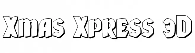
A bold, 3D decorative font with a festive, playful style.
![Xmas Xpress 3D font caratteri gratis]() Scaricare 136 Downloads@WebFont
Scaricare 136 Downloads@WebFont -
( Fonts by Kong Font - Personal-use only. For commercial use please contact owner. )
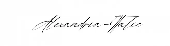
A graceful and flowing script font with a handwritten style.
![Alexandria-Italic font caratteri gratis]() Scaricare 136 Downloads@WebFont
Scaricare 136 Downloads@WebFont -
( Fonts by Uusimaa Type Foundry Inc - Personal-use only. For commercial use please contact owner. )
A textured, chalk-like font with a playful, hand-drawn style.
![schalk font caratteri gratis]() Scaricare 136 Downloads@WebFont
Scaricare 136 Downloads@WebFont -
( Fonts by Daniel Zadorozny - www.iconian.com - Free for personal use )
A futuristic, geometric font with angular and rounded elements, featuring unique cutouts.
![Sagan Leftalic font caratteri gratis]() Scaricare 136 Downloads@WebFont
Scaricare 136 Downloads@WebFont -
( Fonts by Abo Daniel Studio - Panggah Laksono - Personal-use only. For commercial use please contact owner. )
A playful and elegant script font with flowing, cursive letterforms.
![caristha font caratteri gratis]() Scaricare 136 Downloads@WebFont
Scaricare 136 Downloads@WebFont -
( Corina Olivo )
A tall, slender font with elongated characters and a modern aesthetic.
![Giraffe Regular font caratteri gratis]() Scaricare 136 Downloads@WebFont
Scaricare 136 Downloads@WebFont -
( Fonts by Eko Bimantara - Personal-use only. For commercial use please contact owner. )
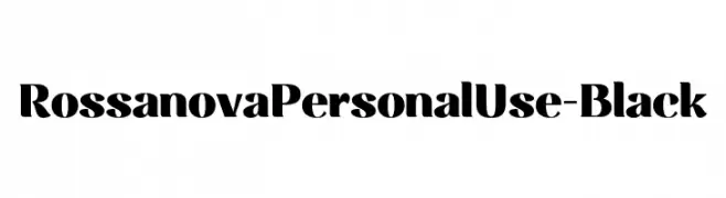
A bold, modern font with thick strokes and a classic touch.
![RossanovaPersonalUse-Black font caratteri gratis]() Scaricare 136 Downloads@WebFont
Scaricare 136 Downloads@WebFont -
( Fonts by Docallisme HAS - Ryal - docallisme.blogspot.com - Personal-use only. For commercial use please contact owner. )
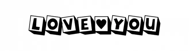
A bold, playful font with characters on tilted blocks, creating a dynamic 3D effect.
![LOVE-YOU font caratteri gratis]() Scaricare 136 Downloads@WebFont
Scaricare 136 Downloads@WebFont -
( Fonts by Typodermic Fonts )
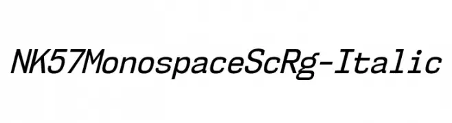
A modern, monospaced italic font with clean lines and uniform spacing.
![NK57MonospaceScRg-Italic font caratteri gratis]() Scaricare 136 Downloads@WebFont
Scaricare 136 Downloads@WebFont -
( Fonts by Vladimir Nikolic )
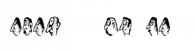
A whimsical font featuring cartoonish faces as characters, perfect for creative projects.
![Abantu Regular font caratteri gratis]() Scaricare 136 Downloads@WebFont
Scaricare 136 Downloads@WebFont -
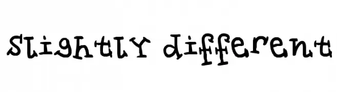
![slightly different font caratteri gratis]() Scaricare 136 Downloads@WebFont
Scaricare 136 Downloads@WebFont -
( Fonts by Four Lines )
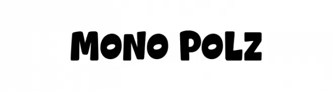
A bold, playful font with rounded edges and a cohesive, slightly condensed style.
![Mono Polz font caratteri gratis]() Scaricare 136 Downloads@WebFont
Scaricare 136 Downloads@WebFont -
( Fonts by Coco Barth )
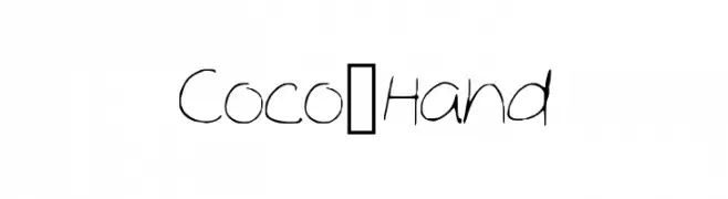
A playful, handwritten font with irregular strokes and a casual style.
![Coco_Hand font caratteri gratis]() Scaricare 136 Downloads@WebFont
Scaricare 136 Downloads@WebFont -
( Fonts by Darrell Flood - Personal-use only. For commercial use please contact owner. )
A bold, playful font with rounded, bubble-like characters ideal for whimsical designs.
![FATS ARE GOOD font caratteri gratis]() Scaricare 136 Downloads@WebFont
Scaricare 136 Downloads@WebFont -
( Fonts by Graphicxell )
A playful and bold font with rounded strokes and a lively appearance.
![Ranked Hockey font caratteri gratis]() Scaricare 136 Downloads@WebFont
Scaricare 136 Downloads@WebFont -
( Fonts by Kat`s Fun Fonts - Personal-use only. For commercial use please contact owner. )
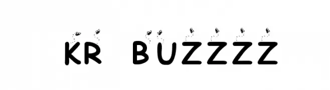
A playful font with bee illustrations and rounded, bold characters.
![KR Buzzzz font caratteri gratis]() Scaricare 136 Downloads@WebFont
Scaricare 136 Downloads@WebFont -
( Fonts by Vladimir Nikolic - www.creativefabrica.com/designer/vladimirnikolic/ - Personal-use only. For commercial use please contact owner. )
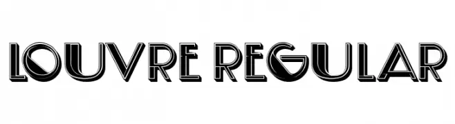
A bold, geometric font with Art Deco influences and shadow effects.
![Louvre Regular font caratteri gratis]() Scaricare 136 Downloads@WebFont
Scaricare 136 Downloads@WebFont -
( Fonts by Ikrar Bey Khubaib )
A lively and energetic script font with fluid, connected letterforms.
![Bulaga font caratteri gratis]() Scaricare 136 Downloads@WebFont
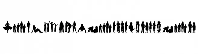
Scaricare 136 Downloads@WebFont -
![HumanSilhouettesFreeFour font caratteri gratis]() Scaricare 136 Downloads@WebFont
Scaricare 136 Downloads@WebFont -
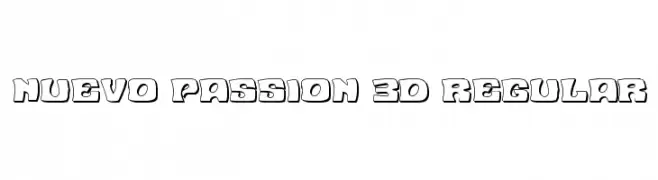
( Fonts by Daniel Zadorozny - www.iconian.com )
A bold, 3D outlined font with a playful and dynamic style.
![Nuevo Passion 3D Regular font caratteri gratis]() Scaricare 136 Downloads@WebFont
Scaricare 136 Downloads@WebFont -
![RecorderFont font caratteri gratis]() Scaricare 136 Downloads@WebFont
Scaricare 136 Downloads@WebFont -
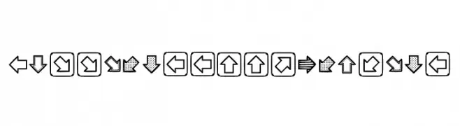
( Fonts by Kusane Hexaku )
A decorative font featuring diverse arrow designs with bold and patterned styles.
![Littlearrows Regular font caratteri gratis]() Scaricare 136 Downloads@WebFont
Scaricare 136 Downloads@WebFont -
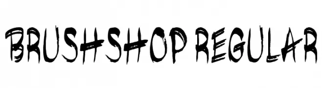
( Fonts by Peter Olexa - www.dealjumbo.com - Personal-use only. For commercial use please contact owner. )
A bold, expressive brush-style font with a hand-painted look.
![brushshop regular font caratteri gratis]() Scaricare 136 Downloads@WebFont
Scaricare 136 Downloads@WebFont -
![Lime Blossom Caps font caratteri gratis]() Scaricare 136 Downloads@WebFont
Scaricare 136 Downloads@WebFont -
( Fonts by Bumbayo Font Fabrik - bumbayo.blogspot.com )
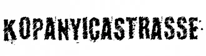
A bold, distressed font with a rugged, grunge-like appearance.
![KopanyicaStrasse font caratteri gratis]() Scaricare 136 Downloads@WebFont
Scaricare 136 Downloads@WebFont -
( Fonts by RaisProject )
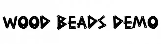
A bold, playful font with a woodcut, handcrafted appearance.
![Wood Beads Demo font caratteri gratis]() Scaricare 136 Downloads@WebFont
Scaricare 136 Downloads@WebFont


Quali sono i font più popolari adesso?
Poppins, Roboto, Montserrat, Open Sans e Lato sono molto usati per le forme pulite e l'ampia applicabilità — dall'identità di marca alle landing page e ai poster.
Quali font si usano spesso nei loghi?
Le sans serif geometriche (es. Poppins, famiglie in stile Gotham) sono scelte comuni per un branding pulito e scalabile. Per un tocco personale restano valide script e stili manoscritti. Abbina un display deciso per i titoli a un corpo testo neutro per riconoscibilità ed equilibrio.
Ogni quanto si aggiorna la lista?
Con regolarità, in base ai download e all'attività reale. Torna spesso per scoprire in anticipo le nuove preferite.
💡 Consiglio: aggiungi ai preferiti — le tendenze cambiano in fretta e i font top di oggi possono ispirare il rebranding di domani.