Benvenuto nelle Font Più Popolari — dove popolarità e qualità si incontrano. Qui trovi i font più scaricati e usati dell'anno. Se cerchi scelte sicure per logo, web o social, inizia da qui.
Ogni font top si distingue per equilibrio, leggibilità e versatilità. Troverai sans serif moderne, script eleganti, serif vintage e display minimalisti.
-
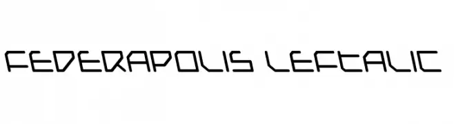
( Fonts by Daniel Zadorozny - www.iconian.com - Free for personal use )
A futuristic, geometric font with angular lines and consistent thickness.
 Scaricare 136 Downloads@WebFont
 -
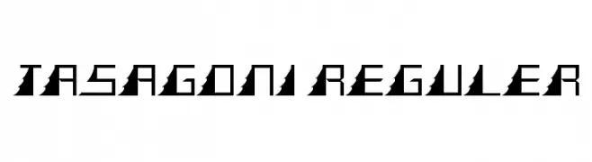
( Fonts by Nirma Indah )
A geometric, angular font with a futuristic and bold design.
![TASAGONI REGULER font caratteri gratis]() Scaricare 136 Downloads@WebFont
Scaricare 136 Downloads@WebFont -
![LoveandSunshine font caratteri gratis]() Scaricare 136 Downloads@WebFont
Scaricare 136 Downloads@WebFont -
![Beat Me Now Regular font caratteri gratis]() Scaricare 136 Downloads@WebFont
Scaricare 136 Downloads@WebFont -
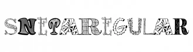
( Fonts by Digital Typeface Studio )
A decorative and artistic font with intricate patterns in each letter.
![SnetaRegular font caratteri gratis]() Scaricare 136 Downloads@WebFont
Scaricare 136 Downloads@WebFont -
( Fonts by Manuel Ramos - www.infinitismo.com - Personal-use only. For commercial use please contact owner. )
A sleek, modern font with thin lines and geometric structure.
![Infinita font caratteri gratis]() Scaricare 136 Downloads@WebFont
Scaricare 136 Downloads@WebFont -
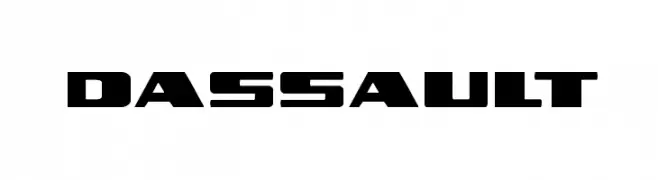
( Iconian Fonts - Daniel Zadorozny - www.iconian.com )
A bold, geometric font with a futuristic and industrial style.
![Dassault font caratteri gratis]() Scaricare 136 Downloads@WebFont
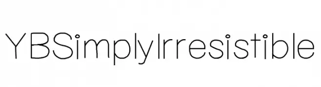
Scaricare 136 Downloads@WebFont -
![YBSimplyIrresistible font caratteri gratis]() Scaricare 136 Downloads@WebFont
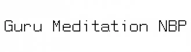
Scaricare 136 Downloads@WebFont -
![Guru Meditation NBP font caratteri gratis]() Scaricare 136 Downloads@WebFont
Scaricare 136 Downloads@WebFont -
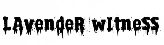
( Fonts by Axel Lymphos )
A bold, dripping font with a grungy, distressed style.
![Lavender Witness font caratteri gratis]() Scaricare 136 Downloads@WebFont
Scaricare 136 Downloads@WebFont -
( Fonts by Lafontype - Anugrah Pasau - Personal-use only. For commercial use please contact owner. )
A modern, fluid handwritten font with elegant curves.
![Celliad font caratteri gratis]() Scaricare 136 Downloads@WebFont
Scaricare 136 Downloads@WebFont -
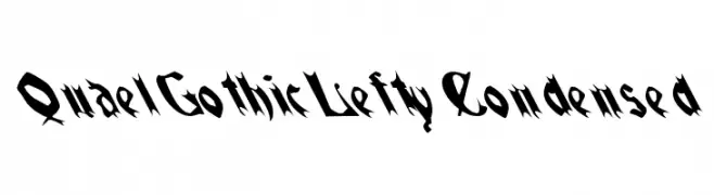
![QuaelGothicLeftyCondensed font caratteri gratis]() Scaricare 136 Downloads@WebFont
Scaricare 136 Downloads@WebFont -
( Fonts by Tipografia Vittoria - Personal-use only. For commercial use please contact owner. )
A classic serif font with elegant proportions and moderate contrast, ideal for sophisticated designs.
![Touch font caratteri gratis]() Scaricare 136 Downloads@WebFont
Scaricare 136 Downloads@WebFont -
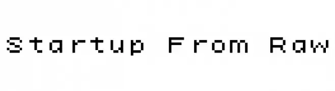
( Fonts by Kreative Korporation - www.kreativekorp.com )
A pixelated, retro-style font with a digital, blocky appearance.
![Startup From Raw font caratteri gratis]() Scaricare 136 Downloads@WebFont
Scaricare 136 Downloads@WebFont -
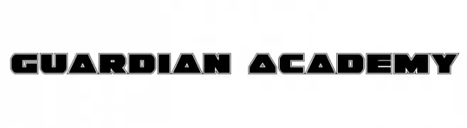
( Fonts by Daniel Zadorozny - www.iconian.com )
A bold, geometric font with strong outlines and angular shapes.
![Guardian Academy font caratteri gratis]() Scaricare 136 Downloads@WebFont
Scaricare 136 Downloads@WebFont -
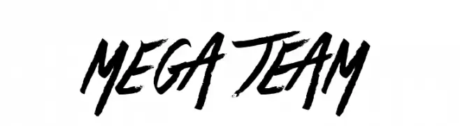
( Fonts by Jonathan S. Harris - www.tattoowoo.com. Personal-use only. For commercial use please contact owner. )
A bold, dynamic brush script with expressive, fluid strokes and a handmade feel.
![Mega Team font caratteri gratis]() Scaricare 136 Downloads@WebFont
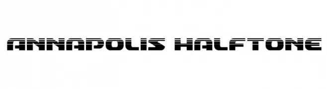
Scaricare 136 Downloads@WebFont -
![Annapolis Halftone font caratteri gratis]() Scaricare 136 Downloads@WebFont
Scaricare 136 Downloads@WebFont -
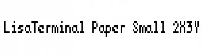
( Fonts by Kreative Korporation - www.kreativekorp.com )
A pixelated, monospaced font with a retro digital style.
![LisaTerminal Paper Small 2X3Y font caratteri gratis]() Scaricare 136 Downloads@WebFont
Scaricare 136 Downloads@WebFont -
( Fonts by StringLabs )
A playful, hand-drawn font with a whimsical and casual style.
![Angkise font caratteri gratis]() Scaricare 136 Downloads@WebFont
Scaricare 136 Downloads@WebFont -
( Fonts by benoitsjoholm.blogspot.com - Benoit Sjoholm - Personal-use only. For commercial use please contact owner. )
A bold, geometric sans-serif font with a modern and clean aesthetic.
![Explora font caratteri gratis]() Scaricare 136 Downloads@WebFont
Scaricare 136 Downloads@WebFont -
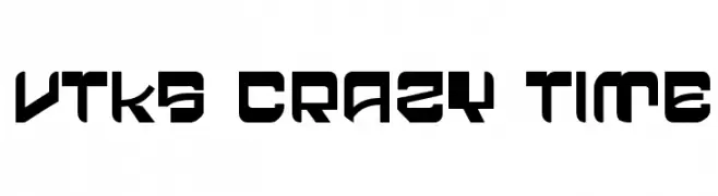
( Fonts by Douglas Vitkauskas - www.vtksdesign.com. Personal-use only. For commercial use please contact owner. )
A bold, futuristic font with geometric shapes and sharp angles.
![vtks crazy time font caratteri gratis]() Scaricare 136 Downloads@WebFont
Scaricare 136 Downloads@WebFont -
( Fonts by Dharmas Studio - Jamaludin Ahmad - Personal-use only. For commercial use please contact owner. )
An elegant script font with flowing, ornate lines and high contrast.
![Simplicity Angela font caratteri gratis]() Scaricare 136 Downloads@WebFont
Scaricare 136 Downloads@WebFont -
( Fonts by www.chequered.ink - Chequered Ink - Personal-use only. For commercial use please contact owner. )
A decorative font with intricate floral and compass motifs.
![Floral Compass font caratteri gratis]() Scaricare 136 Downloads@WebFont
Scaricare 136 Downloads@WebFont -
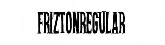
( Gravual - Sander Legrand - www.gravual.com )
A bold, condensed font with thick strokes and a strong presence.
![FriztonRegular font caratteri gratis]() Scaricare 136 Downloads@WebFont
Scaricare 136 Downloads@WebFont -
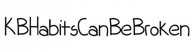
![KBHabitsCanBeBroken font caratteri gratis]() Scaricare 136 Downloads@WebFont
Scaricare 136 Downloads@WebFont -
( Fonts by Wino S Kadir - weknow - www.revolge.com/shop/weknow/ - Personal-use only. For commercial use please contact owner. )
A bold, geometric font with rounded edges and a futuristic style.
![dominique font caratteri gratis]() Scaricare 136 Downloads@WebFont
Scaricare 136 Downloads@WebFont -
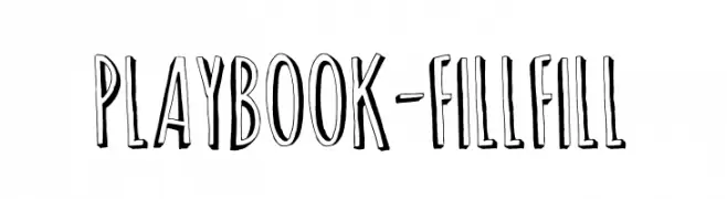
( Fonts by Digi Temply )
A playful, hand-drawn font with bold, uneven strokes and high contrast.
![Playbook-Fill Fill font caratteri gratis]() Scaricare 136 Downloads@WebFont
Scaricare 136 Downloads@WebFont -
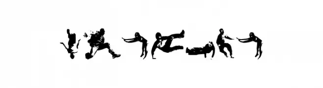
( coletivo NEGOBOM - Felipe Caroé - www.coletivonegobom.com )
Energetic display font made from parkour silhouettes.
![Parkour font caratteri gratis]() Scaricare 136 Downloads@WebFont
Scaricare 136 Downloads@WebFont -
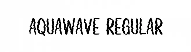
( Fonts by Creatype Studio )
A wavy, decorative font with a fluid, energetic style.
![Aquawave Regular font caratteri gratis]() Scaricare 136 Downloads@WebFont
Scaricare 136 Downloads@WebFont -
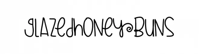
( Fonts by a Des Gomez. Personal-use only. For commercial use please contact owner. )
A playful handwritten font with a whimsical and casual style.
![GlazedHoneyBuns font caratteri gratis]() Scaricare 136 Downloads@WebFont
Scaricare 136 Downloads@WebFont -
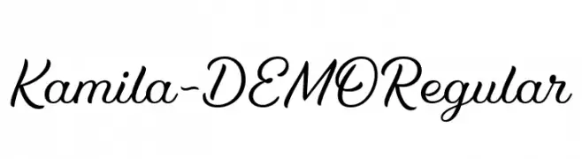
( Fonts by SevenType - Vitória Neves - Personal-use only. For commercial use please contact owner. )
An elegant and flowing script font with smooth, cursive letterforms.
![Kamila-DEMO Regular font caratteri gratis]() Scaricare 136 Downloads@WebFont
Scaricare 136 Downloads@WebFont -
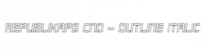
( Fonts by Apostrophic Lab )
A modern, italicized outline font with a condensed and geometric style.
![Republikaps Cnd - Outline Italic font caratteri gratis]() Scaricare 136 Downloads@WebFont
Scaricare 136 Downloads@WebFont -
( Fonts by Graphix Line Studio )
Casual handwritten script font.
![Cecilia font caratteri gratis]() Scaricare 136 Downloads@WebFont
Scaricare 136 Downloads@WebFont -
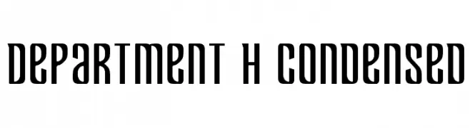
( Iconian Fonts - Daniel Zadorozny - www.iconian.com )
A bold, condensed font with a modern, industrial look.
![Department H Condensed font caratteri gratis]() Scaricare 136 Downloads@WebFont
Scaricare 136 Downloads@WebFont -
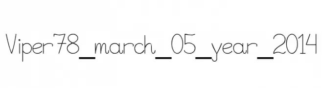
( Vlad Viperov )
A playful, handwritten font with thin, elongated characters and a whimsical style.
![Viper78_march_05_year_2014 font caratteri gratis]() Scaricare 136 Downloads@WebFont
Scaricare 136 Downloads@WebFont


Quali sono i font più popolari adesso?
Poppins, Roboto, Montserrat, Open Sans e Lato sono molto usati per le forme pulite e l'ampia applicabilità — dall'identità di marca alle landing page e ai poster.
Quali font si usano spesso nei loghi?
Le sans serif geometriche (es. Poppins, famiglie in stile Gotham) sono scelte comuni per un branding pulito e scalabile. Per un tocco personale restano valide script e stili manoscritti. Abbina un display deciso per i titoli a un corpo testo neutro per riconoscibilità ed equilibrio.
Ogni quanto si aggiorna la lista?
Con regolarità, in base ai download e all'attività reale. Torna spesso per scoprire in anticipo le nuove preferite.
💡 Consiglio: aggiungi ai preferiti — le tendenze cambiano in fretta e i font top di oggi possono ispirare il rebranding di domani.