Benvenuto nelle Font Più Popolari — dove popolarità e qualità si incontrano. Qui trovi i font più scaricati e usati dell'anno. Se cerchi scelte sicure per logo, web o social, inizia da qui.
Ogni font top si distingue per equilibrio, leggibilità e versatilità. Troverai sans serif moderne, script eleganti, serif vintage e display minimalisti.
-
 Scaricare 133 Downloads@WebFont
 -
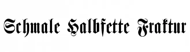
( Fonts by Torre de Prata )
A bold, intricate blackletter font with ornate, Gothic-inspired design.
![Schmale Halbfette Fraktur font caratteri gratis]() Scaricare 133 Downloads@WebFont
Scaricare 133 Downloads@WebFont -
( Fonts by Skiiller Studio )
Bold, playful handwritten font.
![Mikulsa font caratteri gratis]() Scaricare 133 Downloads@WebFont
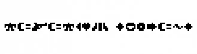
Scaricare 133 Downloads@WebFont -
![ROTORcap Symbols font caratteri gratis]() Scaricare 133 Downloads@WebFont
Scaricare 133 Downloads@WebFont -
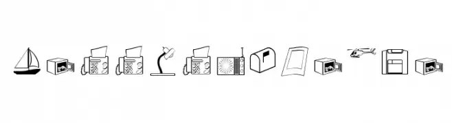
( Fonts by Manfred Klein. Free for private and charity use. Free for commercial with donation to organizations )
A dingbat font with office and business-themed pictograms.
![LessIsMoreOne font caratteri gratis]() Scaricare 133 Downloads@WebFont
Scaricare 133 Downloads@WebFont -
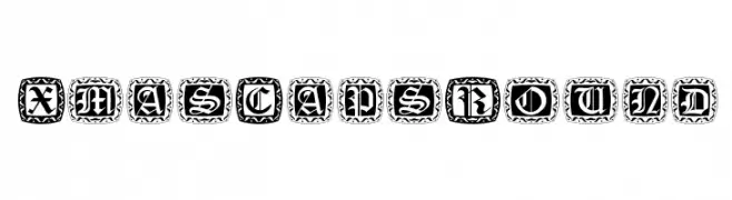
( Fonts by Manfred Klein. Free for private and charity use. Free for commercial with donation to organizations )
A decorative, ornate font with a festive, vintage style.
![XmasCapsRound font caratteri gratis]() Scaricare 133 Downloads@WebFont
Scaricare 133 Downloads@WebFont -
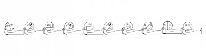
( Fonts by Manfred Klein. Free for private and charity use. Free for commercial with donation to organizations )
A whimsical and artistic font with characters depicted as reclining figures.
![LogoModels font caratteri gratis]() Scaricare 133 Downloads@WebFont
Scaricare 133 Downloads@WebFont -
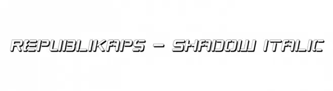
( Fonts by Apostrophic Lab )
Bold, italicized font with a shadow effect for a 3D look.
![Republikaps - Shadow Italic font caratteri gratis]() Scaricare 133 Downloads@WebFont
Scaricare 133 Downloads@WebFont -
( Fonts by AlifRyanZulfikar - Personal-use only. For commercial use please contact owner. )
A whimsical and elegant script font with flowing, interconnected letters and playful loops.
![Valentine Soul - Personal Use font caratteri gratis]() Scaricare 133 Downloads@WebFont
Scaricare 133 Downloads@WebFont -
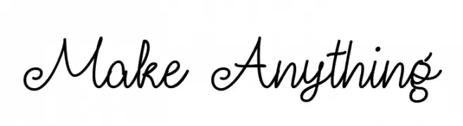
( Fonts by Misti Hammers - mistifonts.com - Personal-use only. For commercial use please contact owner. )
A whimsical script font with flowing, interconnected letters and decorative loops.
![Make Anything font caratteri gratis]() Scaricare 133 Downloads@WebFont
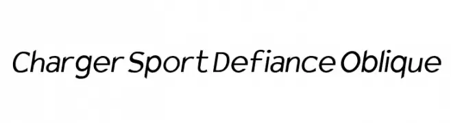
Scaricare 133 Downloads@WebFont -
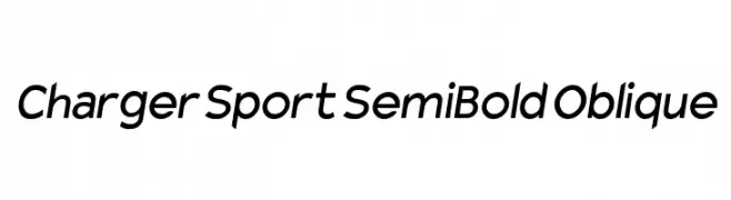
![Charger Sport SemiBold Oblique font caratteri gratis]() Scaricare 133 Downloads@WebFont
Scaricare 133 Downloads@WebFont -
( Fonts by Goma Shin - www.geocities.jp/gomarice_font/ - Personal-use only. For commercial use please contact owner. )
A bold, rounded slab serif font with a vintage yet modern appeal.
![ATAMA-SERIF__G font caratteri gratis]() Scaricare 133 Downloads@WebFont
Scaricare 133 Downloads@WebFont -
( Fonts by Leonard Posavec - LeoSupply.co - Leonard Posavec - Personal-use only. For commercial use please contact owner. )
A bold, condensed font with a distressed texture and strong presence.
![Bastion! font caratteri gratis]() Scaricare 133 Downloads@WebFont
Scaricare 133 Downloads@WebFont -
( Fonts by Winter Design Studio - winty5.wixsite.com/noahtheawesome/ - Personal-use only. For commercial use please contact owner. )
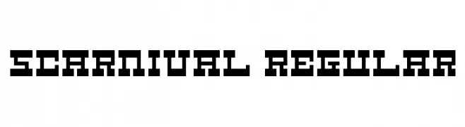
A bold, geometric font with a pixelated, retro digital aesthetic.
![5Carnival Regular font caratteri gratis]() Scaricare 133 Downloads@WebFont
Scaricare 133 Downloads@WebFont -
( Fonts by Manfred Klein. Free for private and charity use. Free for commercial with donation to organizations )
Cartoonish, hand-drawn font with energetic, comic character illustrations.
![Spontcomic font caratteri gratis]() Scaricare 133 Downloads@WebFont
Scaricare 133 Downloads@WebFont -
( Fonts by Burhan Afif - hanscostudio.com - Personal-use only. For commercial use please contact owner. )
A graceful script font with flowing cursive letters and intricate flourishes.
![Femina font caratteri gratis]() Scaricare 133 Downloads@WebFont
Scaricare 133 Downloads@WebFont -
( Free for personal use - www.pixelsagas.com )
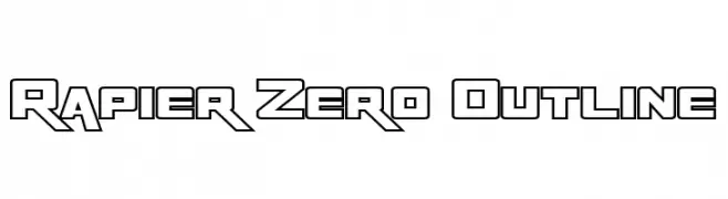
A bold, angular outline font with a futuristic and dynamic style.
![Rapier Zero Outline font caratteri gratis]() Scaricare 133 Downloads@WebFont
Scaricare 133 Downloads@WebFont -
( Fonts by Marty Bee - www.martybee.com )
A bold, angular font with sharp, jagged edges, ideal for dynamic and modern designs.
![Freakout Plain font caratteri gratis]() Scaricare 133 Downloads@WebFont
Scaricare 133 Downloads@WebFont -
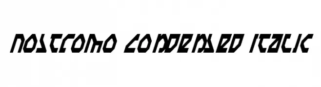
![Nostromo Condensed Italic font caratteri gratis]() Scaricare 133 Downloads@WebFont
Scaricare 133 Downloads@WebFont -
( Fonts by p2pnut - Personal-use only. For commercial use please contact owner. )
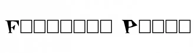
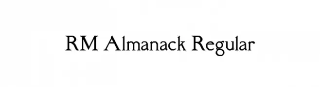
A classic serif typeface with sharp serifs and moderate contrast.
![RM Almanack Regular font caratteri gratis]() Scaricare 133 Downloads@WebFont
Scaricare 133 Downloads@WebFont -
( Free for personal use - www.pixelsagas.com )
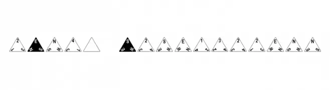
Geometric triangular design with bold typography and a navigational theme.
![dPoly Tetrahedron font caratteri gratis]() Scaricare 133 Downloads@WebFont
Scaricare 133 Downloads@WebFont -
![Gardiner MS font caratteri gratis]() Scaricare 133 Downloads@WebFont
Scaricare 133 Downloads@WebFont -
( Fonts by Billy Argel Fonts - www.billyargel.com - Personal-use only. For commercial use please contact owner. )
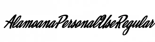
A bold, flowing script font with high contrast and elegant cursive elements.
![Alamoana Personal Use Regular font caratteri gratis]() Scaricare 133 Downloads@WebFont
Scaricare 133 Downloads@WebFont -
( Fonts by Leonard Posavec )
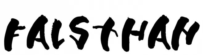
A bold, brush-style font with an expressive and handcrafted appearance.
![Falsthan font caratteri gratis]() Scaricare 133 Downloads@WebFont
Scaricare 133 Downloads@WebFont -
( Fonts by Apostrophic Lab )
A modern, condensed, and italicized font with a futuristic, streamlined design.
![Republika III Cnd - Haze Italic font caratteri gratis]() Scaricare 133 Downloads@WebFont
Scaricare 133 Downloads@WebFont -
( Fonts by Cannot Into Space Fonts )
A delicate, hand-drawn oblique font with a casual yet sophisticated style.
![SuplexDriver Hairline Oblique font caratteri gratis]() Scaricare 133 Downloads@WebFont
Scaricare 133 Downloads@WebFont -
( Fonts by www.omniglot.com )
A decorative, bold font with a calligraphic and fantasy-inspired design.
![Bel'arian font caratteri gratis]() Scaricare 133 Downloads@WebFont
Scaricare 133 Downloads@WebFont -
( Fonts by Peter Wiegel - www.peter-wiegel.de - Personal-use only. For commercial use please contact owner. )
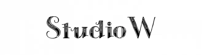
A decorative font with a blend of modern and vintage styles, featuring intricate detailing.
![StudioW font caratteri gratis]() Scaricare 133 Downloads@WebFont
Scaricare 133 Downloads@WebFont -
( Fonts by Iconian Fonts )
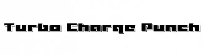
A bold, geometric font with a retro-futuristic, industrial style.
![Turbo Charge Punch font caratteri gratis]() Scaricare 133 Downloads@WebFont
Scaricare 133 Downloads@WebFont -
( Fonts by www.tipografea.com )
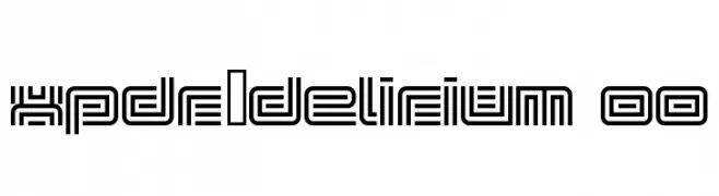
A futuristic, decorative font with intricate geometric line patterns.
![xpdr_delirium 00 font caratteri gratis]() Scaricare 133 Downloads@WebFont
Scaricare 133 Downloads@WebFont -
( Fonts by Tokokoo Studio )
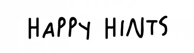
A playful, handwritten font with a casual and friendly style.
![Happy Hints font caratteri gratis]() Scaricare 133 Downloads@WebFont
Scaricare 133 Downloads@WebFont -
( Fonts by Mans Greback - Personal-use only. For commercial use please contact owner. )
A bold and robust font with strong, thick strokes and a slightly elegant curvature.
![Manofik PERSONAL USE ONLY Bold font caratteri gratis]() Scaricare 133 Downloads@WebFont
Scaricare 133 Downloads@WebFont -
( Fonts by Daniel Zadorozny - www.iconian.com )
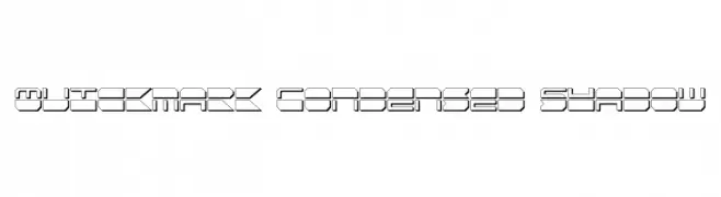
A bold, geometric font with a shadow effect and condensed, angular design.
![Quickmark Condensed Shadow font caratteri gratis]() Scaricare 133 Downloads@WebFont
Scaricare 133 Downloads@WebFont -
( Fonts by Letterara )
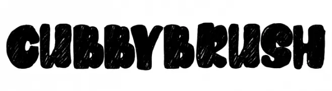
A bold, playful brush-style font with a hand-drawn texture.
![Cubby Brush font caratteri gratis]() Scaricare 133 Downloads@WebFont
Scaricare 133 Downloads@WebFont -
( Fonts by Iconian Fonts )
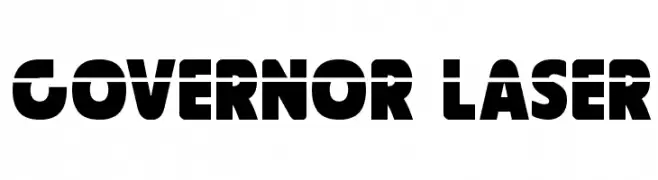
A bold, geometric font with a futuristic and industrial style.
![Governor Laser font caratteri gratis]() Scaricare 133 Downloads@WebFont
Scaricare 133 Downloads@WebFont


Quali sono i font più popolari adesso?
Poppins, Roboto, Montserrat, Open Sans e Lato sono molto usati per le forme pulite e l'ampia applicabilità — dall'identità di marca alle landing page e ai poster.
Quali font si usano spesso nei loghi?
Le sans serif geometriche (es. Poppins, famiglie in stile Gotham) sono scelte comuni per un branding pulito e scalabile. Per un tocco personale restano valide script e stili manoscritti. Abbina un display deciso per i titoli a un corpo testo neutro per riconoscibilità ed equilibrio.
Ogni quanto si aggiorna la lista?
Con regolarità, in base ai download e all'attività reale. Torna spesso per scoprire in anticipo le nuove preferite.
💡 Consiglio: aggiungi ai preferiti — le tendenze cambiano in fretta e i font top di oggi possono ispirare il rebranding di domani.