Benvenuto nelle Font Più Popolari — dove popolarità e qualità si incontrano. Qui trovi i font più scaricati e usati dell'anno. Se cerchi scelte sicure per logo, web o social, inizia da qui.
Ogni font top si distingue per equilibrio, leggibilità e versatilità. Troverai sans serif moderne, script eleganti, serif vintage e display minimalisti.
-
 Scaricare 134 Downloads@WebFont
 -
( Fonts by Manfred Klein - manfred-klein.ina-mar.com )
Hand-drawn, doodle-style icon set with playful faces and shapes.
![SktchBatsInversTwo font caratteri gratis]() Scaricare 134 Downloads@WebFont
Scaricare 134 Downloads@WebFont -
( Fonts by Beautypes )
A whimsical and decorative font with playful swashes and bold numbers.
![Kudofun Swash font caratteri gratis]() Scaricare 134 Downloads@WebFont
Scaricare 134 Downloads@WebFont -
( Fonts by blue studio09 - Personal-use only. For commercial use please contact owner. )
A playful, bold, and rounded font with a dynamic and informal style.
![Yello Lemon font caratteri gratis]() Scaricare 134 Downloads@WebFont
Scaricare 134 Downloads@WebFont -
( Fonts by Apostrophic Lab )
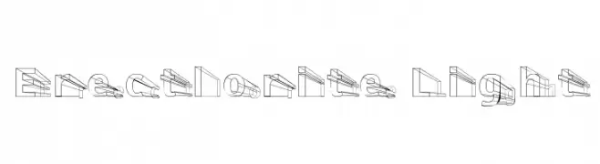
A three-dimensional, outline-style font with geometric and angular design.
![Erectlorite Light font caratteri gratis]() Scaricare 134 Downloads@WebFont
Scaricare 134 Downloads@WebFont -
( Fonts by Eddy Goodboy )
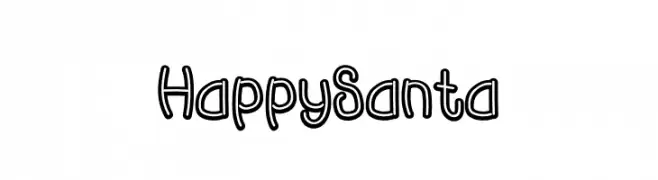
A playful, double-outlined font with a cartoon-like appearance.
![Happy Santa font caratteri gratis]() Scaricare 134 Downloads@WebFont
Scaricare 134 Downloads@WebFont -
( Fonts by myname5749 - Personal-use only. For commercial use please contact owner. )
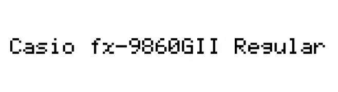
A pixelated, monospaced font with a retro digital display aesthetic.
![Casio fx-9860GII Regular font caratteri gratis]() Scaricare 134 Downloads@WebFont
Scaricare 134 Downloads@WebFont -
( Fonts by Woodcutter Manero - http://www.woodcutter.es - Personal-use only. For commercial use please contact owner. )
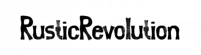
A bold, textured font with a rustic, handcrafted style.
![Rustic Revolution font caratteri gratis]() Scaricare 134 Downloads@WebFont
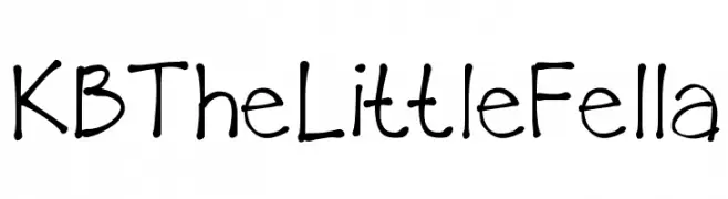
Scaricare 134 Downloads@WebFont -
![KBTheLittleFella font caratteri gratis]() Scaricare 134 Downloads@WebFont
Scaricare 134 Downloads@WebFont -
( Fonts by a Max Infeld - XEROGRAPHER FONTS - xerographer.blogspot.com . Personal-use only. For commercial use please contact owner. )
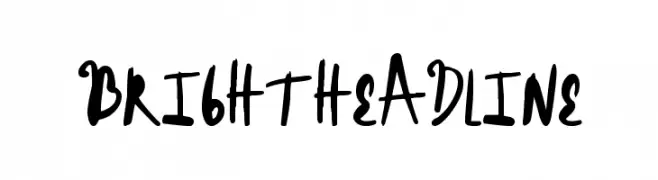
A bold, expressive handwritten font with dynamic strokes.
![BrightHeadline font caratteri gratis]() Scaricare 134 Downloads@WebFont
Scaricare 134 Downloads@WebFont -
( Jonathan S. Harris - www.tattoowoo.com )
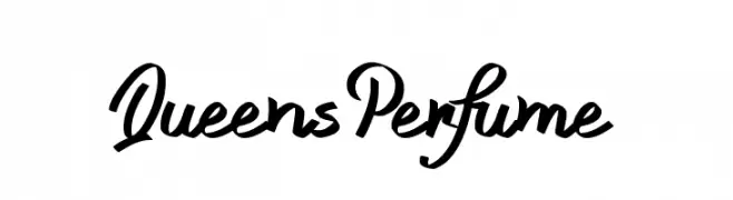
A bold, dynamic script font with fluid, cursive letterforms.
![Queens Perfume font caratteri gratis]() Scaricare 134 Downloads@WebFont
Scaricare 134 Downloads@WebFont -
( Fonts by Daniel Zadorozny - www.iconian.com - Free for personal use )
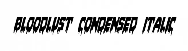
A dramatic, horror-themed font with sharp, jagged edges and a condensed italic style.
![Bloodlust Condensed Italic font caratteri gratis]() Scaricare 134 Downloads@WebFont
Scaricare 134 Downloads@WebFont -
( These fonts are free to use in any private, recreational manner.For commercial go to www.flopdesign.com/fordesign/font.html )
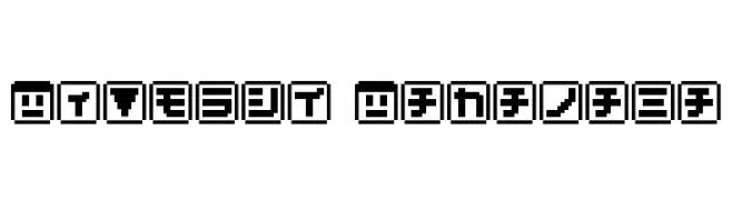
A bold, pixelated font with a retro, digital aesthetic.
![KEYmode Katakana font caratteri gratis]() Scaricare 134 Downloads@WebFont
Scaricare 134 Downloads@WebFont -
( Fonts by Daniel Zadorozny - www.iconian.com )
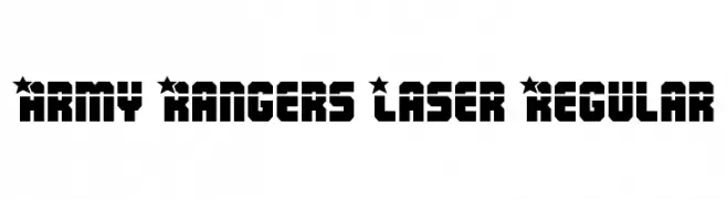
A bold, geometric font with a military-inspired design featuring star-adorned uppercase letters.
![Army Rangers Laser Regular font caratteri gratis]() Scaricare 134 Downloads@WebFont
Scaricare 134 Downloads@WebFont -
( Fonts by a Max Infeld - XEROGRAPHER FONTS - xerographer.blogspot.com . Personal-use only. For commercial use please contact owner. )
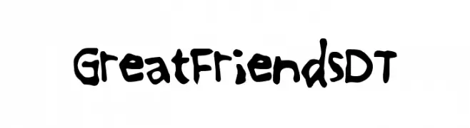
A playful, hand-drawn font with a casual and friendly appearance.
![GreatFriendsDT font caratteri gratis]() Scaricare 134 Downloads@WebFont
Scaricare 134 Downloads@WebFont -
![Squaropen Condensed font caratteri gratis]() Scaricare 134 Downloads@WebFont
Scaricare 134 Downloads@WebFont -
( Fonts by Scarlet Reyes )
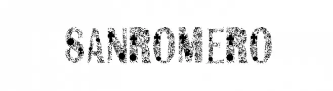
A bold, distressed font with a grunge texture and irregular edges.
![SANROMERO font caratteri gratis]() Scaricare 134 Downloads@WebFont
Scaricare 134 Downloads@WebFont -
( Fonts by www.blambot.com )
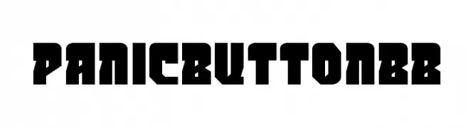
A bold, geometric font with a futuristic and industrial style.
![PanicButtonBB font caratteri gratis]() Scaricare 134 Downloads@WebFont
Scaricare 134 Downloads@WebFont -
( Doel Creative - creativemarket.com/fajriyandi )
A classic, elegant script font with flowing, cursive letterforms.
![Kaeshum font caratteri gratis]() Scaricare 134 Downloads@WebFont
Scaricare 134 Downloads@WebFont -
( cargocollective.com/mezarecabarren )
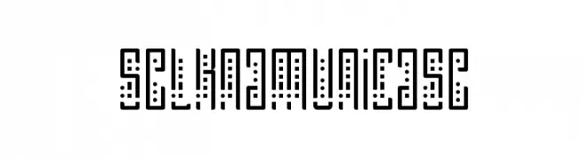
A geometric, modern font with a unicase style and dotted accents.
![SelknamUnicase font caratteri gratis]() Scaricare 134 Downloads@WebFont
Scaricare 134 Downloads@WebFont -
( Fonts by Daniel Zadorozny - www.iconian.com - Free for personal use )
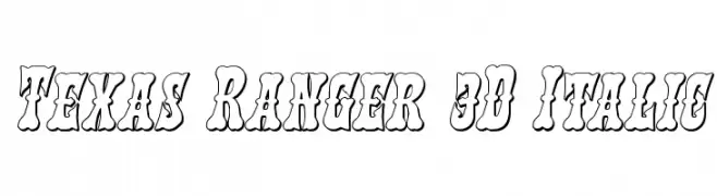
A bold, 3D italic font with a playful and dynamic style.
![Texas Ranger 3D Italic font caratteri gratis]() Scaricare 134 Downloads@WebFont
Scaricare 134 Downloads@WebFont -
( Fonts by Manfred Klein. Free for private and charity use. Free for commercial with donation to organizations )
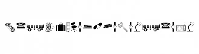
Minimalist iconographic font with black and white pictograms.
![BlackWhiteMinimalism font caratteri gratis]() Scaricare 134 Downloads@WebFont
Scaricare 134 Downloads@WebFont -
( Fonts by Origin Type )
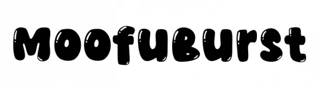
A bold, playful font with rounded, bubbly characters and a whimsical style.
![Moofu Burst font caratteri gratis]() Scaricare 134 Downloads@WebFont
Scaricare 134 Downloads@WebFont -
( Fonts by CloutierFontes )
An ornate, decorative font with floral embellishments.
![CF Flowers of Destiny Personal Regular font caratteri gratis]() Scaricare 134 Downloads@WebFont
Scaricare 134 Downloads@WebFont -
![Guru DoctorKnowBest font caratteri gratis]() Scaricare 134 Downloads@WebFont
Scaricare 134 Downloads@WebFont -
( Fonts by Iconian Fonts )
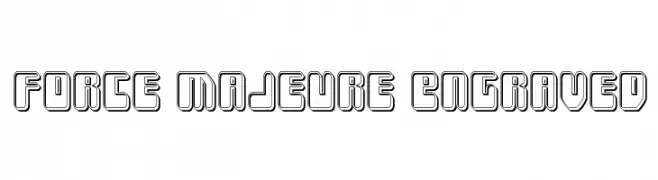
A bold, engraved font with a three-dimensional, futuristic style.
![Force Majeure Engraved font caratteri gratis]() Scaricare 134 Downloads@WebFont
Scaricare 134 Downloads@WebFont -
![Battenberg and Custard font caratteri gratis]() Scaricare 134 Downloads@WebFont
Scaricare 134 Downloads@WebFont -
( Fonts by ingoFonts - Ingo Zimmermann - Personal-use only. For commercial use please contact owner. )
A bold, condensed font with a modern and impactful style.
![AbsolutCondensedRed-Bold font caratteri gratis]() Scaricare 134 Downloads@WebFont
Scaricare 134 Downloads@WebFont -
( Noto is a trademark of Google Inc. Noto fonts are open source. All Noto fonts are published under the SIL Open Font License, Version 1.1 )
A modern, extra bold sans-serif font with clean lines and balanced spacing.
![Noto Sans Arabic UI ExtraBold font caratteri gratis]() Scaricare 134 Downloads@WebFont
Scaricare 134 Downloads@WebFont -
( Fonts by Cannot Into Space Fonts )
A delicate, hand-drawn font with thin, whimsical strokes and an organic feel.
![Filament One font caratteri gratis]() Scaricare 134 Downloads@WebFont
Scaricare 134 Downloads@WebFont -
( Fonts by Apostrophic Lab )
A geometric, angular font with a modern and minimalist design.
![Kimono Italic font caratteri gratis]() Scaricare 134 Downloads@WebFont
Scaricare 134 Downloads@WebFont -
( Fonts by Dondon Nillo - www.behance.net/dondon_nila056 - Personal-use only. For commercial use please contact owner. )
A playful, handwritten font with a casual and whimsical style.
![katkat_scrambled font caratteri gratis]() Scaricare 134 Downloads@WebFont
Scaricare 134 Downloads@WebFont -
( Fonts by Luke Owens - Personal-use only. For commercial use please contact owner. )
A bold, slanted font with thick strokes and a dynamic style.
![Oregon LDO ExtraBlack Sinistral font caratteri gratis]() Scaricare 134 Downloads@WebFont
Scaricare 134 Downloads@WebFont -
( Fonts by Daniel Zadorozny - www.iconian.com )
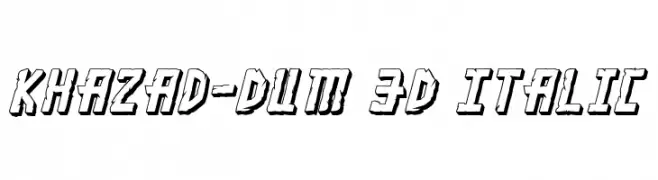
A bold, 3D italic font with a modern, edgy style and shadow effects.
![Khazad-Dum 3D Italic font caratteri gratis]() Scaricare 134 Downloads@WebFont
Scaricare 134 Downloads@WebFont -
( Donationware - www.junkohanhero.com )
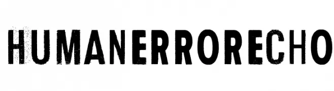
A bold, distressed font with a vintage, industrial style.
![Human Error Echo font caratteri gratis]() Scaricare 134 Downloads@WebFont
Scaricare 134 Downloads@WebFont


Quali sono i font più popolari adesso?
Poppins, Roboto, Montserrat, Open Sans e Lato sono molto usati per le forme pulite e l'ampia applicabilità — dall'identità di marca alle landing page e ai poster.
Quali font si usano spesso nei loghi?
Le sans serif geometriche (es. Poppins, famiglie in stile Gotham) sono scelte comuni per un branding pulito e scalabile. Per un tocco personale restano valide script e stili manoscritti. Abbina un display deciso per i titoli a un corpo testo neutro per riconoscibilità ed equilibrio.
Ogni quanto si aggiorna la lista?
Con regolarità, in base ai download e all'attività reale. Torna spesso per scoprire in anticipo le nuove preferite.
💡 Consiglio: aggiungi ai preferiti — le tendenze cambiano in fretta e i font top di oggi possono ispirare il rebranding di domani.