Benvenuto nelle Font Più Popolari — dove popolarità e qualità si incontrano. Qui trovi i font più scaricati e usati dell'anno. Se cerchi scelte sicure per logo, web o social, inizia da qui.
Ogni font top si distingue per equilibrio, leggibilità e versatilità. Troverai sans serif moderne, script eleganti, serif vintage e display minimalisti.
-
 Scaricare 698 Downloads@WebFont
 -
( Fonts by www.freakyfonts.de )
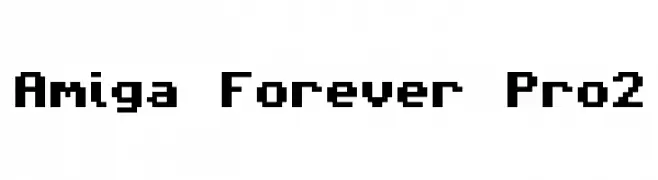
A pixelated, retro-style font with a blocky, grid-like appearance.
![Amiga Forever Pro2 font caratteri gratis]() Scaricare 698 Downloads@WebFont
Scaricare 698 Downloads@WebFont -
( Fonts by Jayvee Enaguas - Personal-use only. For commercial use please contact owner. )
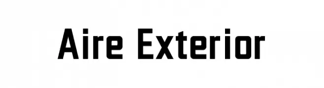
A bold, modern font with geometric and angular characteristics.
![Aire Exterior font caratteri gratis]() Scaricare 697 Downloads@WebFont
Scaricare 697 Downloads@WebFont -
Caratteri di typotopia. For commercial use please contact the owner.
( Fonts by Typotopia - Typotopia.co - Personal Use Only, for Commercial Use, please contact us )
A rough, hand-drawn font with a casual and artistic style.
![Jupiter font caratteri gratis]() Scaricare 697 Downloads@WebFont
Scaricare 697 Downloads@WebFont -
( Fonts by Yadhie Setiawan - typelinestudio.com - Personal-use only. For commercial use please contact owner. )
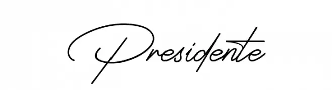
A sophisticated script font with fluid, connected strokes and elegant curves.
![Presidente font caratteri gratis]() Scaricare 697 Downloads@WebFont
Scaricare 697 Downloads@WebFont -
-
( Fonts by Cristiano Sobral - Personal-use only. For commercial use please contact owner. )
A bold, italic serif font with a classic and elegant style.
![Avrile Serif Bold Italic font caratteri gratis]() Scaricare 697 Downloads@WebFont
Scaricare 697 Downloads@WebFont -
( weknow - Wino S Kadir - www.creativefabrica.com/designer/weknow/ )
A modern, hollow font with a neon glow effect and rounded edges.
![NEON GLOW-Hollow font caratteri gratis]() Scaricare 697 Downloads@WebFont
Scaricare 697 Downloads@WebFont -
![Wakanda font caratteri gratis]() Scaricare 697 Downloads@WebFont
Scaricare 697 Downloads@WebFont -
( Fonts by madeDeduk )
A playful, handwritten font with fluid, dynamic letterforms and a whimsical style.
![Geovana font caratteri gratis]() Scaricare 697 Downloads@WebFont
Scaricare 697 Downloads@WebFont -
![DPCutie font caratteri gratis]() Scaricare 697 Downloads@WebFont
Scaricare 697 Downloads@WebFont


Quali sono i font più popolari adesso?
Poppins, Roboto, Montserrat, Open Sans e Lato sono molto usati per le forme pulite e l'ampia applicabilità — dall'identità di marca alle landing page e ai poster.
Quali font si usano spesso nei loghi?
Le sans serif geometriche (es. Poppins, famiglie in stile Gotham) sono scelte comuni per un branding pulito e scalabile. Per un tocco personale restano valide script e stili manoscritti. Abbina un display deciso per i titoli a un corpo testo neutro per riconoscibilità ed equilibrio.
Ogni quanto si aggiorna la lista?
Con regolarità, in base ai download e all'attività reale. Torna spesso per scoprire in anticipo le nuove preferite.
💡 Consiglio: aggiungi ai preferiti — le tendenze cambiano in fretta e i font top di oggi possono ispirare il rebranding di domani.