Benvenuto nelle Font Più Popolari — dove popolarità e qualità si incontrano. Qui trovi i font più scaricati e usati dell'anno. Se cerchi scelte sicure per logo, web o social, inizia da qui.
Ogni font top si distingue per equilibrio, leggibilità e versatilità. Troverai sans serif moderne, script eleganti, serif vintage e display minimalisti.
-
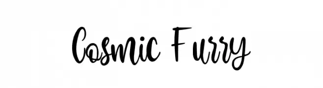
( Fonts by zamjump - Ahmad Zamzami - Personal-use only. For commercial use please contact owner. )
A playful, whimsical script font with smooth, flowing cursive letters.
 Scaricare 131 Downloads@WebFont
 -
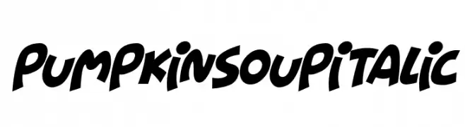
( Fonts by Darrell Flood )
A playful, bold italic font with rounded, exaggerated characters.
![Pumpkin Soup Italic font caratteri gratis]() Scaricare 131 Downloads@WebFont
Scaricare 131 Downloads@WebFont -
![DIN Rundschrift Breit KonturKursiv font caratteri gratis]() Scaricare 131 Downloads@WebFont
Scaricare 131 Downloads@WebFont -
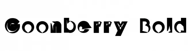
![Goonberry Bold font caratteri gratis]() Scaricare 131 Downloads@WebFont
Scaricare 131 Downloads@WebFont -
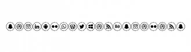
![social networks colors font caratteri gratis]() Scaricare 131 Downloads@WebFont
Scaricare 131 Downloads@WebFont -
( Fonts by Ahmad Zulfikar Ali )
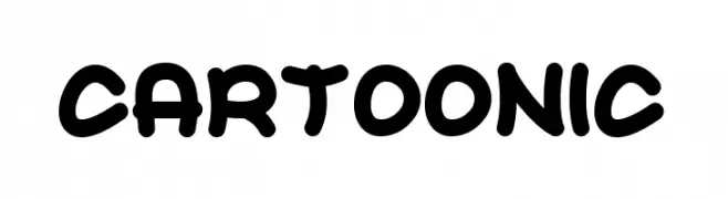
A bold, playful font with a cartoon-like, rounded style.
![CARTOONIC font caratteri gratis]() Scaricare 131 Downloads@WebFont
Scaricare 131 Downloads@WebFont -
( Copyright 2013 The Alegreya Sans Project Authors (https://github.com/huertatipografica/Alegreya-Sans) )
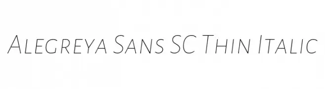
A sleek, thin, and italicized font with a modern and elegant style.
![Alegreya Sans SC Thin Italic font caratteri gratis]() Scaricare 131 Downloads@WebFont
Scaricare 131 Downloads@WebFont -
( Fonts by Des Gomez )
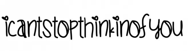
A playful handwritten font with whimsical decorative elements.
![ICantStopThinkinOfYou font caratteri gratis]() Scaricare 131 Downloads@WebFont
Scaricare 131 Downloads@WebFont -
( Vladimir Nikolic - www.coroflot.com/vladimirnikolic )
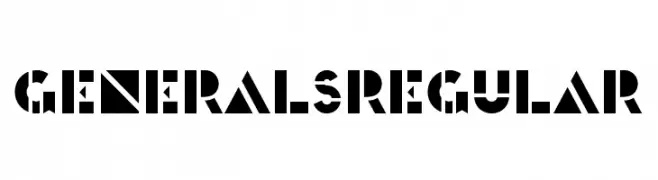
A bold, geometric font with stencil-like cutouts and an industrial feel.
![Generals Regular font caratteri gratis]() Scaricare 131 Downloads@WebFont
Scaricare 131 Downloads@WebFont -
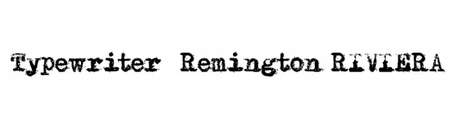
( Fonts by MR.FISK Fonts - Personal-use only. For commercial use please contact owner. )
A vintage, distressed typewriter-style font with a bold, textured appearance.
![Typewriter - Remington RIVIERA font caratteri gratis]() Scaricare 131 Downloads@WebFont
Scaricare 131 Downloads@WebFont -
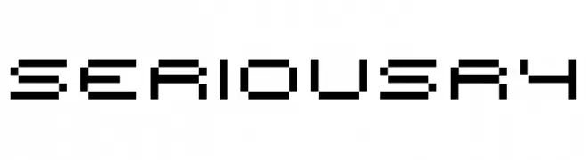
![seriousr4 font caratteri gratis]() Scaricare 131 Downloads@WebFont
Scaricare 131 Downloads@WebFont -
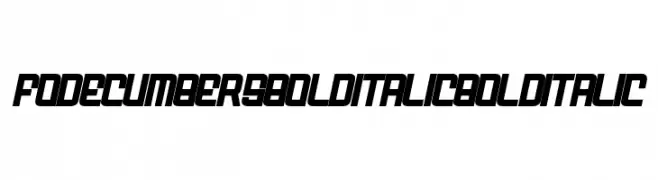
( Fonts by zamjump - Ahmad Zamzami - Personal-use only. For commercial use please contact owner. )
A bold, italicized font with a futuristic and angular design.
![FODECUMBERS BOLD ITALIC Bold Italic font caratteri gratis]() Scaricare 131 Downloads@WebFont
Scaricare 131 Downloads@WebFont -
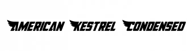
![American Kestrel Condensed font caratteri gratis]() Scaricare 131 Downloads@WebFont
Scaricare 131 Downloads@WebFont -
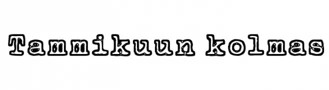
( Fonts by www.junkohanhero.com )
A bold, decorative font with a playful, outlined style.
![Tammikuun kolmas font caratteri gratis]() Scaricare 131 Downloads@WebFont
Scaricare 131 Downloads@WebFont -
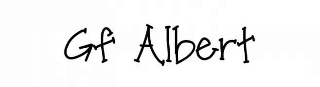
( Fonts by Geronimo Fonts - Personal-use only. For commercial use please contact owner. )
A playful, handwritten font with a casual and whimsical style.
![Gf Albert font caratteri gratis]() Scaricare 131 Downloads@WebFont
Scaricare 131 Downloads@WebFont -
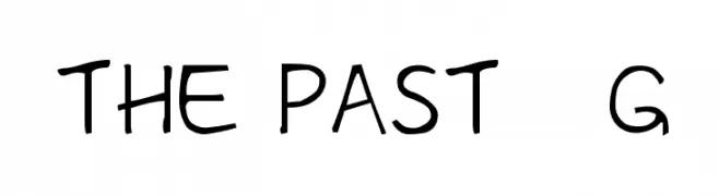
( Fonts by Goma Shin )
A playful, handwritten font with irregular, whimsical strokes.
![The Past__G font caratteri gratis]() Scaricare 131 Downloads@WebFont
Scaricare 131 Downloads@WebFont -
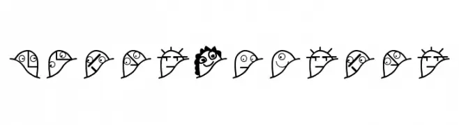
( Fonts by Manfred Klein. Free for private and charity use. Free for commercial with donation to organizations )
A whimsical collection of bird illustrations representing different characters.
![Gipfelkoepfe font caratteri gratis]() Scaricare 131 Downloads@WebFont
Scaricare 131 Downloads@WebFont -
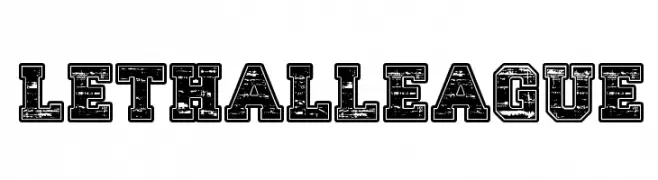
( imagex - www.imagex-fonts.com )
A bold, distressed font with a vintage, rugged aesthetic.
![Lethal League font caratteri gratis]() Scaricare 131 Downloads@WebFont
Scaricare 131 Downloads@WebFont -
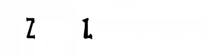
![Zed Leppelin font caratteri gratis]() Scaricare 131 Downloads@WebFont
Scaricare 131 Downloads@WebFont -
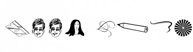
( Fonts by Blue Vinyl - Jess Latham - www.bvfonts.com )
Eclectic hand-drawn dingbat font with playful icons and symbols.
![Kool Ding font caratteri gratis]() Scaricare 131 Downloads@WebFont
Scaricare 131 Downloads@WebFont -
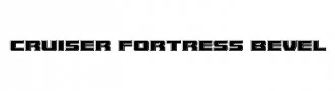
( Fonts by Iconian Fonts )
A bold, geometric font with a three-dimensional beveled effect.
![Cruiser Fortress Bevel font caratteri gratis]() Scaricare 131 Downloads@WebFont
Scaricare 131 Downloads@WebFont -
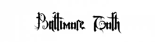
( Lanark - Kurt Tesnau - strangegeometry.com )
An ornate Gothic font with intricate details and decorative flourishes.
![Baltimore Goth font caratteri gratis]() Scaricare 131 Downloads@WebFont
Scaricare 131 Downloads@WebFont -
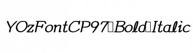
![YOzFontCP97 Bold Italic font caratteri gratis]() Scaricare 131 Downloads@WebFont
Scaricare 131 Downloads@WebFont -
( tups - Rio Suzandy - laritelanjang.net )
A playful, hand-drawn font with a sketch-like, energetic style.
![lazydayRegular font caratteri gratis]() Scaricare 131 Downloads@WebFont
Scaricare 131 Downloads@WebFont -
![Fedyral II Halftone font caratteri gratis]() Scaricare 131 Downloads@WebFont
Scaricare 131 Downloads@WebFont -
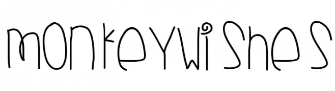
( Fonts by Des Gomez )
A playful, hand-drawn font with a whimsical and energetic style.
![MonkeyWishes font caratteri gratis]() Scaricare 131 Downloads@WebFont
Scaricare 131 Downloads@WebFont -
( Fonts by Letterafa Studio )
A bold, playful font with exaggerated curves and sharp edges, perfect for decorative use.
![Black Mouse -Personal Use font caratteri gratis]() Scaricare 131 Downloads@WebFont
Scaricare 131 Downloads@WebFont -
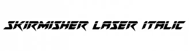
( Fonts by Daniel Zadorozny - www.iconian.com - Free for personal use )
A bold, futuristic font with sharp, angular edges and an italicized slant.
![Skirmisher Laser Italic font caratteri gratis]() Scaricare 131 Downloads@WebFont
Scaricare 131 Downloads@WebFont -
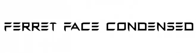
( Fonts by Daniel Zadorozny - www.iconian.com )
A bold, futuristic font with sharp, angular lines and a condensed structure.
![Ferret Face Condensed font caratteri gratis]() Scaricare 131 Downloads@WebFont
Scaricare 131 Downloads@WebFont -
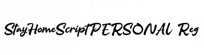
( Fonts by olexstudio - Firman Syah - Personal-use only. For commercial use please contact owner. )
A casual, flowing script font with a handwritten appearance.
![StayHomeScriptPERSONAL-Reg font caratteri gratis]() Scaricare 131 Downloads@WebFont
Scaricare 131 Downloads@WebFont -
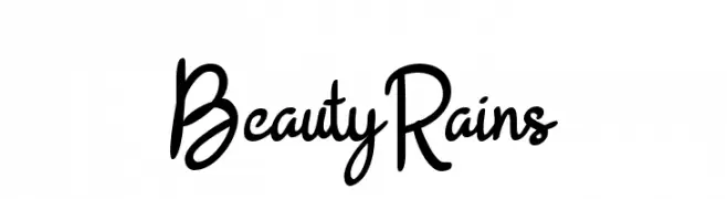
( ViactionType - Lukman Hidayat - www.myfonts.com/foundry/Viaction_Type/ )
A playful and casual handwritten font with fluid, slightly irregular strokes.
![BeautyRains font caratteri gratis]() Scaricare 131 Downloads@WebFont
Scaricare 131 Downloads@WebFont -
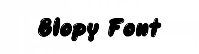
( Fonts by Excellent Ritma Florendia )
A playful, bold font with rounded characters and whimsical star accents.
![Blopy Font font caratteri gratis]() Scaricare 131 Downloads@WebFont
Scaricare 131 Downloads@WebFont -
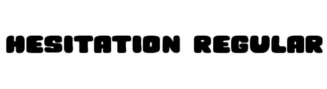
( Vladimir Nikolic - www.coroflot.com/vladimirnikolic )
A bold, rounded font with a playful and friendly appearance.
![Hesitation Regular font caratteri gratis]() Scaricare 131 Downloads@WebFont
Scaricare 131 Downloads@WebFont -
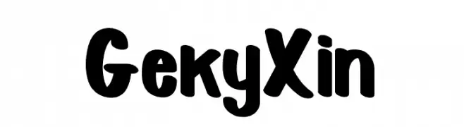
( Fonts by StringLabs )
A bold, playful font with rounded edges and a slightly condensed style.
![Geky Xin font caratteri gratis]() Scaricare 131 Downloads@WebFont
Scaricare 131 Downloads@WebFont -
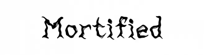
( Walter E Stewart )
A jagged, eerie font with distressed, twisted characters ideal for horror themes.
![Mortified font caratteri gratis]() Scaricare 131 Downloads@WebFont
Scaricare 131 Downloads@WebFont


Quali sono i font più popolari adesso?
Poppins, Roboto, Montserrat, Open Sans e Lato sono molto usati per le forme pulite e l'ampia applicabilità — dall'identità di marca alle landing page e ai poster.
Quali font si usano spesso nei loghi?
Le sans serif geometriche (es. Poppins, famiglie in stile Gotham) sono scelte comuni per un branding pulito e scalabile. Per un tocco personale restano valide script e stili manoscritti. Abbina un display deciso per i titoli a un corpo testo neutro per riconoscibilità ed equilibrio.
Ogni quanto si aggiorna la lista?
Con regolarità, in base ai download e all'attività reale. Torna spesso per scoprire in anticipo le nuove preferite.
💡 Consiglio: aggiungi ai preferiti — le tendenze cambiano in fretta e i font top di oggi possono ispirare il rebranding di domani.