Benvenuto nelle Font Più Popolari — dove popolarità e qualità si incontrano. Qui trovi i font più scaricati e usati dell'anno. Se cerchi scelte sicure per logo, web o social, inizia da qui.
Ogni font top si distingue per equilibrio, leggibilità e versatilità. Troverai sans serif moderne, script eleganti, serif vintage e display minimalisti.
-
( Fonts by Zetafonts - Personal-use only. For commercial use please contact owner. )
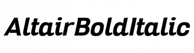
A bold and italicized font with a modern, dynamic style.
 Scaricare 131 Downloads@WebFont
 -
( Fonts by Craft Supply Co - Personal-use only. For commercial use please contact owner. )
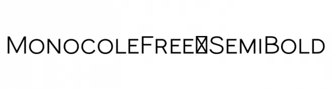
A modern, geometric sans-serif font with bold, uniform strokes.
![MonocoleFree-SemiBold font caratteri gratis]() Scaricare 131 Downloads@WebFont
Scaricare 131 Downloads@WebFont -
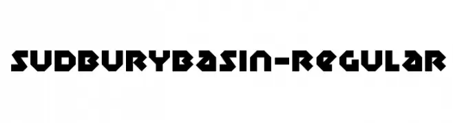
![SudburyBasin-Regular font caratteri gratis]() Scaricare 131 Downloads@WebFont
Scaricare 131 Downloads@WebFont -
( Fonts by Mocha Frappuccino - Personal-use only. For commercial use please contact owner. )
Bold, italicized sans-serif font with a dynamic style.
![Bigail Personal Used font caratteri gratis]() Scaricare 131 Downloads@WebFont
Scaricare 131 Downloads@WebFont -
( Fonts by Shara Weber )
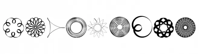
Ornamental spirograph-style display set with circular geometric motifs.
![SpiroFace font caratteri gratis]() Scaricare 131 Downloads@WebFont
Scaricare 131 Downloads@WebFont -
![TRATEXPOSVERSALSAMISK POSVERSALSAMISK font caratteri gratis]() Scaricare 131 Downloads@WebFont
Scaricare 131 Downloads@WebFont -
( Fonts by David Espinosa [Type Sailor] - www.facebook.com/typesailor - Personal-use only. For commercial use please contact owner. )
A bold, geometric font with a zigzag pattern for a modern, edgy look.
![Caro font caratteri gratis]() Scaricare 131 Downloads@WebFont
Scaricare 131 Downloads@WebFont -
( Fonts by StringLabs - stringlabscreative.com - Personal-use only. For commercial use please contact owner. )
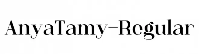
A classic serif font with high contrast and elegant strokes.
![AnyaTamy-Regular font caratteri gratis]() Scaricare 131 Downloads@WebFont
Scaricare 131 Downloads@WebFont -
( Fonts by a Situjuh Nazara - c7n1.wordpress.com. Personal-use only. For commercial use please contact owner. )
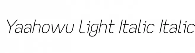
A modern, light, and italicized font with smooth, rounded edges.
![Yaahowu Light Italic Italic font caratteri gratis]() Scaricare 131 Downloads@WebFont
Scaricare 131 Downloads@WebFont -
( http://www.typhoontype.net/category/fonts/ Commerciali Caratteri )
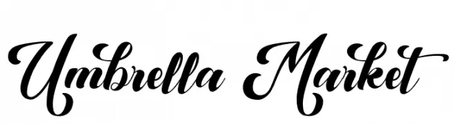
A bold, elegant script font with flowing curves and high contrast.
![Umbrella Market font caratteri gratis]() Scaricare 131 Downloads
Scaricare 131 Downloads -
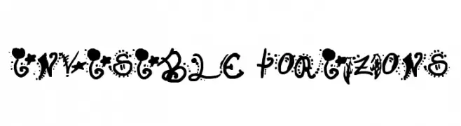
![Invisible Horizons font caratteri gratis]() Scaricare 131 Downloads@WebFont
Scaricare 131 Downloads@WebFont -
( Fonts by Manuel Viergutz - Typo Graphic Design - www.typographicdesign.de )
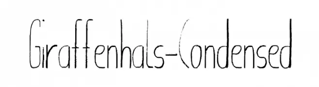
A tall, narrow, and modern font with a unique vertical emphasis.
![Giraffenhals-Condensed font caratteri gratis]() Scaricare 131 Downloads@WebFont
Scaricare 131 Downloads@WebFont -
( Fonts by Makashi - Maqsum Kamil - Personal-use only. For commercial use please contact owner. )
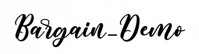
A bold, elegant cursive font with high contrast and flowing style.
![Bargain_Demo font caratteri gratis]() Scaricare 131 Downloads@WebFont
Scaricare 131 Downloads@WebFont -
( Fonts by Daniel Zadorozny - www.iconian.com - Free for personal use )
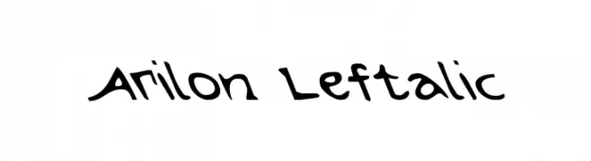
A bold, left-slanted font with a dynamic, handcrafted style.
![Arilon Leftalic font caratteri gratis]() Scaricare 131 Downloads@WebFont
Scaricare 131 Downloads@WebFont -
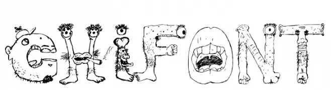
( Fonts by Chidiebere Udogwu )
A whimsical and cartoon-like decorative font with playful character designs.
![Chi font font caratteri gratis]() Scaricare 131 Downloads@WebFont
Scaricare 131 Downloads@WebFont -
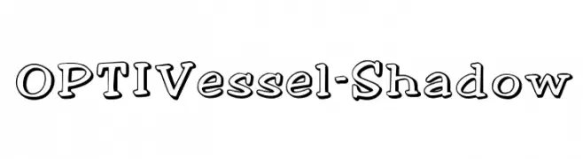
( Fonts by Castcraft Software - OPTI Fonts Archive - opti.netii.net - Personal-use only. For commercial use please contact owner. )
A playful, bold font with a shadow effect and hand-drawn aesthetic.
![OPTIVessel-Shadow font caratteri gratis]() Scaricare 131 Downloads@WebFont
Scaricare 131 Downloads@WebFont -
( wraith wolf - boxed in - shadowdesign.tumblr.com/ )
A geometric, modern font with a boxy, technical appearance.
![boxmd Regular font caratteri gratis]() Scaricare 131 Downloads@WebFont
Scaricare 131 Downloads@WebFont -
( Fonts by www.paintblackeditions.org )
A bold, geometric font with playful dotted patterns and thick outlines.
![mekano1 font caratteri gratis]() Scaricare 131 Downloads@WebFont
Scaricare 131 Downloads@WebFont -
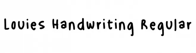
( Fonts by Lourdes Michaelson )
Casual handwritten font with rounded, playful forms.
![Louies Handwriting Regular font caratteri gratis]() Scaricare 131 Downloads@WebFont
Scaricare 131 Downloads@WebFont -
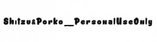
( Fonts by dcoxy )
A bold, outlined font with a playful and cartoonish style.
![Shitzu&Porko_PersonalUseOnly font caratteri gratis]() Scaricare 131 Downloads@WebFont
Scaricare 131 Downloads@WebFont -
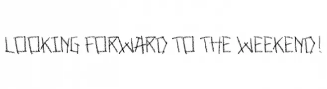
![Looking forward to the weekend! font caratteri gratis]() Scaricare 131 Downloads@WebFont
Scaricare 131 Downloads@WebFont -
( Fonts by Edric Studio - Personal-use only. For commercial use please contact owner. )
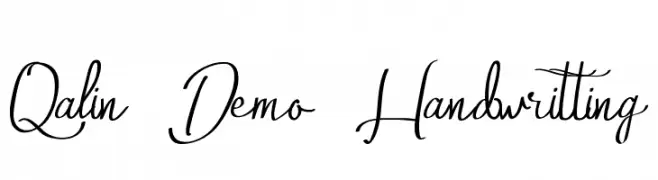
A flowing, elegant script font with graceful curves and artistic flair.
![Qalin Demo Handwritting font caratteri gratis]() Scaricare 131 Downloads@WebFont
Scaricare 131 Downloads@WebFont -
( Fonts by Manfred Klein. Free for private and charity use. Free for commercial with donation to organizations )
A whimsical, creature-inspired decorative font with bold, artistic characters.
![DemocraticPeaceWarriors font caratteri gratis]() Scaricare 131 Downloads@WebFont
Scaricare 131 Downloads@WebFont -
( Bill Walker )
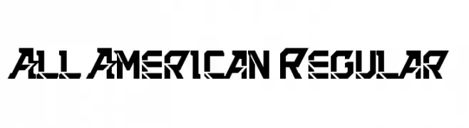
A bold, geometric font with a futuristic and edgy design.
![All American Regular font caratteri gratis]() Scaricare 131 Downloads@WebFont
Scaricare 131 Downloads@WebFont -
![Soulitude font caratteri gratis]() Scaricare 131 Downloads@WebFont
Scaricare 131 Downloads@WebFont -
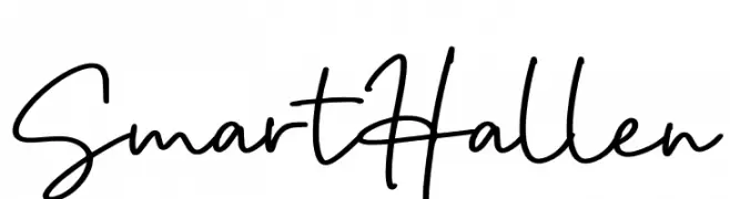
( Fonts by Kong Font )
Casual handwritten script font.
![Smart Hallen font caratteri gratis]() Scaricare 131 Downloads@WebFont
Scaricare 131 Downloads@WebFont -
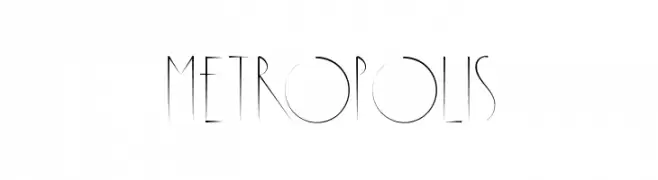
( Fonts by Manuel Ramos - www.infinitismo.com - Personal-use only. For commercial use please contact owner. )
A sleek, geometric font with elongated characters and high contrast.
![Metropolis font caratteri gratis]() Scaricare 131 Downloads@WebFont
Scaricare 131 Downloads@WebFont -
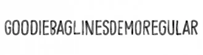
![Goodie Bag Lines DEMO Regular font caratteri gratis]() Scaricare 131 Downloads@WebFont
Scaricare 131 Downloads@WebFont -
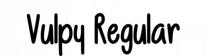
( Fonts by Vulpine - Personal-use only. For commercial use please contact owner. )
A playful, bold handwritten font with rounded strokes and a whimsical style.
![Vulpy Regular font caratteri gratis]() Scaricare 131 Downloads@WebFont
Scaricare 131 Downloads@WebFont -
( Fonts by Situjuh Nazara - 7ntypes.com - Personal-use only. For commercial use please contact owner. )
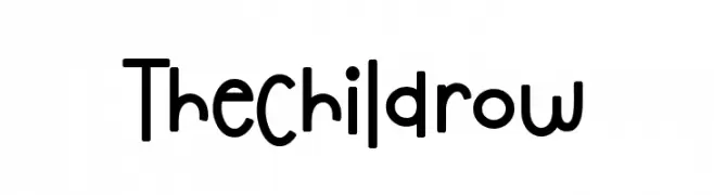
A playful, rounded font with smooth curves and a friendly design.
![The Childrow font caratteri gratis]() Scaricare 131 Downloads@WebFont
Scaricare 131 Downloads@WebFont -
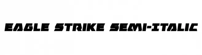
( Fonts by Daniel Zadorozny - www.iconian.com - Free for personal use )
A bold, angular, semi-italic font with a dynamic and modern style.
![Eagle Strike Semi-Italic font caratteri gratis]() Scaricare 131 Downloads@WebFont
Scaricare 131 Downloads@WebFont -
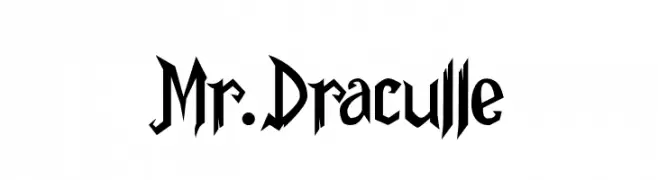
( Fonts by Kong Font - https://fontkong.com/ - Personal-use only. For commercial use please contact owner. )
A gothic, dramatic font with sharp, angular lines and pointed serifs.
![Mr.Draculle font caratteri gratis]() Scaricare 131 Downloads@WebFont
Scaricare 131 Downloads@WebFont -
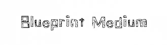
( imaginestudios.cu.cc )
A hand-drawn, blueprint-inspired font with sketch-like outlines and shading.
![Blueprint Medium font caratteri gratis]() Scaricare 131 Downloads@WebFont
Scaricare 131 Downloads@WebFont -
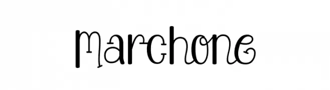
( Fonts by Situjuh Nazara - 7ntypes.com - Personal-use only. For commercial use please contact owner. )
A playful, whimsical font with tall, narrow letters and slight curls.
![Marchone font caratteri gratis]() Scaricare 131 Downloads@WebFont
Scaricare 131 Downloads@WebFont -
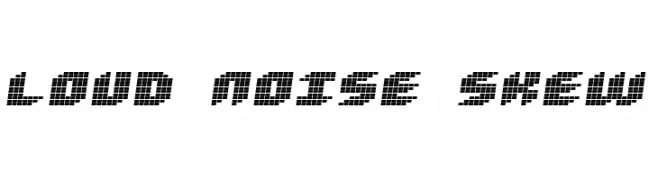
( Fonts by Jacob Fisher - www.pizzadude.dk )
A bold, pixelated font with a skewed, digital display style.
![Loud noise Skew font caratteri gratis]() Scaricare 131 Downloads@WebFont
Scaricare 131 Downloads@WebFont


Quali sono i font più popolari adesso?
Poppins, Roboto, Montserrat, Open Sans e Lato sono molto usati per le forme pulite e l'ampia applicabilità — dall'identità di marca alle landing page e ai poster.
Quali font si usano spesso nei loghi?
Le sans serif geometriche (es. Poppins, famiglie in stile Gotham) sono scelte comuni per un branding pulito e scalabile. Per un tocco personale restano valide script e stili manoscritti. Abbina un display deciso per i titoli a un corpo testo neutro per riconoscibilità ed equilibrio.
Ogni quanto si aggiorna la lista?
Con regolarità, in base ai download e all'attività reale. Torna spesso per scoprire in anticipo le nuove preferite.
💡 Consiglio: aggiungi ai preferiti — le tendenze cambiano in fretta e i font top di oggi possono ispirare il rebranding di domani.