Benvenuto nelle Font Più Popolari — dove popolarità e qualità si incontrano. Qui trovi i font più scaricati e usati dell'anno. Se cerchi scelte sicure per logo, web o social, inizia da qui.
Ogni font top si distingue per equilibrio, leggibilità e versatilità. Troverai sans serif moderne, script eleganti, serif vintage e display minimalisti.
-
( Fonts by Woodcutter )
A bold, distressed stencil font with a vintage, industrial feel.
 Scaricare 126 Downloads@WebFont
 -
( Fonts by The Docallisme )
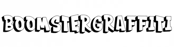
A bold, graffiti-style font with three-dimensional, dynamic letters.
![BOOMSTER Graffiti font caratteri gratis]() Scaricare 126 Downloads@WebFont
Scaricare 126 Downloads@WebFont -
( Fonts by Dharmas Studio )
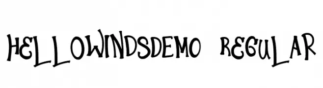
A playful, hand-drawn font with a whimsical and dynamic style.
![HelloWindsDEMO-Regular font caratteri gratis]() Scaricare 126 Downloads@WebFont
Scaricare 126 Downloads@WebFont -
( Fonts by Arliyan Creative )
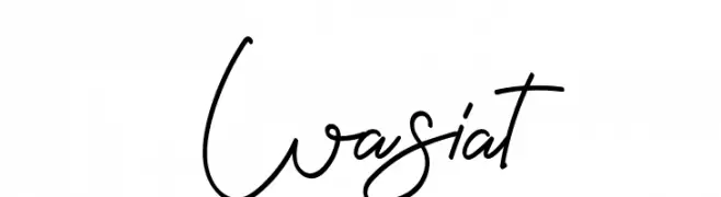
A fluid and elegant script font with a dynamic, handwritten style.
![Wasiat font caratteri gratis]() Scaricare 126 Downloads@WebFont
Scaricare 126 Downloads@WebFont -
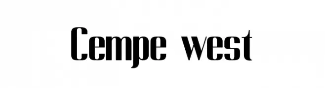
( Fonts by Kong Font - https://fontkong.com/ - Personal-use only. For commercial use please contact owner. )
A bold, high-contrast font with a modern, geometric style.
![Cempe west font caratteri gratis]() Scaricare 126 Downloads@WebFont
Scaricare 126 Downloads@WebFont -
( Fonts by a Max Infeld - XEROGRAPHER FONTS - xerographer.blogspot.com . Personal-use only. For commercial use please contact owner. )
A bold, artistic handwritten font with dynamic, slanted characters.
![GiftCards font caratteri gratis]() Scaricare 126 Downloads@WebFont
Scaricare 126 Downloads@WebFont -
![Perfect Pixel Italic TestDrive font caratteri gratis]() Scaricare 126 Downloads@WebFont
Scaricare 126 Downloads@WebFont -
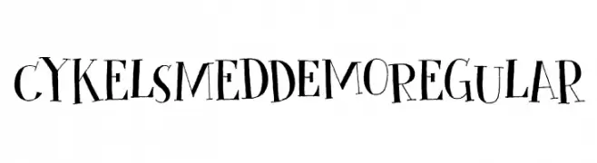
( Hanoded - David Kerkhoff - www.hanodedfonts.com )
A playful, hand-drawn font with whimsical characters and unique symbols.
![Cykelsmed DEMO Regular font caratteri gratis]() Scaricare 126 Downloads@WebFont
Scaricare 126 Downloads@WebFont -
( Zetafonts - www.zetafonts.com )
A bold, modern typeface with strong, uniform strokes and a slightly condensed width.
![Kabrio-ExtraBold font caratteri gratis]() Scaricare 126 Downloads@WebFont
Scaricare 126 Downloads@WebFont -
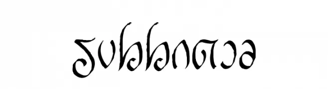
( Fonts by a Neale Davidson - www.pixelsagas.com. Personal-use only. For commercial use please contact owner. )
An elegant, flowing script with intricate, decorative calligraphy.
![Rellanic font caratteri gratis]() Scaricare 126 Downloads@WebFont
Scaricare 126 Downloads@WebFont -
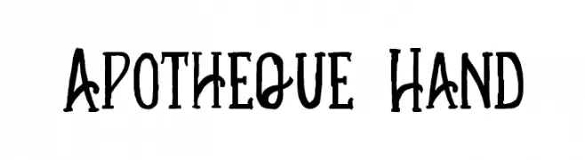
( Fonts by Fie Clarke - bonezdesignz.com - check the website before use the fonts! Personal-use only. )
A whimsical, hand-drawn font with tall, narrow characters and a playful style.
![Apotheque Hand font caratteri gratis]() Scaricare 126 Downloads@WebFont
Scaricare 126 Downloads@WebFont -
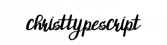
( Attype Studio - Fadli Ramadhan Iskandar - thehungryjpeg.com/attype-studio/ )
A bold, festive script font with playful holiday icons.
![ChristTypeScript font caratteri gratis]() Scaricare 126 Downloads@WebFont
Scaricare 126 Downloads@WebFont -
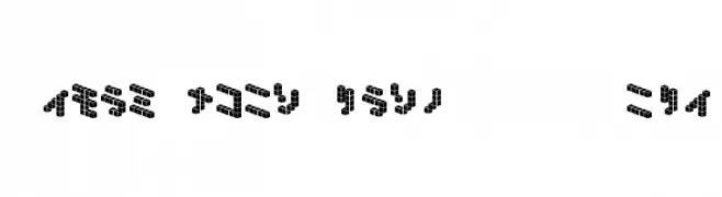
![DemonCubicBlock NKP Tile font caratteri gratis]() Scaricare 126 Downloads@WebFont
Scaricare 126 Downloads@WebFont -
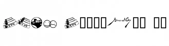
![DEVO Dingbats 10 font caratteri gratis]() Scaricare 126 Downloads@WebFont
Scaricare 126 Downloads@WebFont -
Caratteri di danny91194. For commercial use please contact the owner.
( Byieshination )
A decorative and abstract font with bold, sweeping curves and intricate details.
![ResallFont font caratteri gratis]() Scaricare 126 Downloads@WebFont
Scaricare 126 Downloads@WebFont -
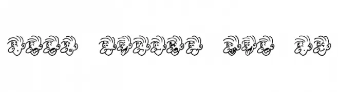
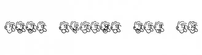
( Fonts by Jeff Levine. FREEWARE )
A series of cartoon faces depicting various moods, designed as decorative elements.
![Mood Swings Two JL font caratteri gratis]() Scaricare 126 Downloads@WebFont
Scaricare 126 Downloads@WebFont -
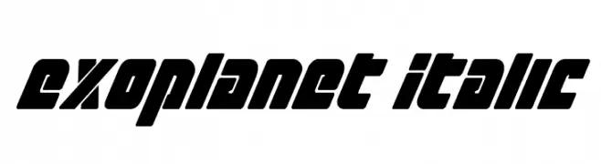
( Fonts by Daniel Zadorozny - www.iconian.com - Free for personal use )
A bold, italicized font with a futuristic and geometric design.
![Exoplanet Italic font caratteri gratis]() Scaricare 126 Downloads@WebFont
Scaricare 126 Downloads@WebFont -
( Fonts by Jeff Levine. FREEWARE )
A series of cartoon faces depicting various moods, not a traditional font.
![Mood Swings One JL font caratteri gratis]() Scaricare 126 Downloads@WebFont
Scaricare 126 Downloads@WebFont -
( Fonts by FreshtypeINK )
An elegant, flowing script font with ornate uppercase and harmonious lowercase characters.
![Dinner font caratteri gratis]() Scaricare 126 Downloads@WebFont
Scaricare 126 Downloads@WebFont -
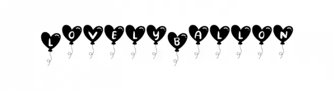
( Fonts by lyanatha - Ana Natalia - Personal-use only. For commercial use please contact owner. )
A playful font with characters inside heart-shaped balloons, ideal for festive and romantic themes.
![Lovely Ballon font caratteri gratis]() Scaricare 126 Downloads@WebFont
Scaricare 126 Downloads@WebFont -
( Fonts by www.houseoflime.com )
A bold, framed font with geometric, monospaced characters.
![Framed font caratteri gratis]() Scaricare 126 Downloads@WebFont
Scaricare 126 Downloads@WebFont -
![curls_n_twirls font caratteri gratis]() Scaricare 126 Downloads@WebFont
Scaricare 126 Downloads@WebFont -
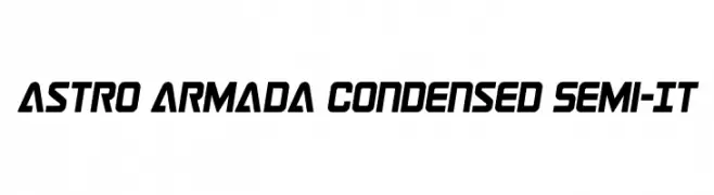
( Fonts by Daniel Zadorozny - www.iconian.com - Personal-use only. For commercial use please contact owner. )
A bold, condensed, semi-italic font with a futuristic and dynamic design.
![Astro Armada Condensed Semi-It font caratteri gratis]() Scaricare 126 Downloads@WebFont
Scaricare 126 Downloads@WebFont -
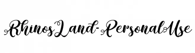
( Fonts by Typhoon Type - Suthi Srisopha - www.typhoontype.net - Personal-use only. For commercial use please contact owner. )
An elegant script font with intricate swashes and flourishes, perfect for sophisticated designs.
![Rhinos Land - Personal Use font caratteri gratis]() Scaricare 126 Downloads@WebFont
Scaricare 126 Downloads@WebFont -
( Fonts by Daniel Zadorozny - www.iconian.com )
A futuristic, condensed italic font with sharp, angular edges.
![QuickGear Condensed Italic font caratteri gratis]() Scaricare 126 Downloads@WebFont
Scaricare 126 Downloads@WebFont -
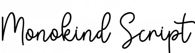
( Fonts by PutraCetol Studio - www.putracetol.com - Personal-use only. For commercial use please contact owner. )
A playful and flowing script font with smooth, continuous strokes and elegant curves.
![Monokind Script font caratteri gratis]() Scaricare 126 Downloads@WebFont
Scaricare 126 Downloads@WebFont -
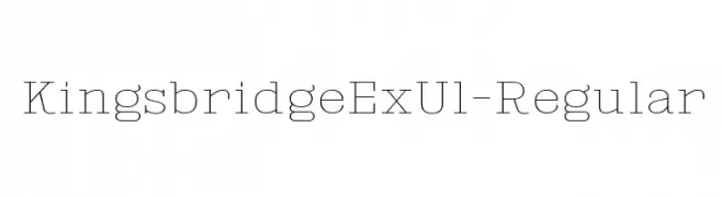
( Fonts by Typodermic Fonts )
A clean, modern font with geometric structure and minimal contrast.
![KingsbridgeExUl-Regular font caratteri gratis]() Scaricare 126 Downloads@WebFont
Scaricare 126 Downloads@WebFont -
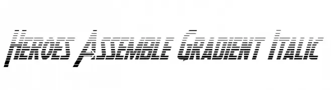
( Fonts by Daniel Zadorozny - www.iconian.com )
A bold, italic font with a gradient line effect, conveying speed and modernity.
![Heroes Assemble Gradient Italic font caratteri gratis]() Scaricare 126 Downloads@WebFont
Scaricare 126 Downloads@WebFont -
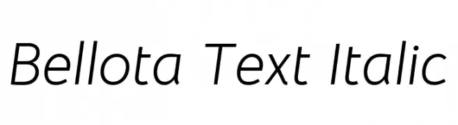
( Copyright 2019 The Bellota Project Authors (https://github.com/kemie/Bellota-Font) )
A modern, italic font with smooth, rounded characters and low contrast.
![Bellota Text Italic font caratteri gratis]() Scaricare 126 Downloads@WebFont
Scaricare 126 Downloads@WebFont -
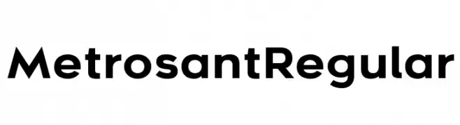
( Deepak Dogra - www.creativefabrica.com/designer/deepak-dogra/ )
A modern, bold sans-serif font with a geometric design.
![Metrosant Regular font caratteri gratis]() Scaricare 126 Downloads@WebFont
Scaricare 126 Downloads@WebFont -
( Fonts by Inermedia Studio )
A bold, playful font with a zigzag pattern through each character.
![JUNGGLE font caratteri gratis]() Scaricare 126 Downloads@WebFont
Scaricare 126 Downloads@WebFont -
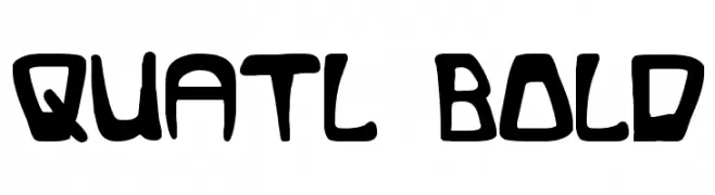
( Fonts by Daniel Zadorozny - www.iconian.com - Free for personal use )
A bold, playful font with an organic, hand-drawn style.
![Quatl Bold font caratteri gratis]() Scaricare 126 Downloads@WebFont
Scaricare 126 Downloads@WebFont -
( Fonts by Manfred Klein. Free for private and charity use. Free for commercial with donation to organizations )
An artistic and decorative font with intricate geometric patterns and flourishes.
![RodgauCaps font caratteri gratis]() Scaricare 126 Downloads@WebFont
Scaricare 126 Downloads@WebFont -
( Fonts by 123Print UK----www.123print.co.uk. Personal-use only. For commercial use please contact owner. )
A playful, handwritten font with quirky, irregular letterforms.
![Marie-Alternate font caratteri gratis]() Scaricare 126 Downloads@WebFont
Scaricare 126 Downloads@WebFont -
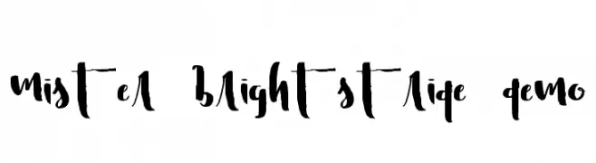
![Mister Brightstride Demo font caratteri gratis]() Scaricare 126 Downloads@WebFont
Scaricare 126 Downloads@WebFont


Quali sono i font più popolari adesso?
Poppins, Roboto, Montserrat, Open Sans e Lato sono molto usati per le forme pulite e l'ampia applicabilità — dall'identità di marca alle landing page e ai poster.
Quali font si usano spesso nei loghi?
Le sans serif geometriche (es. Poppins, famiglie in stile Gotham) sono scelte comuni per un branding pulito e scalabile. Per un tocco personale restano valide script e stili manoscritti. Abbina un display deciso per i titoli a un corpo testo neutro per riconoscibilità ed equilibrio.
Ogni quanto si aggiorna la lista?
Con regolarità, in base ai download e all'attività reale. Torna spesso per scoprire in anticipo le nuove preferite.
💡 Consiglio: aggiungi ai preferiti — le tendenze cambiano in fretta e i font top di oggi possono ispirare il rebranding di domani.