Benvenuto nelle Font Più Popolari — dove popolarità e qualità si incontrano. Qui trovi i font più scaricati e usati dell'anno. Se cerchi scelte sicure per logo, web o social, inizia da qui.
Ogni font top si distingue per equilibrio, leggibilità e versatilità. Troverai sans serif moderne, script eleganti, serif vintage e display minimalisti.
-
 Scaricare 129 Downloads@WebFont
 -
( EvasUniqueFonts - Eva Barabas - www.etsy.com/ie/shop/DigitalTypefaceS )
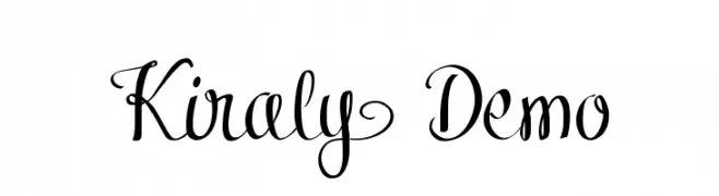
An elegant script font with flowing cursive style and intricate swashes.
![Kiraly Demo font caratteri gratis]() Scaricare 129 Downloads@WebFont
Scaricare 129 Downloads@WebFont -
( Fonts by Meliora Studio - Personal-use only. For commercial use please contact owner. )
A classic serif font with bold strokes and elegant curves, exuding timeless elegance.
![NathalliaDemo-Regular font caratteri gratis]() Scaricare 129 Downloads@WebFont
Scaricare 129 Downloads@WebFont -
( Fonts by Sorkin Type Co - Personal-use only. For commercial use please contact owner. )
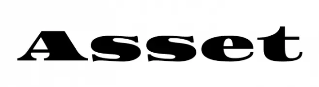
A bold, high-contrast serif font with dramatic strokes and pronounced serifs.
![Asset font caratteri gratis]() Scaricare 129 Downloads@WebFont
Scaricare 129 Downloads@WebFont -
( Fonts by Kotak Kuning Studio - kotakkuning.com - Personal-use only. For commercial use please contact owner. )
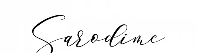
An elegant script font with flowing, high-contrast strokes and graceful swashes.
![Sarodime font caratteri gratis]() Scaricare 129 Downloads@WebFont
Scaricare 129 Downloads@WebFont -
( Fonts by Daniel Zadorozny - www.iconian.com - Free for personal use )
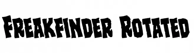
A bold, rugged font with jagged edges and a hand-cut appearance.
![Freakfinder Rotated font caratteri gratis]() Scaricare 129 Downloads@WebFont
Scaricare 129 Downloads@WebFont -
( Fonts by Bolt Cutter - www.boltcutterdesign.com - Personal-use only. For commercial use please contact owner. )
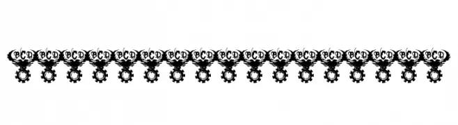
A decorative, industrial-themed design with gear-like motifs around letters.
![Bolt Cutter Nasty font caratteri gratis]() Scaricare 129 Downloads@WebFont
Scaricare 129 Downloads@WebFont -
( Fonts by Qwerks - Personal-use only. For commercial use please contact owner. )
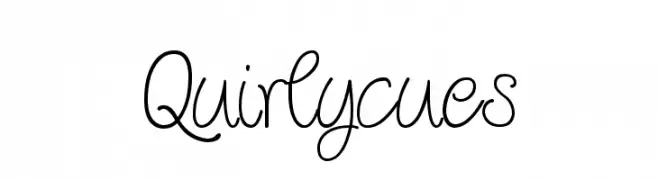
A whimsical, curly handwritten font with playful loops and dynamic strokes.
![Quirlycues font caratteri gratis]() Scaricare 129 Downloads@WebFont
Scaricare 129 Downloads@WebFont -
( Fonts by Pinisiart )
Bold, playful display font with exaggerated serifs and quirky shapes.
![LAUGHTER font caratteri gratis]() Scaricare 129 Downloads@WebFont
Scaricare 129 Downloads@WebFont -
( Iconian Fonts - Daniel Zadorozny - www.iconian.com )
A bold, geometric font with a futuristic and industrial aesthetic.
![Aircruiser Title font caratteri gratis]() Scaricare 129 Downloads@WebFont
Scaricare 129 Downloads@WebFont -
( imagex - www.imagex-fonts.com )
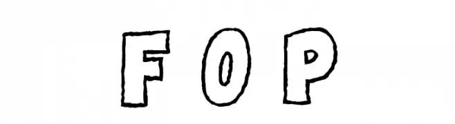
A playful, hand-drawn font with a bold, whimsical style.
![Famous Oldies Plain font caratteri gratis]() Scaricare 129 Downloads@WebFont
Scaricare 129 Downloads@WebFont -
( Fonts by Studio Hello Good )
A lively and dynamic handwritten font with fluid, slightly irregular strokes.
![STREGONE font caratteri gratis]() Scaricare 129 Downloads@WebFont
Scaricare 129 Downloads@WebFont -
( Fonts by Vladimir Nikolic )
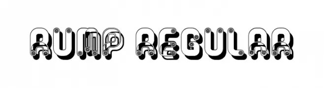
A bold, decorative font with a mechanical and futuristic style.
![Rump Regular font caratteri gratis]() Scaricare 129 Downloads@WebFont
Scaricare 129 Downloads@WebFont -
( Fonts by Daniel Zadorozny - www.iconian.com - Free for personal use )
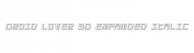
A futuristic, 3D, expanded italic font with a tech-inspired design.
![Droid Lover 3D Expanded Italic font caratteri gratis]() Scaricare 129 Downloads@WebFont
Scaricare 129 Downloads@WebFont -
( Fonts by Kong Font - fontkong.com - Personal-use only. For commercial use please contact owner. )
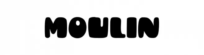
A bold, rounded font with a playful and retro vibe.
![Moulin font caratteri gratis]() Scaricare 129 Downloads@WebFont
Scaricare 129 Downloads@WebFont -
( Fonts by Bluestype Studio )
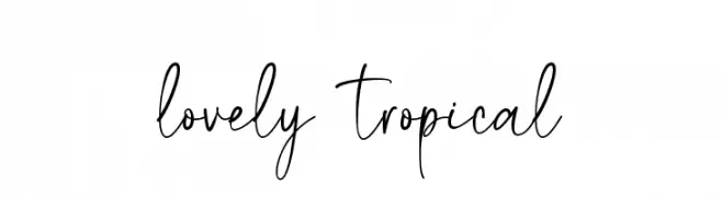
Playful and elegant handwritten script font.
![lovely tropical font caratteri gratis]() Scaricare 129 Downloads@WebFont
Scaricare 129 Downloads@WebFont -
( Fonts by Manfred Klein. Free for private and charity use. Free for commercial with donation to organizations )
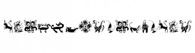
Ornamental pictogram font with tribal and folkloric motifs.
![TribalDesigns_Tre font caratteri gratis]() Scaricare 129 Downloads@WebFont
Scaricare 129 Downloads@WebFont -
( Nght's Place - www.crosswinds.net/~nghtmvs/font/fonts1.html )
A decorative blackletter font with ornate, boxed characters and high contrast.
![101! Antique Alpha font caratteri gratis]() Scaricare 129 Downloads@WebFont
Scaricare 129 Downloads@WebFont -
( Fonts by Integritype Studio )
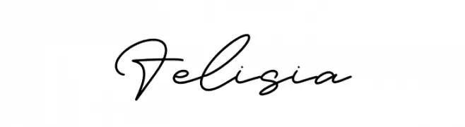
A refined, cursive script font with elegant, flowing lines.
![Felisia font caratteri gratis]() Scaricare 129 Downloads@WebFont
Scaricare 129 Downloads@WebFont -
( Fonts by www.houseoflime.com )
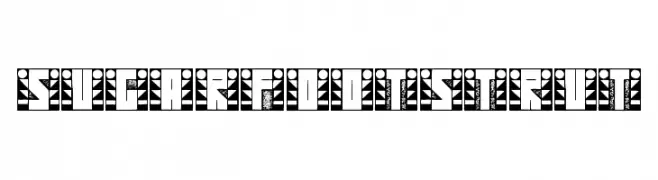
A bold, decorative font with intricate patterns and geometric designs.
![SugarFootStrut font caratteri gratis]() Scaricare 129 Downloads@WebFont
Scaricare 129 Downloads@WebFont -
( Fonts by Anita Jürgeleit - Personal-use only. For commercial use please contact owner. )
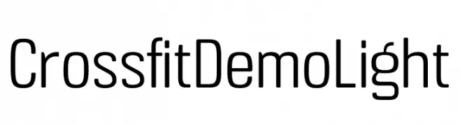
A modern, sans-serif font with a clean and streamlined appearance.
![Crossfit Demo Light font caratteri gratis]() Scaricare 129 Downloads@WebFont
Scaricare 129 Downloads@WebFont -
( Fonts by Design Vector10 )
Bold, italicized font with a distressed, grunge texture.
![Legend Bold Italic font caratteri gratis]() Scaricare 129 Downloads@WebFont
Scaricare 129 Downloads@WebFont -
( Fonts by Cloutierfontes )
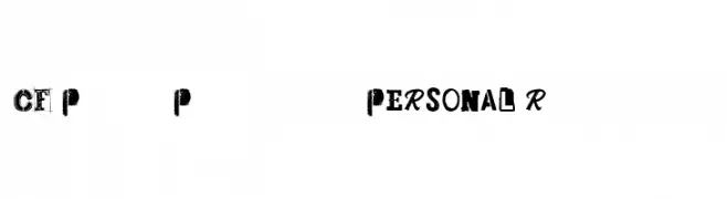
A bold, eclectic font with a punk rock aesthetic and distressed textures.
![CF Punk Posters PERSONAL Regular font caratteri gratis]() Scaricare 129 Downloads@WebFont
Scaricare 129 Downloads@WebFont -
( Fonts by Izabela de Lima - elfadophotoscape.blogspot.com.br )
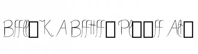
A modern, elegant font with flowing uppercase and structured lowercase letters.
![Bella K. A Better Place Alts font caratteri gratis]() Scaricare 129 Downloads@WebFont
Scaricare 129 Downloads@WebFont -
( Otto Maurer Design - Otto Maurer - www.myfonts.com/foundry/Otto_Maurer/ )
A bold, geometric font with a double-line outline, offering a modern and futuristic look.
![Haike col font caratteri gratis]() Scaricare 129 Downloads@WebFont
Scaricare 129 Downloads@WebFont -
( Khiro )
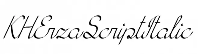
An elegant, italic script font with flowing, connected strokes.
![KH Erza Script Italic font caratteri gratis]() Scaricare 129 Downloads@WebFont
Scaricare 129 Downloads@WebFont -
( Fonts by Wahyu Eka Prasetya - wepfont.com - Personal-use only. For commercial use please contact owner. )
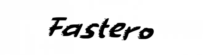
A bold, brush-style font with dynamic, slanted characters.
![Fastero font caratteri gratis]() Scaricare 129 Downloads@WebFont
Scaricare 129 Downloads@WebFont -
( weknow - Wino S Kadir - www.creativefabrica.com/designer/weknow/ )
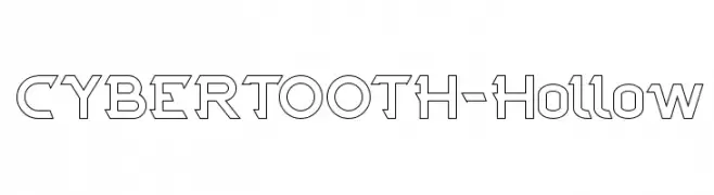
A hollow, geometric font with sharp, angular edges and a futuristic style.
![CYBERTOOTH-Hollow font caratteri gratis]() Scaricare 129 Downloads@WebFont
Scaricare 129 Downloads@WebFont -
( Fonts by Galdino Otten Fonts - www.galdinootten.com - Personal-use only. For commercial use please contact owner. )
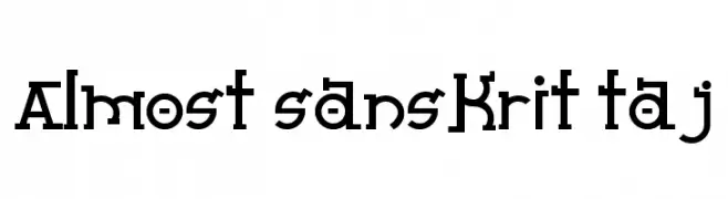
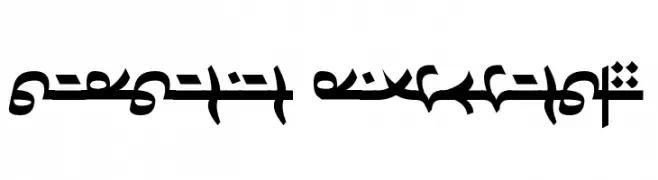
A bold, decorative font with geometric and Sanskrit-inspired elements.
![Almost Sanskrit Taj font caratteri gratis]() Scaricare 129 Downloads@WebFont
Scaricare 129 Downloads@WebFont -
( Nght's Place - www.crosswinds.net/~nghtmvs/font/fonts1.html )
A decorative font with a barcode-inspired design, featuring characters enclosed in rectangular frames.
![101! BarCode 'Bet font caratteri gratis]() Scaricare 129 Downloads@WebFont
Scaricare 129 Downloads@WebFont -
( Fonts by vladimirnikolic - Personal-use only. For commercial use please contact owner. )
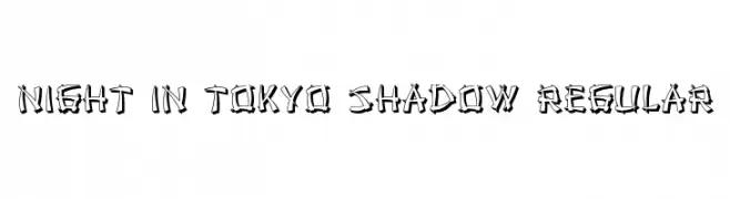
A bold, graffiti-inspired font with a dynamic shadow effect.
![Night in Tokyo Shadow Regular font caratteri gratis]() Scaricare 129 Downloads@WebFont
Scaricare 129 Downloads@WebFont -
( Fonts by PutraCetol Studio )
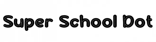
A bold, rounded font with a playful dotted pattern, perfect for creative projects.
![Super School Dot font caratteri gratis]() Scaricare 129 Downloads@WebFont
Scaricare 129 Downloads@WebFont -
( Fonts by www.omniglot.com )
A decorative and intricate font with complex curves and sharp angles.
![Dardanian Righthand4 font caratteri gratis]() Scaricare 129 Downloads@WebFont
Scaricare 129 Downloads@WebFont -
![Sughayer Separates 10 font caratteri gratis]() Scaricare 129 Downloads@WebFont
Scaricare 129 Downloads@WebFont -
Caratteri di glyphstyle. For commercial use please contact the owner.
( NOTE: This demo font is for PERSONAL USE ONLY! But any donation are very appreciated. Paypal account for donation : https://www.paypal.me/dimasardhi full version: https://www.glyphstyle.net/eastory/ contact us at styleglyph@gmail.com And follow my ins )
A bold, geometric font with clean lines and a modern aesthetic.
![EASTORY DEMO font caratteri gratis]() Scaricare 129 Downloads@WebFont
Scaricare 129 Downloads@WebFont


Quali sono i font più popolari adesso?
Poppins, Roboto, Montserrat, Open Sans e Lato sono molto usati per le forme pulite e l'ampia applicabilità — dall'identità di marca alle landing page e ai poster.
Quali font si usano spesso nei loghi?
Le sans serif geometriche (es. Poppins, famiglie in stile Gotham) sono scelte comuni per un branding pulito e scalabile. Per un tocco personale restano valide script e stili manoscritti. Abbina un display deciso per i titoli a un corpo testo neutro per riconoscibilità ed equilibrio.
Ogni quanto si aggiorna la lista?
Con regolarità, in base ai download e all'attività reale. Torna spesso per scoprire in anticipo le nuove preferite.
💡 Consiglio: aggiungi ai preferiti — le tendenze cambiano in fretta e i font top di oggi possono ispirare il rebranding di domani.