Benvenuto nelle Font Più Popolari — dove popolarità e qualità si incontrano. Qui trovi i font più scaricati e usati dell'anno. Se cerchi scelte sicure per logo, web o social, inizia da qui.
Ogni font top si distingue per equilibrio, leggibilità e versatilità. Troverai sans serif moderne, script eleganti, serif vintage e display minimalisti.
-
( Fonts by William Koch )
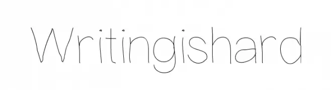
A playful, hand-drawn style with thin, uneven strokes and a whimsical feel.
 Scaricare 129 Downloads@WebFont
 -
( Fonts by Vunira Design - Personal-use only. For commercial use please contact owner. )
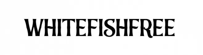
A bold, decorative font with medieval-inspired elements and intricate detailing.
![WhitefishFREE font caratteri gratis]() Scaricare 129 Downloads@WebFont
Scaricare 129 Downloads@WebFont -
( Fonts by Misti Hammers - mistifonts.com - Personal-use only. For commercial use please contact owner. )
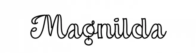
A playful and decorative script font with elegant, flowing lines.
![Magnilda font caratteri gratis]() Scaricare 129 Downloads@WebFont
Scaricare 129 Downloads@WebFont -
( Fonts by Feri Fauzi )
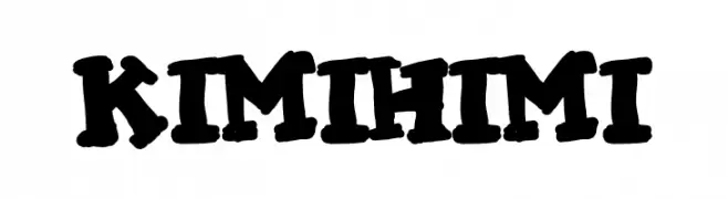
A bold, playful, and hand-drawn style font with a lively and energetic feel.
![KIMI HIMI font caratteri gratis]() Scaricare 129 Downloads@WebFont
Scaricare 129 Downloads@WebFont -
( Fonts by Manfred Klein. Free for private and charity use. Free for commercial with donation to organizations )
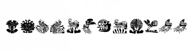
A decorative font with intricate, abstract animal designs inspired by tribal art.
![MyPrivateZoo font caratteri gratis]() Scaricare 129 Downloads@WebFont
Scaricare 129 Downloads@WebFont -
( Misti's Fonts - mistifonts.com/ )
A playful, modern font with rounded edges and a clean, minimalist aesthetic.
![We Are In Love [Heartless] font caratteri gratis]() Scaricare 129 Downloads@WebFont
Scaricare 129 Downloads@WebFont -
( Darrell Flood )
A playful and bold font with rounded, whimsical characters.
![Sushi Roll font caratteri gratis]() Scaricare 129 Downloads@WebFont
Scaricare 129 Downloads@WebFont -
( Fonts by a Neale Davidson - www.pixelsagas.com. Personal-use only. For commercial use please contact owner. )
A bold, angular font with a runic, stone-carved aesthetic.
![Dethek Stone font caratteri gratis]() Scaricare 129 Downloads@WebFont
Scaricare 129 Downloads@WebFont -
( Fonts by Manfred Klein. Free for private and charity use. Free for commercial with donation to organizations )
A decorative collection of fantastical creature illustrations with intricate details.
![FantasticCreationsTwo font caratteri gratis]() Scaricare 129 Downloads@WebFont
Scaricare 129 Downloads@WebFont -
( Fonts by Daniel Zadorozny - www.iconian.com - Free for personal use )
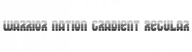
A bold, modern font with a unique gradient stripe effect.
![Warrior Nation Gradient Regular font caratteri gratis]() Scaricare 129 Downloads@WebFont
Scaricare 129 Downloads@WebFont -
( Fonts by Jamie Place [FontBlast Design] - Personal-use only. For commercial use please contact owner. )
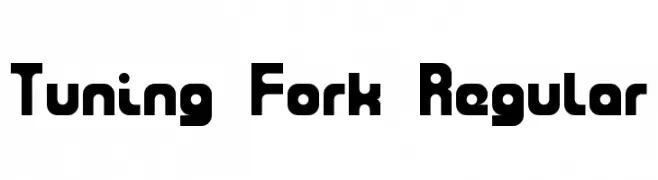
A bold, rounded, and geometric font with a modern style.
![Tuning Fork Regular font caratteri gratis]() Scaricare 129 Downloads@WebFont
Scaricare 129 Downloads@WebFont -
( Fonts by www.comicneue.com - Personal-use only. For commercial use please contact owner. )
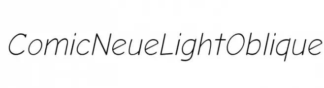
A playful, modern font with a light, oblique slant and rounded characters.
![Comic Neue Light Oblique font caratteri gratis]() Scaricare 129 Downloads@WebFont
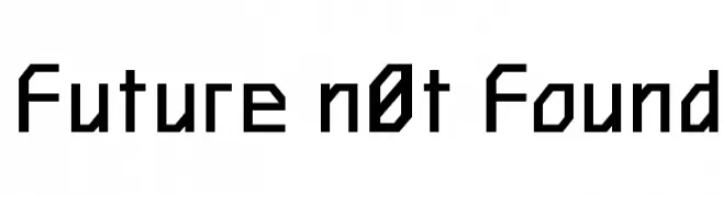
Scaricare 129 Downloads@WebFont -
![Future n0t Found font caratteri gratis]() Scaricare 129 Downloads@WebFont
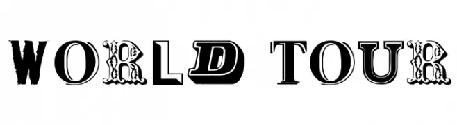
Scaricare 129 Downloads@WebFont -
( Public domain / GPL / OFL - jlhfonts.blogspot.com/ )
A bold, eclectic display typeface with diverse styles and textures.
![World Tour font caratteri gratis]() Scaricare 129 Downloads@WebFont
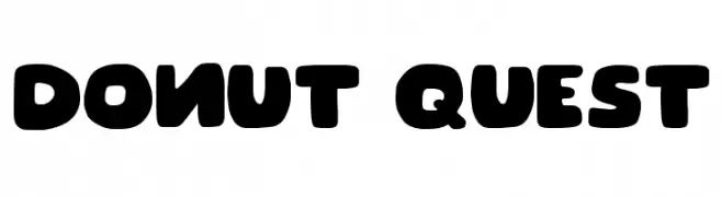
Scaricare 129 Downloads@WebFont -
( Fonts by Joseph Dawson )
A playful, bold font with rounded, chunky letters perfect for fun and whimsical designs.
![Donut Quest font caratteri gratis]() Scaricare 129 Downloads@WebFont
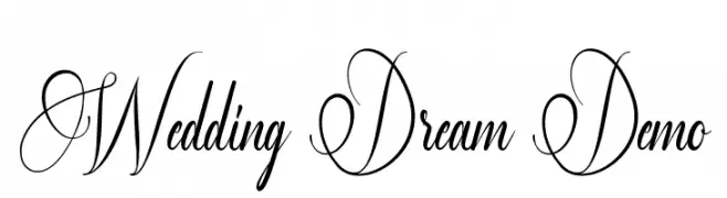
Scaricare 129 Downloads@WebFont -
( Fonts by Edric Studio - Personal-use only. For commercial use please contact owner. )
An elegant script font with intricate swirls, ideal for formal and romantic occasions.
![Wedding Dream Demo font caratteri gratis]() Scaricare 129 Downloads@WebFont
Scaricare 129 Downloads@WebFont -
( Fonts by Winter Design Studio - winty5.wixsite.com/noahtheawesome/ - Personal-use only. For commercial use please contact owner. )
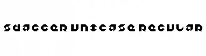
A bold, geometric font with sharp angles and a futuristic style.
![5Dagger Unicase Regular font caratteri gratis]() Scaricare 129 Downloads@WebFont
Scaricare 129 Downloads@WebFont -
( Fonts by Dafne Salvatori )
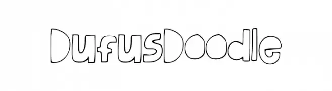
A playful, hand-drawn font with bold, rounded characters.
![DufusDoodle font caratteri gratis]() Scaricare 129 Downloads@WebFont
Scaricare 129 Downloads@WebFont -
( Fonts by Vladimir Nikolic - www.creativefabrica.com/designer/vladimirnikolic/ - Personal-use only. For commercial use please contact owner. )
A bold, decorative font with a three-dimensional, embossed appearance.
![Jewelry Regular font caratteri gratis]() Scaricare 129 Downloads@WebFont
Scaricare 129 Downloads@WebFont -
( Fonts by Apostrophic Lab )
A geometric, pixelated font with a retro digital style.
![So Sue Me font caratteri gratis]() Scaricare 129 Downloads@WebFont
Scaricare 129 Downloads@WebFont -
( Rachel San )
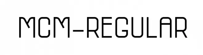
A modern, geometric font with uniform stroke widths and high legibility.
![MCM-Regular font caratteri gratis]() Scaricare 129 Downloads@WebFont
Scaricare 129 Downloads@WebFont -
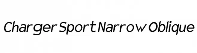
![Charger Sport Narrow Oblique font caratteri gratis]() Scaricare 129 Downloads@WebFont
Scaricare 129 Downloads@WebFont -
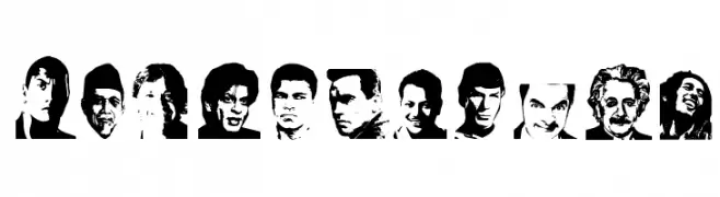
( Fonts by Haslinda Adnan )
Decorative display font with integrated portrait illustrations in each letter.
![Personality font caratteri gratis]() Scaricare 129 Downloads@WebFont
Scaricare 129 Downloads@WebFont -
( Fonts by Iconian Fonts )
A bold, staggered italic font with a dynamic and edgy style.
![Creepy Crawlers Staggered Italic font caratteri gratis]() Scaricare 129 Downloads@WebFont
Scaricare 129 Downloads@WebFont -
( Fonts by Ditya Ananto )
A playful, bubble-themed decorative font with intricate circular patterns.
![BUBBLE IN TEXT font caratteri gratis]() Scaricare 129 Downloads@WebFont
Scaricare 129 Downloads@WebFont -
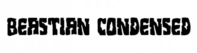
( Fonts by Daniel Zadorozny - www.iconian.com )
A bold, condensed font with a rugged, textured appearance.
![Beastian Condensed font caratteri gratis]() Scaricare 129 Downloads@WebFont
Scaricare 129 Downloads@WebFont -
( Fonts by Royaltype )
A playful, hand-drawn style with bold, textured outlines and rounded forms.
![Peanut font caratteri gratis]() Scaricare 129 Downloads@WebFont
Scaricare 129 Downloads@WebFont -
( گالری فانت فارسی پژوهش آريانا - only compatible with Farsi and Arabic )
A futuristic, geometric font with bold, angular lines and a modern aesthetic.
![Proton font caratteri gratis]() Scaricare 129 Downloads@WebFont
Scaricare 129 Downloads@WebFont -
( Måns Grebäck - www.mansgreback.com )
A clean, modern sans-serif font with tall, narrow letterforms.
![Falkin Sans PERSONAL font caratteri gratis]() Scaricare 129 Downloads@WebFont
Scaricare 129 Downloads@WebFont -
( Fonts by Geronimo Fonts - Personal-use only. For commercial use please contact owner. )
A bold, geometric font with angular shapes and a modern industrial aesthetic.
![Lines Regular font caratteri gratis]() Scaricare 129 Downloads@WebFont
Scaricare 129 Downloads@WebFont -
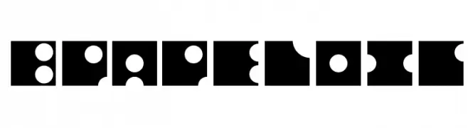
( Fonts by backpacker.gr )
A bold, geometric font with puzzle-like shapes and high contrast.
![BPapeloig font caratteri gratis]() Scaricare 129 Downloads@WebFont
Scaricare 129 Downloads@WebFont -
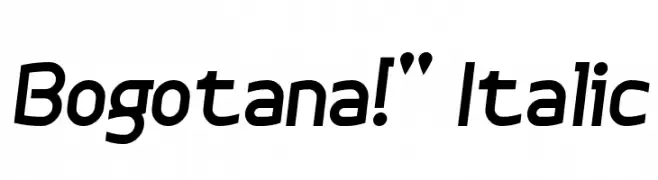
( Fonts by Yun Gonzalez - g3drakoheart-arts.deviantart.com - Personal-use only. For commercial use please contact owner. )
A modern, italic font with clean lines and a dynamic feel.
![Bogotana!]() Scaricare 129 Downloads@WebFont
Scaricare 129 Downloads@WebFont -
( Fonts by PressGang Studios )
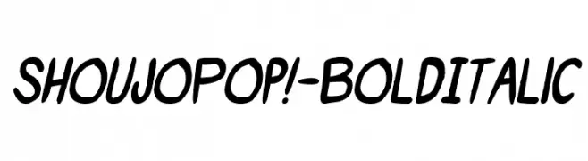
A bold and italic playful font with rounded, dynamic characters.
![ShoujoPop!-BoldItalic font caratteri gratis]() Scaricare 129 Downloads@WebFont
Scaricare 129 Downloads@WebFont -
( Fonts by Billy Argel Fonts ® )
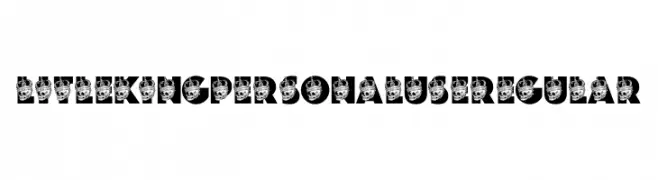
A bold, decorative font with a skull and crown motif, ideal for striking designs.
![LITLE KING PERSONAL USE Regular font caratteri gratis]() Scaricare 129 Downloads@WebFont
Scaricare 129 Downloads@WebFont -
( Fonts by Abraham Type (AldeDesign Studio) - Alde Design - Personal-use only. For commercial use please contact owner. )
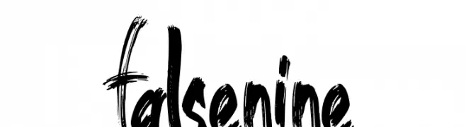
A dynamic, brush-stroke font with an expressive, hand-painted style.
![false nine font caratteri gratis]() Scaricare 129 Downloads@WebFont
Scaricare 129 Downloads@WebFont
![We Are In Love [Heartless] font caratteri gratis](https://d144mzi0q5mijx.cloudfront.net/img/W/E/We-Are-In-Love-Heartless.webp)


Quali sono i font più popolari adesso?
Poppins, Roboto, Montserrat, Open Sans e Lato sono molto usati per le forme pulite e l'ampia applicabilità — dall'identità di marca alle landing page e ai poster.
Quali font si usano spesso nei loghi?
Le sans serif geometriche (es. Poppins, famiglie in stile Gotham) sono scelte comuni per un branding pulito e scalabile. Per un tocco personale restano valide script e stili manoscritti. Abbina un display deciso per i titoli a un corpo testo neutro per riconoscibilità ed equilibrio.
Ogni quanto si aggiorna la lista?
Con regolarità, in base ai download e all'attività reale. Torna spesso per scoprire in anticipo le nuove preferite.
💡 Consiglio: aggiungi ai preferiti — le tendenze cambiano in fretta e i font top di oggi possono ispirare il rebranding di domani.