Benvenuto nelle Font Più Popolari — dove popolarità e qualità si incontrano. Qui trovi i font più scaricati e usati dell'anno. Se cerchi scelte sicure per logo, web o social, inizia da qui.
Ogni font top si distingue per equilibrio, leggibilità e versatilità. Troverai sans serif moderne, script eleganti, serif vintage e display minimalisti.
-
 Scaricare 131 Downloads@WebFont
 -
![Cornucopia of Dingbats Seven font caratteri gratis]() Scaricare 131 Downloads@WebFont
Scaricare 131 Downloads@WebFont -
![Lovers in February font caratteri gratis]() Scaricare 131 Downloads@WebFont
Scaricare 131 Downloads@WebFont -
( Fonts by Daniel Zadorozny - www.iconian.com - Free for personal use )
A bold, 3D outlined font with a strong, geometric design.
![Watchtower 3D Regular font caratteri gratis]() Scaricare 131 Downloads@WebFont
Scaricare 131 Downloads@WebFont -
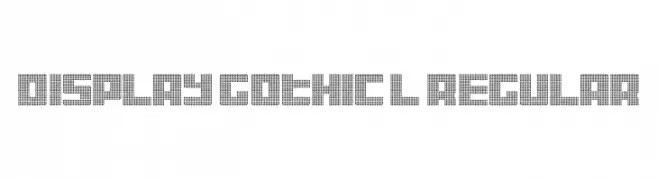
![Display Gothic L Regular font caratteri gratis]() Scaricare 131 Downloads@WebFont
Scaricare 131 Downloads@WebFont -
( Fonts by Letterara - Thomas Aradea - Personal-use only. For commercial use please contact owner. )
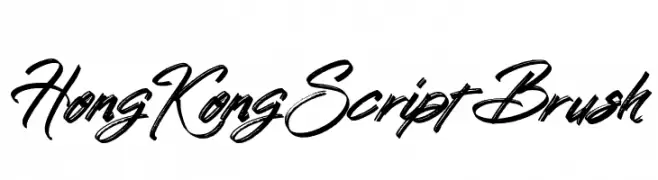
A dynamic brush script font with bold, fluid strokes and a lively, hand-drawn quality.
![Hong Kong Script Brush font caratteri gratis]() Scaricare 131 Downloads@WebFont
Scaricare 131 Downloads@WebFont -
( Fonts by Woodcutter )
A bold, intricate Gothic script with elaborate flourishes and sharp angles.
![Gothic Panceta font caratteri gratis]() Scaricare 131 Downloads@WebFont
Scaricare 131 Downloads@WebFont -
( Fonts by a Des Gomez. Personal-use only. For commercial use please contact owner. )
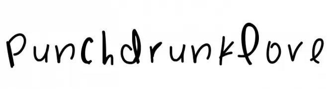
A playful, handwritten font with a whimsical and casual style.
![PunchDrunkLove font caratteri gratis]() Scaricare 131 Downloads@WebFont
Scaricare 131 Downloads@WebFont -
( Fonts by Vladimir Nikolic - www.creativefabrica.com/designer/vladimirnikolic/ - Personal-use only. For commercial use please contact owner. )
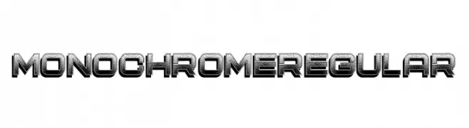
A bold, geometric font with a 3D effect and textured interior, perfect for striking displays.
![Monochrome Regular font caratteri gratis]() Scaricare 131 Downloads@WebFont
Scaricare 131 Downloads@WebFont -
( Fonts by www.blambot.com )
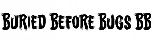
A bold, brushstroke-style font with dynamic and rugged characteristics.
![Buried Before Bugs BB font caratteri gratis]() Scaricare 131 Downloads@WebFont
Scaricare 131 Downloads@WebFont -
( Fonts by nariswari_creative - Taufik Dwi Purnomo - Personal-use only. For commercial use please contact owner. )
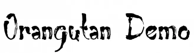
A bold, hand-drawn font with a rough, expressive style.
![Orangutan Demo font caratteri gratis]() Scaricare 131 Downloads@WebFont
Scaricare 131 Downloads@WebFont -
( Fonts by Iconian Fonts )
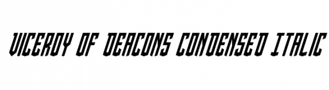
A bold, condensed, and italicized font with sharp angles and dynamic energy.
![Viceroy of Deacons Condensed Italic font caratteri gratis]() Scaricare 131 Downloads@WebFont
Scaricare 131 Downloads@WebFont -
( Fonts by Khurasan™ )
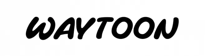
A bold, playful font with rounded edges and a smooth, flowing style.
![Waytoon font caratteri gratis]() Scaricare 131 Downloads@WebFont
Scaricare 131 Downloads@WebFont -
( Fonts by Daniel Zadorozny - www.iconian.com - Free for personal use )
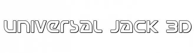
A bold, geometric 3D outline font with a futuristic style.
![Universal Jack 3D font caratteri gratis]() Scaricare 131 Downloads@WebFont
Scaricare 131 Downloads@WebFont -
( Iconian Fonts - Daniel Zadorozny - www.iconian.com )
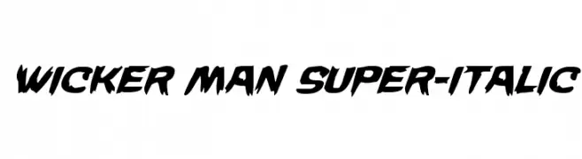
A bold, italicized font with sharp, angular edges and a dynamic style.
![Wicker Man Super-Italic font caratteri gratis]() Scaricare 131 Downloads@WebFont
Scaricare 131 Downloads@WebFont -
( Free for a personal use. For a commercial use please visit www.kevinandamanda.com )
A playful, hand-drawn font with a whimsical and casual style.
![Pea Stacy Tunibug font caratteri gratis]() Scaricare 131 Downloads@WebFont
Scaricare 131 Downloads@WebFont -
( Fonts by Iconian Fonts )
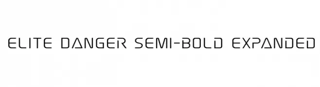
A modern, geometric font with clean lines and a futuristic style.
![Elite Danger Semi-Bold Expanded font caratteri gratis]() Scaricare 131 Downloads@WebFont
Scaricare 131 Downloads@WebFont -
( Fonts by Paul Reid - tracertong.co.uk )
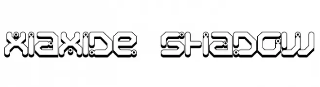
A futuristic, geometric font with bold lines and shadow effects.
![Xiaxide Shadow font caratteri gratis]() Scaricare 131 Downloads@WebFont
Scaricare 131 Downloads@WebFont -
( Fonts by 7NTypes )
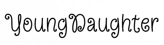
A playful and whimsical font with decorative curls and loops.
![Young Daughter font caratteri gratis]() Scaricare 131 Downloads@WebFont
Scaricare 131 Downloads@WebFont -
( Fonts by Typhoon Type - Suthi Srisopha - www.typhoontype.net - Personal-use only. For commercial use please contact owner. )
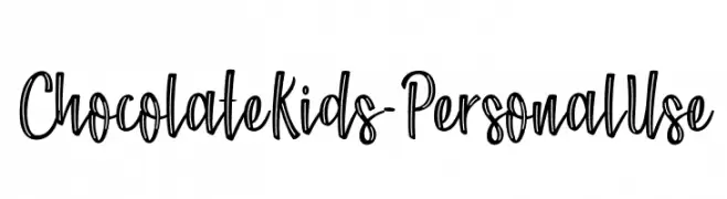
A playful, handwritten font with bold strokes and a lively, dynamic style.
![Chocolate Kids - Personal Use font caratteri gratis]() Scaricare 131 Downloads@WebFont
Scaricare 131 Downloads@WebFont -
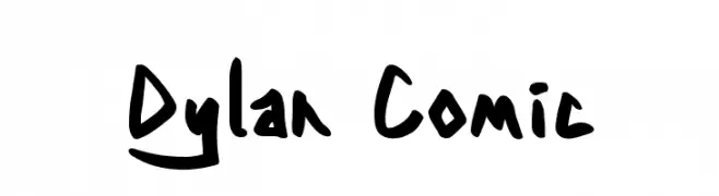
![Dylan Comic font caratteri gratis]() Scaricare 131 Downloads@WebFont
Scaricare 131 Downloads@WebFont -
( Fonts by Attype Studio )
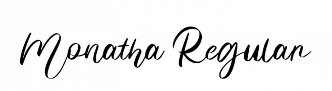
Elegant cursive script font with a handwritten style.
![Monatha Regular font caratteri gratis]() Scaricare 131 Downloads@WebFont
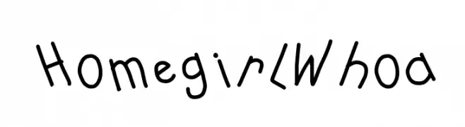
Scaricare 131 Downloads@WebFont -
![HomegirlWhoa font caratteri gratis]() Scaricare 131 Downloads@WebFont
Scaricare 131 Downloads@WebFont -
( Fonts by Ditya Ananto )
A decorative font with leaf and vine motifs, offering a whimsical and organic style.
![FOLIAGE font caratteri gratis]() Scaricare 131 Downloads@WebFont
Scaricare 131 Downloads@WebFont -
( memesbruh03 - Aaron D. Chand )
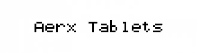
A pixelated, retro-style font with a blocky, digital appearance.
![Aerx Tablets font caratteri gratis]() Scaricare 131 Downloads@WebFont
Scaricare 131 Downloads@WebFont -
![Grissom Free font caratteri gratis]() Scaricare 131 Downloads@WebFont
Scaricare 131 Downloads@WebFont -
( Fonts by Wino S Kadir - weknow - www.revolge.com/shop/weknow/ - Personal-use only. For commercial use please contact owner. )
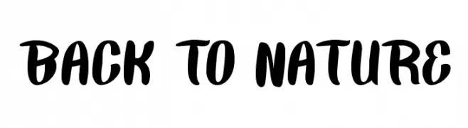
A bold, playful script font with a handwritten feel.
![BACK TO NATURE font caratteri gratis]() Scaricare 131 Downloads@WebFont
Scaricare 131 Downloads@WebFont -
( Fonts by MaybeICanMakeFonts... )
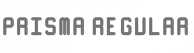
A geometric, outlined font with a futuristic and modern aesthetic.
![Prisma Regular font caratteri gratis]() Scaricare 131 Downloads@WebFont
Scaricare 131 Downloads@WebFont -
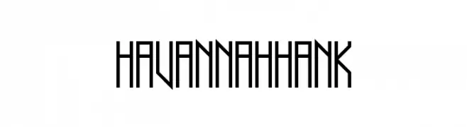
![Havannah Hank font caratteri gratis]() Scaricare 131 Downloads@WebFont
Scaricare 131 Downloads@WebFont -
( Hanoded - David Kerkhoff - www.hanodedfonts.com )
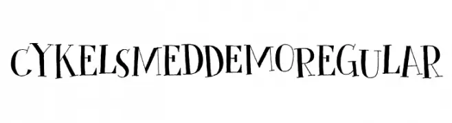
A playful, hand-drawn font with whimsical characters and unique symbols.
![Cykelsmed DEMO Regular font caratteri gratis]() Scaricare 131 Downloads@WebFont
Scaricare 131 Downloads@WebFont -
( Fonts by Wildan Type )
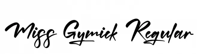
A bold, energetic script font with flowing, connected strokes and playful swashes.
![Miss Gymick Regular font caratteri gratis]() Scaricare 131 Downloads@WebFont
Scaricare 131 Downloads@WebFont -
( Fonts by Andrew Hart - dirt2.com )
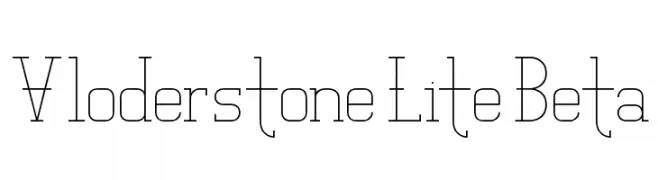
A modern, geometric font with thin lines and a minimalist aesthetic.
![Vloderstone Lite Beta font caratteri gratis]() Scaricare 131 Downloads@WebFont
Scaricare 131 Downloads@WebFont -
( Fonts by Amos Jerbi - ajerbi.com - Personal-use only. For commercial use please contact owner. )
A modern, wide-stanced font with consistent stroke width and clear readability.
![PtilWide Regular font caratteri gratis]() Scaricare 131 Downloads@WebFont
Scaricare 131 Downloads@WebFont -
( Fonts by Garisman Studio )
A bold, dynamic script font with fluid, connected letterforms.
![Maqueen font caratteri gratis]() Scaricare 131 Downloads@WebFont
Scaricare 131 Downloads@WebFont -
( Fonts by Fie Clarke - bonezdesignz.com - check the website before use the fonts! Personal-use only. )
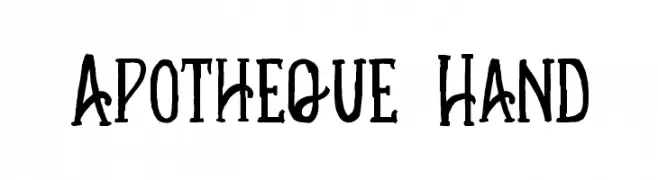
A whimsical, hand-drawn font with tall, narrow characters and a playful style.
![Apotheque Hand font caratteri gratis]() Scaricare 131 Downloads@WebFont
Scaricare 131 Downloads@WebFont


Quali sono i font più popolari adesso?
Poppins, Roboto, Montserrat, Open Sans e Lato sono molto usati per le forme pulite e l'ampia applicabilità — dall'identità di marca alle landing page e ai poster.
Quali font si usano spesso nei loghi?
Le sans serif geometriche (es. Poppins, famiglie in stile Gotham) sono scelte comuni per un branding pulito e scalabile. Per un tocco personale restano valide script e stili manoscritti. Abbina un display deciso per i titoli a un corpo testo neutro per riconoscibilità ed equilibrio.
Ogni quanto si aggiorna la lista?
Con regolarità, in base ai download e all'attività reale. Torna spesso per scoprire in anticipo le nuove preferite.
💡 Consiglio: aggiungi ai preferiti — le tendenze cambiano in fretta e i font top di oggi possono ispirare il rebranding di domani.