Benvenuto nelle Font Più Popolari — dove popolarità e qualità si incontrano. Qui trovi i font più scaricati e usati dell'anno. Se cerchi scelte sicure per logo, web o social, inizia da qui.
Ogni font top si distingue per equilibrio, leggibilità e versatilità. Troverai sans serif moderne, script eleganti, serif vintage e display minimalisti.
-
 Scaricare 127 Downloads@WebFont
 -
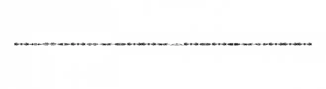
( Fonts by Manfred Klein. Free for private and charity use. Free for commercial with donation to organizations )
Abstract, fish-themed decorative font with geometric symbols.
![FishFaces font caratteri gratis]() Scaricare 127 Downloads@WebFont
Scaricare 127 Downloads@WebFont -
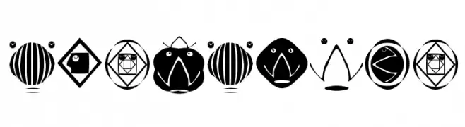
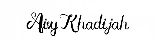
( SSI.Scraps - Syukur Setiyadi - www.creativefabrica.com/designer/syukursetiyadi/ )
An elegant, flowing script font with ornate uppercase and connected lowercase letters.
![Aisy Khadijah font caratteri gratis]() Scaricare 127 Downloads@WebFont
Scaricare 127 Downloads@WebFont -
( Fonts by Vladimir Nikolic )
Ornamental font featuring diverse hairstyle silhouettes.
![Haircut Regular font caratteri gratis]() Scaricare 127 Downloads@WebFont
Scaricare 127 Downloads@WebFont -
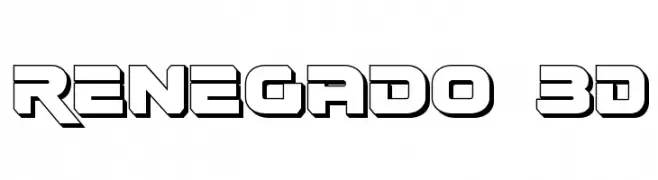
( Fonts by Daniel Zadorozny - www.iconian.com - Free for personal use )
A bold, 3D geometric font with a futuristic and industrial style.
![Renegado 3D font caratteri gratis]() Scaricare 127 Downloads@WebFont
Scaricare 127 Downloads@WebFont -
( Fonts by Daniel Zadorozny - www.iconian.com - Free for personal use )
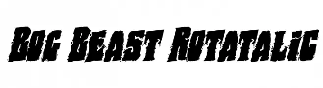
A bold, distressed font with a rugged, textured appearance.
![Bog Beast Rotatalic font caratteri gratis]() Scaricare 127 Downloads@WebFont
Scaricare 127 Downloads@WebFont -
( Jaycobs - Jay Cobs - www.jaycobs.fr )
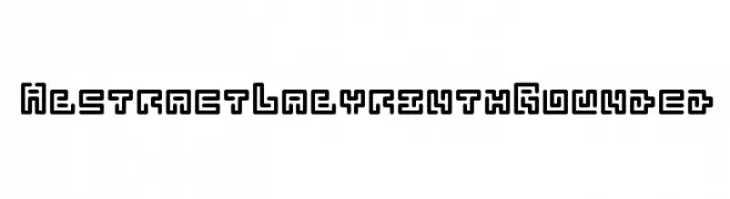
A geometric, abstract font with rounded edges and a labyrinth-like design.
![Abstract Labyrinth Rounded font caratteri gratis]() Scaricare 127 Downloads@WebFont
Scaricare 127 Downloads@WebFont -
( Fonts by Woodcutter Manero - www.woodcutter.es - Personal-use only. For commercial use please contact owner. )
A bold, hand-painted style font with a rustic and organic feel.
![Sovereignty font caratteri gratis]() Scaricare 127 Downloads@WebFont
Scaricare 127 Downloads@WebFont -
( Fonts by Saridezra - Personal-use only. For commercial use please contact owner. )
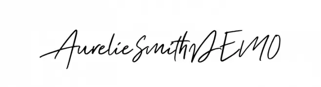
A dynamic and fluid handwritten font with elegant, flowing strokes.
![AurelieSmithDEMO font caratteri gratis]() Scaricare 127 Downloads@WebFont
Scaricare 127 Downloads@WebFont -
( Fonts by www.woodcutter.es - woodcutter Manero - Personal-use only. For commercial use please contact owner. )
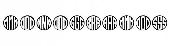
A bold, geometric font with monogram-style circular enclosures.
![MONOGRAMOS font caratteri gratis]() Scaricare 127 Downloads@WebFont
Scaricare 127 Downloads@WebFont -
( Fonts by a Neale Davidson - www.pixelsagas.com. Personal-use only. For commercial use please contact owner. )
A bold, geometric font with sharp angles and a faceted, gemstone-like appearance.
![Gemcut Bold font caratteri gratis]() Scaricare 127 Downloads@WebFont
Scaricare 127 Downloads@WebFont -
( Fonts by Samuel Park - Personal-use only. For commercial use please contact owner. )
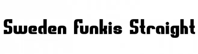
A bold, geometric font with straight lines and rounded corners, offering a modern industrial look.
![Sweden Funkis Straight font caratteri gratis]() Scaricare 127 Downloads@WebFont
Scaricare 127 Downloads@WebFont -
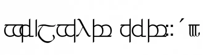
![Tengwar ver. # 3 font caratteri gratis]() Scaricare 127 Downloads@WebFont
Scaricare 127 Downloads@WebFont -
( Fonts by Manfred Klein. Free for private and charity use. Free for commercial with donation to organizations )
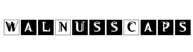
A bold, decorative font with characters enclosed in square borders, ideal for vintage-themed designs.
![WalNussCaps font caratteri gratis]() Scaricare 127 Downloads@WebFont
Scaricare 127 Downloads@WebFont -
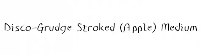
![Disco-Grudge Stroked (Apple) Medium font caratteri gratis]() Scaricare 127 Downloads@WebFont
Scaricare 127 Downloads@WebFont -
( London's Letters - www.londonsletters.com/ )
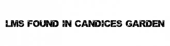
A bold, decorative font with floral patterns integrated into each character.
![LMS Found In Candice's Garden font caratteri gratis]() Scaricare 127 Downloads@WebFont
Scaricare 127 Downloads@WebFont -
( Fonts by Nico Muslib )
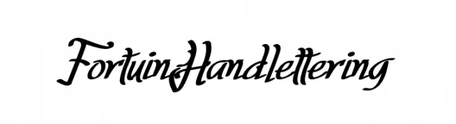
A flowing, cursive font with elegant, sweeping lines and a handwritten appearance.
![Fortuin Handlettering font caratteri gratis]() Scaricare 127 Downloads@WebFont
Scaricare 127 Downloads@WebFont -
( Fonts by Red Hat )
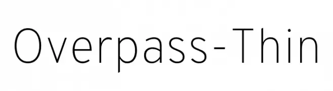
A thin, modern sans-serif font with clean lines and high legibility.
![Overpass-Thin font caratteri gratis]() Scaricare 127 Downloads@WebFont
Scaricare 127 Downloads@WebFont -
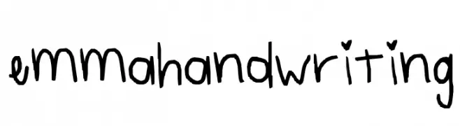
![emmahandwriting font caratteri gratis]() Scaricare 127 Downloads@WebFont
Scaricare 127 Downloads@WebFont -
( Fonts by Samuel Park - Personal-use only. For commercial use please contact owner. )
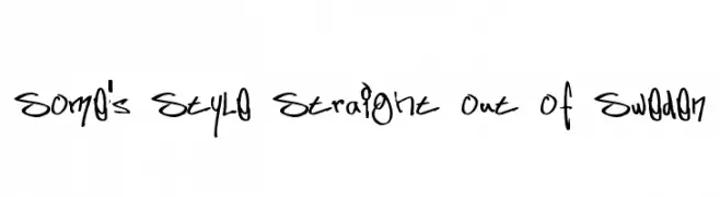
A bold, expressive handwritten font with a graffiti-like style.
![Some's Style Straight out of Sweden font caratteri gratis]() Scaricare 127 Downloads@WebFont
Scaricare 127 Downloads@WebFont -
( Fonts by twinletter - Rozikan - Personal-use only. For commercial use please contact owner. )
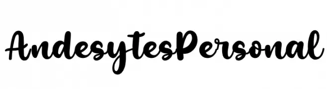
A bold, playful script font with smooth, flowing strokes and rounded edges.
![Andesytes Personal font caratteri gratis]() Scaricare 127 Downloads@WebFont
Scaricare 127 Downloads@WebFont -
( Fonts by Chequered Ink )
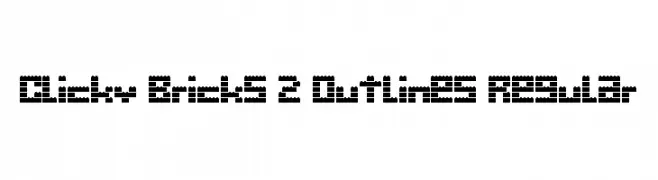
A playful, blocky font inspired by interlocking bricks, perfect for creative projects.
![Clicky Bricks 2 Outlines Regular font caratteri gratis]() Scaricare 127 Downloads@WebFont
Scaricare 127 Downloads@WebFont -
( Fonts by Madatype Studio )
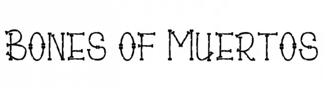
A playful, bone-themed font with a quirky, skeletal design.
![Bones of Muertos font caratteri gratis]() Scaricare 127 Downloads@WebFont
Scaricare 127 Downloads@WebFont -
( Fonts by illegalistic )
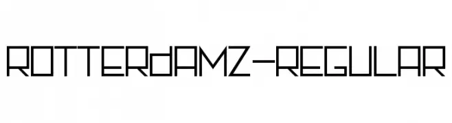
A geometric, modern font with consistent stroke width and sharp angles.
![Rotterdamz-Regular font caratteri gratis]() Scaricare 127 Downloads@WebFont
Scaricare 127 Downloads@WebFont -
( Fonts by beomsaurus - Personal-use only. For commercial use please contact owner. )
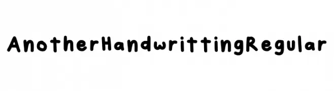
A playful, casual handwritten font with rounded, consistent strokes.
![Another Handwritting Regular font caratteri gratis]() Scaricare 127 Downloads@WebFont
Scaricare 127 Downloads@WebFont -
( Fonts by Vladimir Nikolic - www.creativefabrica.com/designer/vladimirnikolic/ - Personal-use only. For commercial use please contact owner. )
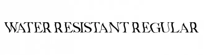
A bold, angular serif font with a dramatic and artistic flair.
![Water Resistant Regular font caratteri gratis]() Scaricare 127 Downloads@WebFont
Scaricare 127 Downloads@WebFont -
![GrandNover3 font caratteri gratis]() Scaricare 127 Downloads@WebFont
Scaricare 127 Downloads@WebFont -
( Fonts by Khurasan™ )
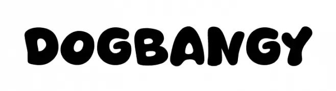
A playful, bold font with rounded, bubbly characters ideal for fun projects.
![Dogbangy font caratteri gratis]() Scaricare 127 Downloads@WebFont
Scaricare 127 Downloads@WebFont -
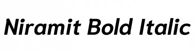
( Copyright 2018 the Niramit Project Authors (https://github.com/cadsondemak/Niramit) )
A bold, italic, and modern typeface with clean lines and moderate contrast.
![Niramit Bold Italic font caratteri gratis]() Scaricare 127 Downloads@WebFont
Scaricare 127 Downloads@WebFont -
( Iconian Fonts - Daniel Zadorozny - www.iconian.com )
A bold, distressed font with a chaotic, grunge-like style.
![Dokter Monstro Semi-Italic font caratteri gratis]() Scaricare 127 Downloads@WebFont
Scaricare 127 Downloads@WebFont -
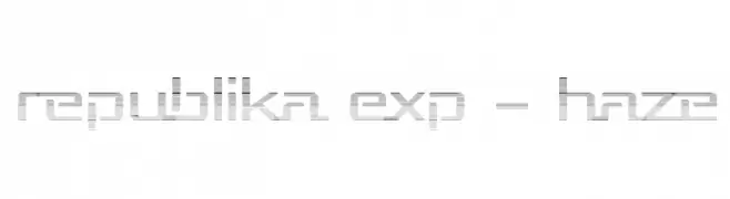
( Fonts by Apostrophic Lab )
A futuristic font with a digital haze effect and geometric design.
![Republika Exp - Haze font caratteri gratis]() Scaricare 127 Downloads@WebFont
Scaricare 127 Downloads@WebFont -
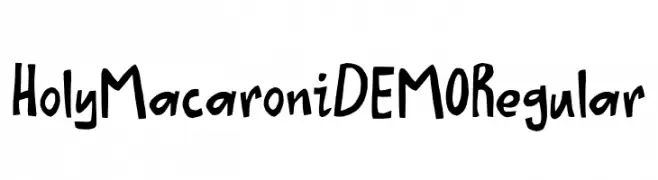
( Fonts by D K )
A playful, hand-drawn font with a whimsical, cartoonish style.
![Holy Macaroni DEMO Regular font caratteri gratis]() Scaricare 127 Downloads@WebFont
Scaricare 127 Downloads@WebFont -
( Fonts by Manfred Klein. Free for private and charity use. Free for commercial with donation to organizations )
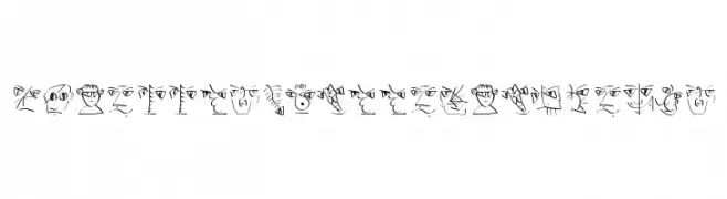
A whimsical and artistic font with abstract facial illustrations for each character.
![ScribblesCalligraphique font caratteri gratis]() Scaricare 127 Downloads@WebFont
Scaricare 127 Downloads@WebFont -
( Fonts by Edric Studio - Personal-use only. For commercial use please contact owner. )
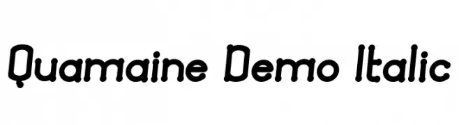
A playful, rounded, and slightly italicized font with a handwritten feel.
![Quamaine Demo Italic font caratteri gratis]() Scaricare 127 Downloads@WebFont
Scaricare 127 Downloads@WebFont -
![Ygnorant font caratteri gratis]() Scaricare 127 Downloads@WebFont
Scaricare 127 Downloads@WebFont


Quali sono i font più popolari adesso?
Poppins, Roboto, Montserrat, Open Sans e Lato sono molto usati per le forme pulite e l'ampia applicabilità — dall'identità di marca alle landing page e ai poster.
Quali font si usano spesso nei loghi?
Le sans serif geometriche (es. Poppins, famiglie in stile Gotham) sono scelte comuni per un branding pulito e scalabile. Per un tocco personale restano valide script e stili manoscritti. Abbina un display deciso per i titoli a un corpo testo neutro per riconoscibilità ed equilibrio.
Ogni quanto si aggiorna la lista?
Con regolarità, in base ai download e all'attività reale. Torna spesso per scoprire in anticipo le nuove preferite.
💡 Consiglio: aggiungi ai preferiti — le tendenze cambiano in fretta e i font top di oggi possono ispirare il rebranding di domani.