Benvenuto nelle Font Più Popolari — dove popolarità e qualità si incontrano. Qui trovi i font più scaricati e usati dell'anno. Se cerchi scelte sicure per logo, web o social, inizia da qui.
Ogni font top si distingue per equilibrio, leggibilità e versatilità. Troverai sans serif moderne, script eleganti, serif vintage e display minimalisti.
-
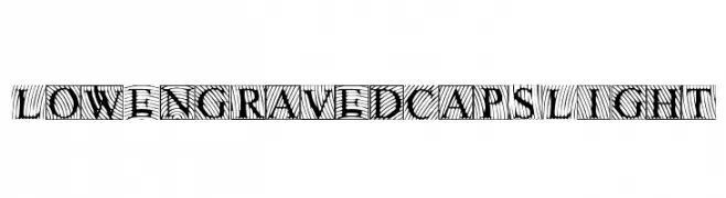
( Fonts by Edric Studio www.creativefabrica.com/designer/edricstudio/ - Personal-use only. For commercial use please contact owner. )
A geometric, outlined font with a modern and futuristic style.
 Scaricare 126 Downloads@WebFont
 -
![LowEngravedCapsLight font caratteri gratis]() Scaricare 126 Downloads@WebFont
Scaricare 126 Downloads@WebFont -
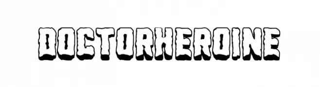
( Fonts by Woodcutter )
A bold, playful font with a 3D effect and comic book style.
![Doctor Heroine font caratteri gratis]() Scaricare 126 Downloads@WebFont
Scaricare 126 Downloads@WebFont -
( www.leodsen.com )
A bold, decorative font with a metallic, patterned design.
![Metalic font caratteri gratis]() Scaricare 126 Downloads@WebFont
Scaricare 126 Downloads@WebFont -
![FlappyBirdy Regular font caratteri gratis]() Scaricare 126 Downloads@WebFont
Scaricare 126 Downloads@WebFont -
![thirtyeight font caratteri gratis]() Scaricare 126 Downloads@WebFont
Scaricare 126 Downloads@WebFont -
( Fonts by Vladimir Nikolic - Personal-use only. For commercial use please contact owner. )
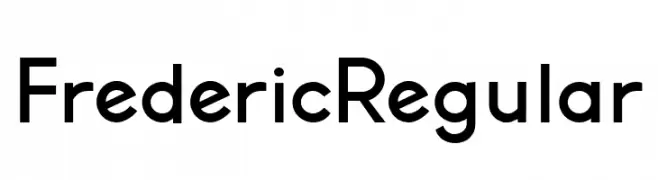
A modern sans-serif font with clean lines and excellent readability.
![Frederic Regular font caratteri gratis]() Scaricare 126 Downloads@WebFont
Scaricare 126 Downloads@WebFont -
( Fonts by Daniel Zadorozny - www.iconian.com - Free for personal use )
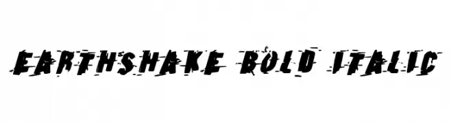
A bold, italic, distressed font with a grunge aesthetic and dynamic style.
![Earthshake Bold Italic font caratteri gratis]() Scaricare 126 Downloads@WebFont
Scaricare 126 Downloads@WebFont -
( Fonts by Edric Studio - Personal-use only. For commercial use please contact owner. )
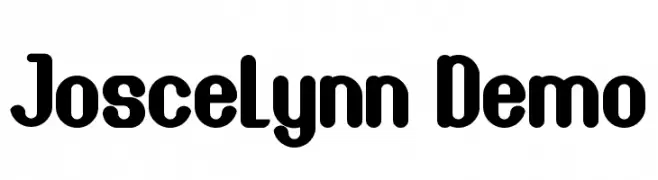
A bold, rounded font with smooth curves and a playful, modern style.
![Joscelynn Demo font caratteri gratis]() Scaricare 126 Downloads@WebFont
Scaricare 126 Downloads@WebFont -
( Fonts by Socialh. Personal-use only. For commercial use please contact owner. )
A bold, abstract font with explosive, jagged shapes.
![Shehab font caratteri gratis]() Scaricare 126 Downloads@WebFont
Scaricare 126 Downloads@WebFont -
( Fonts by HIRO std - Personal-use only. For commercial use please contact owner. )
An elegant, flowing script font with a cursive, handwritten style.
![Silly Girls font caratteri gratis]() Scaricare 126 Downloads@WebFont
Scaricare 126 Downloads@WebFont -
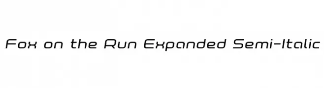
( Iconian Fonts - Daniel Zadorozny - www.iconian.com )
A modern, expanded semi-italic font with smooth curves and consistent stroke thickness.
![Fox on the Run Expanded Semi-Italic font caratteri gratis]() Scaricare 126 Downloads@WebFont
Scaricare 126 Downloads@WebFont -
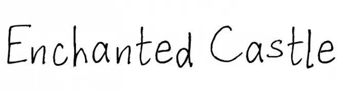
( Fonts by www.fontpanda.com. Personal-use only. For commercial use please contact owner. )
A whimsical, hand-drawn font with irregular strokes and a playful charm.
![Enchanted Castle font caratteri gratis]() Scaricare 126 Downloads@WebFont
Scaricare 126 Downloads@WebFont -
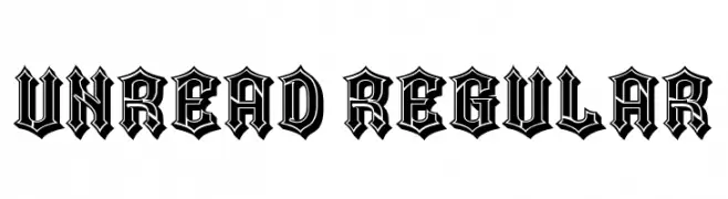
( Fonts by Vladimir Nikolic - www.creativefabrica.com/designer/vladimirnikolic/ - Personal-use only. For commercial use please contact owner. )
A bold, decorative font with a gothic, blackletter style.
![Unread Regular font caratteri gratis]() Scaricare 126 Downloads@WebFont
Scaricare 126 Downloads@WebFont -
( Fonts by a Max Infeld - XEROGRAPHER FONTS - xerographer.blogspot.com . Personal-use only. For commercial use please contact owner. )
An intricate and artistic font with swirling, elongated strokes and decorative flourishes.
![AnotherParty font caratteri gratis]() Scaricare 126 Downloads@WebFont
Scaricare 126 Downloads@WebFont -
( Fonts by Manfred Klein. Free for private and charity use. Free for commercial with donation to organizations )
A spooky, dripping font perfect for horror themes.
![Draculas font caratteri gratis]() Scaricare 126 Downloads@WebFont
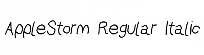
Scaricare 126 Downloads@WebFont -
![AppleStorm Regular Italic font caratteri gratis]() Scaricare 126 Downloads@WebFont
Scaricare 126 Downloads@WebFont -
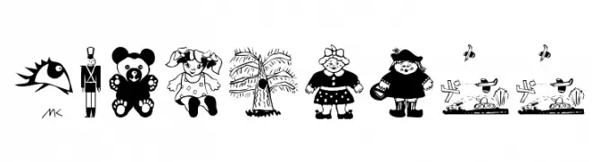
( Fonts by Manfred Klein - manfred-klein.ina-mar.com )
A whimsical, cartoon-style font featuring playful illustrations perfect for children's projects.
![KidsStuff font caratteri gratis]() Scaricare 126 Downloads@WebFont
Scaricare 126 Downloads@WebFont -
( Fonts by Manfred Klein. Free for private and charity use. Free for commercial with donation to organizations )
A playful and bold collection of numbers and symbols in circular shapes.
![CrazyDingdingsOne font caratteri gratis]() Scaricare 126 Downloads@WebFont
Scaricare 126 Downloads@WebFont -
( Fonts by Daniel Zadorozny - www.iconian.com )
A modern, semi-italic outlined font with a dynamic and geometric design.
![Escape Artist Academy Semi-Italic font caratteri gratis]() Scaricare 126 Downloads@WebFont
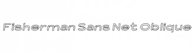
Scaricare 126 Downloads@WebFont -
![Fisherman Sans Net Oblique font caratteri gratis]() Scaricare 126 Downloads@WebFont
Scaricare 126 Downloads@WebFont -
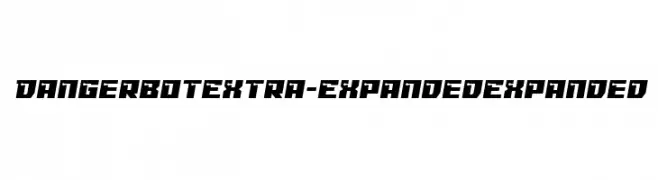
( Fonts by Iconian Fonts )
A bold, futuristic font with angular, geometric shapes and an extra expanded width.
![Dangerbot Extra-Expanded Expanded font caratteri gratis]() Scaricare 126 Downloads@WebFont
Scaricare 126 Downloads@WebFont -
( Fonts by Handpik - Personal-use only. For commercial use please contact owner. )
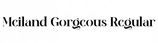
A high-contrast serif font with elegant, dramatic strokes and a refined aesthetic.
![Meiland Gorgeous Regular font caratteri gratis]() Scaricare 126 Downloads@WebFont
Scaricare 126 Downloads@WebFont -
( Fonts by Manuel Viergutz - Typo Graphic Design - www.typographicdesign.de )
A pixelated, bitmap font with a retro digital aesthetic.
![webpixelbitmap-Light font caratteri gratis]() Scaricare 126 Downloads@WebFont
Scaricare 126 Downloads@WebFont -
( Fonts by CannotIntoSpaceFonts - KineticPlasma Fonts - Personal-use only. For commercial use please contact owner. )
A bold, geometric font with strong, angular lines and a modern aesthetic.
![Bolshevik font caratteri gratis]() Scaricare 126 Downloads@WebFont
Scaricare 126 Downloads@WebFont -
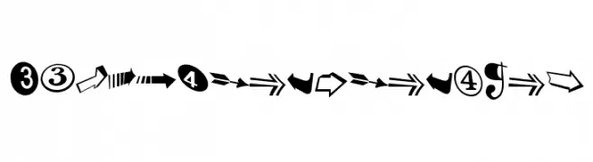
( Fonts by Daniel Zadorozny - www.iconian.com - Free for personal use )
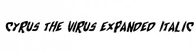
A bold, textured, expanded italic font with a dynamic and distressed style.
![Cyrus the Virus Expanded Italic font caratteri gratis]() Scaricare 126 Downloads@WebFont
Scaricare 126 Downloads@WebFont -
![Melchior_Handwritten Medium font caratteri gratis]() Scaricare 126 Downloads@WebFont
Scaricare 126 Downloads@WebFont -
( Southype - Rodrigo Gonzalez - www.southype.com )
A bold, geometric font with a modern, industrial style.
![New Russia 2108 St font caratteri gratis]() Scaricare 126 Downloads@WebFont
Scaricare 126 Downloads@WebFont -
( Fonts by Beautypes - Bhakti Al Akbar Pasaribu - Personal-use only. For commercial use please contact owner. )
An elegant script font with flowing, cursive lines and a sophisticated style.
![Losttimoh font caratteri gratis]() Scaricare 126 Downloads@WebFont
Scaricare 126 Downloads@WebFont -
( Fonts by Apostrophic Lab )
Organic, abstract display font with spiky, membrane-inspired forms.
![Ovulution II Membrane font caratteri gratis]() Scaricare 126 Downloads@WebFont
Scaricare 126 Downloads@WebFont -
( Fonts by Letteralle Studios - Annas Yahya - Personal-use only. For commercial use please contact owner. )
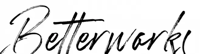
A dynamic, expressive handwritten font with fluid cursive letterforms.
![Betterworks font caratteri gratis]() Scaricare 126 Downloads@WebFont
Scaricare 126 Downloads@WebFont -
( Fonts by Manfred Klein. Free for private and charity use. Free for commercial with donation to organizations )
A bold, stencil-style font with a geometric, industrial aesthetic.
![StencilBricksRandom font caratteri gratis]() Scaricare 126 Downloads@WebFont
Scaricare 126 Downloads@WebFont -
( Fonts by Woodcutter )
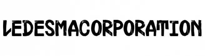
A bold, textured, hand-painted style font with a dynamic and artistic appearance.
![Ledesma Corporation font caratteri gratis]() Scaricare 126 Downloads@WebFont
Scaricare 126 Downloads@WebFont -
( Fonts by Apostrophic Lab )
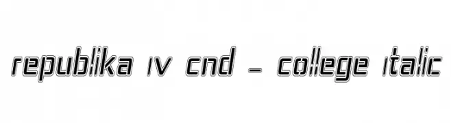
A bold, condensed, italicized collegiate-style font with outlined characters.
![Republika IV Cnd - College Italic font caratteri gratis]() Scaricare 126 Downloads@WebFont
Scaricare 126 Downloads@WebFont -
( Fonts by a Max Infeld - XEROGRAPHER FONTS - xerographer.blogspot.com . Personal-use only. For commercial use please contact owner. )
A whimsical and artistic font with fluid, hand-drawn letterforms.
![FreshWaters font caratteri gratis]() Scaricare 126 Downloads@WebFont
Scaricare 126 Downloads@WebFont


Quali sono i font più popolari adesso?
Poppins, Roboto, Montserrat, Open Sans e Lato sono molto usati per le forme pulite e l'ampia applicabilità — dall'identità di marca alle landing page e ai poster.
Quali font si usano spesso nei loghi?
Le sans serif geometriche (es. Poppins, famiglie in stile Gotham) sono scelte comuni per un branding pulito e scalabile. Per un tocco personale restano valide script e stili manoscritti. Abbina un display deciso per i titoli a un corpo testo neutro per riconoscibilità ed equilibrio.
Ogni quanto si aggiorna la lista?
Con regolarità, in base ai download e all'attività reale. Torna spesso per scoprire in anticipo le nuove preferite.
💡 Consiglio: aggiungi ai preferiti — le tendenze cambiano in fretta e i font top di oggi possono ispirare il rebranding di domani.