Benvenuto nelle Font Più Popolari — dove popolarità e qualità si incontrano. Qui trovi i font più scaricati e usati dell'anno. Se cerchi scelte sicure per logo, web o social, inizia da qui.
Ogni font top si distingue per equilibrio, leggibilità e versatilità. Troverai sans serif moderne, script eleganti, serif vintage e display minimalisti.
-
( Fonts by Socialh. Personal-use only. For commercial use please contact owner. )
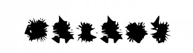
A bold, abstract font with explosive, jagged shapes.
 Scaricare 128 Downloads@WebFont
 -
( Iconian Fonts - Daniel Zadorozny - www.iconian.com )
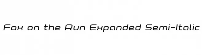
A modern, expanded semi-italic font with smooth curves and consistent stroke thickness.
![Fox on the Run Expanded Semi-Italic font caratteri gratis]() Scaricare 128 Downloads@WebFont
Scaricare 128 Downloads@WebFont -
( Fonts by Kat`s Fun Fonts - Personal-use only. For commercial use please contact owner. )
A playful font with bold letters and whimsical gnome illustrations.
![KR Garden for Sue font caratteri gratis]() Scaricare 128 Downloads@WebFont
Scaricare 128 Downloads@WebFont -
( Fonts by Manfred Klein. Free for private and charity use. Free for commercial with donation to organizations )
A whimsical, cartoon-like font with unique illustrative characters.
![Olisillus font caratteri gratis]() Scaricare 128 Downloads@WebFont
Scaricare 128 Downloads@WebFont -
( Fonts by Manfred Klein. Free for private and charity use. Free for commercial with donation to organizations )
A spooky, dripping font perfect for horror themes.
![Draculas font caratteri gratis]() Scaricare 128 Downloads@WebFont
Scaricare 128 Downloads@WebFont -
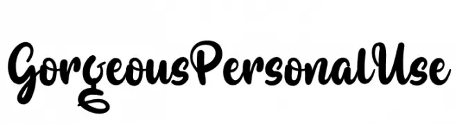
( Fonts by twinletter - Rozikan - Personal-use only. For commercial use please contact owner. )
A bold, expressive script font with flowing, cursive letterforms.
![Gorgeous Personal Use font caratteri gratis]() Scaricare 128 Downloads@WebFont
Scaricare 128 Downloads@WebFont -
( Josiah Werning - www.josiahwerning.com )
An organic, nature-inspired font with intricate, branch-like detailing.
![Forestry font caratteri gratis]() Scaricare 128 Downloads@WebFont
Scaricare 128 Downloads@WebFont -
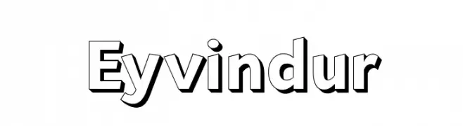
( Fonts by Misti Hammers - mistifonts.com - Personal-use only. For commercial use please contact owner. )
A bold, 3D sans-serif font with a shadow effect, ideal for impactful headlines.
![Eyvindur font caratteri gratis]() Scaricare 128 Downloads@WebFont
Scaricare 128 Downloads@WebFont -
( Noto is a trademark of Google Inc. Noto fonts are open source. All Noto fonts are published under the SIL Open Font License, Version 1.1 )
A classic serif typeface with a condensed style, ideal for formal and space-efficient text.
![Noto Serif Tamil Condensed font caratteri gratis]() Scaricare 128 Downloads@WebFont
Scaricare 128 Downloads@WebFont -
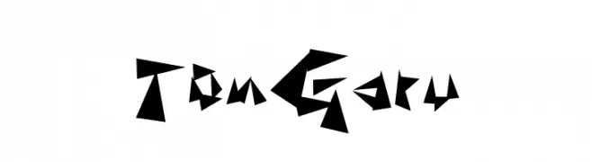
( Fonts by Baka - Kyakirun - bakafonts.kyakirun.com )
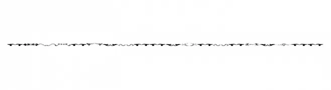
A bold, angular font with a dynamic, jagged design.
![TonGaru font caratteri gratis]() Scaricare 128 Downloads@WebFont
Scaricare 128 Downloads@WebFont -
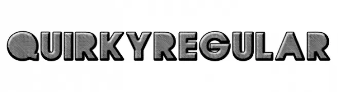
( Fonts by Billy Argel )
A bold, playful font with a 3D effect and shadowing.
![QUIRKY Regular font caratteri gratis]() Scaricare 128 Downloads@WebFont
Scaricare 128 Downloads@WebFont -
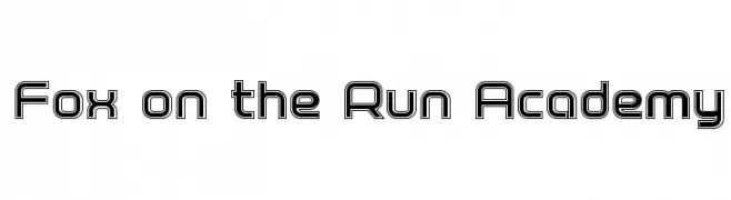
( Iconian Fonts - Daniel Zadorozny - www.iconian.com )
A bold, geometric outline font with a modern, futuristic style.
![Fox on the Run Academy font caratteri gratis]() Scaricare 128 Downloads@WebFont
Scaricare 128 Downloads@WebFont -
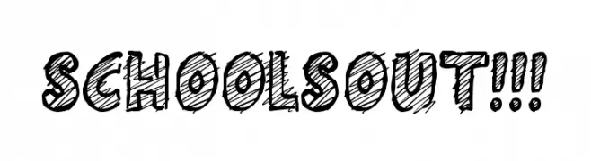
( Fonts by Jonathan S. Harris )
A playful, hand-drawn font with a sketchy, textured style.
![Schools Out!!! font caratteri gratis]() Scaricare 128 Downloads@WebFont
Scaricare 128 Downloads@WebFont -
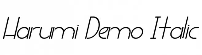
( Fonts by Noah Type - noahtype.com - Personal-use only. For commercial use please contact owner. )
A sleek, modern italic font with consistent stroke width and elegant curves.
![Harumi Demo Italic font caratteri gratis]() Scaricare 128 Downloads@WebFont
Scaricare 128 Downloads@WebFont -
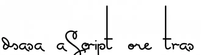
( Fonts by Mario Arturo - www.marioarturo.com )
A playful, handwritten script with smooth, flowing lines and consistent stroke thickness.
![MasanaScript-5Extras font caratteri gratis]() Scaricare 128 Downloads@WebFont
Scaricare 128 Downloads@WebFont -
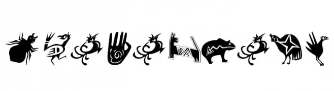
( Fonts by Manfred Klein. Free for private and charity use. Free for commercial with donation to organizations )
An artistic and decorative font featuring mythical and abstract creature designs.
![Shamanbats font caratteri gratis]() Scaricare 128 Downloads@WebFont
Scaricare 128 Downloads@WebFont -
![Melchior_Handwritten Medium font caratteri gratis]() Scaricare 128 Downloads@WebFont
Scaricare 128 Downloads@WebFont -
![Sughayer Separates 3 font caratteri gratis]() Scaricare 128 Downloads@WebFont
Scaricare 128 Downloads@WebFont -
( Fonts by Iordanis Passas )
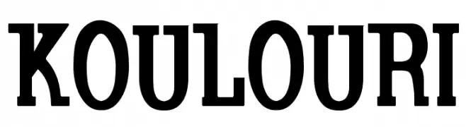
A bold, serif font with strong strokes and a classic yet modern style.
![Koulouri font caratteri gratis]() Scaricare 128 Downloads@WebFont
Scaricare 128 Downloads@WebFont -
( Fonts by Apostrophic Lab )
Organic, abstract display font with spiky, membrane-inspired forms.
![Ovulution II Membrane font caratteri gratis]() Scaricare 128 Downloads@WebFont
Scaricare 128 Downloads@WebFont -
( Fonts by Apostrophic Lab )
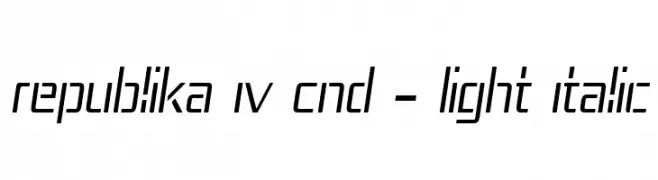
A sleek, modern, condensed italic font with geometric structure and consistent stroke width.
![Republika IV Cnd - Light Italic font caratteri gratis]() Scaricare 128 Downloads@WebFont
Scaricare 128 Downloads@WebFont -
( Fonts by Kurnia Setyadi )
A playful, hand-drawn style font with bold, dynamic characters.
![Markisa font caratteri gratis]() Scaricare 128 Downloads@WebFont
Scaricare 128 Downloads@WebFont -
( Fonts by Manushi Parikh, Satya Rajpurohit - Personal-use only. For commercial use please contact owner. )
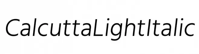
A sleek, modern, light italic sans-serif font with medium contrast.
![Calcutta Light Italic font caratteri gratis]() Scaricare 128 Downloads@WebFont
Scaricare 128 Downloads@WebFont -
( Fonts by Woodcutter )
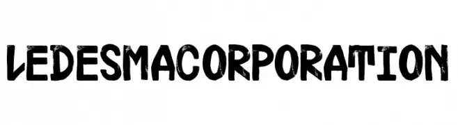
A bold, textured, hand-painted style font with a dynamic and artistic appearance.
![Ledesma Corporation font caratteri gratis]() Scaricare 128 Downloads@WebFont
Scaricare 128 Downloads@WebFont -
( Fonts by Iconian Fonts )
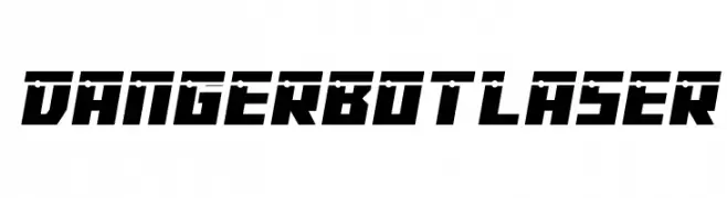
A bold, futuristic font with sharp, angular edges and a geometric style.
![Dangerbot Laser font caratteri gratis]() Scaricare 128 Downloads@WebFont
Scaricare 128 Downloads@WebFont -
( Fonts by Daniel Zadorozny - www.iconian.com - Free for personal use )
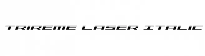
A futuristic, italicized font with sharp angles and a sleek, modern design.
![Trireme Laser Italic font caratteri gratis]() Scaricare 128 Downloads@WebFont
Scaricare 128 Downloads@WebFont -
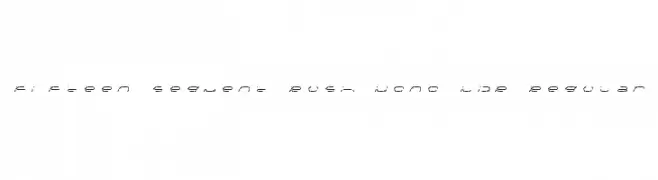
( Free - fontstruct.fontshop.com/fontstructors/neoqueto )
A segmented, monospaced font with a digital, technical appearance.
![Fifteen Segment Rush Mono LDR Regular font caratteri gratis]() Scaricare 128 Downloads@WebFont
Scaricare 128 Downloads@WebFont -
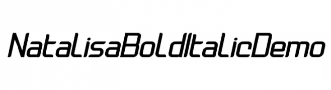
Caratteri di Sabrcreative. For commercial use please contact the owner.
( Natalisa )
A bold, italic, and modern font with a sleek, dynamic style.
![Natalisa Bold Italic Demo font caratteri gratis]() Scaricare 128 Downloads@WebFont
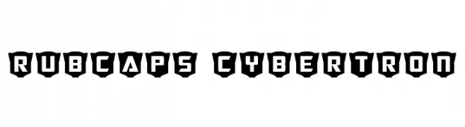
Scaricare 128 Downloads@WebFont -
![RubCaps Cybertron font caratteri gratis]() Scaricare 128 Downloads@WebFont
Scaricare 128 Downloads@WebFont -
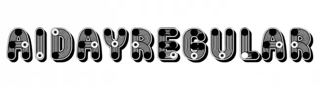
( Fonts by Vladimir Nikolic )
A bold, playful font with layered, colorful designs and rounded edges.
![Aiday Regular font caratteri gratis]() Scaricare 128 Downloads@WebFont
Scaricare 128 Downloads@WebFont -
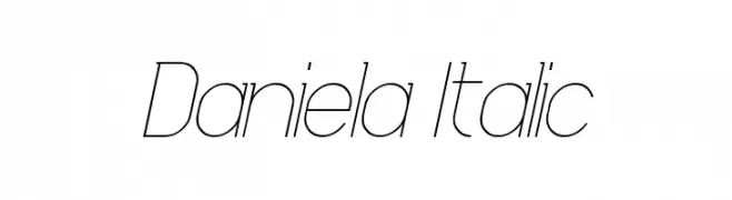
( Fonts by David Espinosa [Type Sailor] - www.facebook.com/typesailor - Personal-use only. For commercial use please contact owner. )
A sleek, modern italic font with thin, elongated characters.
![Daniela Italic font caratteri gratis]() Scaricare 128 Downloads@WebFont
Scaricare 128 Downloads@WebFont -
( Woodcutter - woodcutter Manero - www.woodcutter.es )
A bold, hand-drawn font with jagged edges and a dynamic style.
![FINOLIS font caratteri gratis]() Scaricare 128 Downloads@WebFont
Scaricare 128 Downloads@WebFont -
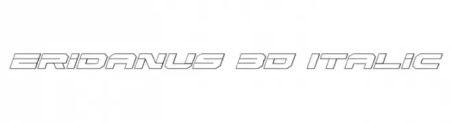
( Fonts by Daniel Zadorozny - www.iconian.com - Free for personal use )
A bold, 3D italic font with a futuristic and dynamic style.
![Eridanus 3D Italic font caratteri gratis]() Scaricare 128 Downloads@WebFont
Scaricare 128 Downloads@WebFont -
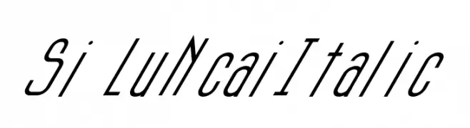
( Fonts by a cenz qobbal - www.facebook.com/cenzqobbalfonts. Personal-use only. For commercial use please contact owner. )
A modern, italic font with elongated, narrow characters.
![Si LuNcaiItalic font caratteri gratis]() Scaricare 128 Downloads@WebFont
Scaricare 128 Downloads@WebFont -
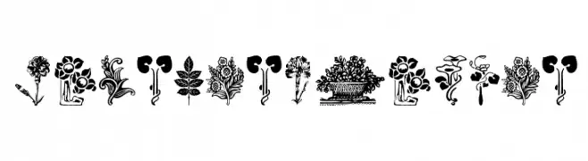
( Fonts by Manfred Klein. Free for private and charity use. Free for commercial with donation to organizations )
Highly detailed floral and botanical dingbat illustrations.
![PlantenNBlomen font caratteri gratis]() Scaricare 128 Downloads@WebFont
Scaricare 128 Downloads@WebFont


Quali sono i font più popolari adesso?
Poppins, Roboto, Montserrat, Open Sans e Lato sono molto usati per le forme pulite e l'ampia applicabilità — dall'identità di marca alle landing page e ai poster.
Quali font si usano spesso nei loghi?
Le sans serif geometriche (es. Poppins, famiglie in stile Gotham) sono scelte comuni per un branding pulito e scalabile. Per un tocco personale restano valide script e stili manoscritti. Abbina un display deciso per i titoli a un corpo testo neutro per riconoscibilità ed equilibrio.
Ogni quanto si aggiorna la lista?
Con regolarità, in base ai download e all'attività reale. Torna spesso per scoprire in anticipo le nuove preferite.
💡 Consiglio: aggiungi ai preferiti — le tendenze cambiano in fretta e i font top di oggi possono ispirare il rebranding di domani.