Benvenuto nelle Font Più Popolari — dove popolarità e qualità si incontrano. Qui trovi i font più scaricati e usati dell'anno. Se cerchi scelte sicure per logo, web o social, inizia da qui.
Ogni font top si distingue per equilibrio, leggibilità e versatilità. Troverai sans serif moderne, script eleganti, serif vintage e display minimalisti.
-
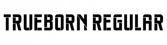
( Fonts by Vladimir Nikolic - www.creativefabrica.com/designer/vladimirnikolic/ - Personal-use only. For commercial use please contact owner. )
A bold, geometric font with sharp angles and a modern aesthetic.
 Scaricare 127 Downloads@WebFont
 -
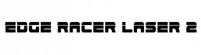
( Fonts by www.iconian.com - Personal-use only. For commercial use please contact owner. )
A bold, geometric font with a futuristic and digital aesthetic.
![Edge Racer Laser 2 font caratteri gratis]() Scaricare 127 Downloads@WebFont
Scaricare 127 Downloads@WebFont -
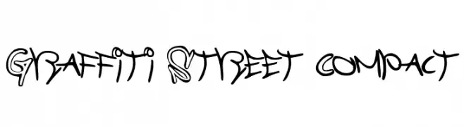
![Graffiti Street Compact font caratteri gratis]() Scaricare 127 Downloads@WebFont
Scaricare 127 Downloads@WebFont -
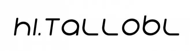
( Fonts by CannotIntoSpaceFonts - KineticPlasma Fonts - Personal-use only. For commercial use please contact owner. )
A modern, elongated font with rounded edges and a futuristic style.
![Hi. Tall Obl font caratteri gratis]() Scaricare 127 Downloads@WebFont
Scaricare 127 Downloads@WebFont -
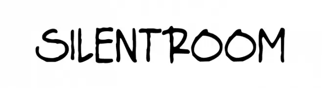
( Fonts by Origin Type )
Handwritten, playful font with irregular strokes.
![Silent Room font caratteri gratis]() Scaricare 127 Downloads@WebFont
Scaricare 127 Downloads@WebFont -
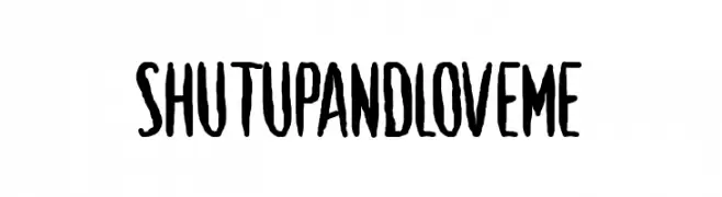
( Fonts by www.chequered.ink - Chequered Ink - Personal-use only. For commercial use please contact owner. )
A bold, hand-drawn font with an expressive and playful style.
![Shut Up and Love Me font caratteri gratis]() Scaricare 127 Downloads@WebFont
Scaricare 127 Downloads@WebFont -
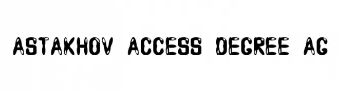
( Fonts by Dmitry Astakhov - www.behance.net/adonis-abe1e - Personal-use only. For commercial use please contact owner. )
A bold, playful font with high contrast and organic shapes, ideal for creative projects.
![Astakhov Access Degree AG font caratteri gratis]() Scaricare 127 Downloads@WebFont
Scaricare 127 Downloads@WebFont -
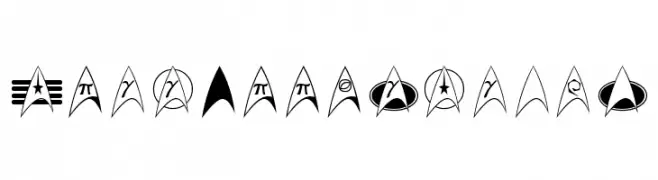
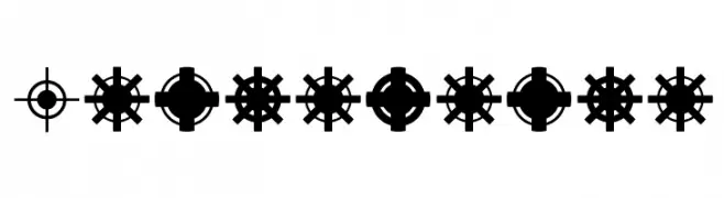
( Fonts by a Neale Davidson - www.pixelsagas.com. Personal-use only. For commercial use please contact owner. )
A collection of sci-fi inspired arrowhead symbols for decorative use.
![TrekArrowheads font caratteri gratis]() Scaricare 127 Downloads@WebFont
Scaricare 127 Downloads@WebFont -
( Fonts by Letterena Studios )
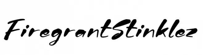
A bold, expressive script font with dynamic, cursive letterforms.
![Firegrant Stinklez font caratteri gratis]() Scaricare 127 Downloads@WebFont
Scaricare 127 Downloads@WebFont -
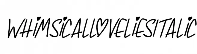
![Whimsical Lovelies Italic font caratteri gratis]() Scaricare 127 Downloads@WebFont
Scaricare 127 Downloads@WebFont -
Caratteri di danny91194. For commercial use please contact the owner.
( l )
A decorative and artistic font with geometric and abstract letterforms.
![yacuzzi font caratteri gratis]() Scaricare 127 Downloads@WebFont
Scaricare 127 Downloads@WebFont -
( گالری فانت فارسی پژوهش آريانا - only compatible with Farsi and Arabic )
A dynamic, italic handwritten font with artistic flair.
![Ketaab Italic font caratteri gratis]() Scaricare 127 Downloads@WebFont
Scaricare 127 Downloads@WebFont -
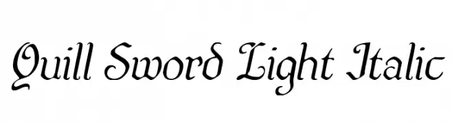
( Fonts by Iconian Fonts )
A classic, elegant calligraphic font with a modern, italicized twist.
![Quill Sword Light Italic font caratteri gratis]() Scaricare 127 Downloads@WebFont
Scaricare 127 Downloads@WebFont -
( Fonts by Woodcutter )
A bold, textured font with a playful, hand-painted style.
![Bahamonde font caratteri gratis]() Scaricare 127 Downloads@WebFont
Scaricare 127 Downloads@WebFont -
![SamtolSlim font caratteri gratis]() Scaricare 127 Downloads@WebFont
Scaricare 127 Downloads@WebFont -
![Grasping font caratteri gratis]() Scaricare 127 Downloads@WebFont
Scaricare 127 Downloads@WebFont -
( Fonts by 9031.com )
A hand-drawn, artistic font with a playful and informal style.
![Dimension-Regular font caratteri gratis]() Scaricare 127 Downloads@WebFont
Scaricare 127 Downloads@WebFont -
![WE ARE THE WORD font caratteri gratis]() Scaricare 127 Downloads@WebFont
Scaricare 127 Downloads@WebFont -
( Fonts by ingoFonts - Ingo Zimmermann - Personal-use only. For commercial use please contact owner. )
A classic serif font with elegant strokes and balanced proportions.
![NovelloReduced font caratteri gratis]() Scaricare 127 Downloads@WebFont
Scaricare 127 Downloads@WebFont -
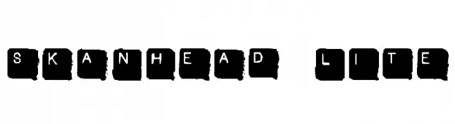
![SkanHead Lite font caratteri gratis]() Scaricare 127 Downloads@WebFont
Scaricare 127 Downloads@WebFont -
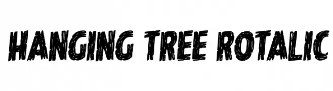
( Fonts by Daniel Zadorozny - www.iconian.com - Personal-use only. For commercial use please contact owner. )
A bold, textured, hand-drawn font with a dynamic and edgy style.
![Hanging Tree Rotalic font caratteri gratis]() Scaricare 127 Downloads@WebFont
Scaricare 127 Downloads@WebFont -
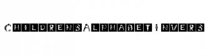
( Fonts by Manfred Klein. Free for private and charity use. Free for commercial with donation to organizations )
A playful font with letters formed by illustrations of children in various activities.
![ChildrensAlphabetInvers font caratteri gratis]() Scaricare 127 Downloads@WebFont
Scaricare 127 Downloads@WebFont -
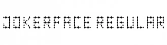
![Jokerface Regular font caratteri gratis]() Scaricare 127 Downloads@WebFont
Scaricare 127 Downloads@WebFont -
( Fonts by Aestherica Studio )
A modern, cursive font with a handwritten feel and elegant flow.
![Monthier font caratteri gratis]() Scaricare 127 Downloads@WebFont
Scaricare 127 Downloads@WebFont -
![Jiraijirai font caratteri gratis]() Scaricare 127 Downloads@WebFont
Scaricare 127 Downloads@WebFont -
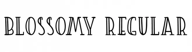
( Fonts by Love SVG - lovesvg.com - Personal-use only. For commercial use please contact owner. )
A decorative and whimsical font with elongated serifs and a playful style.
![Blossomy Regular font caratteri gratis]() Scaricare 127 Downloads@WebFont
Scaricare 127 Downloads@WebFont -
( Fonts by a Max Infeld - XEROGRAPHER FONTS - xerographer.blogspot.com . Personal-use only. For commercial use please contact owner. )
A playful and quirky font with irregular, dynamic letterforms.
![MuchFunky font caratteri gratis]() Scaricare 127 Downloads@WebFont
Scaricare 127 Downloads@WebFont -
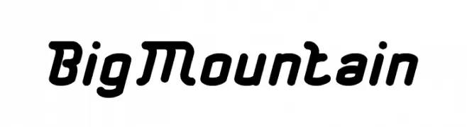
( Fonts by weknow - Wino S Kadir - Personal-use only. For commercial use please contact owner. )
A bold, rounded font with a playful and dynamic style.
![Big Mountain font caratteri gratis]() Scaricare 127 Downloads@WebFont
Scaricare 127 Downloads@WebFont -
Caratteri di ChristineMeany. For commercial use please contact the owner.
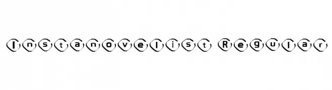
( Instanovelist Font )
A bold, modern font with characters enclosed in hexagonal shapes, offering a playful and artistic style.
![Instanovelist Regular font caratteri gratis]() Scaricare 127 Downloads@WebFont
Scaricare 127 Downloads@WebFont -
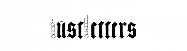
( Personal-use only. For commercial use please contact owner. )
A bold, ornate blackletter font with a medieval aesthetic.
![Just Letters font caratteri gratis]() Scaricare 127 Downloads@WebFont
Scaricare 127 Downloads@WebFont -
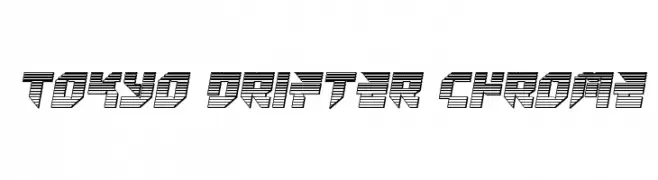
( Iconian Fonts - Daniel Zadorozny - www.iconian.com )
A bold, futuristic font with a 3D effect and geometric shapes.
![Tokyo Drifter Chrome font caratteri gratis]() Scaricare 126 Downloads@WebFont
Scaricare 126 Downloads@WebFont -
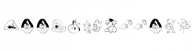
( Fonts by Manfred Klein. Free for private and charity use. Free for commercial with donation to organizations )
A decorative font with whimsical aquatic-themed illustrations for each character.
![DeepSwimmers font caratteri gratis]() Scaricare 126 Downloads@WebFont
Scaricare 126 Downloads@WebFont -
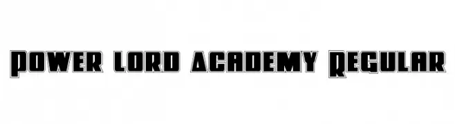
( Fonts by Iconian Fonts - Daniel Zadorozny )
A bold, geometric font with strong outlines and modern appeal.
![Power Lord Academy Regular font caratteri gratis]() Scaricare 126 Downloads@WebFont
Scaricare 126 Downloads@WebFont -
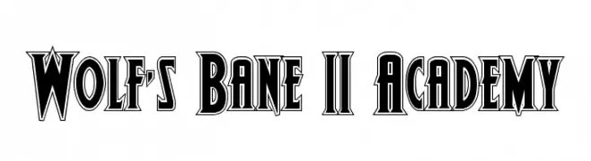
( Donationware )
A bold, angular font with a vintage gothic flair.
![Wolf's Bane II Academy font caratteri gratis]() Scaricare 126 Downloads@WebFont
Scaricare 126 Downloads@WebFont -
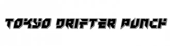
( Iconian Fonts - Daniel Zadorozny - www.iconian.com )
A bold, geometric font with a three-dimensional, futuristic design.
![Tokyo Drifter Punch font caratteri gratis]() Scaricare 126 Downloads@WebFont
Scaricare 126 Downloads@WebFont


Quali sono i font più popolari adesso?
Poppins, Roboto, Montserrat, Open Sans e Lato sono molto usati per le forme pulite e l'ampia applicabilità — dall'identità di marca alle landing page e ai poster.
Quali font si usano spesso nei loghi?
Le sans serif geometriche (es. Poppins, famiglie in stile Gotham) sono scelte comuni per un branding pulito e scalabile. Per un tocco personale restano valide script e stili manoscritti. Abbina un display deciso per i titoli a un corpo testo neutro per riconoscibilità ed equilibrio.
Ogni quanto si aggiorna la lista?
Con regolarità, in base ai download e all'attività reale. Torna spesso per scoprire in anticipo le nuove preferite.
💡 Consiglio: aggiungi ai preferiti — le tendenze cambiano in fretta e i font top di oggi possono ispirare il rebranding di domani.