Benvenuto nelle Font Più Popolari — dove popolarità e qualità si incontrano. Qui trovi i font più scaricati e usati dell'anno. Se cerchi scelte sicure per logo, web o social, inizia da qui.
Ogni font top si distingue per equilibrio, leggibilità e versatilità. Troverai sans serif moderne, script eleganti, serif vintage e display minimalisti.
-
( Fonts by www.studiotypo.com - Personal-use only. For commercial use please contact owner. )
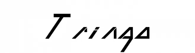
A thin, italicized font with a futuristic and geometric style.
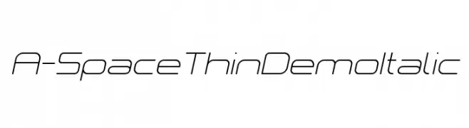 Scaricare 124 Downloads@WebFont
 -
( Fonts by Alex Tomlinson - Skyhaven Fonts - shfonts.com )
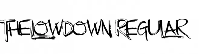
A bold, hand-drawn font with a graffiti-like, expressive style.
![TheLowDown-Regular font caratteri gratis]() Scaricare 124 Downloads@WebFont
Scaricare 124 Downloads@WebFont -
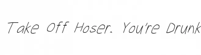
![Take Off Hoser, You're Drunk font caratteri gratis]() Scaricare 124 Downloads@WebFont
Scaricare 124 Downloads@WebFont -
( Fonts by www.haroldsfonts.com )
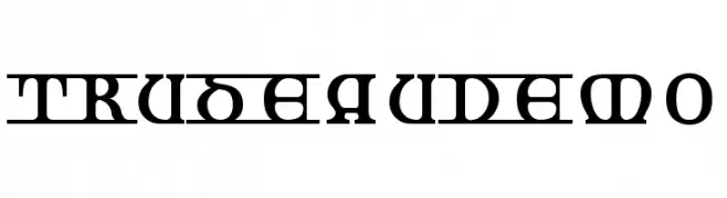
A bold, geometric, and decorative font with a modern vintage style.
![TrudeauDemo font caratteri gratis]() Scaricare 124 Downloads@WebFont
Scaricare 124 Downloads@WebFont -
![Tringo font caratteri gratis]() Scaricare 124 Downloads@WebFont
Scaricare 124 Downloads@WebFont -
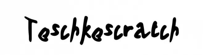
![Teschkescratch font caratteri gratis]() Scaricare 124 Downloads@WebFont
Scaricare 124 Downloads@WebFont -
( Fonts by Subectype & Orenari - Rangga Subekti & Ari - Personal-use only. For commercial use please contact owner. )
A lively handwritten font with fluid strokes and a casual script style.
![Adinda Melia regular font caratteri gratis]() Scaricare 124 Downloads@WebFont
Scaricare 124 Downloads@WebFont -
( Blambot - www.blambot.com )
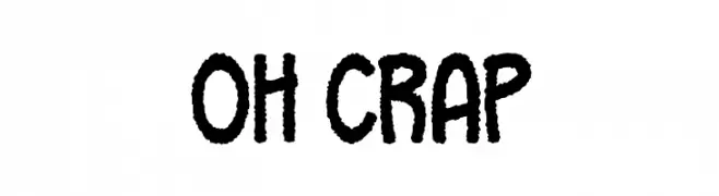
A bold, playful handwritten font with thick, uneven strokes.
![Oh Crap font caratteri gratis]() Scaricare 124 Downloads@WebFont
Scaricare 124 Downloads@WebFont -
( Fonts by Handpik - Personal-use only. For commercial use please contact owner. )
A tall, narrow font with a modern and sleek design.
![sabana-Regular font caratteri gratis]() Scaricare 124 Downloads@WebFont
Scaricare 124 Downloads@WebFont -
![SecretCode-Normal font caratteri gratis]() Scaricare 124 Downloads
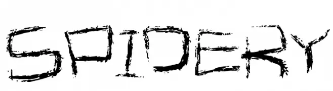
Scaricare 124 Downloads -
![Spidery font caratteri gratis]() Scaricare 124 Downloads@WebFont
Scaricare 124 Downloads@WebFont -
( Fonts by Misti Hammers - mistifonts.com - Personal-use only. For commercial use please contact owner. )
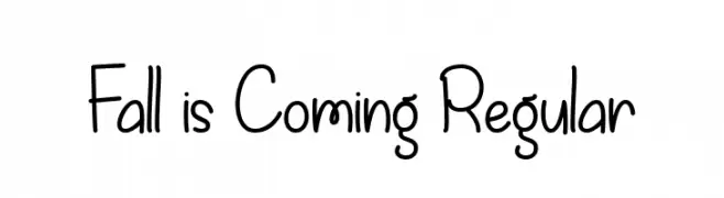
A playful, handwritten font with smooth, rounded edges and a casual style.
![Fall is Coming Regular font caratteri gratis]() Scaricare 124 Downloads@WebFont
Scaricare 124 Downloads@WebFont -
( Fonts by Apostrophic Lab )
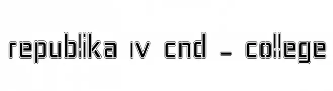
A bold, geometric outline font with a modern and futuristic style.
![Republika IV Cnd - College font caratteri gratis]() Scaricare 124 Downloads@WebFont
Scaricare 124 Downloads@WebFont -
( Fonts by Scratchones )
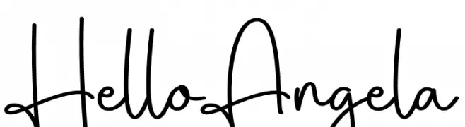
Casual handwritten script font.
![Hello Angela font caratteri gratis]() Scaricare 124 Downloads@WebFont
Scaricare 124 Downloads@WebFont -
( Fonts by Peter Wiegel - www.peter-wiegel.de - Personal-use only. For commercial use please contact owner. )
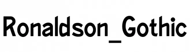
A bold, geometric font with clean lines and a modern aesthetic.
![Ronaldson_Gothic font caratteri gratis]() Scaricare 124 Downloads@WebFont
Scaricare 124 Downloads@WebFont -
( Fonts by Manfred Klein. Free for private and charity use. Free for commercial with donation to organizations )
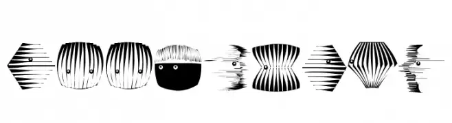
A decorative series of abstract, fish-like shapes with bold, graphic patterns.
![BookHeads font caratteri gratis]() Scaricare 124 Downloads@WebFont
Scaricare 124 Downloads@WebFont -
( Fonts by Apostrophic Lab )
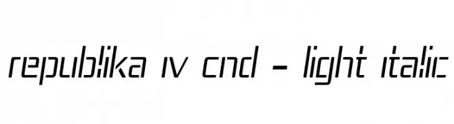
A sleek, modern, condensed italic font with geometric structure and consistent stroke width.
![Republika IV Cnd - Light Italic font caratteri gratis]() Scaricare 124 Downloads@WebFont
Scaricare 124 Downloads@WebFont -
( Fonts by Mans Greback - Personal-use only. For commercial use please contact owner. )
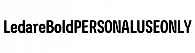
A bold, modern typeface with smooth curves and a slightly condensed structure.
![Ledare Bold PERSONAL USE ONLY font caratteri gratis]() Scaricare 124 Downloads@WebFont
Scaricare 124 Downloads@WebFont -
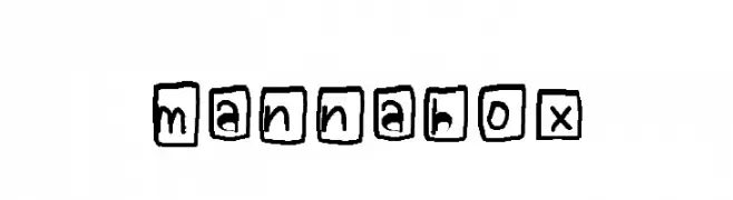
![mannabox font caratteri gratis]() Scaricare 124 Downloads@WebFont
Scaricare 124 Downloads@WebFont -
( Chequered Ink - chequered.ink/ )
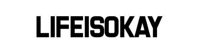
A bold, geometric font with uniform strokes and a modern industrial style.
![LifeIsOkay font caratteri gratis]() Scaricare 124 Downloads@WebFont
Scaricare 124 Downloads@WebFont -
Caratteri di Sabrcreative. For commercial use please contact the owner.
( Natalisa )
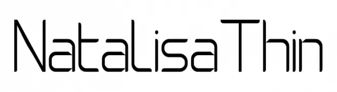
A thin, geometric font with a modern and minimalist design.
![Natalisa Thin font caratteri gratis]() Scaricare 124 Downloads@WebFont
Scaricare 124 Downloads@WebFont -
( Fonts by Daniel Zadorozny - www.iconian.com - Free for personal use )
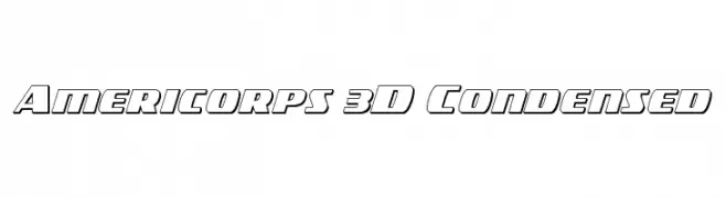
A bold, 3D, condensed font with a modern geometric design.
![Americorps 3D Condensed font caratteri gratis]() Scaricare 124 Downloads@WebFont
Scaricare 124 Downloads@WebFont -
( Fonts by Iconian Fonts - Daniel Zadorozny - Personal-use only. For commercial use please contact owner. )
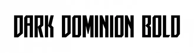
A bold, geometric font with a modern and edgy style.
![Dark Dominion Bold font caratteri gratis]() Scaricare 124 Downloads@WebFont
Scaricare 124 Downloads@WebFont -
( Fonts by Klakon Studio )
Elegant script font with a calligraphic touch.
![Bhotten font caratteri gratis]() Scaricare 124 Downloads@WebFont
Scaricare 124 Downloads@WebFont -
( Fonts by Daniel Zadorozny - www.iconian.com - Free for personal use )
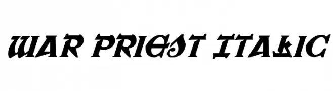
A bold, italic font with sharp, angular lines and a medieval-inspired style.
![War Priest Italic font caratteri gratis]() Scaricare 124 Downloads@WebFont
Scaricare 124 Downloads@WebFont -
( Fonts by Brixdee - jack-oatley.com - Personal-use only. For commercial use please contact owner. )
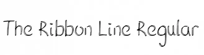
A playful, hand-drawn font with a ribbon-like, whimsical style.
![The Ribbon Line Regular font caratteri gratis]() Scaricare 124 Downloads@WebFont
Scaricare 124 Downloads@WebFont -
( Fonts by Yoga Letter )
A bold, playful font with exaggerated curves and whimsical style.
![BLASQER font caratteri gratis]() Scaricare 124 Downloads@WebFont
Scaricare 124 Downloads@WebFont -
( Fonts by Fachran Heit )
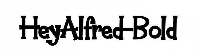
A bold, playful font with a whimsical and dynamic style.
![HeyAlfred-Bold font caratteri gratis]() Scaricare 124 Downloads@WebFont
Scaricare 124 Downloads@WebFont -
( Fonts by Situjuh Nazara - 7ntypes.com - Personal-use only. For commercial use please contact owner. )
A modern, geometric font with clean lines and rounded edges.
![gpkn font caratteri gratis]() Scaricare 124 Downloads@WebFont
Scaricare 124 Downloads@WebFont -
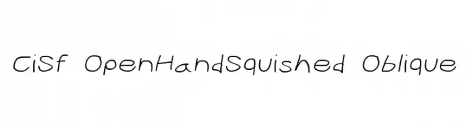
![CiSf OpenHandSquished Oblique font caratteri gratis]() Scaricare 124 Downloads@WebFont
Scaricare 124 Downloads@WebFont -
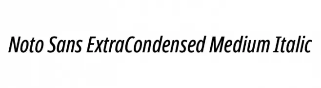
( Fonts by Google )
A modern, extra condensed sans-serif font with medium weight and italic style.
![Noto Sans ExtraCondensed Medium Italic font caratteri gratis]() Scaricare 124 Downloads@WebFont
Scaricare 124 Downloads@WebFont -
( Fonts by PutraCetol Studio )
A bold, geometric font with stylized, energetic characters.
![Nipsey font caratteri gratis]() Scaricare 124 Downloads@WebFont
Scaricare 124 Downloads@WebFont -
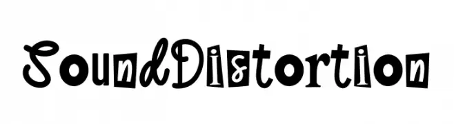
( Fonts by Ronny Studio )
A bold, eclectic font with playful and distorted characters.
![Sound Distortion font caratteri gratis]() Scaricare 124 Downloads@WebFont
Scaricare 124 Downloads@WebFont -
( Fonts by Alexa )
A bold, playful font with a hand-drawn, whimsical style.
![Brazie font caratteri gratis]() Scaricare 124 Downloads@WebFont
Scaricare 124 Downloads@WebFont -
![Humble Wall [Hungry Trees] font caratteri gratis]() Scaricare 124 Downloads@WebFont
Scaricare 124 Downloads@WebFont


![Humble Wall [Hungry Trees] font caratteri gratis](https://d144mzi0q5mijx.cloudfront.net/img/H/U/Humble-Wall-Hungry-Trees.webp)
Quali sono i font più popolari adesso?
Poppins, Roboto, Montserrat, Open Sans e Lato sono molto usati per le forme pulite e l'ampia applicabilità — dall'identità di marca alle landing page e ai poster.
Quali font si usano spesso nei loghi?
Le sans serif geometriche (es. Poppins, famiglie in stile Gotham) sono scelte comuni per un branding pulito e scalabile. Per un tocco personale restano valide script e stili manoscritti. Abbina un display deciso per i titoli a un corpo testo neutro per riconoscibilità ed equilibrio.
Ogni quanto si aggiorna la lista?
Con regolarità, in base ai download e all'attività reale. Torna spesso per scoprire in anticipo le nuove preferite.
💡 Consiglio: aggiungi ai preferiti — le tendenze cambiano in fretta e i font top di oggi possono ispirare il rebranding di domani.