Benvenuto nelle Font Più Popolari — dove popolarità e qualità si incontrano. Qui trovi i font più scaricati e usati dell'anno. Se cerchi scelte sicure per logo, web o social, inizia da qui.
Ogni font top si distingue per equilibrio, leggibilità e versatilità. Troverai sans serif moderne, script eleganti, serif vintage e display minimalisti.
-
 Scaricare 123 Downloads@WebFont
 -
( Fonts by Robbi D )
A bamboo-inspired font with a natural, organic design.
![Little Bamboo font caratteri gratis]() Scaricare 123 Downloads@WebFont
Scaricare 123 Downloads@WebFont -
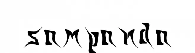
![sampanda font caratteri gratis]() Scaricare 123 Downloads@WebFont
Scaricare 123 Downloads@WebFont -
( Jessica Darnell )
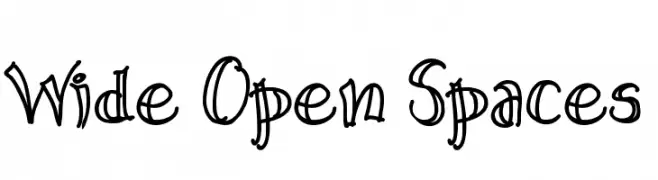
A playful, hand-drawn font with bold, whimsical strokes.
![Wide Open Spaces font caratteri gratis]() Scaricare 122 Downloads@WebFont
Scaricare 122 Downloads@WebFont -
![Bize_Ne_Di__er_Harflerden_Bizim_Ad__m__z_Bertug_ve_Cesur font caratteri gratis]() Scaricare 122 Downloads@WebFont
Scaricare 122 Downloads@WebFont -
( Fonts by www.26plus-zeichen.de )
A bold, geometric font inspired by origami, featuring sharp angles and a modern aesthetic.
![RealOrigami font caratteri gratis]() Scaricare 122 Downloads@WebFont
Scaricare 122 Downloads@WebFont -
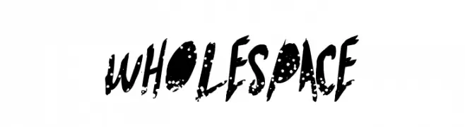
( Fonts by a Max Infeld - XEROGRAPHER FONTS - xerographer.blogspot.com . Personal-use only. For commercial use please contact owner. )
A bold, distressed font with a grunge-like texture and dynamic style.
![WholeSpace font caratteri gratis]() Scaricare 122 Downloads@WebFont
Scaricare 122 Downloads@WebFont -
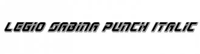
( Iconian Fonts - Daniel Zadorozny - www.iconian.com )
A bold, italic font with geometric shapes and strong outlines, exuding energy and modernity.
![Legio Sabina Punch Italic font caratteri gratis]() Scaricare 122 Downloads@WebFont
Scaricare 122 Downloads@WebFont -
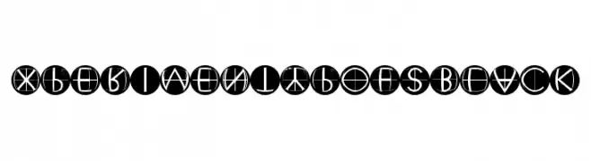
( Fonts by Manfred Klein. Free for private and charity use. Free for commercial with donation to organizations )
A geometric, futuristic font with characters enclosed in black circles.
![XperimentypoFSBlack font caratteri gratis]() Scaricare 122 Downloads@WebFont
Scaricare 122 Downloads@WebFont -
( Fonts by www.selawetype.com - Personal-use only. FOR DONATION https://www.paypal.me/selawe . For commercial use please contact owner. )
A bold, cursive font with a dynamic, handwritten style.
![Janetalus font caratteri gratis]() Scaricare 122 Downloads@WebFont
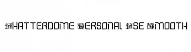
Scaricare 122 Downloads@WebFont -
![Shatterdome Personal Use Smooth font caratteri gratis]() Scaricare 122 Downloads@WebFont
Scaricare 122 Downloads@WebFont -
( Barry Stock )
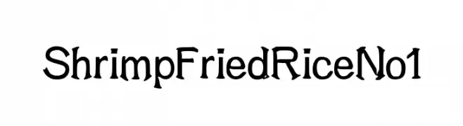
A whimsical, decorative font with a hand-drawn, artistic style.
![ShrimpFriedRiceNo1 font caratteri gratis]() Scaricare 122 Downloads@WebFont
Scaricare 122 Downloads@WebFont -
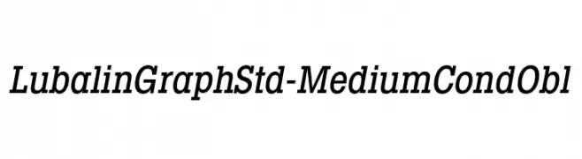
Caratteri di HammerBro101. For commercial use please contact the owner.
![LubalinGraphStd-MediumCondObl font caratteri gratis]() Scaricare 122 Downloads@WebFont
Scaricare 122 Downloads@WebFont -
( Fonts by TarmSaft Font Factory - http://www.aska.nu/tarmsaft/ )
A bold, angular font with a dynamic and geometric style.
![Sprutfest font caratteri gratis]() Scaricare 122 Downloads
Scaricare 122 Downloads -
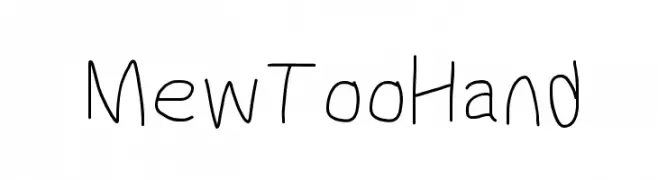
![MewTooHand font caratteri gratis]() Scaricare 122 Downloads@WebFont
Scaricare 122 Downloads@WebFont -
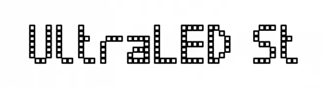
( Fonts by Southype )
A pixelated, grid-based font with a modern, digital look.
![UltraLED St font caratteri gratis]() Scaricare 122 Downloads@WebFont
Scaricare 122 Downloads@WebFont -
( Free - niram.org )
A rugged, hand-drawn font with a textured, distressed appearance.
![Rain&Neer font caratteri gratis]() Scaricare 122 Downloads@WebFont
Scaricare 122 Downloads@WebFont -
( Iconian Fonts - Daniel Zadorozny - www.iconian.com )
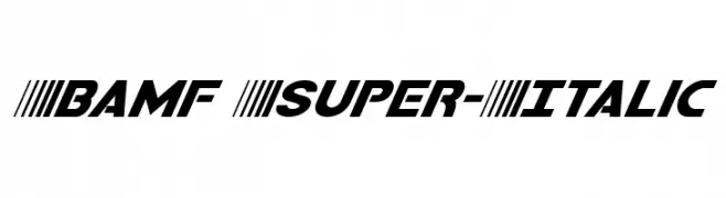
A bold, italic font with a dynamic and modern style.
![Bamf Super-Italic font caratteri gratis]() Scaricare 122 Downloads@WebFont
Scaricare 122 Downloads@WebFont -
( Fonts by Letterena Studios )
A casual, elegant handwritten font with fluid, connected letters.
![Worthington font caratteri gratis]() Scaricare 122 Downloads@WebFont
Scaricare 122 Downloads@WebFont -
( Fonts by Manfred Klein. Free for private and charity use. Free for commercial with donation to organizations )
A whimsical, robot-themed decorative display font with high contrast and unique character illustrations.
![HumanFollowUps font caratteri gratis]() Scaricare 122 Downloads@WebFont
Scaricare 122 Downloads@WebFont -
( AgaSilva - agasilva.com )
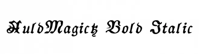
A bold, italicized decorative font with a mystical, enchanting style.
![AuldMagick Bold Italic font caratteri gratis]() Scaricare 122 Downloads@WebFont
Scaricare 122 Downloads@WebFont -
( Fonts by Daniel Zadorozny - www.iconian.com - Free for personal use )
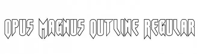
A bold, geometric outline font with sharp angles and a futuristic look.
![Opus Magnus Outline Regular font caratteri gratis]() Scaricare 122 Downloads@WebFont
Scaricare 122 Downloads@WebFont -
( Fonts by a Neale Davidson - www.pixelsagas.com. Personal-use only. For commercial use please contact owner. )
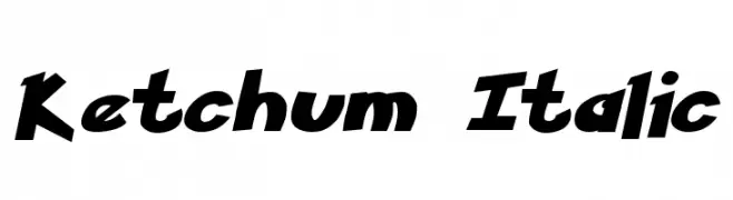
A bold, italicized font with dynamic curves and a playful style.
![Ketchum Italic font caratteri gratis]() Scaricare 122 Downloads@WebFont
Scaricare 122 Downloads@WebFont -
Caratteri di danny91194. For commercial use please contact the owner.
( tricky )
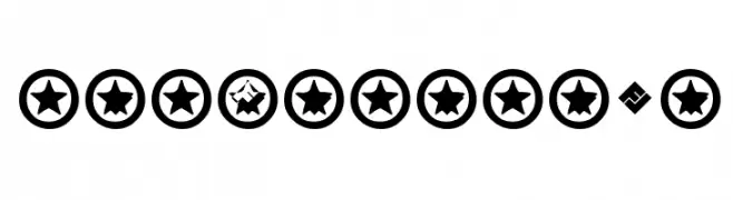
Bold, playful font with stars inside circles.
![HotPotato Bold font caratteri gratis]() Scaricare 122 Downloads@WebFont
Scaricare 122 Downloads@WebFont -
( Fonts by Nick Curtis - www.nicksfonts.com )
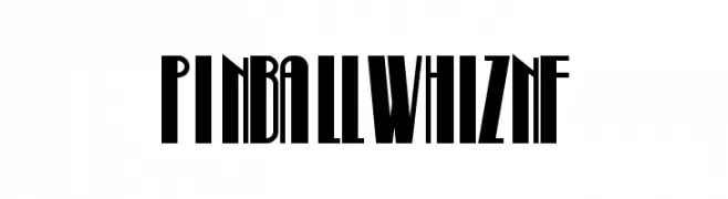
A bold, tall, and narrow font with Art Deco influences.
![PinballWhizNF font caratteri gratis]() Scaricare 122 Downloads@WebFont
Scaricare 122 Downloads@WebFont -
( Fonts by MJType )
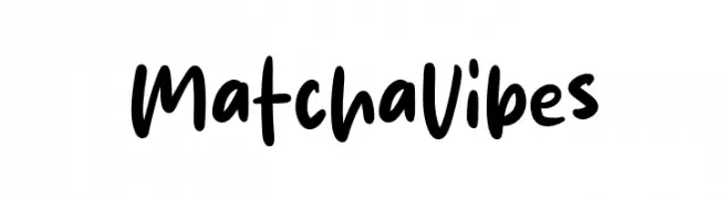
Casual handwritten font with rounded, playful strokes.
![Matcha Vibes font caratteri gratis]() Scaricare 122 Downloads@WebFont
Scaricare 122 Downloads@WebFont -
( Fonts by Daniel Zadorozny - www.iconian.com - Free for personal use )
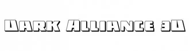
A bold, 3D geometric font with outlined characters for a striking visual effect.
![Dark Alliance 3D font caratteri gratis]() Scaricare 122 Downloads@WebFont
Scaricare 122 Downloads@WebFont -
( Fonts by Neale Davidson - www.pixelsagas.com )
A bold, angular font with a runic, fantasy-inspired design.
![Dovakiin font caratteri gratis]() Scaricare 122 Downloads@WebFont
Scaricare 122 Downloads@WebFont -
( JOEBOB graphics - Joe vanderHam - www.joebob.nl )
A playful, 3D outline font with a hand-drawn, comic book style.
![Crial font caratteri gratis]() Scaricare 122 Downloads@WebFont
Scaricare 122 Downloads@WebFont -
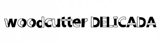
( www.woodcutter.es )
A playful, bold font with a mix of solid and outlined characters.
![woodcutter DELICADA font caratteri gratis]() Scaricare 122 Downloads@WebFont
Scaricare 122 Downloads@WebFont -
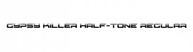
( Fonts by Daniel Zadorozny - www.iconian.com - Free for personal use )
A bold, futuristic font with a unique half-tone effect and geometric design.
![Gypsy Killer Half-Tone Regular font caratteri gratis]() Scaricare 122 Downloads@WebFont
Scaricare 122 Downloads@WebFont -
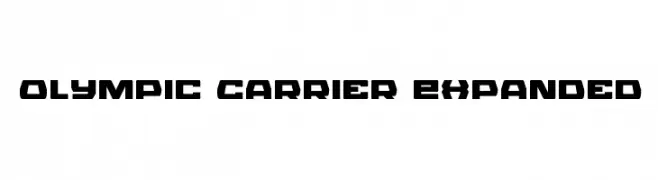
( Fonts by Iconian Fonts )
A bold, geometric font with a futuristic and industrial style.
![Olympic Carrier Expanded font caratteri gratis]() Scaricare 122 Downloads@WebFont
Scaricare 122 Downloads@WebFont -
( Fonts by Manfred Klein. Free for private and charity use. Free for commercial with donation to organizations )
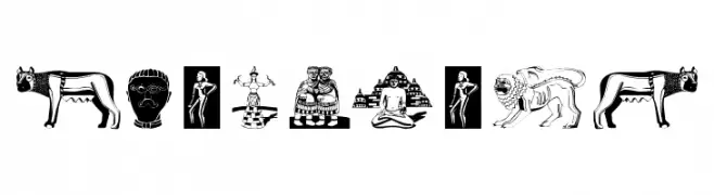
A pictorial display font featuring iconic sculptures as glyphs.
![Sculpturs font caratteri gratis]() Scaricare 122 Downloads@WebFont
Scaricare 122 Downloads@WebFont -
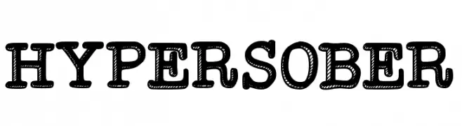
( Joanne Abellar - www.anandalusianbitch.com )
A bold, playful font with a dotted texture, ideal for creative projects.
![Hypersober font caratteri gratis]() Scaricare 122 Downloads@WebFont
Scaricare 122 Downloads@WebFont -
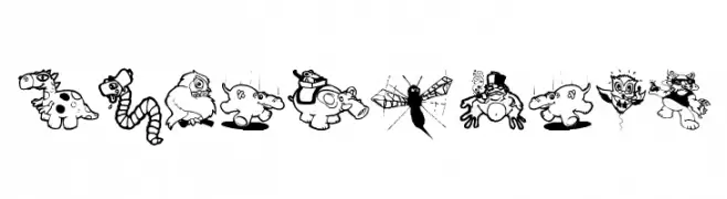
( Fonts by Manfred Klein. Free for private and charity use. Free for commercial with donation to organizations )
Cartoonish, bold-outlined animal and creature illustrations with a humorous style.
![HumorixOne font caratteri gratis]() Scaricare 122 Downloads@WebFont
Scaricare 122 Downloads@WebFont


Quali sono i font più popolari adesso?
Poppins, Roboto, Montserrat, Open Sans e Lato sono molto usati per le forme pulite e l'ampia applicabilità — dall'identità di marca alle landing page e ai poster.
Quali font si usano spesso nei loghi?
Le sans serif geometriche (es. Poppins, famiglie in stile Gotham) sono scelte comuni per un branding pulito e scalabile. Per un tocco personale restano valide script e stili manoscritti. Abbina un display deciso per i titoli a un corpo testo neutro per riconoscibilità ed equilibrio.
Ogni quanto si aggiorna la lista?
Con regolarità, in base ai download e all'attività reale. Torna spesso per scoprire in anticipo le nuove preferite.
💡 Consiglio: aggiungi ai preferiti — le tendenze cambiano in fretta e i font top di oggi possono ispirare il rebranding di domani.