Benvenuto nelle Font Più Popolari — dove popolarità e qualità si incontrano. Qui trovi i font più scaricati e usati dell'anno. Se cerchi scelte sicure per logo, web o social, inizia da qui.
Ogni font top si distingue per equilibrio, leggibilità e versatilità. Troverai sans serif moderne, script eleganti, serif vintage e display minimalisti.
-
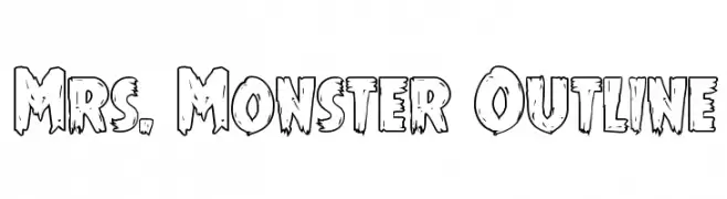
( Fonts by Daniel Zadorozny - www.iconian.com - Free for personal use )
A playful, spooky outline font with jagged edges and a hand-drawn style.
 Scaricare 122 Downloads@WebFont
 -
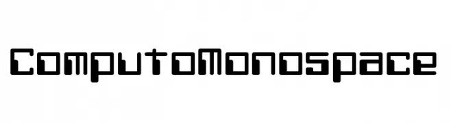
( Fonts by Chequered Ink - chequered.ink - Personal-use only. For commercial use please contact owner. )
A monospaced, futuristic font with geometric, rounded characters.
![Computo Monospace font caratteri gratis]() Scaricare 122 Downloads@WebFont
Scaricare 122 Downloads@WebFont -
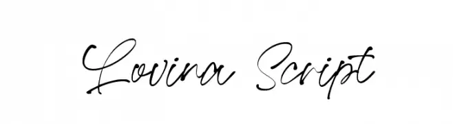
( Fonts by AminMario - Amin Mario - Personal-use only. For commercial use please contact owner. )
A graceful, cursive script font with a natural, handwritten style.
![Lovina Script font caratteri gratis]() Scaricare 122 Downloads@WebFont
Scaricare 122 Downloads@WebFont -
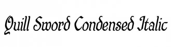
( Fonts by Iconian Fonts )
A dynamic, elegant, and condensed italic font with medium contrast.
![Quill Sword Condensed Italic font caratteri gratis]() Scaricare 122 Downloads@WebFont
Scaricare 122 Downloads@WebFont -
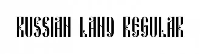
( Fonts by Vladimir Nikolic - Personal-use only. For commercial use please contact owner. )
A bold, decorative font with elongated serifs and intricate detailing.
![Russian Land Regular font caratteri gratis]() Scaricare 122 Downloads@WebFont
Scaricare 122 Downloads@WebFont -
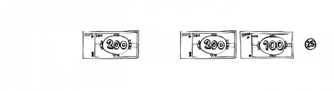
( Fonts by Font Environment - fontenvironment.com )
A decorative font styled like currency symbols and denominations.
![FE-Mo'Money font caratteri gratis]() Scaricare 122 Downloads@WebFont
Scaricare 122 Downloads@WebFont -
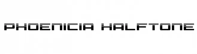
( Fonts by Daniel Zadorozny - www.iconian.com - Free for personal use )
A futuristic halftone font with a bold, digital aesthetic.
![Phoenicia Halftone font caratteri gratis]() Scaricare 122 Downloads@WebFont
Scaricare 122 Downloads@WebFont -
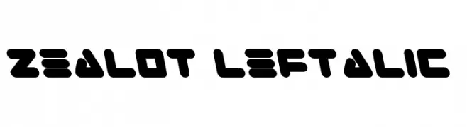
( Fonts by Daniel Zadorozny - www.iconian.com )
A bold, futuristic font with geometric shapes and rounded edges.
![Zealot Leftalic font caratteri gratis]() Scaricare 122 Downloads@WebFont
Scaricare 122 Downloads@WebFont -
( Free for a personal use. For a commercial use please visit www.kevinandamanda.com )
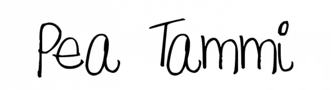
A playful, handwritten font with irregular and organic strokes.
![Pea Tammi font caratteri gratis]() Scaricare 122 Downloads@WebFont
Scaricare 122 Downloads@WebFont -
( Fonts by Manfred Klein. Free for private and charity use. Free for commercial with donation to organizations )
An abstract, artistic design with fractal-like patterns.
![FraktalConPablos font caratteri gratis]() Scaricare 122 Downloads@WebFont
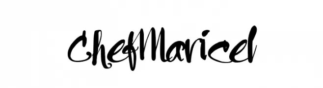
Scaricare 122 Downloads@WebFont -
![Chef Maricel font caratteri gratis]() Scaricare 122 Downloads@WebFont
Scaricare 122 Downloads@WebFont -
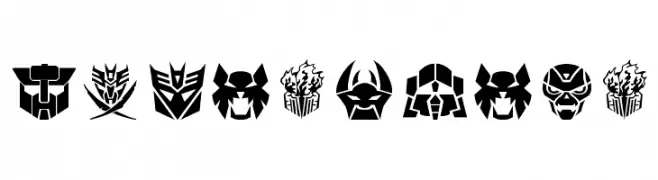
( Fonts by a Neale Davidson - www.pixelsagas.com. Personal-use only. For commercial use please contact owner. )
A collection of futuristic, robotic-themed icons with bold lines and geometric shapes.
![Transdings font caratteri gratis]() Scaricare 122 Downloads@WebFont
Scaricare 122 Downloads@WebFont -
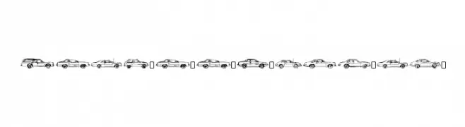
( Fonts by www.typodermicfonts.com - Ray Larabie )
Automotive-themed decorative font with car and truck illustrations.
![OilCrisisB-Regular font caratteri gratis]() Scaricare 122 Downloads@WebFont
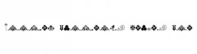
Scaricare 122 Downloads@WebFont -
![Unnamed Ornaments Series One font caratteri gratis]() Scaricare 122 Downloads@WebFont
Scaricare 122 Downloads@WebFont -
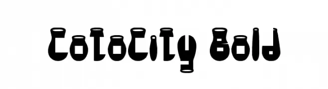
( Free )
A bold, futuristic font with geometric and rounded forms.
![CotoCity Bold font caratteri gratis]() Scaricare 122 Downloads@WebFont
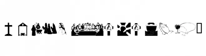
Scaricare 122 Downloads@WebFont -
![wmreligious1 font caratteri gratis]() Scaricare 122 Downloads@WebFont
Scaricare 122 Downloads@WebFont -
( Fonts by DumadiStyle )
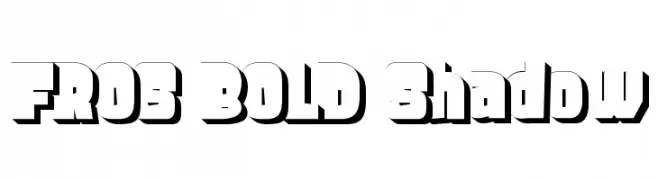
A bold, shadowed font with a strong, three-dimensional look.
![FROS BOLD Shadow font caratteri gratis]() Scaricare 122 Downloads@WebFont
Scaricare 122 Downloads@WebFont -
( Fonts by Geronimo )
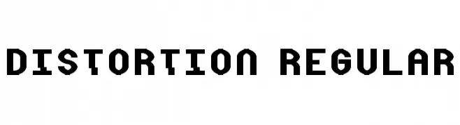
A bold, geometric font with a modern industrial style.
![Distortion Regular font caratteri gratis]() Scaricare 122 Downloads@WebFont
Scaricare 122 Downloads@WebFont -
( Fonts by Zuzulgo Studio - Muhammad Zulfani - Personal-use only. For commercial use please contact owner. )
A modern, geometric sans-serif font with uniform width and clear characters.
![Baginda font caratteri gratis]() Scaricare 121 Downloads@WebFont
Scaricare 121 Downloads@WebFont -
( J0hnnnie - j0hnnie.blogspot.com )
A bold, graffiti-inspired font with a raw, hand-painted look.
![Rough Graffiti font caratteri gratis]() Scaricare 121 Downloads@WebFont
Scaricare 121 Downloads@WebFont -
( Shara Weber - sharasfonts.com )
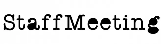
A bold, playful slab serif font with rounded characters and a whimsical style.
![StaffMeeting font caratteri gratis]() Scaricare 121 Downloads@WebFont
Scaricare 121 Downloads@WebFont -
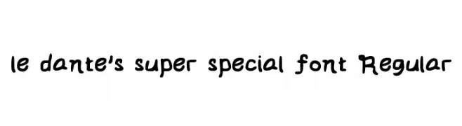
( Fonts by Cavo )
A playful, bold, handwritten-style font with rounded characters.
![le dante's super special font Regular font caratteri gratis]() Scaricare 121 Downloads@WebFont
Scaricare 121 Downloads@WebFont -
![Bork Bork Opposite Oblique font caratteri gratis]() Scaricare 121 Downloads@WebFont
Scaricare 121 Downloads@WebFont -
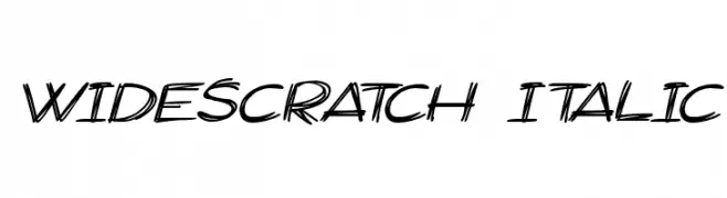
![Widescratch Italic font caratteri gratis]() Scaricare 121 Downloads@WebFont
Scaricare 121 Downloads@WebFont -
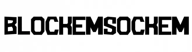
( JibbaJabba Fonts - Jibba Jabba - pages.suddenlink.net/jasonarthur/ )
A bold, geometric font with angular, blocky characters.
![BlockemSockem font caratteri gratis]() Scaricare 121 Downloads@WebFont
Scaricare 121 Downloads@WebFont -
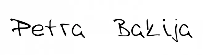
![Petra Bakija font caratteri gratis]() Scaricare 121 Downloads@WebFont
Scaricare 121 Downloads@WebFont -
![Xenik font caratteri gratis]() Scaricare 121 Downloads@WebFont
Scaricare 121 Downloads@WebFont -
( Fonts by Billy Argel Fonts - www.billyargel.com - Personal-use only. For commercial use please contact owner. )
A bold, flowing script font with elegant, cursive letterforms and strong visual impact.
![CHRISTMAS REVUE PERSONAL USE font caratteri gratis]() Scaricare 121 Downloads@WebFont
Scaricare 121 Downloads@WebFont -
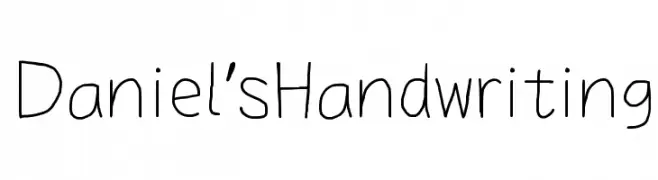
( Fonts by Dan P. Lyons - Personal-use only. For commercial use please contact owner. )
A casual, handwritten font with a personal touch.
![Daniel's Handwriting font caratteri gratis]() Scaricare 121 Downloads@WebFont
Scaricare 121 Downloads@WebFont -
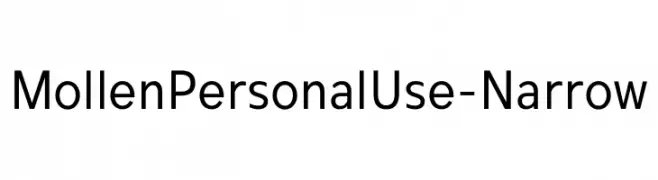
( Fonts by Eko Bimantara - Personal-use only. For commercial use please contact owner. )
A modern, narrow sans-serif font with clean lines and excellent readability.
![MollenPersonalUse-Narrow font caratteri gratis]() Scaricare 121 Downloads@WebFont
Scaricare 121 Downloads@WebFont -
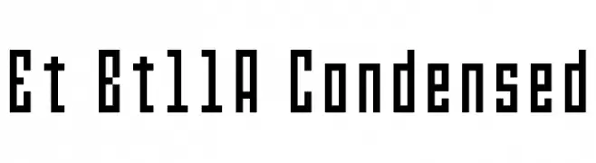
( Electropithecus )
A condensed, monospaced font with a modern, digital aesthetic.
![Et Bt11A Condensed font caratteri gratis]() Scaricare 121 Downloads@WebFont
Scaricare 121 Downloads@WebFont -
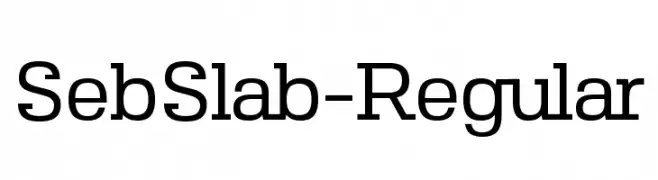
![SebSlab-Regular font caratteri gratis]() Scaricare 121 Downloads@WebFont
Scaricare 121 Downloads@WebFont -
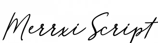
( Fonts by mightype - Personal-use only. For commercial use please contact owner. )
A fluid and graceful script font with a calligraphic style.
![MerrxiScript font caratteri gratis]() Scaricare 121 Downloads@WebFont
Scaricare 121 Downloads@WebFont -
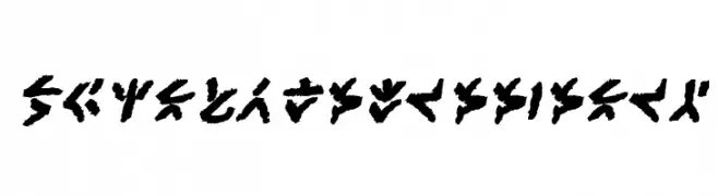
( Fonts by www.blambot.com )
A bold, tribal-inspired font with sharp, angular strokes and a dynamic, hand-drawn appearance.
![XenoTribalBB-Bold font caratteri gratis]() Scaricare 121 Downloads@WebFont
Scaricare 121 Downloads@WebFont -
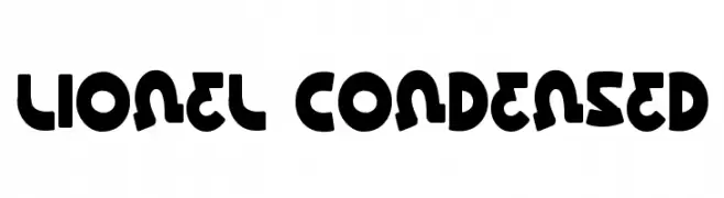
( Fonts by Daniel Zadorozny - www.iconian.com - Free for personal use )
A bold, playful, and condensed font with rounded geometric shapes.
![Lionel Condensed font caratteri gratis]() Scaricare 121 Downloads@WebFont
Scaricare 121 Downloads@WebFont


Quali sono i font più popolari adesso?
Poppins, Roboto, Montserrat, Open Sans e Lato sono molto usati per le forme pulite e l'ampia applicabilità — dall'identità di marca alle landing page e ai poster.
Quali font si usano spesso nei loghi?
Le sans serif geometriche (es. Poppins, famiglie in stile Gotham) sono scelte comuni per un branding pulito e scalabile. Per un tocco personale restano valide script e stili manoscritti. Abbina un display deciso per i titoli a un corpo testo neutro per riconoscibilità ed equilibrio.
Ogni quanto si aggiorna la lista?
Con regolarità, in base ai download e all'attività reale. Torna spesso per scoprire in anticipo le nuove preferite.
💡 Consiglio: aggiungi ai preferiti — le tendenze cambiano in fretta e i font top di oggi possono ispirare il rebranding di domani.