Benvenuto nelle Font Più Popolari — dove popolarità e qualità si incontrano. Qui trovi i font più scaricati e usati dell'anno. Se cerchi scelte sicure per logo, web o social, inizia da qui.
Ogni font top si distingue per equilibrio, leggibilità e versatilità. Troverai sans serif moderne, script eleganti, serif vintage e display minimalisti.
-
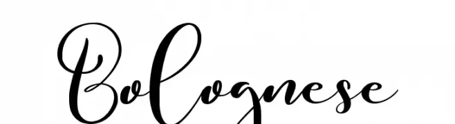
( Fonts by Noftanti Studio - Personal-use only. For commercial use please contact owner. )
An elegant script font with flowing, cursive letters and ornate flourishes.
 Scaricare 120 Downloads@WebFont
 -
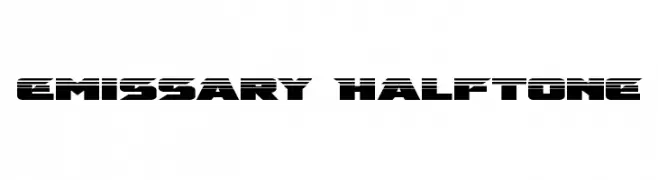
( Fonts by Daniel Zadorozny - www.iconian.com - Free for personal use )
A bold, futuristic font with a halftone effect and geometric design.
![Emissary Halftone font caratteri gratis]() Scaricare 120 Downloads@WebFont
Scaricare 120 Downloads@WebFont -
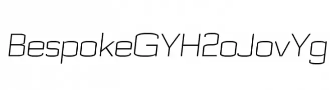
( Quentin9909 )
A sleek, modern font with clean lines and a slightly condensed form.
![Bespoke GYH2oJovYg font caratteri gratis]() Scaricare 120 Downloads@WebFont
Scaricare 120 Downloads@WebFont -
![Vindicator font caratteri gratis]() Scaricare 120 Downloads@WebFont
Scaricare 120 Downloads@WebFont -
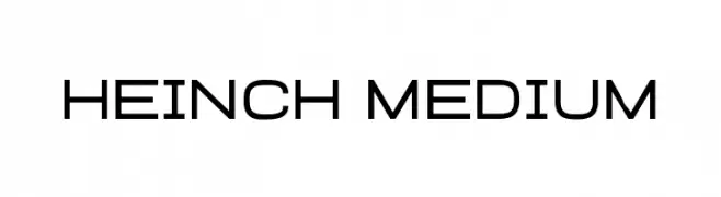
( Fonts by Almarkhatype - Abdul Malik Wisnu - Personal-use only. For commercial use please contact owner. )
A clean, geometric font with a modern and professional appearance.
![Heinch Medium font caratteri gratis]() Scaricare 120 Downloads@WebFont
Scaricare 120 Downloads@WebFont -
( Mushroom font )
A pixelated, retro-style font with a blocky, digital appearance.
![378font font caratteri gratis]() Scaricare 120 Downloads@WebFont
Scaricare 120 Downloads@WebFont -
( Fonts by deFharo - Personal-use only. For commercial use please contact owner. )
A modern, geometric sans-serif font with rounded edges and uniform width.
![lerotica font caratteri gratis]() Scaricare 120 Downloads@WebFont
Scaricare 120 Downloads@WebFont -
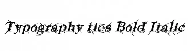
( Fonts by a Typeface Leone - www.tipografialeone.net. Personal-use only. For commercial use please contact owner. )
A bold, italic decorative font with intricate vine-like embellishments.
![Typography ties Bold Italic font caratteri gratis]() Scaricare 120 Downloads@WebFont
Scaricare 120 Downloads@WebFont -
( Fonts by HastaType - Salman Mashudi - Personal-use only. For commercial use please contact owner. )
A playful and elegant script font with a handwritten style.
![Selaras font caratteri gratis]() Scaricare 120 Downloads@WebFont
Scaricare 120 Downloads@WebFont -
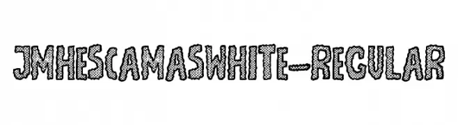
Caratteri di joorgemoron. For commercial use please contact the owner.
( Free for personal use )
A bold, textured font with a fish scale pattern, perfect for decorative use.
![JMHEscamasWhite-Regular font caratteri gratis]() Scaricare 120 Downloads@WebFont
Scaricare 120 Downloads@WebFont -
![GermanySans font caratteri gratis]() Scaricare 120 Downloads@WebFont
Scaricare 120 Downloads@WebFont -
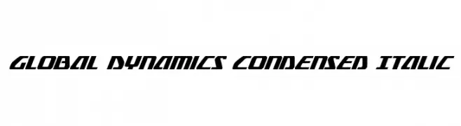
( Fonts by Daniel Zadorozny - www.iconian.com - Free for personal use )
A dynamic, italic, and condensed font with a futuristic style.
![Global Dynamics Condensed Italic font caratteri gratis]() Scaricare 120 Downloads@WebFont
Scaricare 120 Downloads@WebFont -
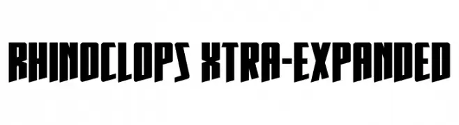
( Fonts by Daniel Zadorozny - www.iconian.com - Personal-use only. For commercial use please contact owner. )
A bold, geometric font with sharp angles and a modern style.
![Rhinoclops Xtra-Expanded font caratteri gratis]() Scaricare 120 Downloads@WebFont
Scaricare 120 Downloads@WebFont -
( Fonts by Geranium Space - Megi Satyo Widodo - Personal-use only. For commercial use please contact owner. )
A dynamic, expressive handwritten font with fluid strokes and a brush-like texture.
![Housky Demo font caratteri gratis]() Scaricare 120 Downloads@WebFont
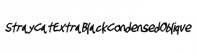
Scaricare 120 Downloads@WebFont -
![Stray Cat ExtraBlack Condensed Oblique font caratteri gratis]() Scaricare 120 Downloads@WebFont
Scaricare 120 Downloads@WebFont -
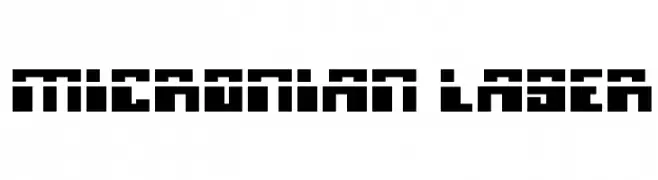
( Fonts by Daniel Zadorozny - www.iconian.com )
A bold, geometric font with a futuristic, digital aesthetic.
![Micronian Laser font caratteri gratis]() Scaricare 120 Downloads@WebFont
Scaricare 120 Downloads@WebFont -
( Måns Grebäck - www.mansgreback.com )
A bold, dynamic script font with a handwritten, elegant style.
![Waiter PERSONAL USE ONLY font caratteri gratis]() Scaricare 120 Downloads@WebFont
Scaricare 120 Downloads@WebFont -
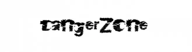
( Fonts by a Max Infeld - XEROGRAPHER FONTS - xerographer.blogspot.com . Personal-use only. For commercial use please contact owner. )
A bold, jagged font with a chaotic, energetic style.
![DangerZone font caratteri gratis]() Scaricare 120 Downloads@WebFont
Scaricare 120 Downloads@WebFont -
( Fonts by Daniel Zadorozny - www.iconian.com - Free for personal use )
A futuristic, italic font with gradient line effects and sharp angles.
![Quark Storm Gradient Italic font caratteri gratis]() Scaricare 120 Downloads@WebFont
Scaricare 120 Downloads@WebFont -
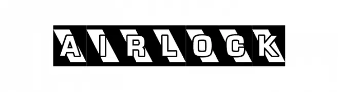
( Anthony Robinson - www.redbubble.com/people/anfa/portfolio )
Bold, geometric font with a 3D shadow effect.
![AIRLOCK font caratteri gratis]() Scaricare 120 Downloads@WebFont
Scaricare 120 Downloads@WebFont -
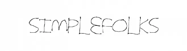
( Fonts by a Max Infeld - XEROGRAPHER FONTS - xerographer.blogspot.com . Personal-use only. For commercial use please contact owner. )
A playful, handwritten font with irregular strokes and a casual style.
![SimpleFolks font caratteri gratis]() Scaricare 120 Downloads@WebFont
Scaricare 120 Downloads@WebFont -
![TruLogik font caratteri gratis]() Scaricare 120 Downloads@WebFont
Scaricare 120 Downloads@WebFont -
( Fonts by Darrell Flood )
A chaotic, ink-splattered font with jagged, energetic characters.
![Nightmare Ink font caratteri gratis]() Scaricare 120 Downloads@WebFont
Scaricare 120 Downloads@WebFont -
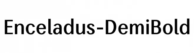
( Fonts by Igor Kosinsky - Personal-use only. For commercial use please contact owner. )
A modern sans-serif font with clean lines and balanced proportions.
![Enceladus-DemiBold font caratteri gratis]() Scaricare 120 Downloads@WebFont
Scaricare 120 Downloads@WebFont -
( Fonts by Subectype & Orenari - Rangga Subekti & Ari - Personal-use only. For commercial use please contact owner. )
A sophisticated cursive font with elegant, flowing strokes.
![highline font caratteri gratis]() Scaricare 120 Downloads@WebFont
Scaricare 120 Downloads@WebFont -
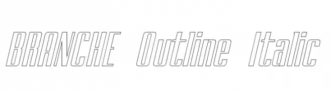
( Typo Bureau Studio - TypoBureau Studio )
A modern, italic outline font with elongated, narrow characters.
![BRANCHE Outline Italic font caratteri gratis]() Scaricare 120 Downloads@WebFont
Scaricare 120 Downloads@WebFont -
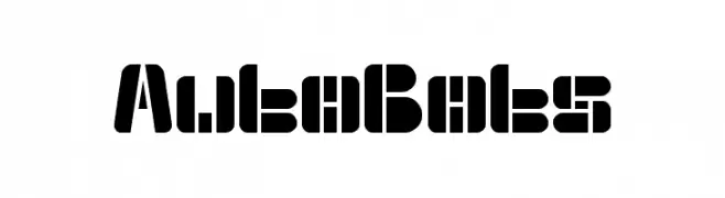
![Auto Bots font caratteri gratis]() Scaricare 120 Downloads@WebFont
Scaricare 120 Downloads@WebFont -
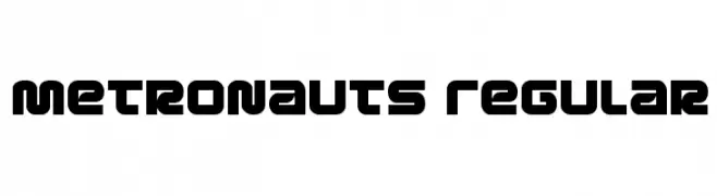
( Fonts by Daniel Zadorozny - www.iconian.com - Free for personal use )
A bold, futuristic font with geometric and modern design elements.
![Metronauts Regular font caratteri gratis]() Scaricare 120 Downloads@WebFont
Scaricare 120 Downloads@WebFont -
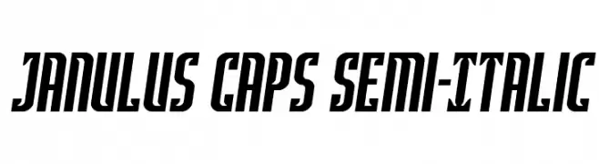
( Fonts by Daniel Zadorozny - www.iconian.com - Personal-use only. For commercial use please contact owner. )
A bold, semi-italic font with a modern, dynamic style.
![Janulus Caps Semi-Italic font caratteri gratis]() Scaricare 120 Downloads@WebFont
Scaricare 120 Downloads@WebFont -
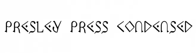
( Fonts by Daniel Zadorozny - www.iconian.com - Free for personal use )
A geometric and angular font with a bold, artistic style.
![Presley Press Condensed font caratteri gratis]() Scaricare 120 Downloads@WebFont
Scaricare 120 Downloads@WebFont -
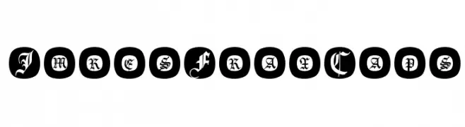
( Fonts by Manfred Klein. Free for private and charity use. Free for commercial with donation to organizations )
A bold blackletter font with ornate Gothic styling and high contrast.
![ImresFraxCaps font caratteri gratis]() Scaricare 120 Downloads@WebFont
Scaricare 120 Downloads@WebFont -
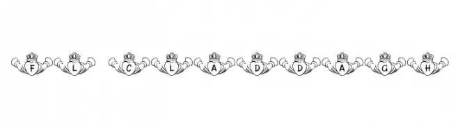
( FontasyLand - www.fontparty.com/designer.php3?dd=195 )
A decorative font featuring letters within a Claddagh symbol design.
![FL Claddagh font caratteri gratis]() Scaricare 120 Downloads@WebFont
Scaricare 120 Downloads@WebFont -
( Fonts by GGBotNet - Personal-use only. For commercial use please contact owner. )
A modern, clean sans-serif font with consistent stroke width and high readability.
![Qaz font caratteri gratis]() Scaricare 120 Downloads@WebFont
Scaricare 120 Downloads@WebFont -
( Fonts by Apostrophic Lab )
The image does not depict a valid font.
![Ovulution I Membrane font caratteri gratis]() Scaricare 120 Downloads@WebFont
Scaricare 120 Downloads@WebFont -
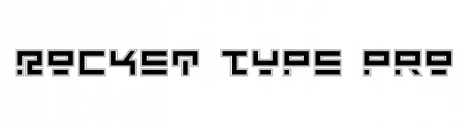
( Fonts by Daniel Zadorozny - www.iconian.com )
A futuristic, geometric font with bold, angular shapes and a digital aesthetic.
![Rocket Type Pro font caratteri gratis]() Scaricare 120 Downloads@WebFont
Scaricare 120 Downloads@WebFont


Quali sono i font più popolari adesso?
Poppins, Roboto, Montserrat, Open Sans e Lato sono molto usati per le forme pulite e l'ampia applicabilità — dall'identità di marca alle landing page e ai poster.
Quali font si usano spesso nei loghi?
Le sans serif geometriche (es. Poppins, famiglie in stile Gotham) sono scelte comuni per un branding pulito e scalabile. Per un tocco personale restano valide script e stili manoscritti. Abbina un display deciso per i titoli a un corpo testo neutro per riconoscibilità ed equilibrio.
Ogni quanto si aggiorna la lista?
Con regolarità, in base ai download e all'attività reale. Torna spesso per scoprire in anticipo le nuove preferite.
💡 Consiglio: aggiungi ai preferiti — le tendenze cambiano in fretta e i font top di oggi possono ispirare il rebranding di domani.