Benvenuto nelle Font Più Popolari — dove popolarità e qualità si incontrano. Qui trovi i font più scaricati e usati dell'anno. Se cerchi scelte sicure per logo, web o social, inizia da qui.
Ogni font top si distingue per equilibrio, leggibilità e versatilità. Troverai sans serif moderne, script eleganti, serif vintage e display minimalisti.
-
( Fonts by ShyFonts )
A bold, condensed, and geometric font with a modern aesthetic.
 Scaricare 639 Downloads@WebFont
 -
( Fonts by Jovanny Lemonad - typetype.ru - Personal-use only. For commercial use please contact owner. )
A modern, bold sans-serif font with clean lines and excellent legibility.
![TTTedsMediumDEMO font caratteri gratis]() Scaricare 639 Downloads@WebFont
Scaricare 639 Downloads@WebFont -
( Copyright 2019 The Gupter Project Authors (https://github.com/octaviopardo/GUPTER) )
A bold serif font with strong strokes and classic serifs.
![Gupter Bold font caratteri gratis]() Scaricare 639 Downloads@WebFont
Scaricare 639 Downloads@WebFont -
( Fonts by www.smeltery.net )
A bold, oblique, monospaced font with a modern and dynamic style.
![Audimat Mono BoldOblique font caratteri gratis]() Scaricare 639 Downloads@WebFont
Scaricare 639 Downloads@WebFont -
( Fonts by Alphabet & Type: Typography & Graphic - Paolo Vannucci - www.alphabetype.it )
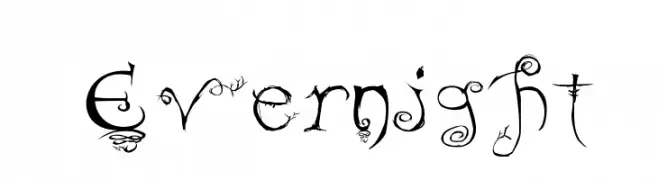
A whimsical, nature-inspired font with vine-like flourishes and an enchanted aesthetic.
![Evernight font caratteri gratis]() Scaricare 639 Downloads@WebFont
Scaricare 639 Downloads@WebFont -
-
( Fonts by Khrys Bosland )
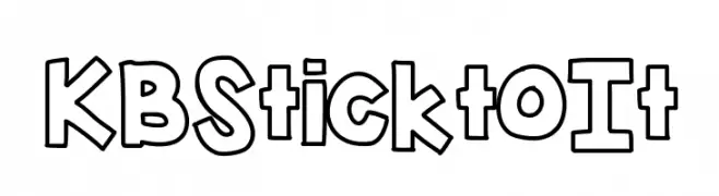
A bold, outlined font with a playful and cartoonish style.
![KBSticktoIt font caratteri gratis]() Scaricare 639 Downloads@WebFont
Scaricare 639 Downloads@WebFont -
![RoboKoz font caratteri gratis]() Scaricare 639 Downloads@WebFont
Scaricare 639 Downloads@WebFont -
( Fonts by Inopatype )
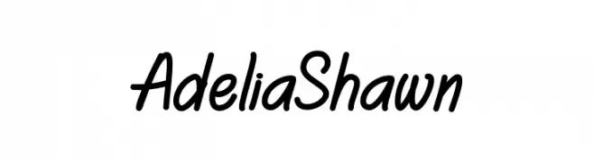
A playful, casual handwritten font with smooth, flowing curves.
![Adelia Shawn font caratteri gratis]() Scaricare 638 Downloads@WebFont
Scaricare 638 Downloads@WebFont -
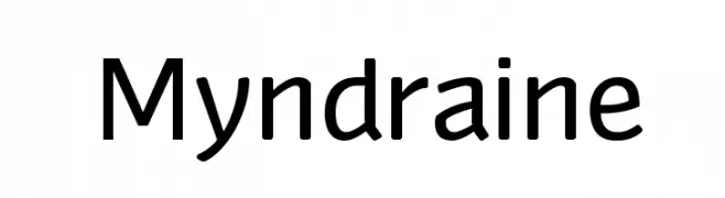
![Myndraine font caratteri gratis]() Scaricare 638 Downloads@WebFont
Scaricare 638 Downloads@WebFont -
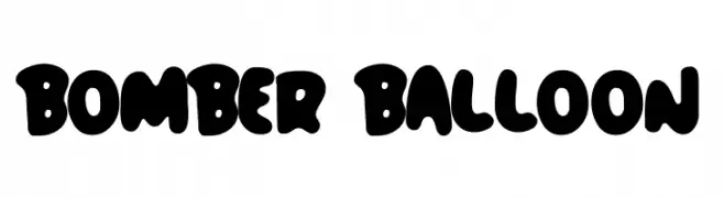
( Fonts by Lettersiro Studio )
A playful, balloon-like font with bold, rounded characters.
![Bomber Balloon font caratteri gratis]() Scaricare 638 Downloads@WebFont
Scaricare 638 Downloads@WebFont
Quali sono i font più popolari adesso?
Poppins, Roboto, Montserrat, Open Sans e Lato sono molto usati per le forme pulite e l'ampia applicabilità — dall'identità di marca alle landing page e ai poster.
Quali font si usano spesso nei loghi?
Le sans serif geometriche (es. Poppins, famiglie in stile Gotham) sono scelte comuni per un branding pulito e scalabile. Per un tocco personale restano valide script e stili manoscritti. Abbina un display deciso per i titoli a un corpo testo neutro per riconoscibilità ed equilibrio.
Ogni quanto si aggiorna la lista?
Con regolarità, in base ai download e all'attività reale. Torna spesso per scoprire in anticipo le nuove preferite.
💡 Consiglio: aggiungi ai preferiti — le tendenze cambiano in fretta e i font top di oggi possono ispirare il rebranding di domani.