Benvenuto nelle Font Più Popolari — dove popolarità e qualità si incontrano. Qui trovi i font più scaricati e usati dell'anno. Se cerchi scelte sicure per logo, web o social, inizia da qui.
Ogni font top si distingue per equilibrio, leggibilità e versatilità. Troverai sans serif moderne, script eleganti, serif vintage e display minimalisti.
-
 Scaricare 637 Downloads@WebFont
 -
( Font by Jonathan Harris - www.tattoowoo.com )
An elegant script font with intricate swashes and high contrast, perfect for luxurious designs.
![Lydia Puente] font caratteri gratis]() Scaricare 637 Downloads@WebFont
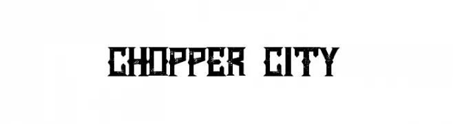
Scaricare 637 Downloads@WebFont -
( Iconian Fonts - Daniel Zadorozny - www.iconian.com )
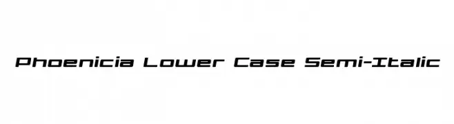
A modern, semi-italic font with geometric precision and balanced spacing.
![Phoenicia Lower Case Semi-Italic font caratteri gratis]() Scaricare 637 Downloads@WebFont
Scaricare 637 Downloads@WebFont -
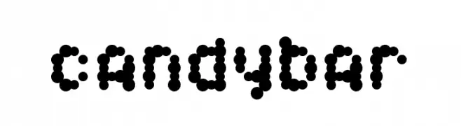
![Candybar font caratteri gratis]() Scaricare 637 Downloads@WebFont
Scaricare 637 Downloads@WebFont -
( Fonts by Daniel Zadorozny - www.iconian.com - Free for personal use )
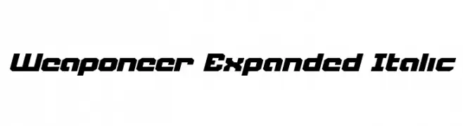
A bold, angular, and italicized font with a futuristic and dynamic style.
![Weaponeer Expanded Italic font caratteri gratis]() Scaricare 636 Downloads@WebFont
Scaricare 636 Downloads@WebFont -
-
( Fonts by Manfred Klein - manfred-klein.ina-mar.com )
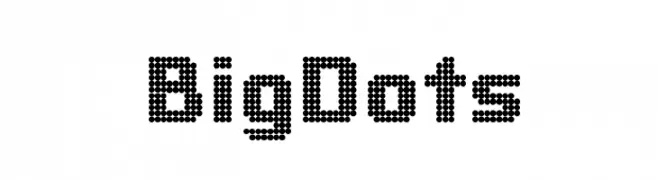
A dot matrix style font with a retro-tech appearance.
![BigDots font caratteri gratis]() Scaricare 636 Downloads@WebFont
Scaricare 636 Downloads@WebFont -
( Fonts by Marty Yawnick - www.typeadesign.com )
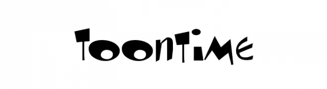
A playful, cartoon-like font with exaggerated, dynamic characters.
![Toontime font caratteri gratis]() Scaricare 636 Downloads@WebFont
Scaricare 636 Downloads@WebFont -
( Fonts by Sam Wang )
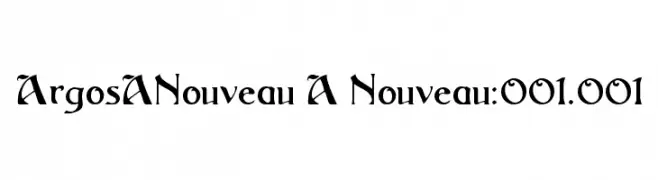
A bold, elegant font with sharp serifs and flowing curves, ideal for creative projects.
![ArgosANouveau A Nouveau:001.001 font caratteri gratis]() Scaricare 636 Downloads@WebFont
Scaricare 636 Downloads@WebFont -
( Fonts by www.peter-wiegel.de. Personal-use only. For commercial use please contact owner. )
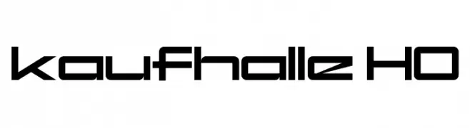
A futuristic, geometric font with bold, clean lines and a modern aesthetic.
![kaufhalle HO font caratteri gratis]() Scaricare 636 Downloads@WebFont
Scaricare 636 Downloads@WebFont -
( Fonts by www.phantompower.de )
A bold, distressed stencil-style font with a rugged, industrial look.
![product font caratteri gratis]() Scaricare 636 Downloads@WebFont
Scaricare 636 Downloads@WebFont
![Lydia Puente] font caratteri gratis](https://d144mzi0q5mijx.cloudfront.net/img/L/Y/Lydia-Puente.webp)

Quali sono i font più popolari adesso?
Poppins, Roboto, Montserrat, Open Sans e Lato sono molto usati per le forme pulite e l'ampia applicabilità — dall'identità di marca alle landing page e ai poster.
Quali font si usano spesso nei loghi?
Le sans serif geometriche (es. Poppins, famiglie in stile Gotham) sono scelte comuni per un branding pulito e scalabile. Per un tocco personale restano valide script e stili manoscritti. Abbina un display deciso per i titoli a un corpo testo neutro per riconoscibilità ed equilibrio.
Ogni quanto si aggiorna la lista?
Con regolarità, in base ai download e all'attività reale. Torna spesso per scoprire in anticipo le nuove preferite.
💡 Consiglio: aggiungi ai preferiti — le tendenze cambiano in fretta e i font top di oggi possono ispirare il rebranding di domani.