Benvenuto nelle Font Più Popolari — dove popolarità e qualità si incontrano. Qui trovi i font più scaricati e usati dell'anno. Se cerchi scelte sicure per logo, web o social, inizia da qui.
Ogni font top si distingue per equilibrio, leggibilità e versatilità. Troverai sans serif moderne, script eleganti, serif vintage e display minimalisti.
-
 Scaricare 2068 Downloads@WebFont
 -
( Fonts by Alex Slobzheninov - Personal-use only. For commercial use please contact owner. )
A clean, modern sans-serif font with a light weight and minimalist design.
![Objectivity-Light font caratteri gratis]() Scaricare 2067 Downloads@WebFont
Scaricare 2067 Downloads@WebFont -
( KyooshiFonts )
A modern, geometric sans-serif font with clean lines and uniform strokes.
![Kyooshi Gothic font caratteri gratis]() Scaricare 2067 Downloads@WebFont
Scaricare 2067 Downloads@WebFont -
![Organo font caratteri gratis]() Scaricare 2067 Downloads@WebFont
Scaricare 2067 Downloads@WebFont -
![Basingstoke font caratteri gratis]() Scaricare 2067 Downloads@WebFont
Scaricare 2067 Downloads@WebFont -
-
( Fonts by a Max Infeld - XEROGRAPHER FONTS - xerographer.blogspot.com . Personal-use only. For commercial use please contact owner. )
A bold, industrial-style font with a diamond plate texture.
![DiamondPlate font caratteri gratis]() Scaricare 2067 Downloads@WebFont
Scaricare 2067 Downloads@WebFont -
( Copyright (c) 2011, Cyreal (www.cyreal.org) )
A classic serif font with elegant strokes and balanced proportions.
![Junge font caratteri gratis]() Scaricare 2067 Downloads@WebFont
Scaricare 2067 Downloads@WebFont -
( Fonts by Mans Greback - www.mawns.com )
A playful, bold font with a bubbly, cartoonish style and thick, rounded strokes.
![Gretoon font caratteri gratis]() Scaricare 2067 Downloads@WebFont
Scaricare 2067 Downloads@WebFont -
( Fonts by Dan P. Lyons - Personal-use only. For commercial use please contact owner. )
A bold, playful font with a hand-drawn, dynamic style.
![Inside Out font caratteri gratis]() Scaricare 2066 Downloads@WebFont
Scaricare 2066 Downloads@WebFont -
( Fonts by Castcraft Software - OPTI Fonts Archive - opti.netii.net - Personal-use only. For commercial use please contact owner. )
A classic serif font with high contrast and elegant strokes.
![OPTIPapong font caratteri gratis]() Scaricare 2066 Downloads@WebFont
Scaricare 2066 Downloads@WebFont -
( Copyright (c) 2012 Silicon Andhra (fonts.siliconandhra.org). )
A modern sans-serif font with clean lines and uniform stroke widths.
![Gurajada font caratteri gratis]() Scaricare 2066 Downloads@WebFont
Scaricare 2066 Downloads@WebFont -
![Tribune Regular font caratteri gratis]() Scaricare 2066 Downloads@WebFont
Scaricare 2066 Downloads@WebFont -
Caratteri di spideraysfonts. For commercial use please contact the owner.
![The Mighty Avengers font caratteri gratis]() Scaricare 2066 Downloads@WebFont
Scaricare 2066 Downloads@WebFont -
![Sorts Mill Goudy font caratteri gratis]() Scaricare 2066 Downloads@WebFont
Scaricare 2066 Downloads@WebFont -
( Fonts by Apostrophic Lab )
A modern, thin font with elongated characters and a sleek design.
![Zillah Modern Thin font caratteri gratis]() Scaricare 2066 Downloads@WebFont
Scaricare 2066 Downloads@WebFont -
( Fonts by Muhammad Sirojuddin - lettersiro.com - Personal-use only. For commercial use please contact owner. )
A jagged, edgy font with sharp, thorn-like characters.
![Heartless font caratteri gratis]() Scaricare 2065 Downloads@WebFont
Scaricare 2065 Downloads@WebFont -
![Troika font caratteri gratis]() Scaricare 2065 Downloads@WebFont
Scaricare 2065 Downloads@WebFont -
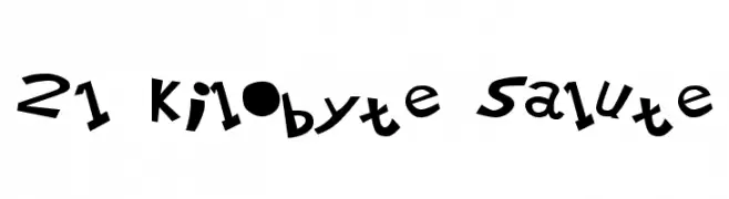
![21 Kilobyte Salute font caratteri gratis]() Scaricare 2065 Downloads
Scaricare 2065 Downloads -
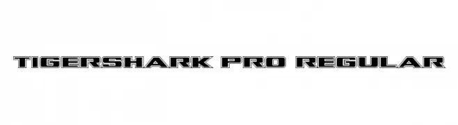
( Fonts by Daniel Zadorozny - www.iconian.com - Free for personal use )
A bold, outlined font with a dynamic, three-dimensional effect.
![Tigershark Pro Regular font caratteri gratis]() Scaricare 2064 Downloads@WebFont
Scaricare 2064 Downloads@WebFont -
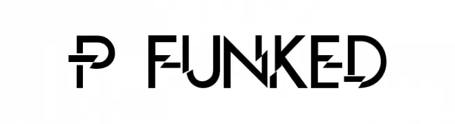
![P Funked font caratteri gratis]() Scaricare 2064 Downloads@WebFont
Scaricare 2064 Downloads@WebFont -
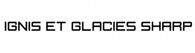
( Fonts by Zdenek Gromnica - www.futuremillennium.com )
A modern, geometric font with sharp edges and consistent spacing.
![Ignis et Glacies Sharp font caratteri gratis]() Scaricare 2064 Downloads@WebFont
Scaricare 2064 Downloads@WebFont -
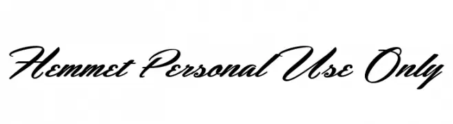
![Hemmet Personal Use Only font caratteri gratis]() Scaricare 2063 Downloads@WebFont
Scaricare 2063 Downloads@WebFont -
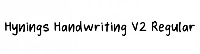
( Fonts by Syaf Rizal - Khurasan - Personal-use only. For commercial use please contact owner. )
A playful, casual handwritten font with smooth, rounded letterforms.
![Hynings Handwriting V2 Regular font caratteri gratis]() Scaricare 2062 Downloads@WebFont
Scaricare 2062 Downloads@WebFont -
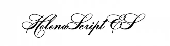
![HelenaScript ES font caratteri gratis]() Scaricare 2062 Downloads@WebFont
Scaricare 2062 Downloads@WebFont -
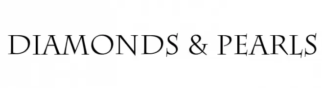
![Diamonds & Pearls font caratteri gratis]() Scaricare 2062 Downloads@WebFont
Scaricare 2062 Downloads@WebFont -
( Fonts by Lemonthe - Dwi Ahidian - Personal-use only. For commercial use please contact owner. )
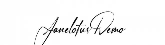
An elegant and sophisticated script font with flowing, interconnected letterforms.
![Janelotus-Demo font caratteri gratis]() Scaricare 2061 Downloads@WebFont
Scaricare 2061 Downloads@WebFont -
( Fonts by Mooniak - Personal-use only. For commercial use please contact owner. )
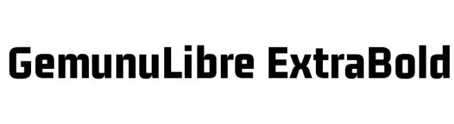
A bold, modern sans-serif font with clean lines and a strong presence.
![GemunuLibre ExtraBold font caratteri gratis]() Scaricare 2061 Downloads@WebFont
Scaricare 2061 Downloads@WebFont -
( Dietrich Kerner )
A bold, geometric font with a modern, industrial aesthetic.
![Marty font caratteri gratis]() Scaricare 2061 Downloads@WebFont
Scaricare 2061 Downloads@WebFont -
![Circo font caratteri gratis]() Scaricare 2061 Downloads@WebFont
Scaricare 2061 Downloads@WebFont -
( Fonts by a The Branded Quotes - https://sellfy.com/thebrandedquotes. Personal-use only. For commercial use please contact owner. )
A bold, playful font with a hand-drawn, rounded style.
![Mild Life Regular font caratteri gratis]() Scaricare 2061 Downloads@WebFont
Scaricare 2061 Downloads@WebFont -
( Copyright (c) 2013, Juan Pablo del Peral (juan@huertatipografica.com.ar), with Reserved Font Names )
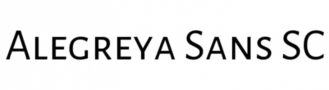
A modern sans-serif font with clean lines and excellent readability.
![Alegreya Sans SC font caratteri gratis]() Scaricare 2061 Downloads@WebFont
Scaricare 2061 Downloads@WebFont -
( Fonts by a Neale Davidson - www.pixelsagas.com. Personal-use only. For commercial use please contact owner. )
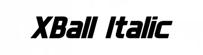
A bold, italic font with a dynamic and modern style.
![XBall Italic font caratteri gratis]() Scaricare 2061 Downloads@WebFont
Scaricare 2061 Downloads@WebFont -
![American Purpose Casual 01 font caratteri gratis]() Scaricare 2061 Downloads@WebFont
Scaricare 2061 Downloads@WebFont -
( Fonts by Manfred Klein. Free for private and charity use. Free for commercial with donation to organizations )
A bold, modern sans-serif font with a clean and impactful style.
![KleinsSansCondBold font caratteri gratis]() Scaricare 2061 Downloads@WebFont
Scaricare 2061 Downloads@WebFont -
( Roger White - web.archive.org/web/20120416090521/www.rogersfonts.org.uk/ )
A sleek, modern font with a dynamic slant and bold, condensed characters.
![Tamworth Gothic font caratteri gratis]() Scaricare 2060 Downloads@WebFont
Scaricare 2060 Downloads@WebFont


Quali sono i font più popolari adesso?
Poppins, Roboto, Montserrat, Open Sans e Lato sono molto usati per le forme pulite e l'ampia applicabilità — dall'identità di marca alle landing page e ai poster.
Quali font si usano spesso nei loghi?
Le sans serif geometriche (es. Poppins, famiglie in stile Gotham) sono scelte comuni per un branding pulito e scalabile. Per un tocco personale restano valide script e stili manoscritti. Abbina un display deciso per i titoli a un corpo testo neutro per riconoscibilità ed equilibrio.
Ogni quanto si aggiorna la lista?
Con regolarità, in base ai download e all'attività reale. Torna spesso per scoprire in anticipo le nuove preferite.
💡 Consiglio: aggiungi ai preferiti — le tendenze cambiano in fretta e i font top di oggi possono ispirare il rebranding di domani.