Benvenuto nelle Font Più Popolari — dove popolarità e qualità si incontrano. Qui trovi i font più scaricati e usati dell'anno. Se cerchi scelte sicure per logo, web o social, inizia da qui.
Ogni font top si distingue per equilibrio, leggibilità e versatilità. Troverai sans serif moderne, script eleganti, serif vintage e display minimalisti.
-
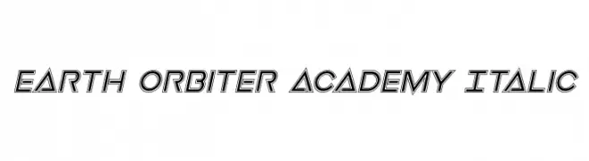
( Fonts by Daniel Zadorozny - www.iconian.com - Personal-use only. For commercial use please contact owner. )
A bold, italic, futuristic font with geometric outlines and a dynamic style.
 Scaricare 117 Downloads@WebFont
 -
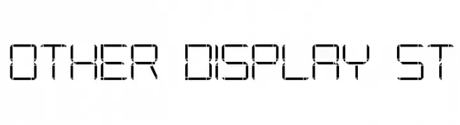
( www.southype.com )
A futuristic, segmented font with a digital, tech-inspired design.
![Other Display St font caratteri gratis]() Scaricare 117 Downloads@WebFont
Scaricare 117 Downloads@WebFont -
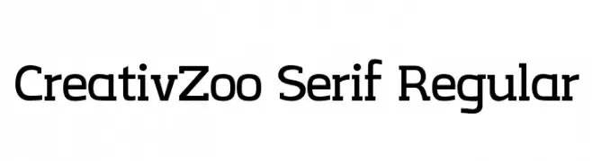
( Fonts by Steve Gardner - www.explogos.com. Personal-use only. For commercial use please contact owner. )
A modern serif typeface with clean lines and balanced proportions.
![CreativZoo Serif Regular font caratteri gratis]() Scaricare 117 Downloads@WebFont
Scaricare 117 Downloads@WebFont -
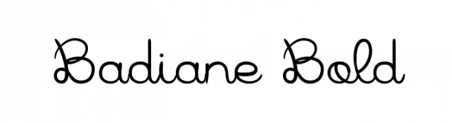
( Fonts by Greg Medina - www.dcoxy.com - Personal-use only. For commercial use please contact owner. )
An elegant, whimsical script font with decorative curls and loops.
![Badiane Bold font caratteri gratis]() Scaricare 117 Downloads@WebFont
Scaricare 117 Downloads@WebFont -
( Fonts by Kurnia Setyadi - Personal-use only. For commercial use please contact owner. )
A playful, bold font with rounded, thick strokes and a friendly appearance.
![Hello Avocado font caratteri gratis]() Scaricare 117 Downloads@WebFont
Scaricare 117 Downloads@WebFont -
( Fonts by Neoqueto - Personal-use only. For commercial use please contact owner. )
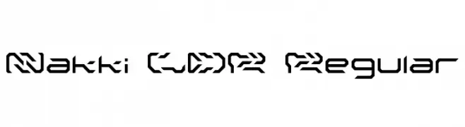
A futuristic, geometric font with sharp angles and bold styling.
![Nakki LDR Regular font caratteri gratis]() Scaricare 117 Downloads@WebFont
Scaricare 117 Downloads@WebFont -
( Fonts by Font Environment - fontenvironment.com )
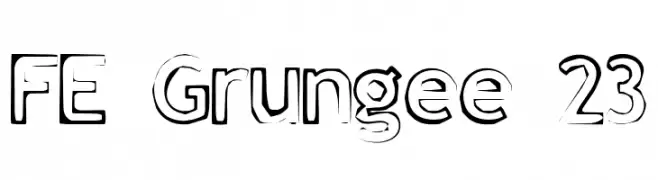
A bold, distressed font with a grunge aesthetic and textured appearance.
![FE Grungee 23 font caratteri gratis]() Scaricare 117 Downloads@WebFont
Scaricare 117 Downloads@WebFont -
( Fonts by Daniel Zadorozny - www.iconian.com )
A bold, jagged, and dripping font perfect for horror themes.
![Zombie Control Condensed Italic font caratteri gratis]() Scaricare 117 Downloads@WebFont
Scaricare 117 Downloads@WebFont -
( Iconian Fonts - Daniel Zadorozny - www.iconian.com )
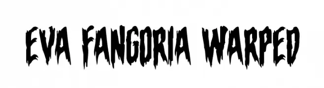
A bold, jagged font with a horror-inspired, dripping effect.
![Eva Fangoria Warped font caratteri gratis]() Scaricare 117 Downloads@WebFont
Scaricare 117 Downloads@WebFont -
( Fonts by Nick Curtis - Personal-use only. For commercial use please contact owner. )
A modern, ultra-condensed font with elongated, sleek characters.
![DaddyLonglegsNF font caratteri gratis]() Scaricare 117 Downloads@WebFont
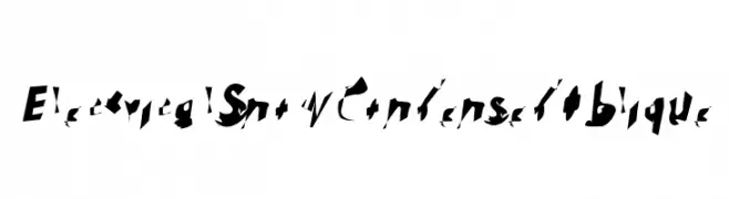
Scaricare 117 Downloads@WebFont -
![Electrical Snow Condensed Oblique font caratteri gratis]() Scaricare 117 Downloads@WebFont
Scaricare 117 Downloads@WebFont -
( Fonts by Manfred Klein. Free for private and charity use. Free for commercial with donation to organizations )
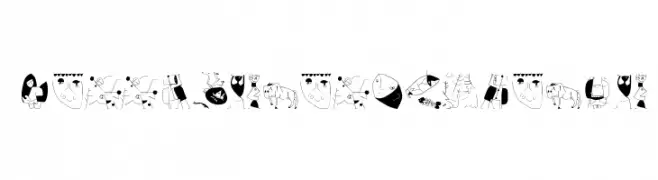
An artistic and abstract font with unique illustrations for each character.
![KleerikaleConBlack font caratteri gratis]() Scaricare 117 Downloads@WebFont
Scaricare 117 Downloads@WebFont -
( Fonts by Typetemp Studio - Personal-use only. For commercial use please contact owner. )
A dynamic, fluid handwritten font with smooth, flowing curves.
![Black Rotela Free Personal Reg font caratteri gratis]() Scaricare 117 Downloads@WebFont
Scaricare 117 Downloads@WebFont -
( Iconian Fonts - Daniel Zadorozny - www.iconian.com )
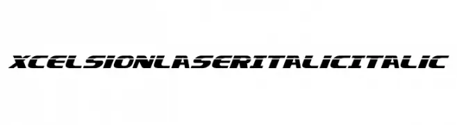
A bold, italicized font with a futuristic and dynamic style.
![Xcelsion Laser Italic Italic font caratteri gratis]() Scaricare 117 Downloads@WebFont
Scaricare 117 Downloads@WebFont -
( Fonts by www.dcoxy.com )
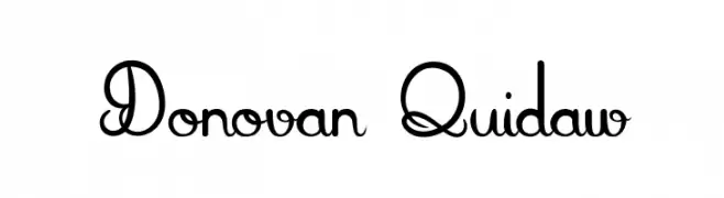
A whimsical and decorative font with intricate loops and flourishes.
![Donovan Quidaw font caratteri gratis]() Scaricare 117 Downloads@WebFont
Scaricare 117 Downloads@WebFont -
( Fonts by Mike Abbink, Paul van der Laan, Pieter van Rosmalen - Personal-use only. For commercial use please contact owner. )
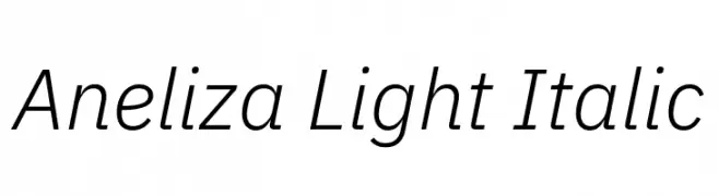
A sleek, light, and italic sans-serif font with a modern aesthetic.
![Aneliza Light Italic font caratteri gratis]() Scaricare 117 Downloads@WebFont
Scaricare 117 Downloads@WebFont -
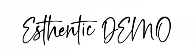
( Fonts by vilogsign - Nur Kholis - Personal-use only. For commercial use please contact owner. )
A lively handwritten font with fluid and dynamic strokes.
![Esthentic DEMO font caratteri gratis]() Scaricare 117 Downloads@WebFont
Scaricare 117 Downloads@WebFont -
( Barbara De Maio - bardm.tumblr.com/ )
A decorative, distressed font with a grunge-like, edgy appearance.
![X-éntrica font caratteri gratis]() Scaricare 117 Downloads@WebFont
Scaricare 117 Downloads@WebFont -
( aldedesign - Alde Saputro - creativemarket.com/aldedesign?u=aldedesign )
A graceful and flowing script font with elegant curves and loops.
![Annisa font caratteri gratis]() Scaricare 117 Downloads@WebFont
Scaricare 117 Downloads@WebFont -
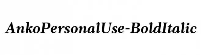
( Fonts by Eko Bimantara - Personal-use only. For commercial use please contact owner. )
A bold, italic serif font with elegant curves and strong strokes.
![AnkoPersonalUse-BoldItalic font caratteri gratis]() Scaricare 117 Downloads@WebFont
Scaricare 117 Downloads@WebFont -
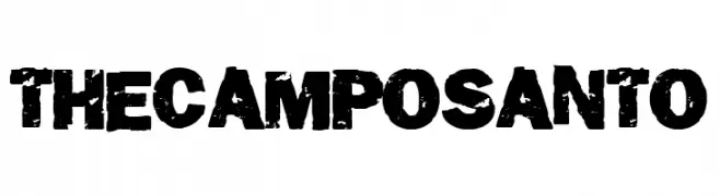
( Fonts by Woodcutter )
A bold, distressed font with a grunge, vintage style and textured appearance.
![The Camposanto font caratteri gratis]() Scaricare 117 Downloads@WebFont
Scaricare 117 Downloads@WebFont -
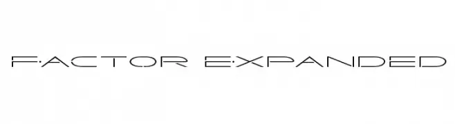
( Fonts by Iconian Fonts )
A futuristic, geometric font with clean lines and unique cut-out elements.
![Factor Expanded font caratteri gratis]() Scaricare 117 Downloads@WebFont
Scaricare 117 Downloads@WebFont -
( Elaine Biss - babstype.com )
A whimsical and ornate font with decorative swirls and curls.
![elaine font caratteri gratis]() Scaricare 117 Downloads@WebFont
Scaricare 117 Downloads@WebFont -
( Fonts by Hanzel Space )
Elegant handwritten script font.
![Rellington font caratteri gratis]() Scaricare 117 Downloads@WebFont
Scaricare 117 Downloads@WebFont -
( Font-a-licious - www.fontalicious.com/ )
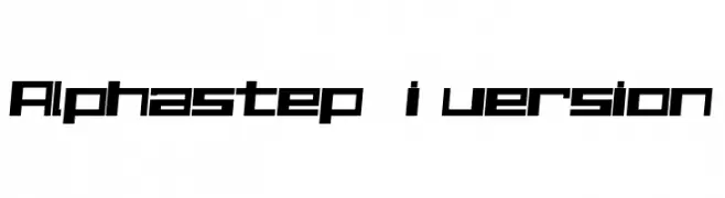
A bold, geometric font with a futuristic and digital aesthetic.
![Alphastep i version font caratteri gratis]() Scaricare 117 Downloads@WebFont
Scaricare 117 Downloads@WebFont -
( Fonts by madeDeduk )
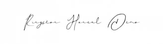
A graceful, handwritten script font with elegant curves and fluid lines.
![Ringston Haneul Demo font caratteri gratis]() Scaricare 117 Downloads@WebFont
Scaricare 117 Downloads@WebFont -
( Fonts by Tshepo Mosoeu - https://www.behance.net/thecyantist Personal-use only. For commercial use please contact owner. )
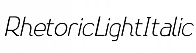
A sleek, modern, light italic font with medium contrast and elegant slant.
![Rhetoric Light Italic font caratteri gratis]() Scaricare 117 Downloads@WebFont
Scaricare 117 Downloads@WebFont -
![SuperFont font caratteri gratis]() Scaricare 117 Downloads@WebFont
Scaricare 117 Downloads@WebFont -
( Fonts by Din Studio - Donis Miftahudin - Personal-use only. For commercial use please contact owner. )
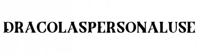
A bold, gothic-inspired font with sharp serifs and dramatic flair.
![Dracolas Personal Use font caratteri gratis]() Scaricare 117 Downloads@WebFont
Scaricare 117 Downloads@WebFont -
( Fonts by Multype Studio )
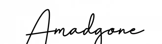
Elegant cursive script with a handwritten feel.
![Amadgone font caratteri gratis]() Scaricare 117 Downloads@WebFont
Scaricare 117 Downloads@WebFont -
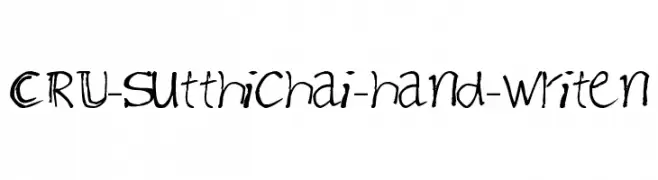
![CRU-Sutthichai-hand-writen font caratteri gratis]() Scaricare 117 Downloads@WebFont
Scaricare 117 Downloads@WebFont -
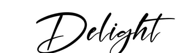
( Fonts by Perspectype Studio - Personal-use only. For commercial use please contact owner. )
A dynamic and fluid script font with elegant, flowing letterforms.
![Delight font caratteri gratis]() Scaricare 117 Downloads@WebFont
Scaricare 117 Downloads@WebFont -
( Fonts by Typhoon Type - Suthi Srisopha - Personal-use only. For commercial use please contact owner. )
An ornate, decorative font with a festive, calligraphic style.
![Best Christmas - Personal Use font caratteri gratis]() Scaricare 117 Downloads@WebFont
Scaricare 117 Downloads@WebFont -
( Fonts by Andi Moz )
A decorative font with star-like embellishments and thin lines.
![Vector Line font caratteri gratis]() Scaricare 117 Downloads@WebFont
Scaricare 117 Downloads@WebFont -
( Matias Romero - matiasromero.deviantart.com/ )
A bold, modern font with geometric elements and strong visual impact.
![Arcoverde font caratteri gratis]() Scaricare 117 Downloads@WebFont
Scaricare 117 Downloads@WebFont


Quali sono i font più popolari adesso?
Poppins, Roboto, Montserrat, Open Sans e Lato sono molto usati per le forme pulite e l'ampia applicabilità — dall'identità di marca alle landing page e ai poster.
Quali font si usano spesso nei loghi?
Le sans serif geometriche (es. Poppins, famiglie in stile Gotham) sono scelte comuni per un branding pulito e scalabile. Per un tocco personale restano valide script e stili manoscritti. Abbina un display deciso per i titoli a un corpo testo neutro per riconoscibilità ed equilibrio.
Ogni quanto si aggiorna la lista?
Con regolarità, in base ai download e all'attività reale. Torna spesso per scoprire in anticipo le nuove preferite.
💡 Consiglio: aggiungi ai preferiti — le tendenze cambiano in fretta e i font top di oggi possono ispirare il rebranding di domani.