Benvenuto nelle Font Più Popolari — dove popolarità e qualità si incontrano. Qui trovi i font più scaricati e usati dell'anno. Se cerchi scelte sicure per logo, web o social, inizia da qui.
Ogni font top si distingue per equilibrio, leggibilità e versatilità. Troverai sans serif moderne, script eleganti, serif vintage e display minimalisti.
-
( Fonts by www.peter-wiegel.de. Personal-use only. For commercial use please contact owner. )
A sleek, modern font with thin lines and geometric shapes.
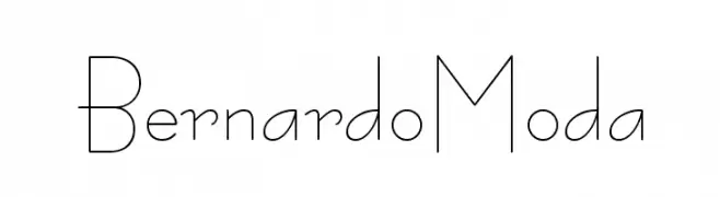 Scaricare 633 Downloads@WebFont
 -
( Fonts by Peter Van Lancker - petervanlancker.me - Personal-use only. For commercial use please contact owner. )
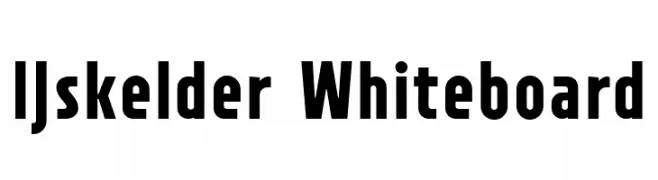
A bold, block-like font with strong, clean lines and minimal embellishment.
![IJskelder Whiteboard font caratteri gratis]() Scaricare 632 Downloads@WebFont
Scaricare 632 Downloads@WebFont -
( Fonts by zoe fonts - www.comiczeichnerin.de - free for non-commercial and commercial purposes. )
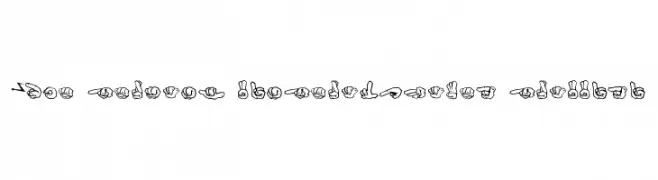
A graffiti-style font using hand gestures to represent letters and numbers.
![ZOE GERMANY Fingeralphabet Graffiti font caratteri gratis]() Scaricare 632 Downloads@WebFont
Scaricare 632 Downloads@WebFont -
( Fonts by a Max Infeld - XEROGRAPHER FONTS - xerographer.blogspot.com . Personal-use only. For commercial use please contact owner. )
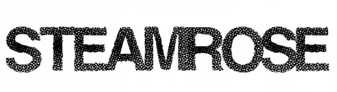
A bold, textured font with a stippled, dotted appearance ideal for creative projects.
![SteamRose font caratteri gratis]() Scaricare 632 Downloads@WebFont
Scaricare 632 Downloads@WebFont -
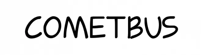
![Cometbus font caratteri gratis]() Scaricare 632 Downloads@WebFont
Scaricare 632 Downloads@WebFont -
-
( Faqih Fawaji )
A modern, thin-stroked font with a clean and elegant design.
![Solo font caratteri gratis]() Scaricare 632 Downloads@WebFont
Scaricare 632 Downloads@WebFont -
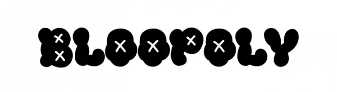
( Fonts by Khurasan )
A playful, bold font with bubble-like characters and unique cross patterns.
![Bloopoly font caratteri gratis]() Scaricare 632 Downloads@WebFont
Scaricare 632 Downloads@WebFont -
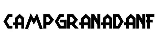
( Fonts by Nick Curtis - www.nicksfonts.com )
A bold, geometric font with a retro yet modern aesthetic.
![CampGranadaNF font caratteri gratis]() Scaricare 632 Downloads@WebFont
Scaricare 632 Downloads@WebFont -
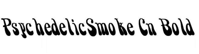
![PsychedelicSmoke Cn Bold font caratteri gratis]() Scaricare 632 Downloads@WebFont
Scaricare 632 Downloads@WebFont -
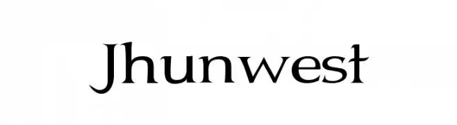
( Fonts by Graham Meade - GemFonts )
A classic serif font with elegant lines and high contrast, perfect for sophisticated designs.
![Jhunwest font caratteri gratis]() Scaricare 632 Downloads@WebFont
Scaricare 632 Downloads@WebFont

Quali sono i font più popolari adesso?
Poppins, Roboto, Montserrat, Open Sans e Lato sono molto usati per le forme pulite e l'ampia applicabilità — dall'identità di marca alle landing page e ai poster.
Quali font si usano spesso nei loghi?
Le sans serif geometriche (es. Poppins, famiglie in stile Gotham) sono scelte comuni per un branding pulito e scalabile. Per un tocco personale restano valide script e stili manoscritti. Abbina un display deciso per i titoli a un corpo testo neutro per riconoscibilità ed equilibrio.
Ogni quanto si aggiorna la lista?
Con regolarità, in base ai download e all'attività reale. Torna spesso per scoprire in anticipo le nuove preferite.
💡 Consiglio: aggiungi ai preferiti — le tendenze cambiano in fretta e i font top di oggi possono ispirare il rebranding di domani.