Benvenuto nelle Font Più Popolari — dove popolarità e qualità si incontrano. Qui trovi i font più scaricati e usati dell'anno. Se cerchi scelte sicure per logo, web o social, inizia da qui.
Ogni font top si distingue per equilibrio, leggibilità e versatilità. Troverai sans serif moderne, script eleganti, serif vintage e display minimalisti.
-
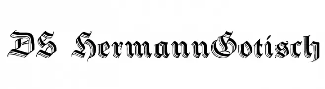
( Fonts by Typographer Mediengestaltung - Personal-use only. For commercial use please contact owner. )
A bold, gothic blackletter font with intricate, angular designs.
 Scaricare 113 Downloads@WebFont
 -
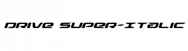
( Fonts by Iconian Fonts - Daniel Zadorozny - Personal-use only. For commercial use please contact owner. )
A bold, futuristic italic font with sharp, angular lines and a dynamic style.
![Drive Super-Italic font caratteri gratis]() Scaricare 113 Downloads@WebFont
Scaricare 113 Downloads@WebFont -
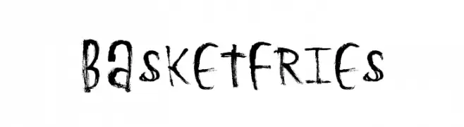
( Xerographer Fonts - Max Infeld - xerographer.blogspot.com )
A bold, hand-drawn font with a textured, brush-like appearance.
![BasketFries font caratteri gratis]() Scaricare 113 Downloads@WebFont
Scaricare 113 Downloads@WebFont -
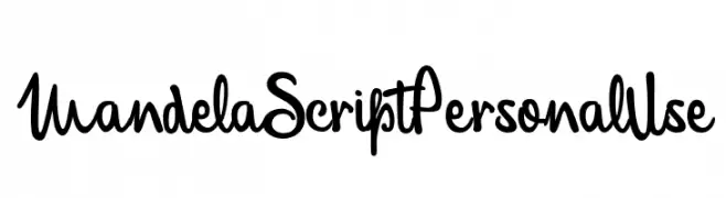
( Fonts by Billy Argel - Personal-use only. For commercial use please contact owner. )
A dynamic and expressive handwritten script font with smooth, flowing strokes.
![MandelaScriptPersonalUse font caratteri gratis]() Scaricare 113 Downloads@WebFont
Scaricare 113 Downloads@WebFont -
( Fonts by Billy Argel Fonts - www.billyargel.com - Personal-use only. For commercial use please contact owner. )
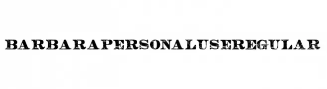
A bold, distressed font with a vintage, rugged appearance.
![BARBARA PERSONAL USE Regular font caratteri gratis]() Scaricare 113 Downloads@WebFont
Scaricare 113 Downloads@WebFont -
( Fonts by Manfred Klein. Free for private and charity use. Free for commercial with donation to organizations )
Abstract symbol font with organic and geometric shapes in square icons.
![OtherShapes font caratteri gratis]() Scaricare 113 Downloads@WebFont
Scaricare 113 Downloads@WebFont -
( Fonts by Vladimir Nikolic )
A geometric, hollow font with a bold and modern design.
![Bathroom Hollow Regular font caratteri gratis]() Scaricare 113 Downloads@WebFont
Scaricare 113 Downloads@WebFont -
( Fonts by Daniel Zadorozny - www.iconian.com )
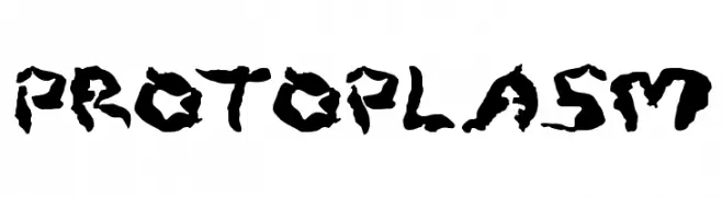
A bold, textured font with an organic, abstract design.
![Protoplasm font caratteri gratis]() Scaricare 113 Downloads@WebFont
Scaricare 113 Downloads@WebFont -
( Fonts by Manfred Klein. Free for private and charity use. Free for commercial with donation to organizations )
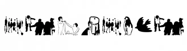
A pictographic font with diverse black and white illustrations.
![MrVector font caratteri gratis]() Scaricare 113 Downloads@WebFont
Scaricare 113 Downloads@WebFont -
( imagex - www.imagex-fonts.com )
A bold, decorative font with heart motifs and a playful style.
![True Stories font caratteri gratis]() Scaricare 113 Downloads@WebFont
Scaricare 113 Downloads@WebFont -
( Fonts by Font Environment - fontenvironment.com )
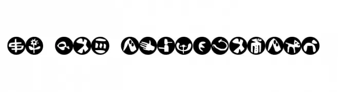
A set of bold, abstract symbols within circular shapes, perfect for creative designs.
![FE-Sam'sDingbatsNo.2 font caratteri gratis]() Scaricare 113 Downloads@WebFont
Scaricare 113 Downloads@WebFont -
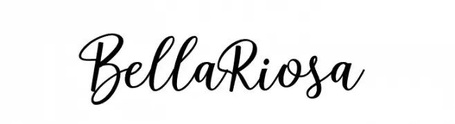
( Fonts by Attract Studio - Personal-use only. For commercial use please contact owner. )
A cursive, handwritten font with elegant, flowing characters.
![BellaRiosa font caratteri gratis]() Scaricare 113 Downloads@WebFont
Scaricare 113 Downloads@WebFont -
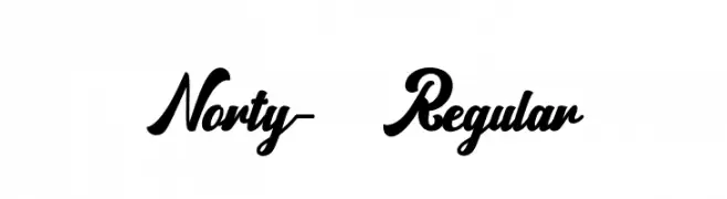
( Fonts by Zulfikar Ali - Personal-use only. For commercial use please contact owner. )
A bold, flowing script font with elegant curves and decorative flourishes.
![Norty-Regular font caratteri gratis]() Scaricare 113 Downloads@WebFont
Scaricare 113 Downloads@WebFont -
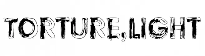
( Fonts by junkohanhero )
A decorative, distressed font with a hand-drawn, chaotic style.
![Torture, Light font caratteri gratis]() Scaricare 113 Downloads@WebFont
Scaricare 113 Downloads@WebFont -
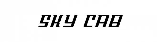
( Fonts by Iconian Fonts )
A bold, angular font with a geometric and dynamic style.
![Sky Cab font caratteri gratis]() Scaricare 113 Downloads@WebFont
Scaricare 113 Downloads@WebFont -
( Fonts by Edric Studio www.creativefabrica.com/designer/edricstudio/ - Personal-use only. For commercial use please contact owner. )
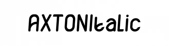
A playful, rounded, and slightly italic font with bold strokes.
![AXTON Italic font caratteri gratis]() Scaricare 113 Downloads@WebFont
Scaricare 113 Downloads@WebFont -
( Fonts by Manfred Klein. Free for private and charity use. Free for commercial with donation to organizations )
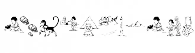
A decorative font with cartoonish Egyptian-themed illustrations.
![OldEgyptOne font caratteri gratis]() Scaricare 113 Downloads@WebFont
Scaricare 113 Downloads@WebFont -
( Fonts by weknow - Wino S Kadir - Personal-use only. For commercial use please contact owner. )
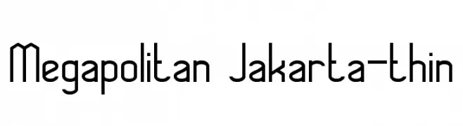
A modern, geometric font with clean lines and a thin weight.
![Megapolitan Jakarta-thin font caratteri gratis]() Scaricare 113 Downloads@WebFont
Scaricare 113 Downloads@WebFont -
( Fonts by Wolve Fonts - https://www.deviantart.com/wolves-fonts - Personal-use only. For commercial use please contact owner. )
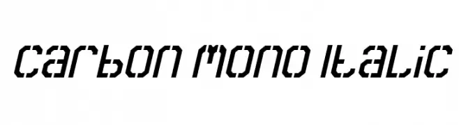
A modern, monospaced italic font with a technical and futuristic style.
![Carbon Mono Italic font caratteri gratis]() Scaricare 113 Downloads@WebFont
Scaricare 113 Downloads@WebFont -
( Nght's Place - www.crosswinds.net/~nghtmvs/font/fonts1.html )
A decorative font with characters inside heart shapes with wings.
![101! If My Heart Had WingZ font caratteri gratis]() Scaricare 113 Downloads@WebFont
Scaricare 113 Downloads@WebFont -
( Fonts by Grzegorz l - www.glukfonts.pl )
Ornamental geometric display font with intricate patterns.
![Opattfram01 font caratteri gratis]() Scaricare 113 Downloads@WebFont
Scaricare 113 Downloads@WebFont -
( Fonts by FatmaStudio - Fatmawati - Personal-use only. For commercial use please contact owner. )
A bold, expressive script font with flowing, cursive letters.
![Meylani font caratteri gratis]() Scaricare 113 Downloads@WebFont
Scaricare 113 Downloads@WebFont -
( Fonts by Iconian Fonts )
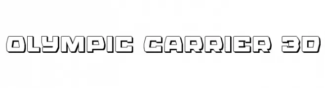
A bold, 3D geometric font with a modern, futuristic style.
![Olympic Carrier 3D font caratteri gratis]() Scaricare 113 Downloads@WebFont
Scaricare 113 Downloads@WebFont -
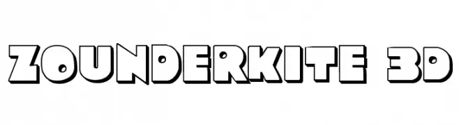
![Zounderkite 3D font caratteri gratis]() Scaricare 113 Downloads@WebFont
Scaricare 113 Downloads@WebFont -
( Fonts by memesbruh03 - Aaron D. Chand - Personal-use only. For commercial use please contact owner. )
A playful, handwritten font with rounded, consistent strokes and a casual feel.
![Fewriter font caratteri gratis]() Scaricare 113 Downloads@WebFont
Scaricare 113 Downloads@WebFont -
( Fonts by Manfred Klein - manfred-klein.ina-mar.com )
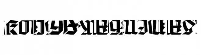
A bold, fragmented font with sharp angles and dynamic negative spaces.
![Kochfragments font caratteri gratis]() Scaricare 113 Downloads@WebFont
Scaricare 113 Downloads@WebFont -
( www.junkohanhero.com )
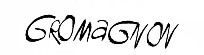
A dynamic, hand-drawn style font with bold, irregular strokes.
![GROmagnon font caratteri gratis]() Scaricare 113 Downloads@WebFont
Scaricare 113 Downloads@WebFont -
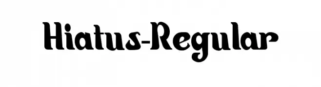
( Luc Mahler )
A bold, playful font with unique curves and sharp edges.
![Hiatus-Regular font caratteri gratis]() Scaricare 113 Downloads@WebFont
Scaricare 113 Downloads@WebFont -
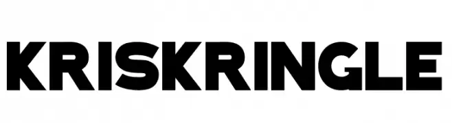
( Fonts by Sealoung - Saiful Anwar - Personal-use only. For commercial use please contact owner. )
A bold, festive font with holiday-themed decorations within each character.
![KRIS KRINGLE font caratteri gratis]() Scaricare 113 Downloads@WebFont
Scaricare 113 Downloads@WebFont -
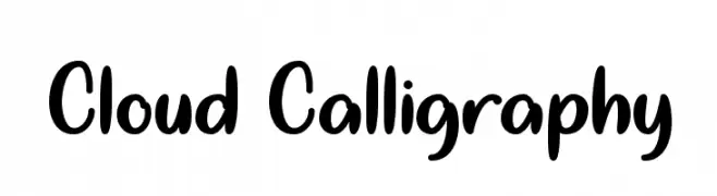
( Misti's Fonts - mistifonts.com/ )
A playful, handwritten font with smooth, rounded edges and a friendly appearance.
![Cloud Calligraphy font caratteri gratis]() Scaricare 112 Downloads@WebFont
Scaricare 112 Downloads@WebFont -
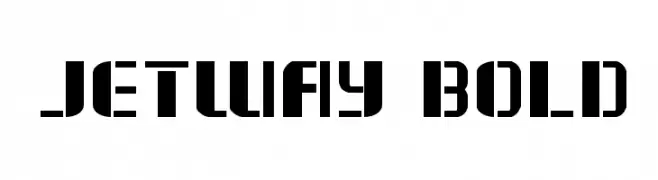
( Fonts by Daniel Zadorozny - www.iconian.com )
A bold, geometric stencil font with a modern, industrial aesthetic.
![Jetway Bold font caratteri gratis]() Scaricare 112 Downloads@WebFont
Scaricare 112 Downloads@WebFont -
( weknow - Wino S Kadir - www.creativefabrica.com/designer/weknow/ )
A bold, italicized font with a pixelated, glitch-inspired design.
![GLITCH Bold Italic font caratteri gratis]() Scaricare 112 Downloads@WebFont
Scaricare 112 Downloads@WebFont -
( Fonts by a Neale Davidson - www.pixelsagas.com. Personal-use only. For commercial use please contact owner. )
A bold, italicized font with a futuristic, tech-inspired design.
![Nippon Tech Bold Italic font caratteri gratis]() Scaricare 112 Downloads@WebFont
Scaricare 112 Downloads@WebFont -
( Fonts by Manfred Klein. Free for private and charity use. Free for commercial with donation to organizations )
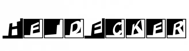
A bold, dynamic font with slanted letters enclosed in black squares, offering a modern and impactful style.
![HeidEcker font caratteri gratis]() Scaricare 112 Downloads@WebFont
Scaricare 112 Downloads@WebFont -
( Noto is a trademark of Google Inc. Noto fonts are open source. All Noto fonts are published under the SIL Open Font License, Version 1.1 )
A modern, clean sans-serif font designed for clarity and readability.
![Noto Sans Arabic UI Medium font caratteri gratis]() Scaricare 112 Downloads@WebFont
Scaricare 112 Downloads@WebFont


Quali sono i font più popolari adesso?
Poppins, Roboto, Montserrat, Open Sans e Lato sono molto usati per le forme pulite e l'ampia applicabilità — dall'identità di marca alle landing page e ai poster.
Quali font si usano spesso nei loghi?
Le sans serif geometriche (es. Poppins, famiglie in stile Gotham) sono scelte comuni per un branding pulito e scalabile. Per un tocco personale restano valide script e stili manoscritti. Abbina un display deciso per i titoli a un corpo testo neutro per riconoscibilità ed equilibrio.
Ogni quanto si aggiorna la lista?
Con regolarità, in base ai download e all'attività reale. Torna spesso per scoprire in anticipo le nuove preferite.
💡 Consiglio: aggiungi ai preferiti — le tendenze cambiano in fretta e i font top di oggi possono ispirare il rebranding di domani.