Benvenuto nelle Font Più Popolari — dove popolarità e qualità si incontrano. Qui trovi i font più scaricati e usati dell'anno. Se cerchi scelte sicure per logo, web o social, inizia da qui.
Ogni font top si distingue per equilibrio, leggibilità e versatilità. Troverai sans serif moderne, script eleganti, serif vintage e display minimalisti.
-
 Scaricare 111 Downloads@WebFont
 -
( Fonts by Khurasan )
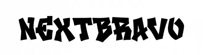
A bold, graffiti-inspired font with angular, dynamic characters.
![Next Bravo font caratteri gratis]() Scaricare 111 Downloads@WebFont
Scaricare 111 Downloads@WebFont -
( Fonts by a Neale Davidson - www.pixelsagas.com. Personal-use only. For commercial use please contact owner. )
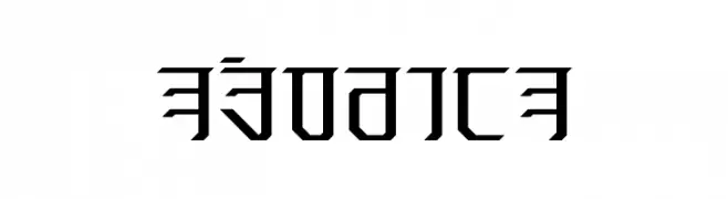
A futuristic, angular font with bold, geometric shapes.
![Exodite font caratteri gratis]() Scaricare 111 Downloads@WebFont
Scaricare 111 Downloads@WebFont -
( Fonts by Iconian Fonts )
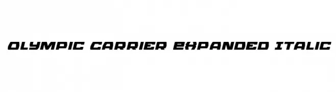
A bold, expanded, and italic font with a modern and dynamic style.
![Olympic Carrier Expanded Italic font caratteri gratis]() Scaricare 111 Downloads@WebFont
Scaricare 111 Downloads@WebFont -
( Fonts by Vladimir Nikolic )
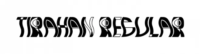
A bold, decorative font with abstract, artistic letterforms.
![Tirahan Regular font caratteri gratis]() Scaricare 111 Downloads@WebFont
Scaricare 111 Downloads@WebFont -
( Fonts by StringLabs - stringlabscreative.com - Personal-use only. For commercial use please contact owner. )
A playful, handwritten-style font with bold, rounded characters.
![Shine Kejora font caratteri gratis]() Scaricare 111 Downloads@WebFont
Scaricare 111 Downloads@WebFont -
( Fonts by Vladimir Nikolic - Personal-use only. For commercial use please contact owner. )
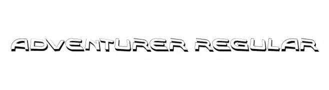
A bold, three-dimensional font with a dynamic and adventurous style.
![Adventurer Regular font caratteri gratis]() Scaricare 111 Downloads@WebFont
Scaricare 111 Downloads@WebFont -
( Fonts by Dirtyline Studio )
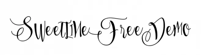
An elegant and flowing script font with intricate swirls and loops.
![SweetlineFreeDemo font caratteri gratis]() Scaricare 111 Downloads@WebFont
Scaricare 111 Downloads@WebFont -
( Iconian Fonts - Daniel Zadorozny - www.iconian.com )
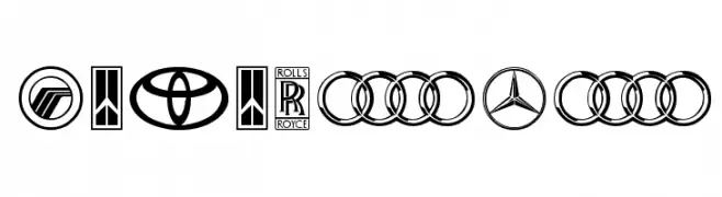
A compilation of car brand logos with varied typographic and emblematic styles.
![Motorama font caratteri gratis]() Scaricare 111 Downloads@WebFont
Scaricare 111 Downloads@WebFont -
( Fonts by deFharo - Personal-use only. For commercial use please contact owner. )
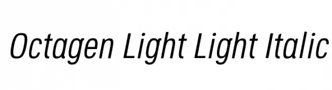
A sleek, modern, light italic font with a slightly condensed style.
![Octagen Light Light Italic font caratteri gratis]() Scaricare 111 Downloads@WebFont
Scaricare 111 Downloads@WebFont -
Caratteri di HammerBro101. For commercial use please contact the owner.
![LubalinGraphStd-BookCondObl font caratteri gratis]() Scaricare 111 Downloads@WebFont
Scaricare 111 Downloads@WebFont -
( Fonts by Woodcutter Manero - http://www.woodcutter.es - Personal-use only. For commercial use please contact owner. )
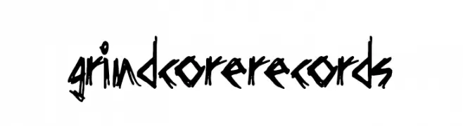
A raw, edgy font with jagged, irregular strokes and a rebellious flair.
![Grindcore Records font caratteri gratis]() Scaricare 111 Downloads@WebFont
Scaricare 111 Downloads@WebFont -
( Haris Prawoto - graphicriver.net/user/selawe/portfolio )
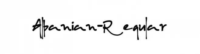
A lively, cursive handwritten font with expressive strokes.
![Albanian-Regular font caratteri gratis]() Scaricare 111 Downloads@WebFont
Scaricare 111 Downloads@WebFont -
( Fonts by Font Monger - Chris Vile - Personal-use only. For commercial use please contact owner. )
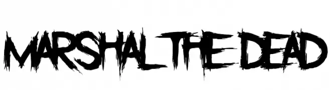
A bold, distressed font with jagged edges and a chaotic, hand-drawn appearance.
![Marshal The Dead font caratteri gratis]() Scaricare 111 Downloads@WebFont
Scaricare 111 Downloads@WebFont -
( Fonts by Peter Wiegel - www.peter-wiegel.de - Personal-use only. For commercial use please contact owner. )
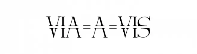
A mirrored, split-design font with bold, artistic flair.
![Via-A-Vis font caratteri gratis]() Scaricare 111 Downloads@WebFont
Scaricare 111 Downloads@WebFont -
( Fonts by Daniel Zadorozny - www.iconian.com - Free for personal use )
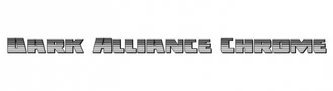
A bold, futuristic font with a chrome-like, layered design.
![Dark Alliance Chrome font caratteri gratis]() Scaricare 111 Downloads@WebFont
Scaricare 111 Downloads@WebFont -
![Slenderscratch font caratteri gratis]() Scaricare 110 Downloads@WebFont
Scaricare 110 Downloads@WebFont -
( Fonts by nomlimofont - Personal-use only. For commercial use please contact owner. )
A whimsical font with heart motifs integrated into each character, offering a romantic and playful style.
![LOVE full song font caratteri gratis]() Scaricare 110 Downloads@WebFont
Scaricare 110 Downloads@WebFont -
( Fonts by www.chequered.ink - Chequered Ink - Personal-use only. For commercial use please contact owner. )
A bold, angular font with a futuristic and industrial design.
![Basilisk Regular font caratteri gratis]() Scaricare 110 Downloads@WebFont
Scaricare 110 Downloads@WebFont -
( Fonts by Manuel Viergutz - Typo Graphic Design - www.typographicdesign.de )
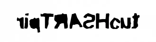
A bold, distressed font with irregular, hand-crafted edges.
![ripTRASHcut font caratteri gratis]() Scaricare 110 Downloads@WebFont
Scaricare 110 Downloads@WebFont -
( Fonts by Phontz )
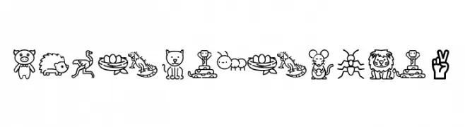
Outlined, cartoon-style icon font with animals and educational symbols.
![PhonicsAnimals2 font caratteri gratis]() Scaricare 110 Downloads@WebFont
Scaricare 110 Downloads@WebFont -
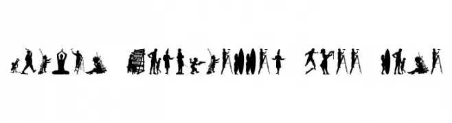
![Human Silhouettes Free Nine font caratteri gratis]() Scaricare 110 Downloads@WebFont
Scaricare 110 Downloads@WebFont -
![Shatterdome Personal Use Grunge font caratteri gratis]() Scaricare 110 Downloads@WebFont
Scaricare 110 Downloads@WebFont -
( Fonts by Misti`s Fonts - mistifonts.com - Personal-use only. For commercial use please contact owner. )
A playful handwritten font with rounded, consistent strokes and a casual vibe.
![Ships In The Night [Bold]Regular font caratteri gratis]() Scaricare 110 Downloads@WebFont
Scaricare 110 Downloads@WebFont -
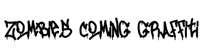
( Fonts by Si Panji )
A bold, graffiti-style font with a dripping paint effect, perfect for urban-themed designs.
![Zombies Coming Graffiti font caratteri gratis]() Scaricare 110 Downloads@WebFont
Scaricare 110 Downloads@WebFont -
( Fonts by Scratchones )
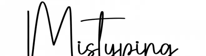
A playful, handwritten font with tall, slender letters and a whimsical style.
![Mistyping font caratteri gratis]() Scaricare 110 Downloads@WebFont
Scaricare 110 Downloads@WebFont -
( Fonts by Misti`s Fonts - mistifonts.com - Personal-use only. For commercial use please contact owner. )
A playful, hand-drawn outline font with a whimsical and friendly style.
![Ships In The Night [Outline]Regular font caratteri gratis]() Scaricare 110 Downloads@WebFont
Scaricare 110 Downloads@WebFont -
( Fonts by Fontherapy Studio )
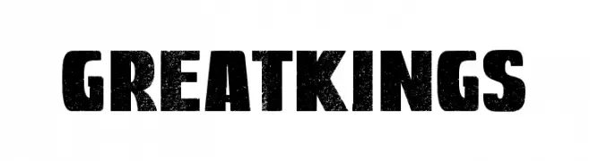
A bold, distressed font with a vintage, rugged appearance.
![Great Kings font caratteri gratis]() Scaricare 110 Downloads@WebFont
Scaricare 110 Downloads@WebFont -
( Fonts by Iconian Fonts )
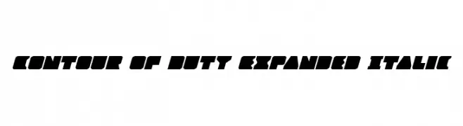
A bold, expanded, and italicized font with a dynamic and geometric style.
![Contour of Duty Expanded Italic font caratteri gratis]() Scaricare 110 Downloads@WebFont
Scaricare 110 Downloads@WebFont -
( Fonts by Wojciech Kalinowski )
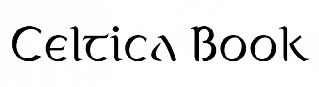
A decorative font with a blend of traditional and modern elements, featuring flowing curves and sharp angles.
![Celtica Book font caratteri gratis]() Scaricare 110 Downloads@WebFont
Scaricare 110 Downloads@WebFont -
( Fonts by Manfred Klein. Free for private and charity use. Free for commercial with donation to organizations )
A decorative, magic-themed font with intricate illustrations in each character.
![MagicActs font caratteri gratis]() Scaricare 110 Downloads@WebFont
Scaricare 110 Downloads@WebFont -
( Fonts by Vladimir Nikolic - Personal-use only. For commercial use please contact owner. )
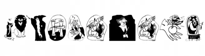
A bold, decorative font with a three-dimensional, playful design.
![Hobo Regular font caratteri gratis]() Scaricare 110 Downloads@WebFont
Scaricare 110 Downloads@WebFont -
( Fonts by Vladimir Nikolic )
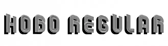
A bold, decorative font with a 3D effect and intricate patterns.
![Erkekler Regular font caratteri gratis]() Scaricare 110 Downloads@WebFont
Scaricare 110 Downloads@WebFont -
( Fonts by Halymunt Studio halymuntstudio.com - Personal-use only. For commercial use please contact owner. )
An elegant, flowing script font with a handwritten appearance.
![Photograph font caratteri gratis]() Scaricare 110 Downloads@WebFont
Scaricare 110 Downloads@WebFont -
( Fonts by Bobistheowl - Personal-use only. For commercial use please contact owner. )
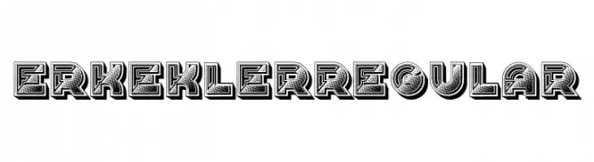
A bold, stencil-style font with a modern and industrial look.
![CabbagetownStoneStd font caratteri gratis]() Scaricare 110 Downloads@WebFont
Scaricare 110 Downloads@WebFont


![Ships In The Night [Bold]Regular font caratteri gratis](https://d144mzi0q5mijx.cloudfront.net/img/S/H/Ships-In-The-Night-Bold-Regular.webp)
![Ships In The Night [Outline]Regular font caratteri gratis](https://d144mzi0q5mijx.cloudfront.net/img/S/H/Ships-In-The-Night-Outline-Regular.webp)

Quali sono i font più popolari adesso?
Poppins, Roboto, Montserrat, Open Sans e Lato sono molto usati per le forme pulite e l'ampia applicabilità — dall'identità di marca alle landing page e ai poster.
Quali font si usano spesso nei loghi?
Le sans serif geometriche (es. Poppins, famiglie in stile Gotham) sono scelte comuni per un branding pulito e scalabile. Per un tocco personale restano valide script e stili manoscritti. Abbina un display deciso per i titoli a un corpo testo neutro per riconoscibilità ed equilibrio.
Ogni quanto si aggiorna la lista?
Con regolarità, in base ai download e all'attività reale. Torna spesso per scoprire in anticipo le nuove preferite.
💡 Consiglio: aggiungi ai preferiti — le tendenze cambiano in fretta e i font top di oggi possono ispirare il rebranding di domani.