Benvenuto nelle Font Più Popolari — dove popolarità e qualità si incontrano. Qui trovi i font più scaricati e usati dell'anno. Se cerchi scelte sicure per logo, web o social, inizia da qui.
Ogni font top si distingue per equilibrio, leggibilità e versatilità. Troverai sans serif moderne, script eleganti, serif vintage e display minimalisti.
-
( Fonts by junkohanhero )
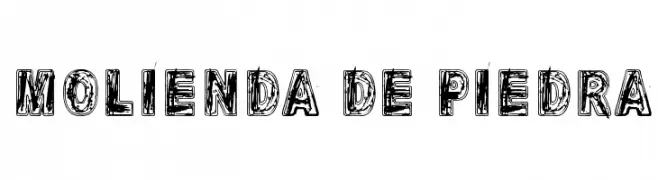
A bold, distressed font with a hand-drawn, textured appearance.
 Scaricare 109 Downloads@WebFont
 -
( Fonts by Wino S Kadir - weknow - www.revolge.com/shop/weknow/ - Personal-use only. For commercial use please contact owner. )
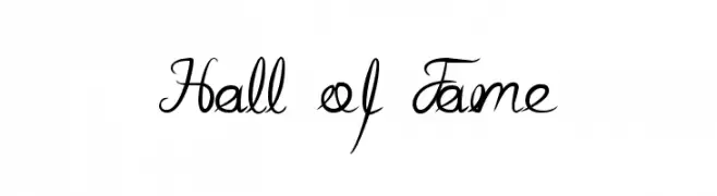
An elegant, flowing script font with a handwritten style.
![Hall of Fame font caratteri gratis]() Scaricare 109 Downloads@WebFont
Scaricare 109 Downloads@WebFont -
( Fonts by Baka - Kyakirun - bakafonts.kyakirun.com )
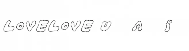
A playful, hand-drawn font with heart accents and a bubbly style.
![LOVELOVE_UfunAhanIyan font caratteri gratis]() Scaricare 109 Downloads@WebFont
Scaricare 109 Downloads@WebFont -
( Fonts by Daniel Zadorozny - www.iconian.com - Personal-use only. For commercial use please contact owner. )
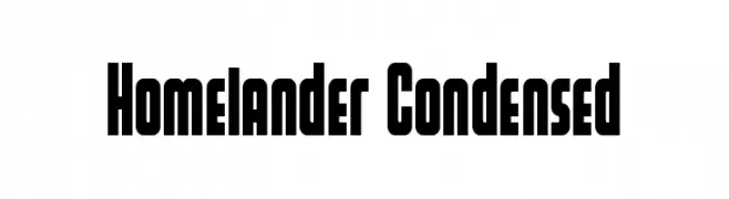
A bold, condensed font with a modern, geometric style.
![Homelander Condensed font caratteri gratis]() Scaricare 109 Downloads@WebFont
Scaricare 109 Downloads@WebFont -
( Fonts by Nurf Designs - Personal-use only. For commercial use please contact owner. )
A modern, rounded sans-serif font with a clean and approachable style.
![Jobless font caratteri gratis]() Scaricare 109 Downloads@WebFont
Scaricare 109 Downloads@WebFont -
( Fonts by Claire O'Connor )
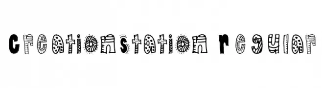
A playful, hand-drawn style font with quirky, embellished characters.
![CreationStation Regular font caratteri gratis]() Scaricare 109 Downloads@WebFont
Scaricare 109 Downloads@WebFont -
( Fonts by Fikry Alif - Fikryal studio - https://www.creativefabrica.com/designer/mfikryalif/ref/222304/ - Personal-use only. For commercial use please contact owner. )
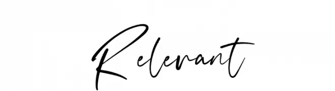
A dynamic, expressive handwritten font with fluid strokes and artistic flair.
![Relevant font caratteri gratis]() Scaricare 109 Downloads@WebFont
Scaricare 109 Downloads@WebFont -
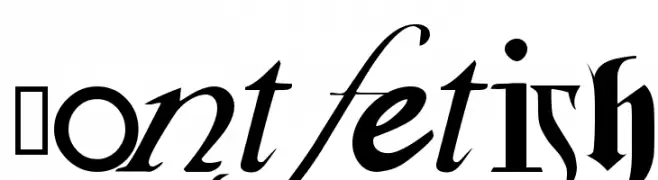
![Fontfetish font caratteri gratis]() Scaricare 109 Downloads@WebFont
Scaricare 109 Downloads@WebFont -
( Fonts by Jonathan S. Harris - Personal-use only. For commercial use please contact owner. )
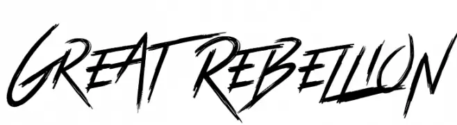
A bold, brush-style font with dynamic, rebellious strokes.
![Great Rebellion font caratteri gratis]() Scaricare 109 Downloads@WebFont
Scaricare 109 Downloads@WebFont -
( Fonts by wep - Wahyu Eka Prasetya - Personal-use only. For commercial use please contact owner. )
A bold, playful font with a hand-drawn, distressed style.
![Crackers Biscuit font caratteri gratis]() Scaricare 109 Downloads@WebFont
Scaricare 109 Downloads@WebFont -
( Fonts by Manfred Klein. Free for private and charity use. Free for commercial with donation to organizations )
Decorative font with illustrated human portraits in a comic style.
![HumanMirror font caratteri gratis]() Scaricare 109 Downloads@WebFont
Scaricare 109 Downloads@WebFont -
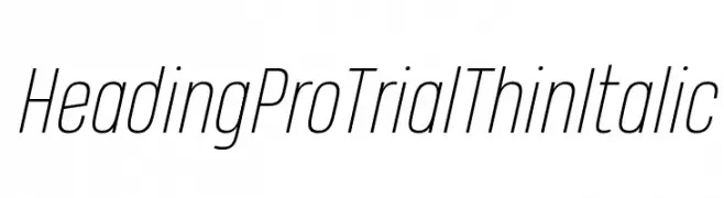
( Zetafonts - www.zetafonts.com )
A sleek, modern, thin italic font with elongated letterforms.
![Heading Pro Trial Thin Italic font caratteri gratis]() Scaricare 109 Downloads@WebFont
Scaricare 109 Downloads@WebFont -
![Beorc Gothic Regular font caratteri gratis]() Scaricare 109 Downloads@WebFont
Scaricare 109 Downloads@WebFont -
( گالری فانت فارسی پژوهش آريانا - only compatible with Farsi and Arabic )
A whimsical and decorative font with playful, animated characters.
![Sorkhpust font caratteri gratis]() Scaricare 109 Downloads@WebFont
Scaricare 109 Downloads@WebFont -
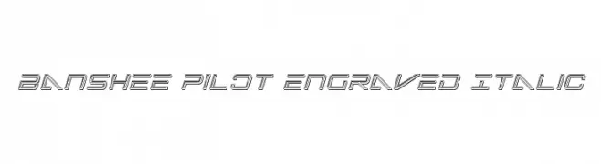
( Fonts by Iconian Fonts )
A futuristic, engraved italic font with a dynamic, three-dimensional appearance.
![Banshee Pilot Engraved Italic font caratteri gratis]() Scaricare 109 Downloads@WebFont
Scaricare 109 Downloads@WebFont -
( Fonts by Carrois Type Design / Ralph du Carrois )
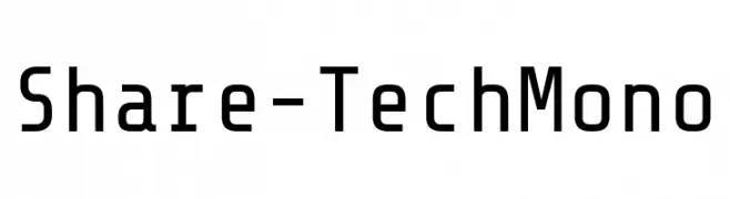
A modern, monospaced font with a technical and clean design.
![Share-TechMono font caratteri gratis]() Scaricare 109 Downloads@WebFont
Scaricare 109 Downloads@WebFont -
( Fonts by fontsandfashion.com. Personal-use only. For commercial use please contact owner. )
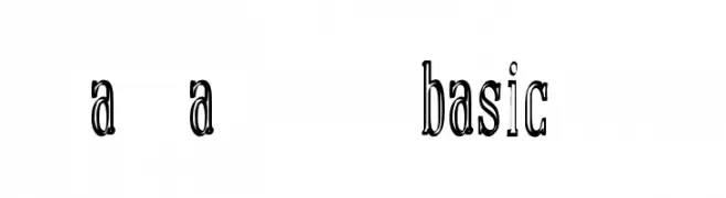
A bold, decorative font with a vintage flair and high contrast strokes.
![manual font basic demo font caratteri gratis]() Scaricare 109 Downloads@WebFont
Scaricare 109 Downloads@WebFont -
( Fonts by www.phantompower.de )
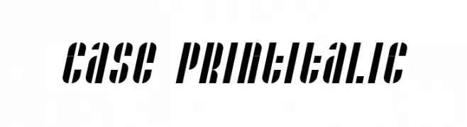
Bold, italicized font with a modern, dynamic style.
![Case printitalic font caratteri gratis]() Scaricare 109 Downloads@WebFont
Scaricare 109 Downloads@WebFont -
( Fonts by Noah Type - noahtype.com - Personal-use only. For commercial use please contact owner. )
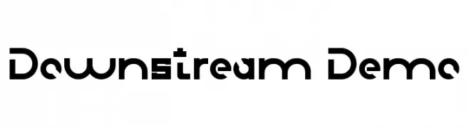
A bold, geometric font with a futuristic and modern design.
![Downstream Demo font caratteri gratis]() Scaricare 109 Downloads@WebFont
Scaricare 109 Downloads@WebFont -
( Fonts by Daniel Zadorozny - www.iconian.com )
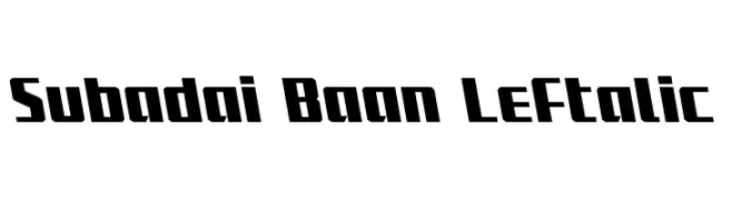
A bold, left-slanted font with a dynamic and robust style.
![Subadai Baan Leftalic font caratteri gratis]() Scaricare 109 Downloads@WebFont
Scaricare 109 Downloads@WebFont -
( Fonts by Press Gang Studios )
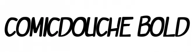
A bold, playful font with a comic-like, dynamic style.
![comicdouche Bold font caratteri gratis]() Scaricare 109 Downloads@WebFont
Scaricare 109 Downloads@WebFont -
![Charger Sport SemiBold Extended Oblique font caratteri gratis]() Scaricare 109 Downloads@WebFont
Scaricare 109 Downloads@WebFont -
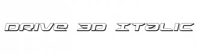
( Fonts by Daniel Zadorozny - www.iconian.com )
A futuristic, 3D italic font with bold outlines and geometric shapes.
![Drive 3D Italic font caratteri gratis]() Scaricare 109 Downloads@WebFont
Scaricare 109 Downloads@WebFont -
( Fonts by Creatype Studio - Rian Rahardi - Personal-use only. For commercial use please contact owner. )
A dynamic, expressive handwritten font with brush-like strokes.
![Sabertooth font caratteri gratis]() Scaricare 109 Downloads@WebFont
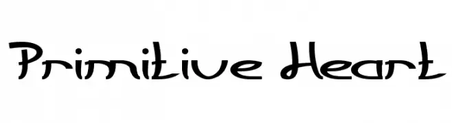
Scaricare 109 Downloads@WebFont -
![Primitive Heart font caratteri gratis]() Scaricare 109 Downloads@WebFont
Scaricare 109 Downloads@WebFont -
( Fonts by Mans Greback - Personal-use only. For commercial use please contact owner. )
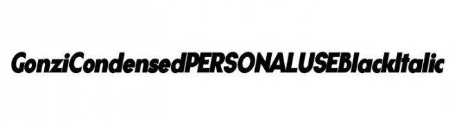
A bold, italic, and condensed font with high contrast and dynamic style.
![Gonzi Condensed PERSONAL USE Black Italic font caratteri gratis]() Scaricare 109 Downloads@WebFont
Scaricare 109 Downloads@WebFont -
( Fonts by Tomasz Skowroński )
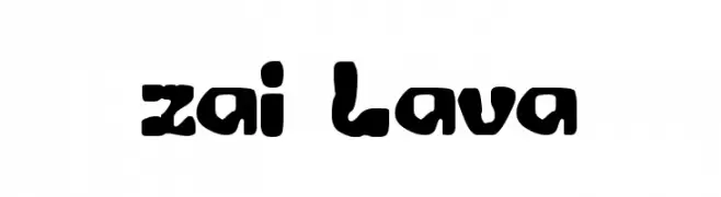
A bold, playful font with an organic, fluid design reminiscent of molten lava.
![zai Lava font caratteri gratis]() Scaricare 109 Downloads@WebFont
Scaricare 109 Downloads@WebFont -
( Iconian Fonts - Daniel Zadorozny - www.iconian.com )
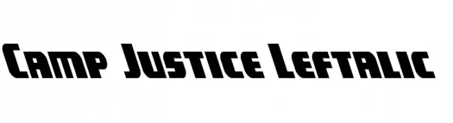
A bold, left-leaning font with wide, angular characters.
![Camp Justice Leftalic font caratteri gratis]() Scaricare 109 Downloads@WebFont
Scaricare 109 Downloads@WebFont -
( Sreekumar M - sreekuttan09.deviantart.com/ )
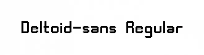
A pixelated, geometric font with a retro digital aesthetic.
![Deltoid-sans Regular font caratteri gratis]() Scaricare 109 Downloads@WebFont
Scaricare 109 Downloads@WebFont -
( Fonts by Google )
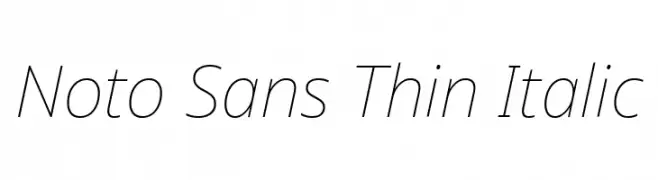
A sleek, modern, and thin italic typeface with elegant strokes and balanced spacing.
![Noto Sans Thin Italic font caratteri gratis]() Scaricare 109 Downloads@WebFont
Scaricare 109 Downloads@WebFont -
![SpookyVHReg Regular font caratteri gratis]() Scaricare 109 Downloads@WebFont
Scaricare 109 Downloads@WebFont -
![SAMyFakeGreek font caratteri gratis]() Scaricare 109 Downloads@WebFont
Scaricare 109 Downloads@WebFont -
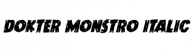
( Iconian Fonts - Daniel Zadorozny - www.iconian.com )
A bold, distressed brush-style font with dynamic, jagged edges.
![Dokter Monstro Italic font caratteri gratis]() Scaricare 109 Downloads@WebFont
Scaricare 109 Downloads@WebFont -
![Christmas Go - Personal Use Only font caratteri gratis]() Scaricare 109 Downloads@WebFont
Scaricare 109 Downloads@WebFont -
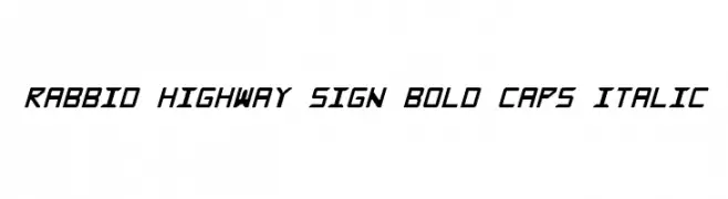
( Fonts by CannotIntoSpaceFonts - KineticPlasma Fonts - Personal-use only. For commercial use please contact owner. )
A bold, italicized font with a geometric and angular design.
![Rabbid Highway Sign Bold Caps Italic font caratteri gratis]() Scaricare 109 Downloads@WebFont
Scaricare 109 Downloads@WebFont


Quali sono i font più popolari adesso?
Poppins, Roboto, Montserrat, Open Sans e Lato sono molto usati per le forme pulite e l'ampia applicabilità — dall'identità di marca alle landing page e ai poster.
Quali font si usano spesso nei loghi?
Le sans serif geometriche (es. Poppins, famiglie in stile Gotham) sono scelte comuni per un branding pulito e scalabile. Per un tocco personale restano valide script e stili manoscritti. Abbina un display deciso per i titoli a un corpo testo neutro per riconoscibilità ed equilibrio.
Ogni quanto si aggiorna la lista?
Con regolarità, in base ai download e all'attività reale. Torna spesso per scoprire in anticipo le nuove preferite.
💡 Consiglio: aggiungi ai preferiti — le tendenze cambiano in fretta e i font top di oggi possono ispirare il rebranding di domani.