Benvenuto nelle Font Più Popolari — dove popolarità e qualità si incontrano. Qui trovi i font più scaricati e usati dell'anno. Se cerchi scelte sicure per logo, web o social, inizia da qui.
Ogni font top si distingue per equilibrio, leggibilità e versatilità. Troverai sans serif moderne, script eleganti, serif vintage e display minimalisti.
-
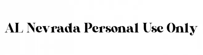
( Fonts by Aluyeah Studio - Personal-use only. For commercial use please contact owner. )
A bold, high-contrast serif font with a classic yet modern appeal.
 Scaricare 600 Downloads@WebFont
 -
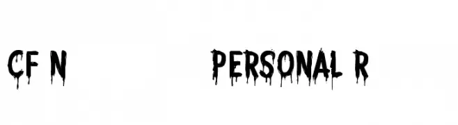
( CloutierFontes - Steve Cloutier - www.cloutierfontes.ca/ )
A bold, dripping font perfect for horror-themed designs.
![CF Nightmare PERSONAL Regular font caratteri gratis]() Scaricare 600 Downloads@WebFont
Scaricare 600 Downloads@WebFont -
( Fonts by a Galdino Otten - galdinootten.com . Personal-use only. For commercial use please contact owner. )
A playful, bold font with irregular, chunky letterforms and a hand-drawn feel.
![Snaps Taste font caratteri gratis]() Scaricare 599 Downloads@WebFont
Scaricare 599 Downloads@WebFont -
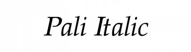
( Fonts by softerviews.org )
A classic serif italic font with elegant, flowing lines and high contrast.
![Pali Italic font caratteri gratis]() Scaricare 599 Downloads@WebFont
Scaricare 599 Downloads@WebFont -
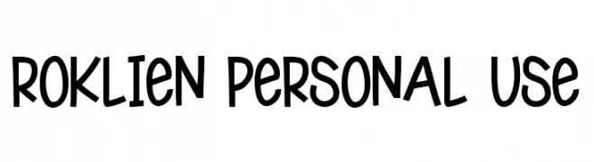
( Fonts by Pandan Wangi )
A playful, hand-drawn font with a whimsical and informal style.
![Roklien Personal Use font caratteri gratis]() Scaricare 599 Downloads@WebFont
Scaricare 599 Downloads@WebFont -
-
![Dont Melt Drip Regular font caratteri gratis]() Scaricare 599 Downloads@WebFont
Scaricare 599 Downloads@WebFont -
![CgZeppelin font caratteri gratis]() Scaricare 599 Downloads@WebFont
Scaricare 599 Downloads@WebFont -
( Fonts by Agathe M.Joyce - www.foundmyfont.com - Personal-use only. For commercial use please contact owner. )
An elegant, cursive font with bold, sweeping uppercase letters and smooth, decorative lowercase characters.
![Atelier du Machiniste font caratteri gratis]() Scaricare 599 Downloads@WebFont
Scaricare 599 Downloads@WebFont -
( Fonts by Gustavo Paz - Personal-use only. For commercial use please contact owner. )
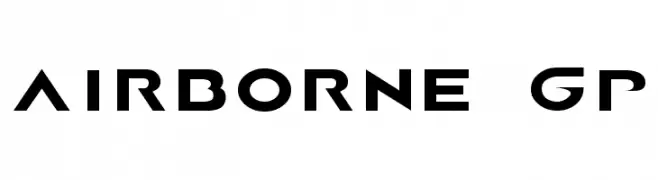
A bold, geometric font with a modern and futuristic style.
![AIRBORNE GP font caratteri gratis]() Scaricare 599 Downloads@WebFont
Scaricare 599 Downloads@WebFont -
( Fonts by dustBUST - Andreas Nylin )
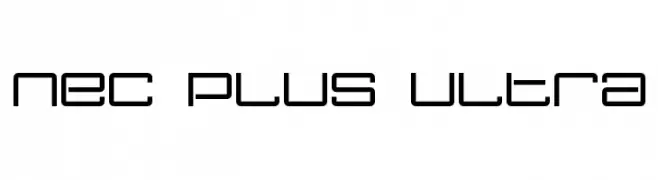
A modern, geometric font with a futuristic and minimalistic design.
![Nec plus ultra font caratteri gratis]() Scaricare 599 Downloads@WebFont
Scaricare 599 Downloads@WebFont


Quali sono i font più popolari adesso?
Poppins, Roboto, Montserrat, Open Sans e Lato sono molto usati per le forme pulite e l'ampia applicabilità — dall'identità di marca alle landing page e ai poster.
Quali font si usano spesso nei loghi?
Le sans serif geometriche (es. Poppins, famiglie in stile Gotham) sono scelte comuni per un branding pulito e scalabile. Per un tocco personale restano valide script e stili manoscritti. Abbina un display deciso per i titoli a un corpo testo neutro per riconoscibilità ed equilibrio.
Ogni quanto si aggiorna la lista?
Con regolarità, in base ai download e all'attività reale. Torna spesso per scoprire in anticipo le nuove preferite.
💡 Consiglio: aggiungi ai preferiti — le tendenze cambiano in fretta e i font top di oggi possono ispirare il rebranding di domani.