Benvenuto nelle Font Più Popolari — dove popolarità e qualità si incontrano. Qui trovi i font più scaricati e usati dell'anno. Se cerchi scelte sicure per logo, web o social, inizia da qui.
Ogni font top si distingue per equilibrio, leggibilità e versatilità. Troverai sans serif moderne, script eleganti, serif vintage e display minimalisti.
-
( Fonts by www.legacyofdefeat.com )
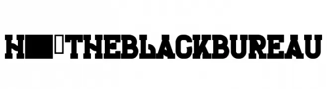
A bold, blocky font with a vintage yet modern aesthetic, ideal for impactful designs.
 Scaricare 587 Downloads@WebFont
 -
( Fonts by Regenerated by Nadim Shaikli - Personal-use only. For commercial use please contact owner. )
A clean, modern sans-serif font with geometric uniformity.
![Petra font caratteri gratis]() Scaricare 587 Downloads@WebFont
Scaricare 587 Downloads@WebFont -
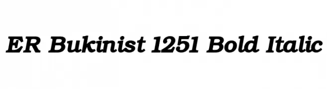
![ER Bukinist 1251 Bold Italic font caratteri gratis]() Scaricare 586 Downloads@WebFont
Scaricare 586 Downloads@WebFont -
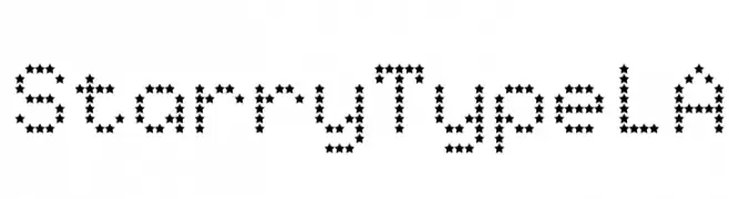
![StarryTypeLA font caratteri gratis]() Scaricare 586 Downloads@WebFont
Scaricare 586 Downloads@WebFont -
( Fonts by Octotype - www.foundmyfont.com - Personal-use only. For commercial use please contact owner. )
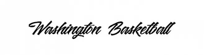
A bold, cursive script font with dynamic, flowing letterforms.
![Washington Basketball font caratteri gratis]() Scaricare 586 Downloads@WebFont
Scaricare 586 Downloads@WebFont -
-
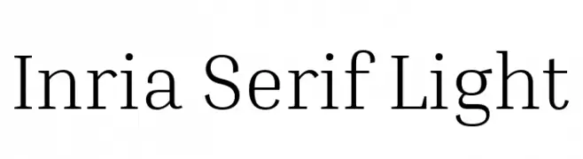
( Copyright 2017 The Inria Serif Project Authors (https://github.com/BlackFoundryCom/InriaFonts) )
A refined serif typeface with light weight and elegant design.
![Inria Serif Light font caratteri gratis]() Scaricare 586 Downloads@WebFont
Scaricare 586 Downloads@WebFont -
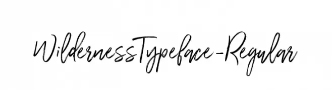
( Mats-Peter Forss - wornoutmedia.com )
A dynamic, brush-style handwritten font with expressive strokes.
![WildernessTypeface-Regular font caratteri gratis]() Scaricare 586 Downloads@WebFont
Scaricare 586 Downloads@WebFont -
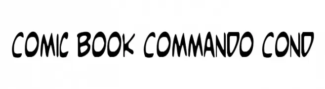
( Fonts by Daniel Zadorozny - www.iconian.com )
A playful, bold font with a comic book style and hand-drawn feel.
![Comic Book Commando Cond font caratteri gratis]() Scaricare 586 Downloads@WebFont
Scaricare 586 Downloads@WebFont -
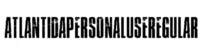
( Billy Argel - billyargel.com/ )
A bold, distressed font with a rugged, vintage texture.
![Atlantida PERSONAL USE Regular font caratteri gratis]() Scaricare 586 Downloads@WebFont
Scaricare 586 Downloads@WebFont -
( Fonts by Dennis Ludlow - Sharkshock Productions )
A playful, hand-drawn font with bold, rounded characters and a whimsical style.
![Fruitopia font caratteri gratis]() Scaricare 586 Downloads@WebFont
Scaricare 586 Downloads@WebFont


Quali sono i font più popolari adesso?
Poppins, Roboto, Montserrat, Open Sans e Lato sono molto usati per le forme pulite e l'ampia applicabilità — dall'identità di marca alle landing page e ai poster.
Quali font si usano spesso nei loghi?
Le sans serif geometriche (es. Poppins, famiglie in stile Gotham) sono scelte comuni per un branding pulito e scalabile. Per un tocco personale restano valide script e stili manoscritti. Abbina un display deciso per i titoli a un corpo testo neutro per riconoscibilità ed equilibrio.
Ogni quanto si aggiorna la lista?
Con regolarità, in base ai download e all'attività reale. Torna spesso per scoprire in anticipo le nuove preferite.
💡 Consiglio: aggiungi ai preferiti — le tendenze cambiano in fretta e i font top di oggi possono ispirare il rebranding di domani.