Benvenuto nelle Font Più Popolari — dove popolarità e qualità si incontrano. Qui trovi i font più scaricati e usati dell'anno. Se cerchi scelte sicure per logo, web o social, inizia da qui.
Ogni font top si distingue per equilibrio, leggibilità e versatilità. Troverai sans serif moderne, script eleganti, serif vintage e display minimalisti.
-
( Copyright (c) 2010-2013, Lautaro Hourcade (lautaro_h@yahoo.com), with Reserved Font Name 'Gafata' )
A modern, clean sans-serif font with balanced spacing and consistent stroke width.
 Scaricare 1955 Downloads@WebFont
 -
Caratteri di Qbotype. For commercial use please contact the owner.
( Fonts by www.phuxerdesigns.com.ar - Non-commercial use of any typeface free version, only buying the full version )
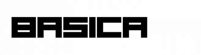
A bold, geometric font with a futuristic and digital aesthetic.
![Basica 2.0 font caratteri gratis]() Scaricare 1955 Downloads@WebFont
Scaricare 1955 Downloads@WebFont -
( Copyright (c) 1999-2010 Ben Weiner (ben@readingtype.org.uk) )
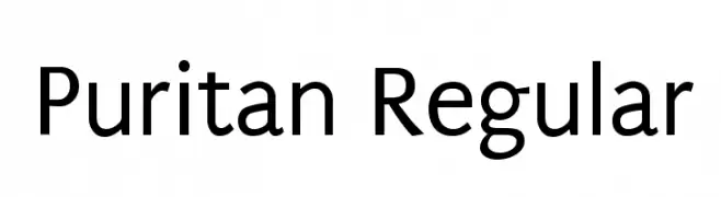
A clean and modern sans-serif typeface with excellent readability.
![Puritan Regular font caratteri gratis]() Scaricare 1955 Downloads@WebFont
Scaricare 1955 Downloads@WebFont -
![proletarian [beta] font caratteri gratis]() Scaricare 1955 Downloads@WebFont
Scaricare 1955 Downloads@WebFont -
( Fonts by www.fontalicious.com )
A bold, retro font with a playful, vintage style.
![Eight Track font caratteri gratis]() Scaricare 1955 Downloads@WebFont
Scaricare 1955 Downloads@WebFont -
( Fonts by ShyFonts )
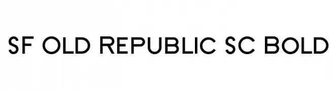
A bold, modern font with a clean and geometric design.
![SF Old Republic SC Bold font caratteri gratis]() Scaricare 1955 Downloads@WebFont
Scaricare 1955 Downloads@WebFont -
( Fonts by Pinisiart )
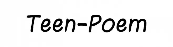
A playful, casual handwritten font with smooth, rounded edges.
![Teen-Poem font caratteri gratis]() Scaricare 1954 Downloads@WebFont
Scaricare 1954 Downloads@WebFont -
( Fonts by Vladimir Nikolic - www.creativefabrica.com/designer/vladimirnikolic/ - Personal-use only. For commercial use please contact owner. )
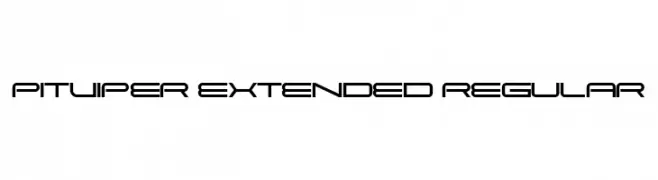
A futuristic, geometric font with a sleek, modern aesthetic and extended width.
![Pitviper Extended Regular font caratteri gratis]() Scaricare 1954 Downloads@WebFont
Scaricare 1954 Downloads@WebFont -
( Fonts by Alex Slobzheninov - Personal-use only. For commercial use please contact owner. )
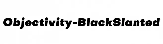
A bold, slanted font with a modern and dynamic style.
![Objectivity-BlackSlanted font caratteri gratis]() Scaricare 1954 Downloads@WebFont
Scaricare 1954 Downloads@WebFont -
Caratteri di JuanCasco. For commercial use please contact the owner.
( Fonts by Juan Casco - www.juancasco.net )
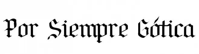
A bold, Gothic-style font with intricate, high-contrast letterforms.
![Por Siempre Gótica font caratteri gratis]() Scaricare 1954 Downloads@WebFont
Scaricare 1954 Downloads@WebFont -
![M+ 1c light font caratteri gratis]() Scaricare 1954 Downloads@WebFont
Scaricare 1954 Downloads@WebFont -
![Exocet Light font caratteri gratis]() Scaricare 1954 Downloads
Scaricare 1954 Downloads -
( Fonts by Apostrophic Lab )
A modern, geometric font with clean lines and uniform stroke width.
![Republikaps font caratteri gratis]() Scaricare 1954 Downloads@WebFont
Scaricare 1954 Downloads@WebFont -
( Fonts by Rick Mueller )
A bold, decorative font with a playful, vintage carnival theme.
![Carnival Rimmed font caratteri gratis]() Scaricare 1954 Downloads@WebFont
Scaricare 1954 Downloads@WebFont -
![AlphaClouds font caratteri gratis]() Scaricare 1954 Downloads@WebFont
Scaricare 1954 Downloads@WebFont -
( Fonts by Daniel Gauthier )
A bold, playful font with a 3D comic book style.
![DimWitGauche font caratteri gratis]() Scaricare 1954 Downloads@WebFont
Scaricare 1954 Downloads@WebFont -
![Brrrrr Regular font caratteri gratis]() Scaricare 1954 Downloads@WebFont
Scaricare 1954 Downloads@WebFont -
![Hog Bold - HMK font caratteri gratis]() Scaricare 1954 Downloads@WebFont
Scaricare 1954 Downloads@WebFont -
Caratteri di defharo. For commercial use please contact the owner.
![TabarraShadow-Italic font caratteri gratis]() Scaricare 1953 Downloads@WebFont
Scaricare 1953 Downloads@WebFont -
( Copyright 2012 The Encode Project Authors (impallari@gmail.com), with Reserved Font Name "Encode Sansâ€. )
A bold, condensed font with a modern and impactful style.
![Encode Sans Condensed Black font caratteri gratis]() Scaricare 1953 Downloads@WebFont
Scaricare 1953 Downloads@WebFont -
( Copyright (c) 2011, Andreas Kalpakides (hello@inderesting.com) )
A modern, geometric sans-serif font with a clean and minimalist design.
![AdventPro-Regular font caratteri gratis]() Scaricare 1953 Downloads@WebFont
Scaricare 1953 Downloads@WebFont -
( Fonts by Daniel Zadorozny - www.iconian.com - Free for personal use )
A futuristic, italic font with geometric shapes and smooth curves.
![Sagan Italic font caratteri gratis]() Scaricare 1953 Downloads@WebFont
Scaricare 1953 Downloads@WebFont -
( Fonts by Jacob Fisher - www.pizzadude.dk )
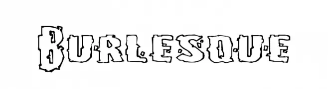
A bold, decorative font with a playful, hand-drawn style and rugged outlines.
![Burlesque font caratteri gratis]() Scaricare 1953 Downloads@WebFont
Scaricare 1953 Downloads@WebFont -
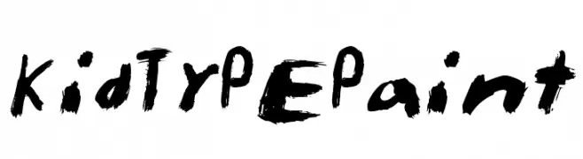
![KidTYPEPaint font caratteri gratis]() Scaricare 1953 Downloads@WebFont
Scaricare 1953 Downloads@WebFont -
( Fonts by Dominique Demetz - ddemetz.com - Personal-use only. For commercial use please contact owner. )
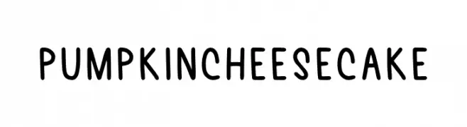
A playful, hand-drawn font with rounded, bold characters and a whimsical style.
![Pumpkin Cheesecake font caratteri gratis]() Scaricare 1952 Downloads@WebFont
Scaricare 1952 Downloads@WebFont -
( Fonts by Pentagram / MCKL - Personal-use only. For commercial use please contact owner. )
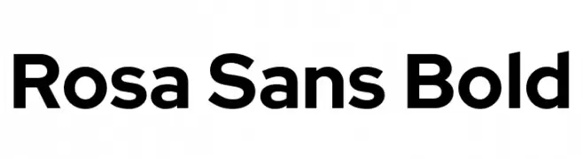
A bold, modern sans-serif font with clean lines and rounded edges.
![Rosa Sans Bold font caratteri gratis]() Scaricare 1952 Downloads@WebFont
Scaricare 1952 Downloads@WebFont -
( Zetafonts - www.zetafonts.com )
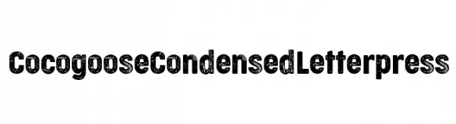
A bold, condensed font with a textured letterpress effect, ideal for vintage and industrial designs.
![Cocogoose Condensed Letterpress font caratteri gratis]() Scaricare 1952 Downloads@WebFont
Scaricare 1952 Downloads@WebFont -
( 7NTypes - Situjuh Nazara - 7ntypes.com )
A bold, modern sans-serif font with a clean and professional appearance.
![LearnShareColaborate-Bold font caratteri gratis]() Scaricare 1952 Downloads@WebFont
Scaricare 1952 Downloads@WebFont -
( Fonts by Dharma Type )
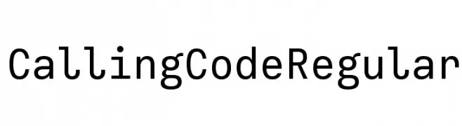
A modern, geometric sans-serif font with balanced spacing and clear readability.
![Calling Code Regular font caratteri gratis]() Scaricare 1952 Downloads@WebFont
Scaricare 1952 Downloads@WebFont -
( Fonts by Bumbayo Font Fabrik )
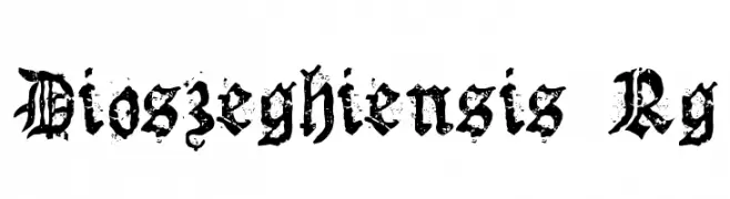
A bold, distressed blackletter font with intricate, Gothic-inspired letterforms.
![Dioszeghiensis Rg font caratteri gratis]() Scaricare 1952 Downloads@WebFont
Scaricare 1952 Downloads@WebFont -
![Eskis1 font caratteri gratis]() Scaricare 1952 Downloads@WebFont
Scaricare 1952 Downloads@WebFont -
( Copyright (c) 2011, Thatcher Ulrich (http://tulrich.com), )
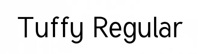
A clean and modern sans-serif font with geometric letterforms.
![Tuffy Regular font caratteri gratis]() Scaricare 1952 Downloads@WebFont
Scaricare 1952 Downloads@WebFont -
( Copyright 2016 The Kokoro Project Authors. )
A playful, rounded font with a whimsical and friendly design.
![Kokoro font caratteri gratis]() Scaricare 1951 Downloads@WebFont
Scaricare 1951 Downloads@WebFont -
( Fonts by www.typodermicfonts.com - Ray Larabie )
A bold, serif font with pronounced serifs and a slightly condensed style.
![Sexsmith-Regular font caratteri gratis]() Scaricare 1951 Downloads@WebFont
Scaricare 1951 Downloads@WebFont -
![Happy Hell font caratteri gratis]() Scaricare 1951 Downloads@WebFont
Scaricare 1951 Downloads@WebFont
![proletarian [beta] font caratteri gratis](https://d144mzi0q5mijx.cloudfront.net/img/P/R/proletarian-beta.webp)


Quali sono i font più popolari adesso?
Poppins, Roboto, Montserrat, Open Sans e Lato sono molto usati per le forme pulite e l'ampia applicabilità — dall'identità di marca alle landing page e ai poster.
Quali font si usano spesso nei loghi?
Le sans serif geometriche (es. Poppins, famiglie in stile Gotham) sono scelte comuni per un branding pulito e scalabile. Per un tocco personale restano valide script e stili manoscritti. Abbina un display deciso per i titoli a un corpo testo neutro per riconoscibilità ed equilibrio.
Ogni quanto si aggiorna la lista?
Con regolarità, in base ai download e all'attività reale. Torna spesso per scoprire in anticipo le nuove preferite.
💡 Consiglio: aggiungi ai preferiti — le tendenze cambiano in fretta e i font top di oggi possono ispirare il rebranding di domani.