Benvenuto nelle Font Più Popolari — dove popolarità e qualità si incontrano. Qui trovi i font più scaricati e usati dell'anno. Se cerchi scelte sicure per logo, web o social, inizia da qui.
Ogni font top si distingue per equilibrio, leggibilità e versatilità. Troverai sans serif moderne, script eleganti, serif vintage e display minimalisti.
-
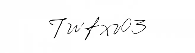
( iwfx - twitter.com/iwfx )
A classic, elegant handwritten font with flowing cursive strokes.
 Scaricare 91 Downloads@WebFont
 -
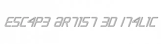
( Fonts by Daniel Zadorozny - www.iconian.com )
A modern, geometric 3D italic font with outlined characters.
![Escape Artist 3D Italic font caratteri gratis]() Scaricare 91 Downloads@WebFont
Scaricare 91 Downloads@WebFont -
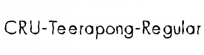
![CRU-Teerapong-Regular font caratteri gratis]() Scaricare 91 Downloads@WebFont
Scaricare 91 Downloads@WebFont -
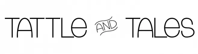
( Fonts by Chris Vile - fontmonger.com - Personal-use only. For commercial use please contact owner. )
A playful and whimsical font with rounded edges and open counters.
![Tattle & Tales font caratteri gratis]() Scaricare 91 Downloads@WebFont
Scaricare 91 Downloads@WebFont -
( Typodermic Fonts - Ray Larabie - www.typodermicfonts.com/ )
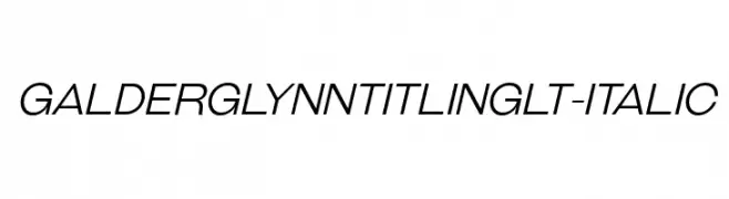
A sleek, modern italic font with elongated characters and smooth curves.
![GalderglynnTitlingLt-Italic font caratteri gratis]() Scaricare 91 Downloads@WebFont
Scaricare 91 Downloads@WebFont -
-
( Fonts by Peter Wiegel - www.peter-wiegel.de - Personal-use only. For commercial use please contact owner. )
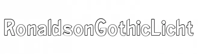
A modern sans-serif font with a bold outline style and rounded edges.
![RonaldsonGothicLicht font caratteri gratis]() Scaricare 91 Downloads@WebFont
Scaricare 91 Downloads@WebFont -
( Iconian Fonts - Daniel Zadorozny - www.iconian.com )
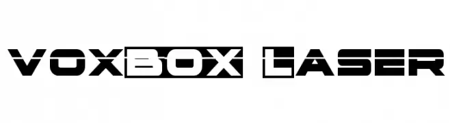
A bold, futuristic font with geometric angles and a modern aesthetic.
![voxBOX Laser font caratteri gratis]() Scaricare 91 Downloads@WebFont
Scaricare 91 Downloads@WebFont -
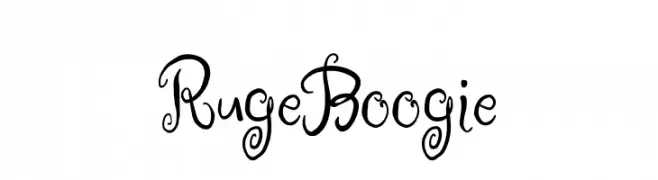
![Ruge Boogie font caratteri gratis]() Scaricare 91 Downloads@WebFont
Scaricare 91 Downloads@WebFont -
( Fonts by 38.lineart - Muhammad Ridha Agusni - Personal-use only. For commercial use please contact owner. )
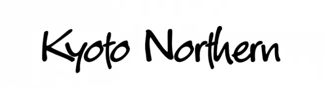
A dynamic handwritten font with fluid, slightly irregular strokes and a playful vibe.
![Kyoto Northern font caratteri gratis]() Scaricare 91 Downloads@WebFont
Scaricare 91 Downloads@WebFont -
( Fonts by Vladimir Nikolic )
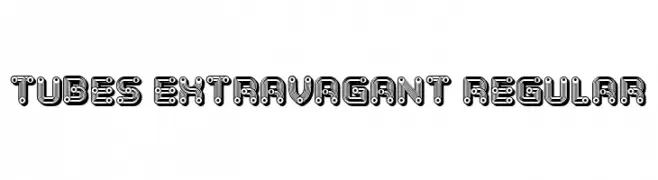
A bold, decorative font with a tubular, futuristic design.
![Tubes Extravagant Regular font caratteri gratis]() Scaricare 91 Downloads@WebFont
Scaricare 91 Downloads@WebFont -
( Fonts by Daniel Zadorozny - www.iconian.com - Free for personal use )
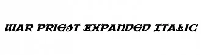
A bold, italicized font with sharp angles and expanded width for a striking appearance.
![War Priest Expanded Italic font caratteri gratis]() Scaricare 91 Downloads@WebFont
Scaricare 91 Downloads@WebFont -
( Fonts by Miriam Malein - Personal-use only. For commercial use please contact owner. )
A playful, handwritten font with a casual and friendly style.
![miriam font caratteri gratis]() Scaricare 91 Downloads@WebFont
Scaricare 91 Downloads@WebFont -
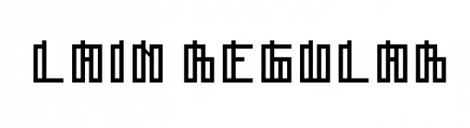
![Lain Regular font caratteri gratis]() Scaricare 91 Downloads@WebFont
Scaricare 91 Downloads@WebFont -
( Fonts by Daniel Zadorozny - www.iconian.com - Free for personal use )
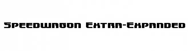
A bold, extra-expanded geometric font with a modern and industrial style.
![Speedwagon Extra-Expanded font caratteri gratis]() Scaricare 91 Downloads@WebFont
Scaricare 91 Downloads@WebFont -
( Fonts by Jayde Garrow - Personal-use only. For commercial use please contact owner. )
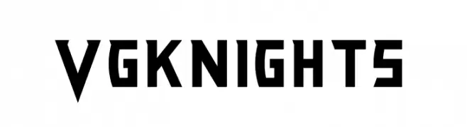
A bold, angular font with a futuristic, geometric style.
![VG KNIGHTS font caratteri gratis]() Scaricare 91 Downloads@WebFont
Scaricare 91 Downloads@WebFont -
( Fonts by Manfred Klein. Free for private and charity use. Free for commercial with donation to organizations )
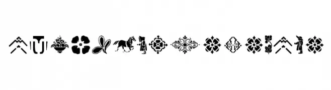
Ornamental dingbat set with vintage floral and geometric motifs.
![OldTypoPiecesOne font caratteri gratis]() Scaricare 91 Downloads@WebFont
Scaricare 91 Downloads@WebFont -
( Blambot - www.blambot.com )
A bold, angular font with a dynamic and geometric design.
![VanHelsing font caratteri gratis]() Scaricare 91 Downloads@WebFont
Scaricare 91 Downloads@WebFont -
( Fonts by Daniel Zadorozny - www.iconian.com )
A bold, italicized font with a futuristic, double-line outline style.
![Escape Artist Academy Italic font caratteri gratis]() Scaricare 91 Downloads@WebFont
Scaricare 91 Downloads@WebFont -
( Fonts by Saridezra - Personal-use only. For commercial use please contact owner. )
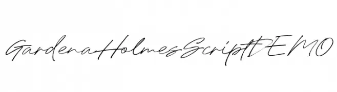
A flowing, cursive script font with elegant, connected letters and a natural handwriting style.
![GardenaHolmesScriptDEMO font caratteri gratis]() Scaricare 91 Downloads@WebFont
Scaricare 91 Downloads@WebFont -
Caratteri di ZedFonts2334. For commercial use please contact the owner.
![ZF2334 Typography Love Bold Italic font caratteri gratis]() Scaricare 91 Downloads@WebFont
Scaricare 91 Downloads@WebFont -
( Fonts by Vladimir Nikolic )
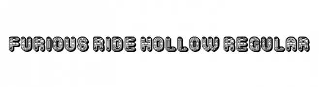
A bold, decorative font with hollow interiors and geometric patterns.
![Furious Ride Hollow Regular font caratteri gratis]() Scaricare 91 Downloads@WebFont
Scaricare 91 Downloads@WebFont -
( Fonts by Kat`s Fun Fonts - Personal-use only. For commercial use please contact owner. )
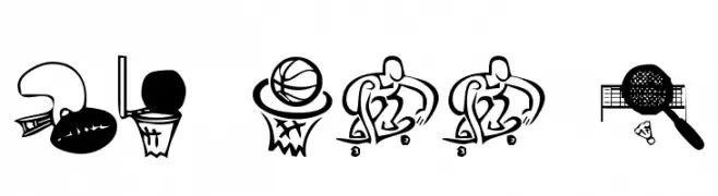
A sports-themed dingbat font featuring playful illustrations of various athletic activities.
![KR All Sport font caratteri gratis]() Scaricare 91 Downloads@WebFont
Scaricare 91 Downloads@WebFont -
( Fonts by junkohanhero - Personal-use only. For commercial use please contact owner. )
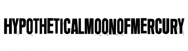
A bold, distressed font with a grunge texture and high contrast, ideal for impactful designs.
![Hypothetical moon of Mercury font caratteri gratis]() Scaricare 91 Downloads@WebFont
Scaricare 91 Downloads@WebFont -
( Fonts by StringLabs - stringlabscreative.com - Personal-use only. For commercial use please contact owner. )
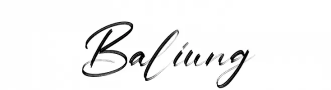
A bold, expressive handwritten font with dynamic strokes.
![Baliung font caratteri gratis]() Scaricare 91 Downloads@WebFont
Scaricare 91 Downloads@WebFont -
( Fonts by wep - Wahyu Eka Prasetya - Personal-use only. For commercial use please contact owner. )
A dynamic and expressive handwritten font with flowing cursive letterforms.
![Awanipun_ font caratteri gratis]() Scaricare 91 Downloads@WebFont
Scaricare 91 Downloads@WebFont -
( Fonts by RaisProject )
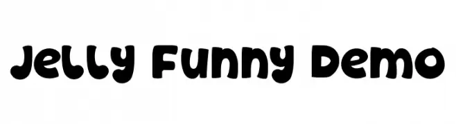
A playful, bold font with rounded, bubbly characters.
![Jelly Funny Demo font caratteri gratis]() Scaricare 91 Downloads@WebFont
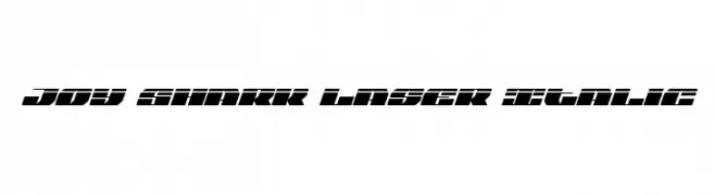
Scaricare 91 Downloads@WebFont -
![Joy Shark Laser Italic font caratteri gratis]() Scaricare 91 Downloads@WebFont
Scaricare 91 Downloads@WebFont -
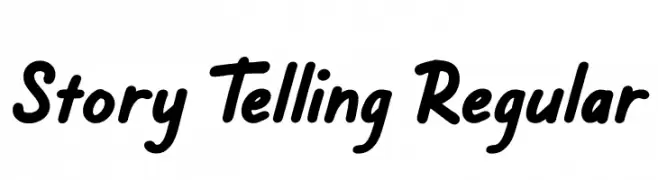
( Fonts by Creatype Studio - Rian Rahardi - Personal-use only. For commercial use please contact owner. )
A bold, playful script font with a dynamic and informal style.
![Story Telling Regular font caratteri gratis]() Scaricare 91 Downloads@WebFont
Scaricare 91 Downloads@WebFont -
( Fonts by Apostrophic Lab )
A futuristic, geometric italic font with a dynamic and sleek design.
![Republika V Cnd - Haze Italic font caratteri gratis]() Scaricare 91 Downloads@WebFont
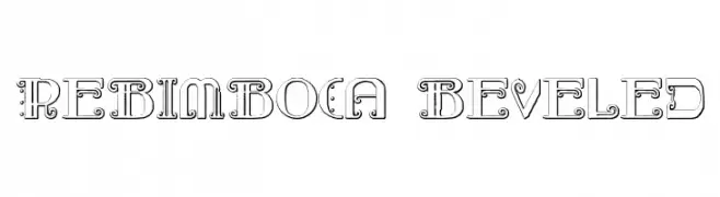
Scaricare 91 Downloads@WebFont -
![Rebimboca Beveled font caratteri gratis]() Scaricare 91 Downloads@WebFont
Scaricare 91 Downloads@WebFont -
( Peax Webdesign - www.peax-webdesign.com/portfolio-graphiste.html )
A bold, brush-style font with a playful, hand-drawn appearance.
![PWBoldToon font caratteri gratis]() Scaricare 91 Downloads@WebFont
Scaricare 91 Downloads@WebFont -
( گالری فانت فارسی پژوهش آريانا - only compatible with Farsi and Arabic )
A bold, geometric font with a modern and impactful design.
![Erfaan font caratteri gratis]() Scaricare 91 Downloads@WebFont
Scaricare 91 Downloads@WebFont -
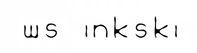
![WS Inkski font caratteri gratis]() Scaricare 91 Downloads@WebFont
Scaricare 91 Downloads@WebFont -
( Fonts by Hanoded - David Kerkhoff - Personal-use only. For commercial use please contact owner. )
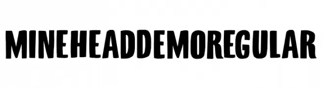
A bold, playful font with thick, rounded strokes and high contrast.
![Minehead DEMO Regular font caratteri gratis]() Scaricare 91 Downloads@WebFont
Scaricare 91 Downloads@WebFont -
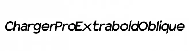
![Charger Pro Extrabold Oblique font caratteri gratis]() Scaricare 91 Downloads@WebFont
Scaricare 91 Downloads@WebFont


Quali sono i font più popolari adesso?
Poppins, Roboto, Montserrat, Open Sans e Lato sono molto usati per le forme pulite e l'ampia applicabilità — dall'identità di marca alle landing page e ai poster.
Quali font si usano spesso nei loghi?
Le sans serif geometriche (es. Poppins, famiglie in stile Gotham) sono scelte comuni per un branding pulito e scalabile. Per un tocco personale restano valide script e stili manoscritti. Abbina un display deciso per i titoli a un corpo testo neutro per riconoscibilità ed equilibrio.
Ogni quanto si aggiorna la lista?
Con regolarità, in base ai download e all'attività reale. Torna spesso per scoprire in anticipo le nuove preferite.
💡 Consiglio: aggiungi ai preferiti — le tendenze cambiano in fretta e i font top di oggi possono ispirare il rebranding di domani.