Benvenuto nelle Font Più Popolari — dove popolarità e qualità si incontrano. Qui trovi i font più scaricati e usati dell'anno. Se cerchi scelte sicure per logo, web o social, inizia da qui.
Ogni font top si distingue per equilibrio, leggibilità e versatilità. Troverai sans serif moderne, script eleganti, serif vintage e display minimalisti.
-
( truefonts.blogspot.com )
A dot-matrix style font inspired by digital displays.
 Scaricare 577 Downloads@WebFont
 -
( Fonts by Paul Lloyd )
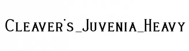
A bold, heavy serif font with a classic and authoritative style.
![Cleaver's_Juvenia_Heavy font caratteri gratis]() Scaricare 577 Downloads
Scaricare 577 Downloads -
( Fonts by www.haroldsfonts.com )
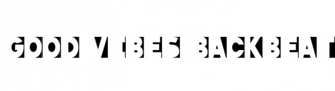
A bold, geometric font with angular shapes and dynamic cut-out patterns.
![Good Vibes Backbeat font caratteri gratis]() Scaricare 577 Downloads@WebFont
Scaricare 577 Downloads@WebFont -
( David Engelby )
A modern, elegant font with clean lines and a sophisticated appearance.
![OnO font caratteri gratis]() Scaricare 577 Downloads@WebFont
Scaricare 577 Downloads@WebFont -
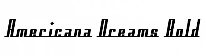
![Americana Dreams Bold font caratteri gratis]() Scaricare 577 Downloads@WebFont
Scaricare 577 Downloads@WebFont -
-
( Fonts by Alex Tomlinson - Skyhaven Fonts - shfonts.com )
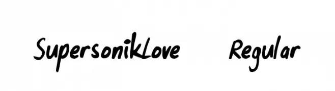
A playful, handwritten font with smooth, fluid strokes and a casual feel.
![SupersonikLove-Regular font caratteri gratis]() Scaricare 577 Downloads@WebFont
Scaricare 577 Downloads@WebFont -
![Charity font caratteri gratis]() Scaricare 577 Downloads@WebFont
Scaricare 577 Downloads@WebFont -
( Fonts by Annisa Afni )
A playful, pirate-themed font with bold, hand-drawn characters and decorative cross-stitch patterns.
![Monkey Pirates font caratteri gratis]() Scaricare 577 Downloads@WebFont
Scaricare 577 Downloads@WebFont -
( Fonts by Alphabet & Type: Typography & Graphic - Paolo Vannucci - www.alphabetype.it )
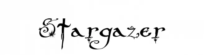
A whimsical and decorative font with celestial embellishments and swirling accents.
![Stargazer font caratteri gratis]() Scaricare 577 Downloads@WebFont
Scaricare 577 Downloads@WebFont -
( Fonts by Andrew Hart - dirt2.com )
An edgy, grungy font with jagged, irregular strokes and a rebellious vibe.
![Electric Panda font caratteri gratis]() Scaricare 577 Downloads@WebFont
Scaricare 577 Downloads@WebFont


Quali sono i font più popolari adesso?
Poppins, Roboto, Montserrat, Open Sans e Lato sono molto usati per le forme pulite e l'ampia applicabilità — dall'identità di marca alle landing page e ai poster.
Quali font si usano spesso nei loghi?
Le sans serif geometriche (es. Poppins, famiglie in stile Gotham) sono scelte comuni per un branding pulito e scalabile. Per un tocco personale restano valide script e stili manoscritti. Abbina un display deciso per i titoli a un corpo testo neutro per riconoscibilità ed equilibrio.
Ogni quanto si aggiorna la lista?
Con regolarità, in base ai download e all'attività reale. Torna spesso per scoprire in anticipo le nuove preferite.
💡 Consiglio: aggiungi ai preferiti — le tendenze cambiano in fretta e i font top di oggi possono ispirare il rebranding di domani.