Benvenuto nelle Font Più Popolari — dove popolarità e qualità si incontrano. Qui trovi i font più scaricati e usati dell'anno. Se cerchi scelte sicure per logo, web o social, inizia da qui.
Ogni font top si distingue per equilibrio, leggibilità e versatilità. Troverai sans serif moderne, script eleganti, serif vintage e display minimalisti.
-
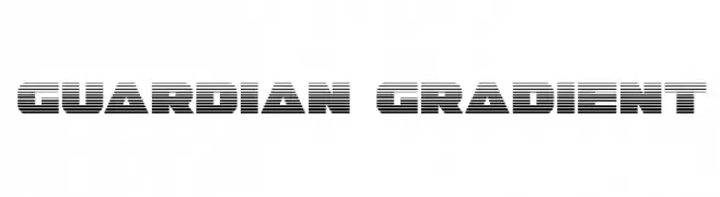
( Fonts by Daniel Zadorozny - www.iconian.com )
A bold, futuristic font with a distinctive striped pattern.
 Scaricare 101 Downloads@WebFont
 -
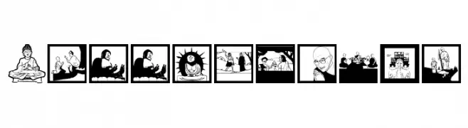
( Fonts by Manfred Klein. Free for private and charity use. Free for commercial with donation to organizations )
Illustrative, Buddhism-themed pictogram font.
![BuddhismTwo font caratteri gratis]() Scaricare 101 Downloads@WebFont
Scaricare 101 Downloads@WebFont -
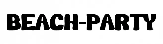
( Fonts by Pinisiart )
A playful, bold font with a hand-drawn, beachy vibe.
![Beach-Party font caratteri gratis]() Scaricare 101 Downloads@WebFont
Scaricare 101 Downloads@WebFont -
( Jorge Bedoy )
A bold, angular font with high contrast and a futuristic style.
![Bedoy font caratteri gratis]() Scaricare 101 Downloads@WebFont
Scaricare 101 Downloads@WebFont -
( Fonts by Daniel Zadorozny - www.iconian.com - Personal-use only. For commercial use please contact owner. )
A bold, futuristic font with sharp angles and a dynamic slant.
![Robo-Clone Expanded font caratteri gratis]() Scaricare 101 Downloads@WebFont
Scaricare 101 Downloads@WebFont -
( Fonts by Edric Studio www.creativefabrica.com/designer/edricstudio/ - Personal-use only. For commercial use please contact owner. )
A bold, playful script font with flowing, dynamic letterforms.
![oppy sahra font caratteri gratis]() Scaricare 101 Downloads@WebFont
Scaricare 101 Downloads@WebFont -
( Fonts by Luke Owens - Personal-use only. For commercial use please contact owner. )
A modern, elegant font with a slight slant and subtle contrast, perfect for versatile use.
![Oregon LDO Sinistral font caratteri gratis]() Scaricare 101 Downloads@WebFont
Scaricare 101 Downloads@WebFont -
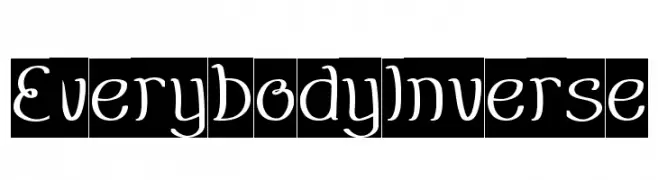
( weknow - Wino S Kadir - www.creativefabrica.com/designer/weknow/ )
A playful, handwritten-style font with curvy and dynamic characters.
![EverybodyInverse font caratteri gratis]() Scaricare 101 Downloads@WebFont
Scaricare 101 Downloads@WebFont -
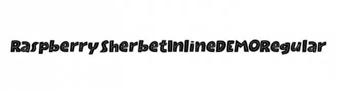
( Fonts by Hanoded )
A bold, playful font with a unique inline style and rounded characters.
![Raspberry Sherbet Inline DEMO Regular font caratteri gratis]() Scaricare 101 Downloads@WebFont
Scaricare 101 Downloads@WebFont -
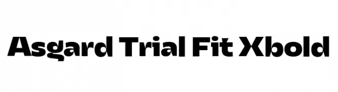
( Fonts by Zetafonts - Personal-use only. For commercial use please contact owner. )
A bold, geometric font with modern, clean lines and strong presence.
![Asgard Trial Fit Xbold font caratteri gratis]() Scaricare 101 Downloads@WebFont
Scaricare 101 Downloads@WebFont -
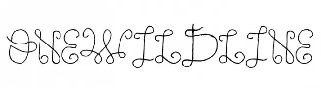
( www.juancasco.net )
A whimsical, single-line calligraphic font with elegant loops and curves.
![One Wild Line font caratteri gratis]() Scaricare 101 Downloads@WebFont
Scaricare 101 Downloads@WebFont -
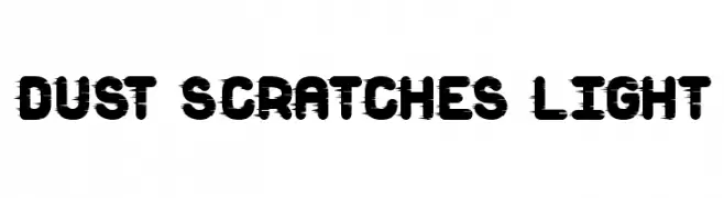
( Fonts by Greg Medina - www.dcoxy.com - Personal-use only. For commercial use please contact owner. )
A bold, distressed font with a scratched, industrial look.
![Dust Scratches light font caratteri gratis]() Scaricare 101 Downloads@WebFont
Scaricare 101 Downloads@WebFont -
( Fonts by Illushvara - Bayu Suwirya - Personal-use only. For commercial use please contact owner. )
A playful handwritten font with smooth, rounded strokes and a casual style.
![Candy font caratteri gratis]() Scaricare 101 Downloads@WebFont
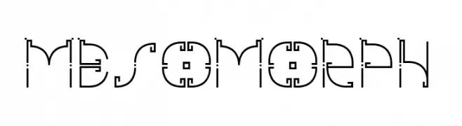
Scaricare 101 Downloads@WebFont -
![mesomorph font caratteri gratis]() Scaricare 101 Downloads@WebFont
Scaricare 101 Downloads@WebFont -
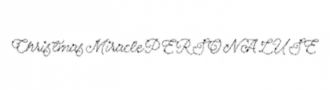
( Måns Grebäck - www.mansgreback.com )
A festive, star-studded script font perfect for holiday-themed projects.
![Christmas Miracle PERSONAL USE font caratteri gratis]() Scaricare 101 Downloads@WebFont
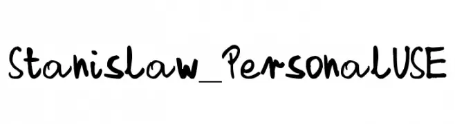
Scaricare 101 Downloads@WebFont -
![Stanislaw_PersonalUSE font caratteri gratis]() Scaricare 101 Downloads@WebFont
Scaricare 101 Downloads@WebFont -
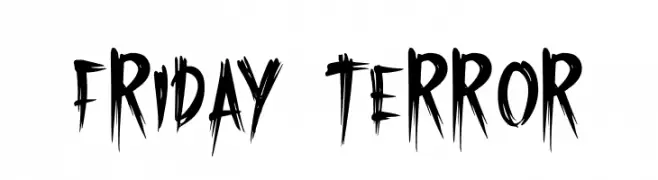
( Fonts by Khurasan - Syaf Rizal - Personal-use only. For commercial use please contact owner. )
A bold, jagged font with a horror-inspired, hand-drawn style.
![Friday Terror font caratteri gratis]() Scaricare 101 Downloads@WebFont
Scaricare 101 Downloads@WebFont -
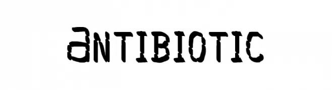
( Gulash - www.czcionki.com/gulash.html )
A bold, hand-drawn font with an organic and playful style.
![Antibiotic font caratteri gratis]() Scaricare 101 Downloads@WebFont
Scaricare 101 Downloads@WebFont -
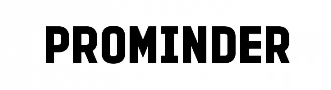
( Fonts by 7NTypes - Personal-use only. For commercial use please contact owner. )
A bold, modern sans-serif font with a strong and impactful presence.
![PROMINDER font caratteri gratis]() Scaricare 101 Downloads@WebFont
Scaricare 101 Downloads@WebFont -
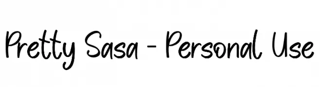
( Fonts by Paily Studio - Personal-use only. For commercial use please contact owner. )
A playful, handwritten font with smooth, flowing lines and a casual aesthetic.
![Pretty Sasa - Personal Use font caratteri gratis]() Scaricare 101 Downloads@WebFont
Scaricare 101 Downloads@WebFont -
( Fonts by Misti Hammers - mistifonts.com - Personal-use only. For commercial use please contact owner. )
A playful handwritten font with a casual and friendly style.
![Cactus Hugs font caratteri gratis]() Scaricare 101 Downloads@WebFont
Scaricare 101 Downloads@WebFont -
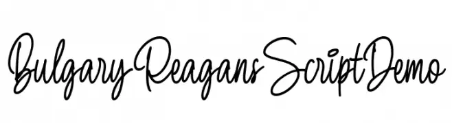
( Fonts by Letterhend Studio )
Elegant handwritten script font.
![BulgaryReagansScriptDemo font caratteri gratis]() Scaricare 101 Downloads@WebFont
Scaricare 101 Downloads@WebFont -
( Fonts by Intype - Personal-use only. For commercial use please contact owner. )
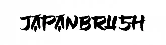
A bold, brushstroke font with dynamic and artistic flair.
![JAPANBRUSH font caratteri gratis]() Scaricare 101 Downloads@WebFont
Scaricare 101 Downloads@WebFont -
( April Arrington - www.facebook.com/profile.php?id=759597846 )
A modern, futuristic font with smooth curves and sharp angles.
![Discoid font caratteri gratis]() Scaricare 101 Downloads@WebFont
Scaricare 101 Downloads@WebFont -
( گالری فانت فارسی پژوهش آريانا - only compatible with Farsi and Arabic )
A modern, geometric font with clean lines and uniform stroke width.
![Gerd III font caratteri gratis]() Scaricare 101 Downloads@WebFont
Scaricare 101 Downloads@WebFont -
( Fonts by Jonathan S. Harris - www.tattoowoo.com. Personal-use only. For commercial use please contact owner. )
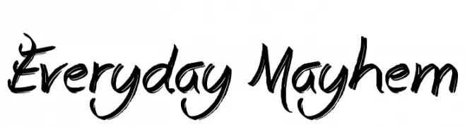
A bold, brush-style font with dynamic, expressive strokes.
![Everyday Mayhem font caratteri gratis]() Scaricare 101 Downloads@WebFont
Scaricare 101 Downloads@WebFont -
( imagex - www.imagex-fonts.com )
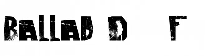
A bold, distressed font with a rugged, grunge aesthetic.
![Ballad of Dwight Frye font caratteri gratis]() Scaricare 101 Downloads@WebFont
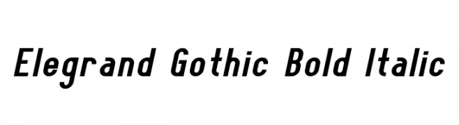
Scaricare 101 Downloads@WebFont -
![Elegrand Gothic Bold Italic font caratteri gratis]() Scaricare 101 Downloads@WebFont
Scaricare 101 Downloads@WebFont -
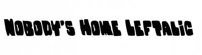
( Donationware - www.iconian.com )
A bold, playful, and decorative font with irregular, chunky characters.
![Nobody's Home Leftalic font caratteri gratis]() Scaricare 101 Downloads@WebFont
Scaricare 101 Downloads@WebFont -
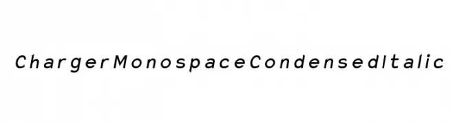
( Fonts by CannotIntoSpaceFonts - KineticPlasma Fonts - Personal-use only. For commercial use please contact owner. )
A modern, condensed monospace italic font with clean lines and consistent spacing.
![Charger Monospace Condensed Italic font caratteri gratis]() Scaricare 101 Downloads@WebFont
Scaricare 101 Downloads@WebFont -
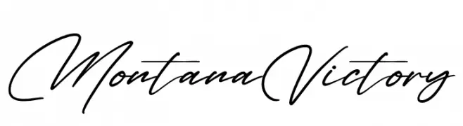
( Fonts by Letterena Studios )
A graceful, cursive script font with a natural handwriting style.
![Montana Victory font caratteri gratis]() Scaricare 101 Downloads@WebFont
Scaricare 101 Downloads@WebFont -
( Fonts by Peter Wiegel - www.peter-wiegel.de - Personal-use only. For commercial use please contact owner. )
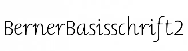
A modern, clean font with a handwritten touch and smooth curves.
![BernerBasisschrift2 font caratteri gratis]() Scaricare 101 Downloads@WebFont
Scaricare 101 Downloads@WebFont -
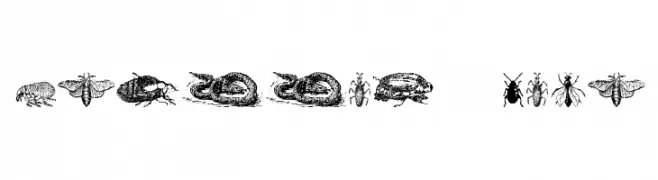
( Fonts by Intellecta Design )
Highly detailed vintage insect and animal illustrations as glyphs.
![Grissom Four font caratteri gratis]() Scaricare 101 Downloads@WebFont
Scaricare 101 Downloads@WebFont -
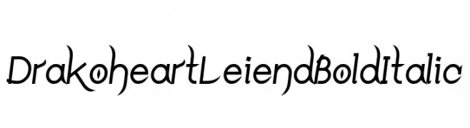
( Fonts by Yun Gonzalez - g3drakoheart-arts.deviantart.com - Personal-use only. For commercial use please contact owner. )
A bold and italicized font with dynamic curves and sharp angles.
![DrakoheartLeiendBoldItalic font caratteri gratis]() Scaricare 101 Downloads@WebFont
Scaricare 101 Downloads@WebFont -
![Lejana font caratteri gratis]() Scaricare 101 Downloads@WebFont
Scaricare 101 Downloads@WebFont


Quali sono i font più popolari adesso?
Poppins, Roboto, Montserrat, Open Sans e Lato sono molto usati per le forme pulite e l'ampia applicabilità — dall'identità di marca alle landing page e ai poster.
Quali font si usano spesso nei loghi?
Le sans serif geometriche (es. Poppins, famiglie in stile Gotham) sono scelte comuni per un branding pulito e scalabile. Per un tocco personale restano valide script e stili manoscritti. Abbina un display deciso per i titoli a un corpo testo neutro per riconoscibilità ed equilibrio.
Ogni quanto si aggiorna la lista?
Con regolarità, in base ai download e all'attività reale. Torna spesso per scoprire in anticipo le nuove preferite.
💡 Consiglio: aggiungi ai preferiti — le tendenze cambiano in fretta e i font top di oggi possono ispirare il rebranding di domani.