Benvenuto nelle Font Più Popolari — dove popolarità e qualità si incontrano. Qui trovi i font più scaricati e usati dell'anno. Se cerchi scelte sicure per logo, web o social, inizia da qui.
Ogni font top si distingue per equilibrio, leggibilità e versatilità. Troverai sans serif moderne, script eleganti, serif vintage e display minimalisti.
-
( Fonts by Dieter Steffmann )
A traditional Blackletter font with ornate, angular design and historical elegance.
 Scaricare 1920 Downloads@WebFont
 -
( Fonts by Nick Curtis - www.nicksfonts.com )
A bold, geometric font with a three-dimensional, faceted design.
![Facets NF font caratteri gratis]() Scaricare 1920 Downloads@WebFont
Scaricare 1920 Downloads@WebFont -
( Paul Lloyd Fonts )
A geometric, art deco-inspired font with tall, narrow letterforms and angular elements.
![Claritty font caratteri gratis]() Scaricare 1920 Downloads
Scaricare 1920 Downloads -
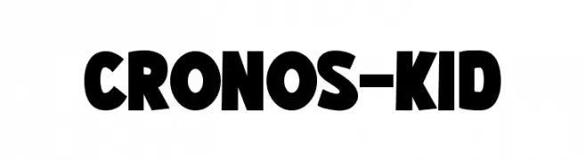
( Fonts by Pinisiart )
A bold, playful font with rounded, slightly irregular characters.
![CRONOS-KID font caratteri gratis]() Scaricare 1919 Downloads@WebFont
Scaricare 1919 Downloads@WebFont -
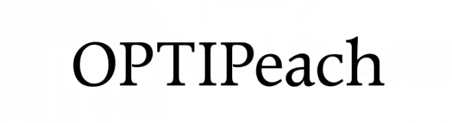
( Fonts by Castcraft Software - OPTI Fonts Archive - opti.netii.net - Personal-use only. For commercial use please contact owner. )
A classic serif font with elegant strokes and high readability.
![OPTIPeach font caratteri gratis]() Scaricare 1919 Downloads@WebFont
Scaricare 1919 Downloads@WebFont -
![Marigold font caratteri gratis]() Scaricare 1919 Downloads@WebFont
Scaricare 1919 Downloads@WebFont -
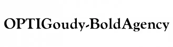
( Fonts by Castcraft Software - opti.netii.net - check the website before use )
A bold, classic serif font with elegant curves and strong strokes.
![OPTIGoudy-BoldAgency font caratteri gratis]() Scaricare 1919 Downloads@WebFont
Scaricare 1919 Downloads@WebFont -
( Fonts by Arkandis Digital Foundry )
A classic serif font with bold, elegant characters and moderate contrast.
![Romande ADF Style Std Demi Bold font caratteri gratis]() Scaricare 1919 Downloads@WebFont
Scaricare 1919 Downloads@WebFont -
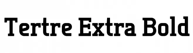
![Tertre Extra Bold font caratteri gratis]() Scaricare 1919 Downloads@WebFont
Scaricare 1919 Downloads@WebFont -
( Fonts by Boba Fonts )
A bold, angular font with a futuristic, sci-fi aesthetic.
![TIE-Wing font caratteri gratis]() Scaricare 1919 Downloads@WebFont
Scaricare 1919 Downloads@WebFont -
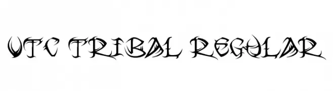
![VTC Tribal Regular font caratteri gratis]() Scaricare 1919 Downloads@WebFont
Scaricare 1919 Downloads@WebFont -
( Fonts by Altsys Metamorphosis )
A playful, handwritten font with a whimsical and casual style.
![Ashley font caratteri gratis]() Scaricare 1919 Downloads@WebFont
Scaricare 1919 Downloads@WebFont -
( Fonts by Cumberland Fontworks - http://www222.pair.com/sjohn/fonts.htm - S. John Ross )
A bold, playful handwritten font with rounded, irregular letterforms.
![Face Front font caratteri gratis]() Scaricare 1919 Downloads@WebFont
Scaricare 1919 Downloads@WebFont -
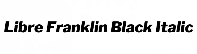
( Copyright (c) 2015, Impallari Type (www.impallari.com) )
A bold, italic typeface with high contrast and modern appeal.
![Libre Franklin Black Italic font caratteri gratis]() Scaricare 1918 Downloads@WebFont
Scaricare 1918 Downloads@WebFont -
( Fonts by Castcraft Software - opti.netii.net - check the website before use )
A tall, narrow, and modern font with a sleek and elegant appearance.
![OPTIJakeOSF font caratteri gratis]() Scaricare 1918 Downloads@WebFont
Scaricare 1918 Downloads@WebFont -
( Copyright (c) 2013, Eduardo Tunni (http://www.tipo.net.ar edu@tipo.net.ar), with Reserved Font Name 'Sintony' )
A bold, modern sans-serif font with high contrast and slightly condensed width.
![Sintony Bold font caratteri gratis]() Scaricare 1918 Downloads@WebFont
Scaricare 1918 Downloads@WebFont -
![Cutie Pop font caratteri gratis]() Scaricare 1918 Downloads@WebFont
Scaricare 1918 Downloads@WebFont -
( Fonts by CannotIntoSpaceFonts - KineticPlasma Fonts - Personal-use only. For commercial use please contact owner. )
A bold, extended font with thick strokes and a modern style.
![Warownia Black Extended font caratteri gratis]() Scaricare 1917 Downloads@WebFont
Scaricare 1917 Downloads@WebFont -
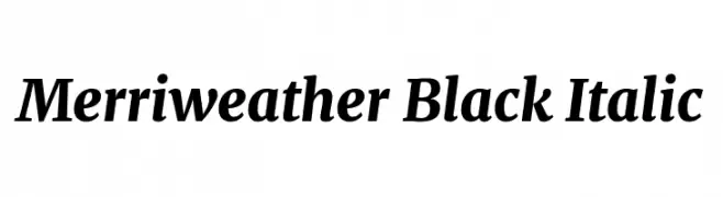
( Copyright 2016 The Merriweather Project Authors (https://github.com/EbenSorkin/Merriweather), with Reserved Font Name "Merriweather". )
A bold, italic serif font with high contrast and classic elegance.
![Merriweather Black Italic font caratteri gratis]() Scaricare 1917 Downloads@WebFont
Scaricare 1917 Downloads@WebFont -
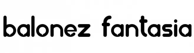
![balonez fantasia font caratteri gratis]() Scaricare 1917 Downloads@WebFont
Scaricare 1917 Downloads@WebFont -
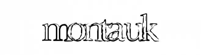
![Montauk font caratteri gratis]() Scaricare 1917 Downloads@WebFont
Scaricare 1917 Downloads@WebFont -
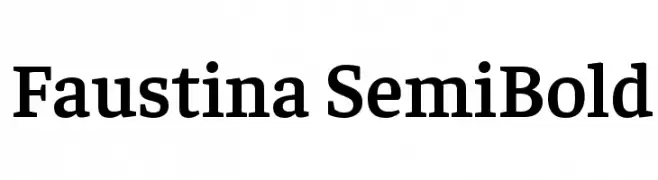
( Copyright 2016 The Faustina Project Authors (omnibus.type@gmail.com) )
A classic serif typeface with semi-bold weight and medium contrast, ideal for elegant and readable text.
![Faustina SemiBold font caratteri gratis]() Scaricare 1916 Downloads@WebFont
Scaricare 1916 Downloads@WebFont -
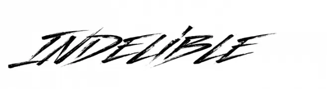
( Fonts by a Youssef Habchi - youssef-habchi.com. Personal-use only. For commercial use please contact owner. )
A bold, brush-style font with dynamic, energetic strokes.
![Indelible font caratteri gratis]() Scaricare 1916 Downloads@WebFont
Scaricare 1916 Downloads@WebFont -
( Copyright (c) 2012, Pablo Impallari (www.impallari.com|impallari@gmail.com) )
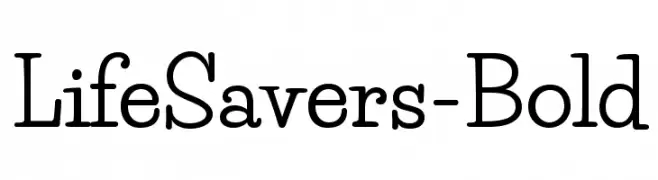
A bold, playful font with rounded edges and a friendly appearance.
![LifeSavers-Bold font caratteri gratis]() Scaricare 1916 Downloads@WebFont
Scaricare 1916 Downloads@WebFont -
( Copyright 2010, 2012, 2014 Adobe Systems Incorporated (http://www.adobe.com/), with Reserved Font Name ‘Source’. )
A bold, italic sans-serif font with a modern and professional look.
![Source Sans Pro Bold Italic font caratteri gratis]() Scaricare 1916 Downloads@WebFont
Scaricare 1916 Downloads@WebFont -
![MERCURY font caratteri gratis]() Scaricare 1916 Downloads@WebFont
Scaricare 1916 Downloads@WebFont -
![Pocono font caratteri gratis]() Scaricare 1916 Downloads@WebFont
Scaricare 1916 Downloads@WebFont -
![Almanaque Outline font caratteri gratis]() Scaricare 1916 Downloads@WebFont
Scaricare 1916 Downloads@WebFont -
( Fonts by James Cianciaruso - Ablaze )
A chaotic, thorny font with an edgy, artistic style.
![Chaos Times Light font caratteri gratis]() Scaricare 1916 Downloads@WebFont
Scaricare 1916 Downloads@WebFont -
Caratteri di fontsnthings. For commercial use please contact the owner.
![AlphaShapes xmas trees font caratteri gratis]() Scaricare 1916 Downloads@WebFont
Scaricare 1916 Downloads@WebFont -
![Dearest font caratteri gratis]() Scaricare 1916 Downloads@WebFont
Scaricare 1916 Downloads@WebFont -
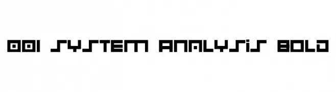
![001 System Analysis Bold font caratteri gratis]() Scaricare 1915 Downloads@WebFont
Scaricare 1915 Downloads@WebFont -
( Fonts by Annisa Afni )
A playful, hand-drawn font with rounded edges and a casual, whimsical style.
![Hello Twins - Personal Use font caratteri gratis]() Scaricare 1914 Downloads@WebFont
Scaricare 1914 Downloads@WebFont -
( Fonts by Manjali Studio )
A bold, playful handwritten font with a modern, friendly style.
![Chicken Quiche font caratteri gratis]() Scaricare 1914 Downloads@WebFont
Scaricare 1914 Downloads@WebFont -
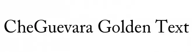
( DrJohnDee - www.fontspace.com/profile/drjohndee )
A classic serif font with elegant, thin strokes and a timeless appearance.
![CheGuevara Golden Text font caratteri gratis]() Scaricare 1914 Downloads@WebFont
Scaricare 1914 Downloads@WebFont


Quali sono i font più popolari adesso?
Poppins, Roboto, Montserrat, Open Sans e Lato sono molto usati per le forme pulite e l'ampia applicabilità — dall'identità di marca alle landing page e ai poster.
Quali font si usano spesso nei loghi?
Le sans serif geometriche (es. Poppins, famiglie in stile Gotham) sono scelte comuni per un branding pulito e scalabile. Per un tocco personale restano valide script e stili manoscritti. Abbina un display deciso per i titoli a un corpo testo neutro per riconoscibilità ed equilibrio.
Ogni quanto si aggiorna la lista?
Con regolarità, in base ai download e all'attività reale. Torna spesso per scoprire in anticipo le nuove preferite.
💡 Consiglio: aggiungi ai preferiti — le tendenze cambiano in fretta e i font top di oggi possono ispirare il rebranding di domani.