Benvenuto nelle Font Più Popolari — dove popolarità e qualità si incontrano. Qui trovi i font più scaricati e usati dell'anno. Se cerchi scelte sicure per logo, web o social, inizia da qui.
Ogni font top si distingue per equilibrio, leggibilità e versatilità. Troverai sans serif moderne, script eleganti, serif vintage e display minimalisti.
-
( www.youtube.com/user/0oOFrANziOo0 )
A bold, expressive font with dynamic, flowing strokes.
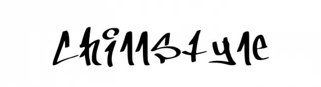 Scaricare 568 Downloads@WebFont
 -
( Fonts by www.kimberlygeswein.com - Kimberly Geswein )
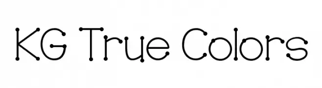
A playful, dot-accented font with a modern and whimsical style.
![KG True Colors font caratteri gratis]() Scaricare 568 Downloads@WebFont
Scaricare 568 Downloads@WebFont -
![Coffee & Curry Shop__G font caratteri gratis]() Scaricare 568 Downloads@WebFont
Scaricare 568 Downloads@WebFont -
![Stifora font caratteri gratis]() Scaricare 568 Downloads@WebFont
Scaricare 568 Downloads@WebFont -
Caratteri di fenomen75. For commercial use please contact the owner.
( free for personal use only )
A futuristic, stencil-like font with bold, rounded characters and consistent stroke thickness.
![STEPS Tracked Blur font caratteri gratis]() Scaricare 568 Downloads@WebFont
Scaricare 568 Downloads@WebFont -
-
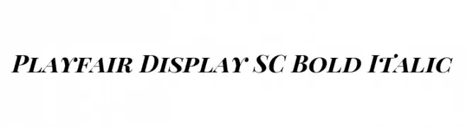
( Copyright 2017 The Playfair Display Project Authors (https://github.com/clauseggers/Playfair-Display), with Reserved Font Name "Playfair Display". )
A bold, italic serif font with high contrast and elegant styling.
![Playfair Display SC Bold Italic font caratteri gratis]() Scaricare 568 Downloads@WebFont
Scaricare 568 Downloads@WebFont -
![LudovicoWoodcut font caratteri gratis]() Scaricare 568 Downloads@WebFont
Scaricare 568 Downloads@WebFont -
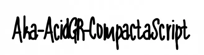
( Fonts by www.aka-acid.com )
A bold, expressive handwritten font with thick strokes and a playful style.
![Aka-AcidGR-CompactaScript font caratteri gratis]() Scaricare 568 Downloads@WebFont
Scaricare 568 Downloads@WebFont -
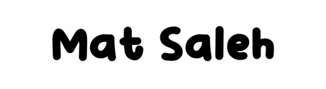
( Fonts by Khurasan )
A playful, bold font with rounded, bubbly characters and a friendly appearance.
![Mat Saleh font caratteri gratis]() Scaricare 568 Downloads@WebFont
Scaricare 568 Downloads@WebFont -
( Fonts by Adien Gunarta - fontasticindonesia.blogspot.com )
A playful, hand-drawn style font with rounded, bold characters.
![Si Kancil font caratteri gratis]() Scaricare 567 Downloads@WebFont
Scaricare 567 Downloads@WebFont


Quali sono i font più popolari adesso?
Poppins, Roboto, Montserrat, Open Sans e Lato sono molto usati per le forme pulite e l'ampia applicabilità — dall'identità di marca alle landing page e ai poster.
Quali font si usano spesso nei loghi?
Le sans serif geometriche (es. Poppins, famiglie in stile Gotham) sono scelte comuni per un branding pulito e scalabile. Per un tocco personale restano valide script e stili manoscritti. Abbina un display deciso per i titoli a un corpo testo neutro per riconoscibilità ed equilibrio.
Ogni quanto si aggiorna la lista?
Con regolarità, in base ai download e all'attività reale. Torna spesso per scoprire in anticipo le nuove preferite.
💡 Consiglio: aggiungi ai preferiti — le tendenze cambiano in fretta e i font top di oggi possono ispirare il rebranding di domani.