Benvenuto nelle Font Più Popolari — dove popolarità e qualità si incontrano. Qui trovi i font più scaricati e usati dell'anno. Se cerchi scelte sicure per logo, web o social, inizia da qui.
Ogni font top si distingue per equilibrio, leggibilità e versatilità. Troverai sans serif moderne, script eleganti, serif vintage e display minimalisti.
-
( Fonts by Klaus Johansen - www.listemageren.dK )
Not a valid font; contains illustrations and placeholders.
 Scaricare 95 Downloads@WebFont
 -
( London's Letters - www.londonsletters.com/ )
A decorative font with an integrated ankh symbol in each character.
![LMS Everlasting font caratteri gratis]() Scaricare 95 Downloads@WebFont
Scaricare 95 Downloads@WebFont -
( Fonts by a Max Infeld - XEROGRAPHER FONTS - xerographer.blogspot.com . Personal-use only. For commercial use please contact owner. )
A playful, casual handwritten font with uneven strokes and a whimsical style.
![TotallyStraight font caratteri gratis]() Scaricare 95 Downloads@WebFont
Scaricare 95 Downloads@WebFont -
( Fonts by Pixel Sagas - Neale and Shayna Davidson - Personal-use only. For commercial use please contact owner. )
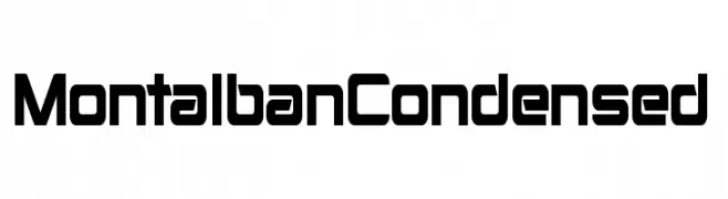
A bold, geometric, and condensed font with a modern and futuristic style.
![Montalban Condensed font caratteri gratis]() Scaricare 95 Downloads@WebFont
Scaricare 95 Downloads@WebFont -
( Fonts by Typodermic Fonts - Raymond Larabie - Personal-use only. For commercial use please contact owner. )
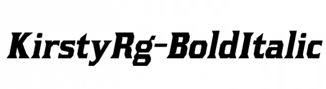
A bold, italicized font with sharp angles and dynamic energy.
![KirstyRg-BoldItalic font caratteri gratis]() Scaricare 95 Downloads@WebFont
Scaricare 95 Downloads@WebFont -
( Fonts by Daniel Zadorozny - www.iconian.com - Free for personal use )
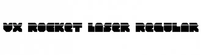
A bold, geometric font with a futuristic and industrial design.
![VX Rocket Laser Regular font caratteri gratis]() Scaricare 95 Downloads@WebFont
Scaricare 95 Downloads@WebFont -
( Fonts by Wino S Kadir - weknow - www.revolge.com/shop/weknow/ - Personal-use only. For commercial use please contact owner. )
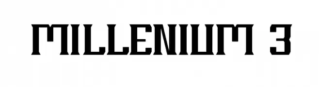
A bold, geometric font with a futuristic and industrial aesthetic.
![MILLENIUM 3 font caratteri gratis]() Scaricare 95 Downloads@WebFont
Scaricare 95 Downloads@WebFont -
( Iconian Fonts - Daniel Zadorozny - www.iconian.com )
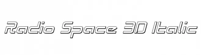
A futuristic, 3D italic font with outlined characters and a tech-inspired design.
![Radio Space 3D Italic font caratteri gratis]() Scaricare 95 Downloads@WebFont
Scaricare 95 Downloads@WebFont -
( Fonts by Manfred Klein. Free for private and charity use. Free for commercial with donation to organizations )
An artistic, pictorial font using illustrations for each character.
![BlaxArties font caratteri gratis]() Scaricare 95 Downloads@WebFont
Scaricare 95 Downloads@WebFont -
( Fonts by Andrimada Creative - Personal-use only. For commercial use please contact owner. )
A bold, playful font with Halloween-themed elements and rounded characters.
![Ghost Stone font caratteri gratis]() Scaricare 95 Downloads@WebFont
Scaricare 95 Downloads@WebFont -
( Mouser Fonts - www.mouserfonts.com/ )
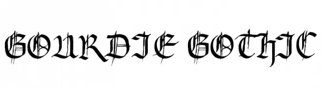
A classic Gothic font with intricate, sharp edges and pointed serifs.
![Gourdie Gothic font caratteri gratis]() Scaricare 95 Downloads@WebFont
Scaricare 95 Downloads@WebFont -
![Gremlin Skins HD Regular font caratteri gratis]() Scaricare 95 Downloads@WebFont
Scaricare 95 Downloads@WebFont -
( Rahmat Hidayat )
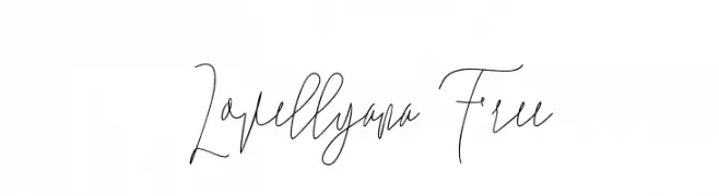
An elegant, cursive font with a graceful, handwritten style.
![Lovellyana Free font caratteri gratis]() Scaricare 95 Downloads@WebFont
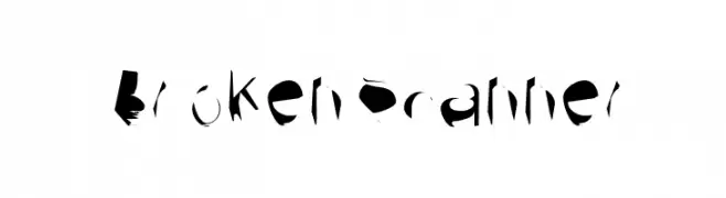
Scaricare 95 Downloads@WebFont -
![Broken Scanner font caratteri gratis]() Scaricare 95 Downloads@WebFont
Scaricare 95 Downloads@WebFont -
( Fonts by MJB Letters - Muhammad Mujibulloh - Personal-use only. For commercial use please contact owner. )
A playful and elegant script font with a handwritten style.
![nalytha font caratteri gratis]() Scaricare 95 Downloads@WebFont
Scaricare 95 Downloads@WebFont -
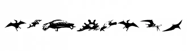
( Fonts by Manfred Klein. Free for private and charity use. Free for commercial with donation to organizations )
A display font made of dinosaur and prehistoric animal silhouettes.
![NewDinos font caratteri gratis]() Scaricare 95 Downloads@WebFont
Scaricare 95 Downloads@WebFont -
( Fonts by gluk - Grzegorz l - Personal-use only. For commercial use please contact owner. )
An elegant and sophisticated font with flowing lines and a slightly slanted style.
![Garineldo font caratteri gratis]() Scaricare 95 Downloads@WebFont
Scaricare 95 Downloads@WebFont -
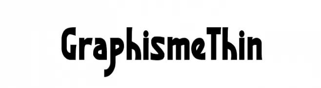
( Fonts by Xerographer Fonts )
A bold, geometric font with strong, angular shapes and consistent stroke widths.
![GraphismeThin font caratteri gratis]() Scaricare 95 Downloads@WebFont
Scaricare 95 Downloads@WebFont -
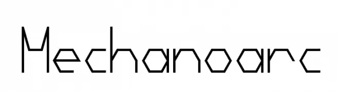
( Fonts by mizcore )
A geometric, angular font with a futuristic and industrial design.
![Mechanoarc font caratteri gratis]() Scaricare 95 Downloads@WebFont
Scaricare 95 Downloads@WebFont -
![Ampere Condensed Italic font caratteri gratis]() Scaricare 95 Downloads@WebFont
Scaricare 95 Downloads@WebFont -
( Fonts by Perspectype Studio )
Casual, modern handwritten script with playful loops.
![Bronwish Albilone font caratteri gratis]() Scaricare 95 Downloads@WebFont
Scaricare 95 Downloads@WebFont -
![Ampere Condensed font caratteri gratis]() Scaricare 95 Downloads@WebFont
Scaricare 95 Downloads@WebFont -
( Zetafonts - www.zetafonts.com )
A clean, modern sans-serif font with smooth curves and uniform stroke width.
![KabrioSoft-Light font caratteri gratis]() Scaricare 95 Downloads@WebFont
Scaricare 95 Downloads@WebFont -
( Perry Mason )
A bold, stencil-style font with a military aesthetic and strong presence.
![AustralianFlyingCorpsStencilSD font caratteri gratis]() Scaricare 95 Downloads@WebFont
Scaricare 95 Downloads@WebFont -
![High Drowic Italic font caratteri gratis]() Scaricare 95 Downloads@WebFont
Scaricare 95 Downloads@WebFont -
( Fonts by Vladimir Nikolic - www.creativefabrica.com/designer/vladimirnikolic/ - Personal-use only. For commercial use please contact owner. )
A bold, geometric font with a modern, industrial aesthetic.
![Panzer Regular font caratteri gratis]() Scaricare 95 Downloads@WebFont
Scaricare 95 Downloads@WebFont -
( Personal-use only. For commercial use please contact owner. )
A playful, hand-drawn font with an informal and whimsical style.
![RetepRelleum font caratteri gratis]() Scaricare 95 Downloads@WebFont
Scaricare 95 Downloads@WebFont -
( Fonts by Benjamin Blåholtz - Personal-use only. For commercial use please contact owner. )
A modern, geometric sans-serif font with clean lines and balanced proportions.
![StorgataRegular font caratteri gratis]() Scaricare 95 Downloads@WebFont
Scaricare 95 Downloads@WebFont -
( Fonts by Faqih Fawaji - Personal-use only. For commercial use please contact owner. )
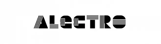
A bold, geometric font with a modern, striped design.
![Alectro font caratteri gratis]() Scaricare 95 Downloads@WebFont
Scaricare 95 Downloads@WebFont -
( Typodermic Fonts - Ray Larabie - www.typodermicfonts.com/ )
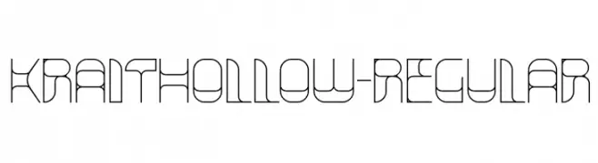
A geometric, hollow font with a futuristic and modern aesthetic.
![KraitHollow-Regular font caratteri gratis]() Scaricare 95 Downloads@WebFont
Scaricare 95 Downloads@WebFont -
![Broken Lamp Extended font caratteri gratis]() Scaricare 95 Downloads@WebFont
Scaricare 95 Downloads@WebFont -
( Fonts by Klaus Johansen - www.listemageren.dK )
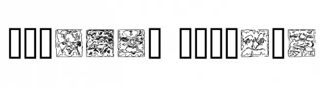
A decorative font with intricate, mythical imagery within each character.
![Mythago Outline font caratteri gratis]() Scaricare 95 Downloads@WebFont
Scaricare 95 Downloads@WebFont -
( Fonts by Kong Font - https://fontkong.com/ - Personal-use only. For commercial use please contact owner. )
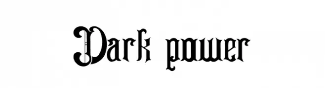
A bold, Gothic-style font with intricate detailing and a medieval aesthetic.
![Dark power font caratteri gratis]() Scaricare 95 Downloads@WebFont
Scaricare 95 Downloads@WebFont -
( Fonts by Billy Argel Fonts - www.billyargel.com - Personal-use only. For commercial use please contact owner. )
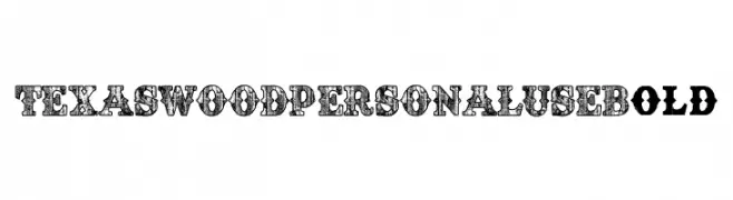
A bold, decorative font with a woodcut texture and vintage appeal.
![TEXASWOOD PERSONAL USE Bold font caratteri gratis]() Scaricare 95 Downloads@WebFont
Scaricare 95 Downloads@WebFont -
( Fonts by Daniel Zadorozny - www.iconian.com )
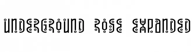
A modern, decorative font with bold strokes and circular embellishments.
![Underground Rose Expanded font caratteri gratis]() Scaricare 95 Downloads@WebFont
Scaricare 95 Downloads@WebFont


Quali sono i font più popolari adesso?
Poppins, Roboto, Montserrat, Open Sans e Lato sono molto usati per le forme pulite e l'ampia applicabilità — dall'identità di marca alle landing page e ai poster.
Quali font si usano spesso nei loghi?
Le sans serif geometriche (es. Poppins, famiglie in stile Gotham) sono scelte comuni per un branding pulito e scalabile. Per un tocco personale restano valide script e stili manoscritti. Abbina un display deciso per i titoli a un corpo testo neutro per riconoscibilità ed equilibrio.
Ogni quanto si aggiorna la lista?
Con regolarità, in base ai download e all'attività reale. Torna spesso per scoprire in anticipo le nuove preferite.
💡 Consiglio: aggiungi ai preferiti — le tendenze cambiano in fretta e i font top di oggi possono ispirare il rebranding di domani.