Benvenuto nelle Font Più Popolari — dove popolarità e qualità si incontrano. Qui trovi i font più scaricati e usati dell'anno. Se cerchi scelte sicure per logo, web o social, inizia da qui.
Ogni font top si distingue per equilibrio, leggibilità e versatilità. Troverai sans serif moderne, script eleganti, serif vintage e display minimalisti.
-
 Scaricare 1912 Downloads@WebFont
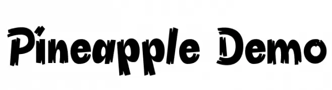
 -
![Pineapple Demo font caratteri gratis]() Scaricare 1912 Downloads@WebFont
Scaricare 1912 Downloads@WebFont -
( Fonts by Daniel Zadorozny - www.iconian.com )
A futuristic, angular font with bold, geometric forms and an expanded width.
![4114 Blaster Expanded font caratteri gratis]() Scaricare 1912 Downloads@WebFont
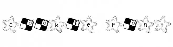
Scaricare 1912 Downloads@WebFont -
![Cookie Font font caratteri gratis]() Scaricare 1912 Downloads@WebFont
Scaricare 1912 Downloads@WebFont -
( Fonts by Hendra Pratama - HPTypework - https://hptypework.com - Personal-use only. For commercial use please contact owner. )
A bold, cursive font with dynamic, flowing strokes and high contrast.
![Belgates font caratteri gratis]() Scaricare 1911 Downloads@WebFont
Scaricare 1911 Downloads@WebFont -
( Copyright 2018 The Long Cang Project Authors (https://github.com/googlefonts/longcang) )
A playful, handwritten-style font with fluid, organic strokes.
![Long Cang Regular font caratteri gratis]() Scaricare 1911 Downloads@WebFont
Scaricare 1911 Downloads@WebFont -
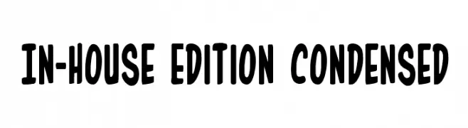
( Fonts by Daniel Zadorozny - www.iconian.com )
A bold, playful, and condensed font with rounded characters.
![In-House Edition Condensed font caratteri gratis]() Scaricare 1911 Downloads@WebFont
Scaricare 1911 Downloads@WebFont -
( Font by Jayvee D. Enaguas - grandchaos9000.deviantart.com )
A playful, rounded font with smooth curves and a friendly appearance.
![Stanberry Regular font caratteri gratis]() Scaricare 1911 Downloads@WebFont
Scaricare 1911 Downloads@WebFont -
( Fonts by Manfred Klein. Free for private and charity use. Free for commercial with donation to organizations )
A bold, medieval-style font with calligraphic influences and sharp, flowing forms.
![IrishUncialfabeta-Bold font caratteri gratis]() Scaricare 1911 Downloads@WebFont
Scaricare 1911 Downloads@WebFont -
( Fonts by ShyFonts )
A bold, oblique font with a futuristic and mechanical design.
![SF Automaton Bold Oblique font caratteri gratis]() Scaricare 1911 Downloads@WebFont
Scaricare 1911 Downloads@WebFont -
![PUNK ROCK Color Fill font caratteri gratis]() Scaricare 1911 Downloads@WebFont
Scaricare 1911 Downloads@WebFont -
( Fonts by Graham Meade - GemFonts )
A bold, textured font with vertical lines creating a distressed effect.
![Erthqake font caratteri gratis]() Scaricare 1911 Downloads@WebFont
Scaricare 1911 Downloads@WebFont -
( Fonts by LJ Design Studios )
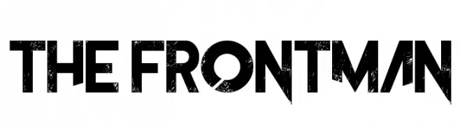
A bold, geometric font with a distressed, vintage texture.
![The Frontman font caratteri gratis]() Scaricare 1910 Downloads@WebFont
Scaricare 1910 Downloads@WebFont -
( Fonts by Sharkshock Productions----www.sharkshock.com. Personal-use only. For commercial use please contact owner. )
A bold, italicized font with high contrast and a dynamic, condensed style.
![News of the World Italic font caratteri gratis]() Scaricare 1910 Downloads@WebFont
Scaricare 1910 Downloads@WebFont -
( Copyright (c) 2011, Brownfox (gayaneh.b@gmail.com) )
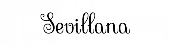
An elegant, decorative script font with intricate swirls and loops.
![Sevillana font caratteri gratis]() Scaricare 1910 Downloads@WebFont
Scaricare 1910 Downloads@WebFont -
![the bubble letters font caratteri gratis]() Scaricare 1910 Downloads@WebFont
Scaricare 1910 Downloads@WebFont -
( Fonts by www.typodermicfonts.com - Ray Larabie )
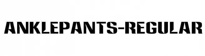
A bold, geometric font with strong angles and high contrast, ideal for impactful designs.
![Anklepants-Regular font caratteri gratis]() Scaricare 1909 Downloads@WebFont
Scaricare 1909 Downloads@WebFont -
( Copyright (c) 2010, Danh Hong (khmertype.blogspot.com) )
A modern, clean sans-serif font with excellent readability and uniform design.
![Khmer font caratteri gratis]() Scaricare 1909 Downloads@WebFont
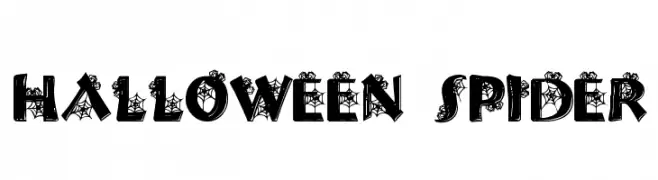
Scaricare 1909 Downloads@WebFont -
![Halloween Spider font caratteri gratis]() Scaricare 1909 Downloads@WebFont
Scaricare 1909 Downloads@WebFont -
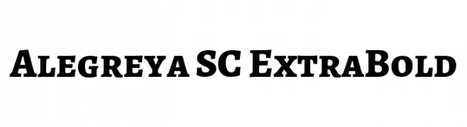
( Copyright 2011 The Alegreya Project Authors (https://github.com/huertatipografica/Alegreya) )
A bold serif font with a classic yet modern style.
![Alegreya SC ExtraBold font caratteri gratis]() Scaricare 1908 Downloads@WebFont
Scaricare 1908 Downloads@WebFont -
( Copyright (c) 2012 by Brian J. Bonislawsky DBA Astigmatic (AOETI) (astigma@astigmatic.com), with Reserved Font Name 'Mouse Memoirs' )
A playful, bold font with a whimsical, cartoon-like style.
![Mouse Memoirs font caratteri gratis]() Scaricare 1908 Downloads@WebFont
Scaricare 1908 Downloads@WebFont -
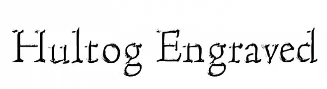
( Fonts by Cumberland Fontworks - http://www222.pair.com/sjohn/fonts.htm - S. John Ross )
An engraved, textured font with a vintage and classic appeal.
![Hultog Engraved font caratteri gratis]() Scaricare 1908 Downloads@WebFont
Scaricare 1908 Downloads@WebFont -
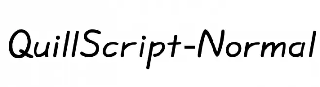
( Fonts by or from www.graffitifonts.net )
A smooth, flowing script font with a handwritten feel.
![QuillScript-Normal font caratteri gratis]() Scaricare 1908 Downloads@WebFont
Scaricare 1908 Downloads@WebFont -
![Funland Park JL font caratteri gratis]() Scaricare 1908 Downloads@WebFont
Scaricare 1908 Downloads@WebFont -
( Fonts by Khurasan )
A playful, handwritten font with bold, rounded characters.
![Jessycat font caratteri gratis]() Scaricare 1907 Downloads@WebFont
Scaricare 1907 Downloads@WebFont -
( Fonts by James Cianciaruso - Ablaze )
A bold, distressed font with a vintage, typewriter-inspired style.
![Ieicester Bold font caratteri gratis]() Scaricare 1907 Downloads@WebFont
Scaricare 1907 Downloads@WebFont -
( Fonts by Press Gang Studios - Andeh Pinkard - www.pressgang-studios.com )
A bold, playful font with irregular, cartoonish letterforms.
![Badonk-a-donk font caratteri gratis]() Scaricare 1907 Downloads@WebFont
Scaricare 1907 Downloads@WebFont -
( Fonts by Daniel Zadorozny - www.iconian.com )
A bold, condensed font with strong, blocky characters for impactful designs.
![Regulators Condensed font caratteri gratis]() Scaricare 1907 Downloads@WebFont
Scaricare 1907 Downloads@WebFont -
( Fonts by Cristiano Sobral - Personal-use only. For commercial use please contact owner. )
A bold, modern sans-serif typeface with clean lines and uniform weight.
![Cheyenne Sans Bold font caratteri gratis]() Scaricare 1906 Downloads@WebFont
Scaricare 1906 Downloads@WebFont -
( Hanoded - David Kerkhoff - www.hanodedfonts.com )
A playful, bold, handwritten font with a casual and dynamic style.
![Earworm DEMO Regular font caratteri gratis]() Scaricare 1906 Downloads@WebFont
Scaricare 1906 Downloads@WebFont -
( Copyright (c) 2012, Pablo Impallari (www.impallari.com|impallari@gmail.com), Rodrigo Fuenzalida (www.rfuenzalida.com|hello@rfuenzalida.com), with Reserved Font Name Libre Caslon. )
A classic serif typeface with elegant details and balanced proportions.
![LibreCaslonText-Regular font caratteri gratis]() Scaricare 1906 Downloads@WebFont
Scaricare 1906 Downloads@WebFont -
![Halogen font caratteri gratis]() Scaricare 1906 Downloads@WebFont
Scaricare 1906 Downloads@WebFont -
![CrashNumbering-Gothic font caratteri gratis]() Scaricare 1906 Downloads@WebFont
Scaricare 1906 Downloads@WebFont -
( Fonts by Nick Curtis - www.nicksfonts.com )
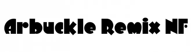
A bold, geometric font with retro and art deco influences.
![Arbuckle Remix NF font caratteri gratis]() Scaricare 1906 Downloads@WebFont
Scaricare 1906 Downloads@WebFont -
![Gradl font caratteri gratis]() Scaricare 1906 Downloads@WebFont
Scaricare 1906 Downloads@WebFont


Quali sono i font più popolari adesso?
Poppins, Roboto, Montserrat, Open Sans e Lato sono molto usati per le forme pulite e l'ampia applicabilità — dall'identità di marca alle landing page e ai poster.
Quali font si usano spesso nei loghi?
Le sans serif geometriche (es. Poppins, famiglie in stile Gotham) sono scelte comuni per un branding pulito e scalabile. Per un tocco personale restano valide script e stili manoscritti. Abbina un display deciso per i titoli a un corpo testo neutro per riconoscibilità ed equilibrio.
Ogni quanto si aggiorna la lista?
Con regolarità, in base ai download e all'attività reale. Torna spesso per scoprire in anticipo le nuove preferite.
💡 Consiglio: aggiungi ai preferiti — le tendenze cambiano in fretta e i font top di oggi possono ispirare il rebranding di domani.