Benvenuto nelle Font Più Popolari — dove popolarità e qualità si incontrano. Qui trovi i font più scaricati e usati dell'anno. Se cerchi scelte sicure per logo, web o social, inizia da qui.
Ogni font top si distingue per equilibrio, leggibilità e versatilità. Troverai sans serif moderne, script eleganti, serif vintage e display minimalisti.
-
( www.lukeferrand.com )
A playful, hand-drawn font with rounded, whimsical characters.
 Scaricare 543 Downloads@WebFont
 -
![V5 Bloques font caratteri gratis]() Scaricare 543 Downloads@WebFont
Scaricare 543 Downloads@WebFont -
( Fonts by Darrell Flood )
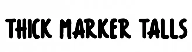
Bold, rounded, hand-drawn marker style font with a playful and informal look.
![Thick Marker Talls font caratteri gratis]() Scaricare 543 Downloads@WebFont
Scaricare 543 Downloads@WebFont -
( Fonts by Woodcutter )
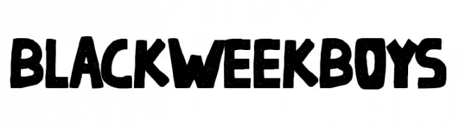
A bold, distressed font with a vintage, hand-crafted look.
![Black Week Boys font caratteri gratis]() Scaricare 543 Downloads@WebFont
Scaricare 543 Downloads@WebFont -
( Font by Jonathan Harris - www.tattoowoo.com )
A dynamic, sketch-like font with overlapping strokes and artistic flair.
![Draw Freehand font caratteri gratis]() Scaricare 543 Downloads@WebFont
Scaricare 543 Downloads@WebFont -
-
( Fonts by Lemon Studio Type )
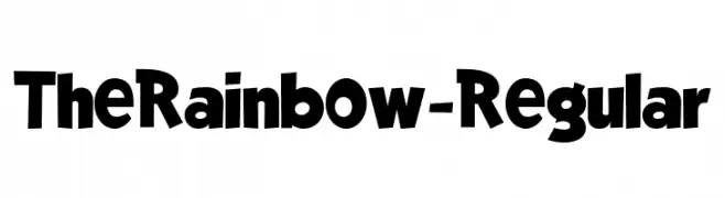
A bold, playful font with rounded, whimsical characters.
![TheRainbow-Regular font caratteri gratis]() Scaricare 543 Downloads@WebFont
Scaricare 543 Downloads@WebFont -
( Fonts by Andrew McCluskey - nalgames.com )
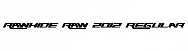
A bold, angular font with a futuristic and dynamic style.
![Rawhide Raw 2012 Regular font caratteri gratis]() Scaricare 543 Downloads@WebFont
Scaricare 543 Downloads@WebFont -
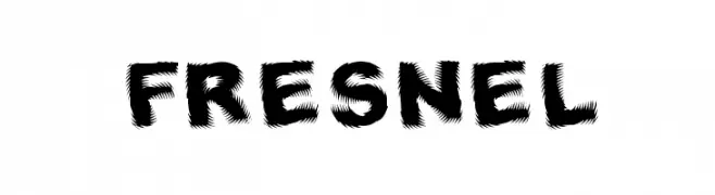
( Fonts by Divide By Zero! - fonts.tom7.com )
A bold, dynamic font with jagged edges and a sense of movement.
![Fresnel font caratteri gratis]() Scaricare 543 Downloads@WebFont
Scaricare 543 Downloads@WebFont -
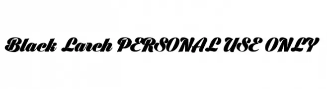
( Fonts by Måns Grebäck )
A bold, dynamic script font with strong slants and thick strokes.
![Black Larch PERSONAL USE ONLY font caratteri gratis]() Scaricare 543 Downloads@WebFont
Scaricare 543 Downloads@WebFont -
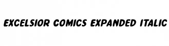
( Fonts by Daniel Zadorozny - www.iconian.com - Free for personal use )
A bold, expanded, and italicized font with a playful and friendly style.
![Excelsior Comics Expanded Italic font caratteri gratis]() Scaricare 543 Downloads@WebFont
Scaricare 543 Downloads@WebFont


Quali sono i font più popolari adesso?
Poppins, Roboto, Montserrat, Open Sans e Lato sono molto usati per le forme pulite e l'ampia applicabilità — dall'identità di marca alle landing page e ai poster.
Quali font si usano spesso nei loghi?
Le sans serif geometriche (es. Poppins, famiglie in stile Gotham) sono scelte comuni per un branding pulito e scalabile. Per un tocco personale restano valide script e stili manoscritti. Abbina un display deciso per i titoli a un corpo testo neutro per riconoscibilità ed equilibrio.
Ogni quanto si aggiorna la lista?
Con regolarità, in base ai download e all'attività reale. Torna spesso per scoprire in anticipo le nuove preferite.
💡 Consiglio: aggiungi ai preferiti — le tendenze cambiano in fretta e i font top di oggi possono ispirare il rebranding di domani.