Benvenuto nelle Font Più Popolari — dove popolarità e qualità si incontrano. Qui trovi i font più scaricati e usati dell'anno. Se cerchi scelte sicure per logo, web o social, inizia da qui.
Ogni font top si distingue per equilibrio, leggibilità e versatilità. Troverai sans serif moderne, script eleganti, serif vintage e display minimalisti.
-
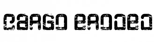
( Qkila - Quentin Aquila - www.creativefabrica.com/designer/qkila/ )
A distressed, industrial-style font with a rugged, weathered appearance.
 Scaricare 92 Downloads@WebFont
 -
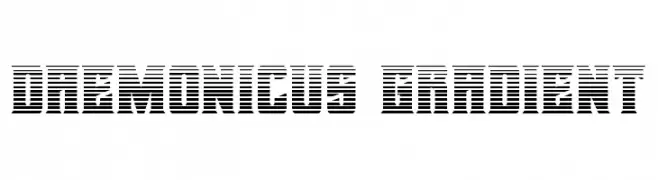
![Daemonicus Gradient font caratteri gratis]() Scaricare 92 Downloads@WebFont
Scaricare 92 Downloads@WebFont -
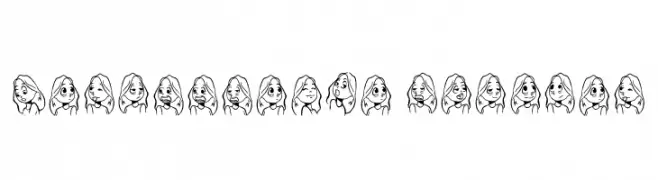
( Fonts by Amol Koli )
Hand-drawn cartoon font made of expressive character faces.
![Cartoonabha Regular font caratteri gratis]() Scaricare 92 Downloads@WebFont
Scaricare 92 Downloads@WebFont -
( Fonts by Iconian Fonts - Daniel Zadorozny - Personal-use only. For commercial use please contact owner. )
A bold, condensed, and italicized font with a dynamic, speedy appearance.
!['89 Speed Affair CondensedItal font caratteri gratis]() Scaricare 92 Downloads@WebFont
Scaricare 92 Downloads@WebFont -
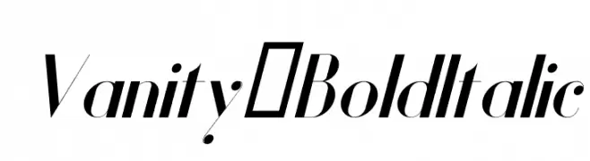
( Fonts by Hendrick Rolandez - Personal-use only. For commercial use please contact owner. )
A bold, italicized font with high contrast and modern elegance.
![Vanity-BoldItalic font caratteri gratis]() Scaricare 92 Downloads@WebFont
Scaricare 92 Downloads@WebFont -
( Fonts by www.woodcutter.es - woodcutter Manero - Personal-use only. For commercial use please contact owner. )
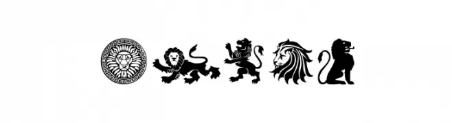
Diverse lion icon set with heraldic, geometric, and artistic styles.
![Lions font caratteri gratis]() Scaricare 92 Downloads@WebFont
Scaricare 92 Downloads@WebFont -
( Character )
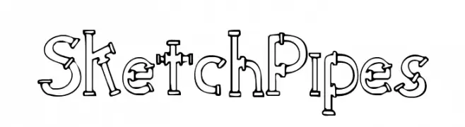
A playful, pipe-themed font with a bold, industrial design.
![SketchPipes font caratteri gratis]() Scaricare 92 Downloads@WebFont
Scaricare 92 Downloads@WebFont -
![Typis-Sans-Demo font caratteri gratis]() Scaricare 92 Downloads@WebFont
Scaricare 92 Downloads@WebFont -
![Deceptibots Title font caratteri gratis]() Scaricare 92 Downloads@WebFont
Scaricare 92 Downloads@WebFont -
( Fonts by Pinisiart )
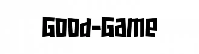
A bold, angular font with a playful, hand-crafted appearance.
![Good-Game font caratteri gratis]() Scaricare 92 Downloads@WebFont
Scaricare 92 Downloads@WebFont -
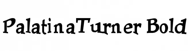
( Lollibomb - www.lollibomb.com/ )
A bold, playful font with a whimsical and artistic style.
![PalatinaTurner Bold font caratteri gratis]() Scaricare 92 Downloads@WebFont
Scaricare 92 Downloads@WebFont -
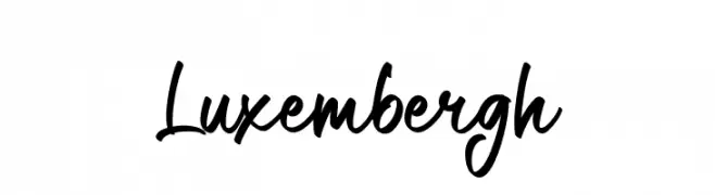
( Fonts by VampStudio - Personal-use only. For commercial use please contact owner. )
A dynamic, expressive handwritten font with fluid, flowing letterforms.
![Luxembergh font caratteri gratis]() Scaricare 92 Downloads@WebFont
Scaricare 92 Downloads@WebFont -
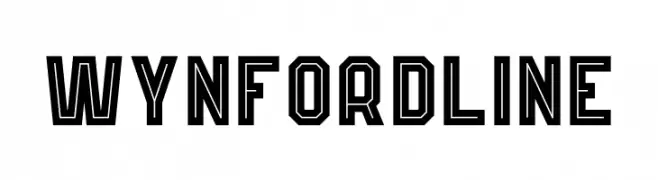
( Fonts by Kong Font - https://fontkong.com/ - Personal-use only. For commercial use please contact owner. )
A bold, geometric outlined font with a modern industrial style.
![Wynford Line font caratteri gratis]() Scaricare 92 Downloads@WebFont
Scaricare 92 Downloads@WebFont -
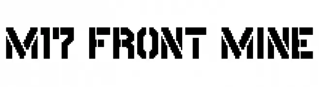
( Fonts by Miffies - mfs.jp.org - Personal-use only. For commercial use please contact owner. )
A bold, geometric font with a modern, digital aesthetic.
![M17_FRONT MINE font caratteri gratis]() Scaricare 92 Downloads@WebFont
Scaricare 92 Downloads@WebFont -
( Aleksandar Stevanov - www.behance.net/Stevanov )
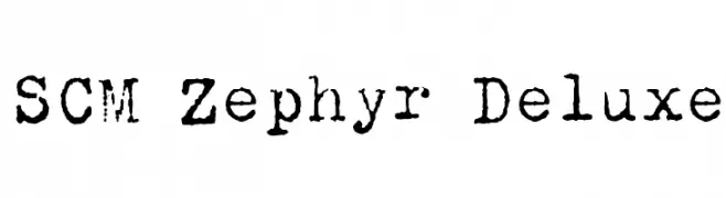
A vintage, typewriter-style font with a monospaced, slightly distressed appearance.
![SCM Zephyr Deluxe font caratteri gratis]() Scaricare 92 Downloads@WebFont
Scaricare 92 Downloads@WebFont -
( Fonts by Peter Wiegel - www.peter-wiegel.de - Personal-use only. For commercial use please contact owner. )
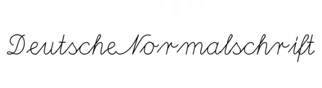
A classic cursive font with elegant, flowing lines and seamless letter connections.
![DeutscheNormalschrift font caratteri gratis]() Scaricare 92 Downloads@WebFont
Scaricare 92 Downloads@WebFont -
( ThePerfectDay Fonts )
A modern, geometric outline font with consistent width and high legibility.
![eidolon font caratteri gratis]() Scaricare 92 Downloads@WebFont
Scaricare 92 Downloads@WebFont -
( Fonts by Black[Foundry] )
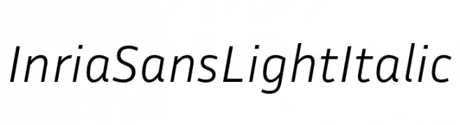
A modern, light, italic sans-serif font with smooth, consistent strokes.
![Inria Sans Light Italic font caratteri gratis]() Scaricare 92 Downloads@WebFont
Scaricare 92 Downloads@WebFont -
( Fonts by Peter Wiegel - www.peter-wiegel.de - Personal-use only. For commercial use please contact owner. )
A classic blackletter font with ornate, italicized letterforms and a historical aesthetic.
![Neue Theuerdank Fraktur UNZ1 Italic font caratteri gratis]() Scaricare 92 Downloads@WebFont
Scaricare 92 Downloads@WebFont -
( Fonts by Daniel Zadorozny - www.iconian.com - Free for personal use )
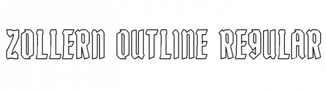
A bold, geometric outline font with sharp, angular edges for a modern and striking appearance.
![Zollern Outline Regular font caratteri gratis]() Scaricare 92 Downloads@WebFont
Scaricare 92 Downloads@WebFont -
( Fonts by Geronimo Fonts - Personal-use only. For commercial use please contact owner. )
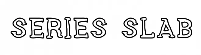
A bold, outlined slab serif font with a modern yet classic appeal.
![SERIES SLAB font caratteri gratis]() Scaricare 92 Downloads@WebFont
Scaricare 92 Downloads@WebFont -
( Fonts by Dmitry Astakhov - www.behance.net/adonis-abe1e - Personal-use only. For commercial use please contact owner. )
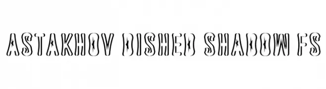
A bold, decorative font with star cutouts and a shadow effect for a 3D look.
![Astakhov Dished Shadow FS font caratteri gratis]() Scaricare 92 Downloads@WebFont
Scaricare 92 Downloads@WebFont -
( Fonts by Zeenesia Studio - Doni Purwoko - Personal-use only. For commercial use please contact owner. )
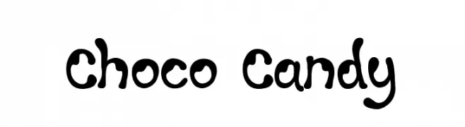
A playful, bubbly font with a hand-drawn, whimsical style.
![Choco Candy font caratteri gratis]() Scaricare 92 Downloads@WebFont
Scaricare 92 Downloads@WebFont -
( www.sparkybuddy.com - David Pustansky - www.sparkybuddy.com/fonts )
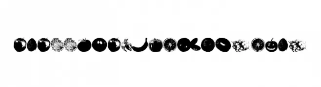
A playful font made entirely of fruit illustrations, perfect for creative projects.
![An Apple A Day Fruit Font font caratteri gratis]() Scaricare 92 Downloads@WebFont
Scaricare 92 Downloads@WebFont -
( Fonts by Vladimir Nikolic - www.creativefabrica.com/designer/vladimirnikolic/ - Personal-use only. For commercial use please contact owner. )
A sleek, modern italic font with consistent stroke width and a dynamic appearance.
![Magistros Light Italic font caratteri gratis]() Scaricare 92 Downloads@WebFont
Scaricare 92 Downloads@WebFont -
( Fonts by Abo Daniel Studio - Panggah Laksono - Personal-use only. For commercial use please contact owner. )
An elegant and decorative script font with ornate letterforms.
![Sibertha font caratteri gratis]() Scaricare 92 Downloads@WebFont
Scaricare 92 Downloads@WebFont -
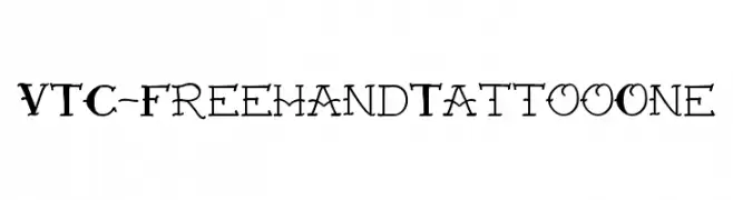
( Fonts by Vigilante Typeface Corporation Larry Yerkes. Personal-use only. For commercial use please contact owner. )
A bold, tattoo-inspired font with intricate, dynamic strokes and sharp angles.
![VTC-FreehandTattooOne font caratteri gratis]() Scaricare 92 Downloads@WebFont
Scaricare 92 Downloads@WebFont -
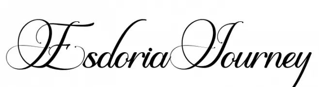
( Fonts by Joko Setiono - Personal-use only. For commercial use please contact owner. )
An elegant script font with flowing, interconnected letterforms and elaborate swashes.
![Esdoria Journey font caratteri gratis]() Scaricare 92 Downloads@WebFont
Scaricare 92 Downloads@WebFont -
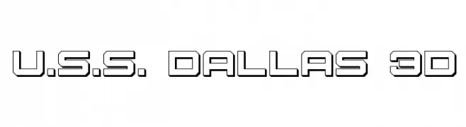
( Iconian Fonts - Daniel Zadorozny - www.iconian.com )
A bold, geometric font with a 3D effect, perfect for modern and industrial designs.
![U.S.S. Dallas 3D font caratteri gratis]() Scaricare 92 Downloads@WebFont
Scaricare 92 Downloads@WebFont -
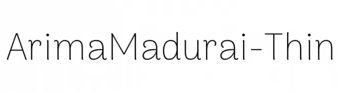
( Fonts by ndiscovered - Personal-use only. For commercial use please contact owner. )
A modern, thin sans-serif font with a clean and elegant design.
![ArimaMadurai-Thin font caratteri gratis]() Scaricare 92 Downloads@WebFont
Scaricare 92 Downloads@WebFont -
( Fonts by a Des Gomez. Personal-use only. For commercial use please contact owner. )
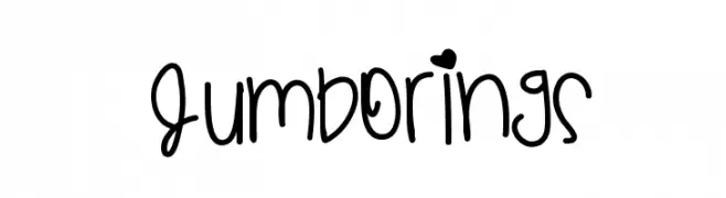
A playful, handwritten font with rounded, whimsical characters and decorative elements.
![JumboRings font caratteri gratis]() Scaricare 92 Downloads@WebFont
Scaricare 92 Downloads@WebFont -
( Fonts by www.junkohanhero.com - Personal-use only. For commercial use please contact owner. )
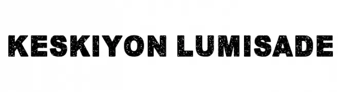
A bold, textured font with a distressed, vintage appearance.
![Keskiyon Lumisade font caratteri gratis]() Scaricare 92 Downloads@WebFont
Scaricare 92 Downloads@WebFont -
( Fonts by Vunira Design - Personal-use only. For commercial use please contact owner. )
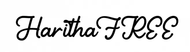
A flowing, cursive font with elegant, connected letters and moderate stroke contrast.
![HarithaFREE font caratteri gratis]() Scaricare 92 Downloads@WebFont
Scaricare 92 Downloads@WebFont -
( Fonts by Khurasan )
A playful, bold font with rounded, bubbly characters.
![Sobiscuit font caratteri gratis]() Scaricare 92 Downloads@WebFont
Scaricare 92 Downloads@WebFont -
( Fonts by ndiscovered - Personal-use only. For commercial use please contact owner. )
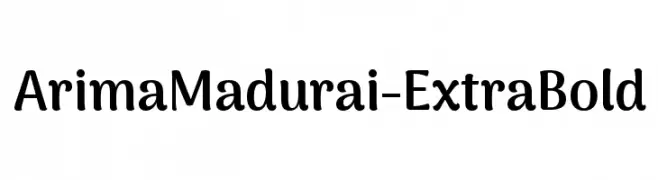
A bold, rounded font with a playful yet sophisticated style.
![ArimaMadurai-ExtraBold font caratteri gratis]() Scaricare 92 Downloads@WebFont
Scaricare 92 Downloads@WebFont


Quali sono i font più popolari adesso?
Poppins, Roboto, Montserrat, Open Sans e Lato sono molto usati per le forme pulite e l'ampia applicabilità — dall'identità di marca alle landing page e ai poster.
Quali font si usano spesso nei loghi?
Le sans serif geometriche (es. Poppins, famiglie in stile Gotham) sono scelte comuni per un branding pulito e scalabile. Per un tocco personale restano valide script e stili manoscritti. Abbina un display deciso per i titoli a un corpo testo neutro per riconoscibilità ed equilibrio.
Ogni quanto si aggiorna la lista?
Con regolarità, in base ai download e all'attività reale. Torna spesso per scoprire in anticipo le nuove preferite.
💡 Consiglio: aggiungi ai preferiti — le tendenze cambiano in fretta e i font top di oggi possono ispirare il rebranding di domani.