Benvenuto nelle Font Più Popolari — dove popolarità e qualità si incontrano. Qui trovi i font più scaricati e usati dell'anno. Se cerchi scelte sicure per logo, web o social, inizia da qui.
Ogni font top si distingue per equilibrio, leggibilità e versatilità. Troverai sans serif moderne, script eleganti, serif vintage e display minimalisti.
-
 Scaricare 539 Downloads@WebFont
 -
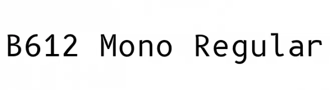
( Copyright 2012 The B612 Project Authors (https://github.com/polarsys/b612) )
A clean, monospaced font ideal for coding and technical documentation.
![B612 Mono Regular font caratteri gratis]() Scaricare 539 Downloads@WebFont
Scaricare 539 Downloads@WebFont -
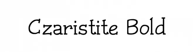
( Fonts by Graham Meade - GemFonts )
A bold, playful font with a hand-drawn aesthetic and varying line thickness.
![Czaristite Bold font caratteri gratis]() Scaricare 539 Downloads@WebFont
Scaricare 539 Downloads@WebFont -
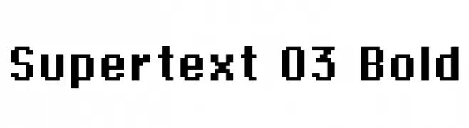
( Font by Sven Stuber - www.superlooper.de )
A bold, pixelated font with a retro digital aesthetic.
![Supertext 03 Bold font caratteri gratis]() Scaricare 539 Downloads@WebFont
Scaricare 539 Downloads@WebFont -
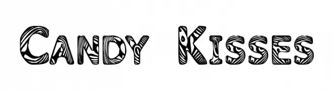
![Candy Kisses font caratteri gratis]() Scaricare 539 Downloads@WebFont
Scaricare 539 Downloads@WebFont -
-
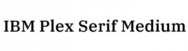
( Copyright © 2017 IBM Corp. with Reserved Font Name "Plex" )
A modern serif font with clean lines and balanced proportions, ideal for versatile design applications.
![IBM Plex Serif Medium font caratteri gratis]() Scaricare 539 Downloads@WebFont
Scaricare 539 Downloads@WebFont -
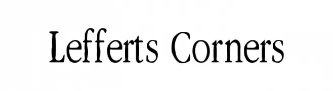
( Fonts by Levi Halmos )
A hand-drawn, artistic font with expressive and whimsical characters.
![Lefferts Corners font caratteri gratis]() Scaricare 539 Downloads@WebFont
Scaricare 539 Downloads@WebFont -
( Fonts by Pun )
An abstract, symbolic font with flowing lines and a mysterious, ancient script feel.
![Nexus font caratteri gratis]() Scaricare 539 Downloads@WebFont
Scaricare 539 Downloads@WebFont -
( Dimka.com - dimka.com/fonts )
A playful, handwritten font with smooth, rounded edges and consistent stroke width.
![Xarrovv font caratteri gratis]() Scaricare 539 Downloads@WebFont
Scaricare 539 Downloads@WebFont -
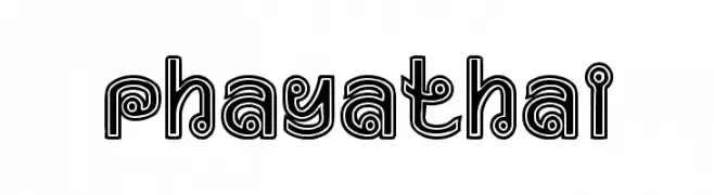
( Woodcutter - woodcutter Manero - www.woodcutter.es )
A bold, decorative font with a retro, three-dimensional outline style.
![Phaya Thai font caratteri gratis]() Scaricare 539 Downloads@WebFont
Scaricare 539 Downloads@WebFont


Quali sono i font più popolari adesso?
Poppins, Roboto, Montserrat, Open Sans e Lato sono molto usati per le forme pulite e l'ampia applicabilità — dall'identità di marca alle landing page e ai poster.
Quali font si usano spesso nei loghi?
Le sans serif geometriche (es. Poppins, famiglie in stile Gotham) sono scelte comuni per un branding pulito e scalabile. Per un tocco personale restano valide script e stili manoscritti. Abbina un display deciso per i titoli a un corpo testo neutro per riconoscibilità ed equilibrio.
Ogni quanto si aggiorna la lista?
Con regolarità, in base ai download e all'attività reale. Torna spesso per scoprire in anticipo le nuove preferite.
💡 Consiglio: aggiungi ai preferiti — le tendenze cambiano in fretta e i font top di oggi possono ispirare il rebranding di domani.