Benvenuto nelle Font Più Popolari — dove popolarità e qualità si incontrano. Qui trovi i font più scaricati e usati dell'anno. Se cerchi scelte sicure per logo, web o social, inizia da qui.
Ogni font top si distingue per equilibrio, leggibilità e versatilità. Troverai sans serif moderne, script eleganti, serif vintage e display minimalisti.
-
( Fonts by Red Hat )
A bold, italic serif font with a classic and elegant style.
 Scaricare 1833 Downloads@WebFont
 -
( Fonts by Luke Owens - Personal-use only. For commercial use please contact owner. )
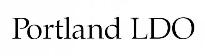
A classic serif font with elegant strokes and refined details.
![Portland LDO font caratteri gratis]() Scaricare 1832 Downloads@WebFont
Scaricare 1832 Downloads@WebFont -
![Kitten Slant font caratteri gratis]() Scaricare 1832 Downloads@WebFont
Scaricare 1832 Downloads@WebFont -
( Fonts by Daniel Zadorozny - www.iconian.com )
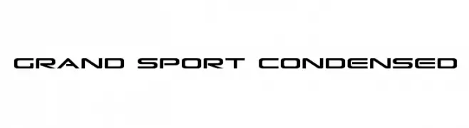
A sleek, modern, and condensed font with a futuristic aesthetic.
![Grand Sport Condensed font caratteri gratis]() Scaricare 1832 Downloads@WebFont
Scaricare 1832 Downloads@WebFont -
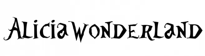
![AliciaWonderland font caratteri gratis]() Scaricare 1832 Downloads@WebFont
Scaricare 1832 Downloads@WebFont -
![AB Exp font caratteri gratis]() Scaricare 1832 Downloads@WebFont
Scaricare 1832 Downloads@WebFont -
( Fonts by Kimberly Geswein - kimberlygeswein.com )
A playful, casual handwritten font with a dynamic and lively feel.
![Complete in Him font caratteri gratis]() Scaricare 1832 Downloads@WebFont
Scaricare 1832 Downloads@WebFont -
( Fonts by Rangkai Aksara - Personal-use only. For commercial use please contact owner. )
A bold, angular font with sharp serifs and geometric details.
![Vasco font caratteri gratis]() Scaricare 1831 Downloads@WebFont
Scaricare 1831 Downloads@WebFont -
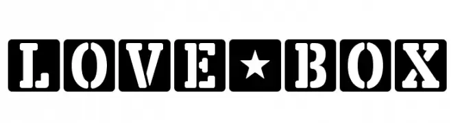
Caratteri di defharo. For commercial use please contact the owner.
![LOVE-BOX font caratteri gratis]() Scaricare 1831 Downloads@WebFont
Scaricare 1831 Downloads@WebFont -
![Bonn Light Beta font caratteri gratis]() Scaricare 1831 Downloads@WebFont
Scaricare 1831 Downloads@WebFont -
![MobitaleCnd-Bold font caratteri gratis]() Scaricare 1831 Downloads@WebFont
Scaricare 1831 Downloads@WebFont -
![Crush49 font caratteri gratis]() Scaricare 1831 Downloads@WebFont
Scaricare 1831 Downloads@WebFont -
( Fonts by Hendra Pratama - HPTypework - https://hptypework.com - Personal-use only. For commercial use please contact owner. )
A casual and elegant handwritten font with fluid, connected letterforms.
![Autography font caratteri gratis]() Scaricare 1830 Downloads@WebFont
Scaricare 1830 Downloads@WebFont -
( Fonts by Peter Wiegel - www.peter-wiegel.de - Personal-use only. For commercial use please contact owner. )
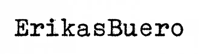
A vintage, typewriter-style serif font with textured, bold characters.
![ErikasBuero font caratteri gratis]() Scaricare 1830 Downloads@WebFont
Scaricare 1830 Downloads@WebFont -
( Bionic Type - fonts.type4.com/ )
An abstract, ink-splatter style font with a highly decorative and artistic appearance.
![Glimmer font caratteri gratis]() Scaricare 1830 Downloads@WebFont
Scaricare 1830 Downloads@WebFont -
![Gourmet Hearth font caratteri gratis]() Scaricare 1830 Downloads@WebFont
Scaricare 1830 Downloads@WebFont -
( Alit Design - Alit Suarnegara - www.alitdesign.net )
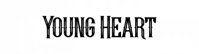
A bold, decorative font with vintage and ornate detailing.
![Young Heart font caratteri gratis]() Scaricare 1830 Downloads@WebFont
Scaricare 1830 Downloads@WebFont -
![Musieer font caratteri gratis]() Scaricare 1830 Downloads@WebFont
Scaricare 1830 Downloads@WebFont -
( Copyright (c) 2014, Indian Type Foundry (info@indiantypefoundry.com). )
A classic serif typeface with medium contrast and elegant serifs.
![Karma Medium font caratteri gratis]() Scaricare 1830 Downloads@WebFont
Scaricare 1830 Downloads@WebFont -
( Fonts by Factor Vector - elfactorvector.blogspot.com )
A bold, modern font with smooth, rounded edges and balanced proportions.
![Patinio Basica font caratteri gratis]() Scaricare 1830 Downloads@WebFont
Scaricare 1830 Downloads@WebFont -
![H2D2-Alevita Rough font caratteri gratis]() Scaricare 1830 Downloads@WebFont
Scaricare 1830 Downloads@WebFont -
( Fonts by Douglas Vitkauskas - www.vtksdesign.com. Personal-use only. For commercial use please contact owner. )
A bold, distressed font with a grunge aesthetic and rugged texture.
![vtks distress font caratteri gratis]() Scaricare 1830 Downloads@WebFont
Scaricare 1830 Downloads@WebFont -
( Fonts by Digital Graphics Labs - www.digitalgraphiclabs.com )
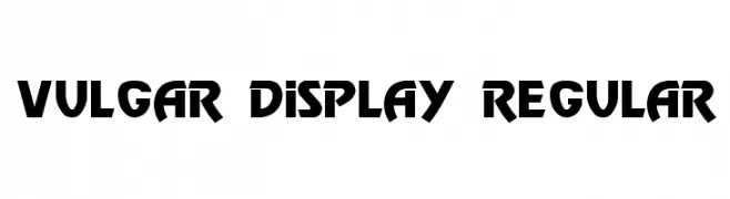
A bold, angular font with a strong geometric style.
![Vulgar Display Regular font caratteri gratis]() Scaricare 1830 Downloads@WebFont
Scaricare 1830 Downloads@WebFont -
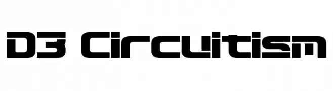
( Fonts by www.DigitalDreamDesign.net )
A futuristic, geometric font with bold, block-like characters and cut-out sections.
![D3 Circuitism font caratteri gratis]() Scaricare 1830 Downloads@WebFont
Scaricare 1830 Downloads@WebFont -
( Fonts by Daniel Zadorozny - www.iconian.com - Free for personal use )
A bold, geometric font with a digital, futuristic style.
![2Tech font caratteri gratis]() Scaricare 1830 Downloads@WebFont
Scaricare 1830 Downloads@WebFont -
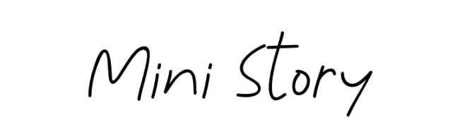
( Fonts by Syaf Rizal - www.creativefabrica.com/ref/53/ - Personal-use only. For commercial use please contact owner. )
A casual, handwritten font with smooth, flowing lines and a relaxed feel.
![Mini Story font caratteri gratis]() Scaricare 1829 Downloads@WebFont
Scaricare 1829 Downloads@WebFont -
( Fonts by Barland )
An elegant, flowing script font with medium contrast, ideal for formal and decorative uses.
![kissitademo font caratteri gratis]() Scaricare 1829 Downloads@WebFont
Scaricare 1829 Downloads@WebFont -
( Fonts by FontGrube AH )
Traditional music notation symbols with bold, clear lines.
![Hymnus FG font caratteri gratis]() Scaricare 1829 Downloads@WebFont
Scaricare 1829 Downloads@WebFont -
Caratteri di fontdationstudio. For commercial use please contact the owner.
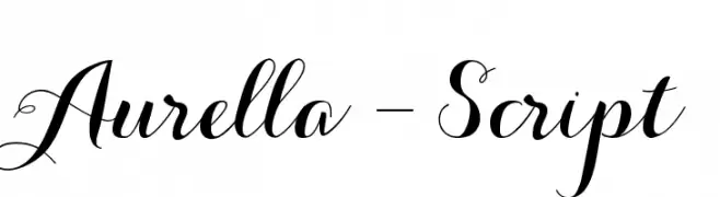
( Thank you for downloading this font This font is free for PERSONAL USE ONLY! Commercial license for this font can be purchased at: http://bit.ly/2xZ1K2U )
A graceful script font with flowing cursive letters and decorative swashes.
![Aurella-Script font caratteri gratis]() Scaricare 1829 Downloads@WebFont
Scaricare 1829 Downloads@WebFont -
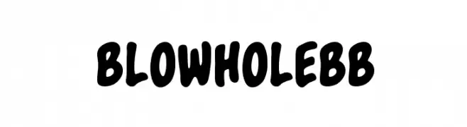
( Fonts by www.blambot.com )
A bold, playful font with rounded, hand-drawn characters.
![BlowholeBB font caratteri gratis]() Scaricare 1829 Downloads@WebFont
Scaricare 1829 Downloads@WebFont -
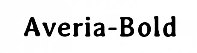
![Averia-Bold font caratteri gratis]() Scaricare 1829 Downloads@WebFont
Scaricare 1829 Downloads@WebFont -
( Fonts by Sam Wang )
A casual, handwritten font with dynamic, fluid strokes.
![Handwriting font caratteri gratis]() Scaricare 1829 Downloads@WebFont
Scaricare 1829 Downloads@WebFont -
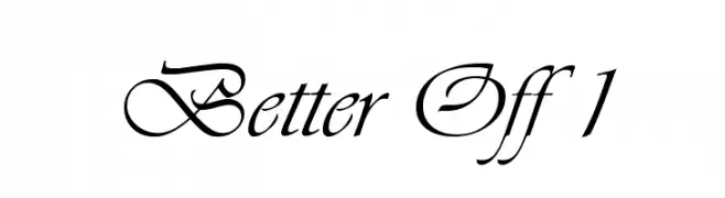
![Better Off 1 font caratteri gratis]() Scaricare 1829 Downloads@WebFont
Scaricare 1829 Downloads@WebFont -
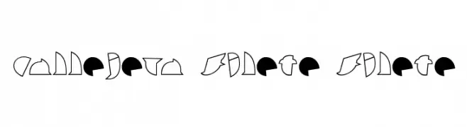
![callejera filete filete font caratteri gratis]() Scaricare 1829 Downloads@WebFont
Scaricare 1829 Downloads@WebFont -
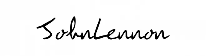
( Fonts by Anita Wainer - www.jamondelmar.com )
A casual handwritten font with dynamic strokes and a personal touch.
![JohnLennon font caratteri gratis]() Scaricare 1829 Downloads@WebFont
Scaricare 1829 Downloads@WebFont


Quali sono i font più popolari adesso?
Poppins, Roboto, Montserrat, Open Sans e Lato sono molto usati per le forme pulite e l'ampia applicabilità — dall'identità di marca alle landing page e ai poster.
Quali font si usano spesso nei loghi?
Le sans serif geometriche (es. Poppins, famiglie in stile Gotham) sono scelte comuni per un branding pulito e scalabile. Per un tocco personale restano valide script e stili manoscritti. Abbina un display deciso per i titoli a un corpo testo neutro per riconoscibilità ed equilibrio.
Ogni quanto si aggiorna la lista?
Con regolarità, in base ai download e all'attività reale. Torna spesso per scoprire in anticipo le nuove preferite.
💡 Consiglio: aggiungi ai preferiti — le tendenze cambiano in fretta e i font top di oggi possono ispirare il rebranding di domani.