Benvenuto nelle Font Più Popolari — dove popolarità e qualità si incontrano. Qui trovi i font più scaricati e usati dell'anno. Se cerchi scelte sicure per logo, web o social, inizia da qui.
Ogni font top si distingue per equilibrio, leggibilità e versatilità. Troverai sans serif moderne, script eleganti, serif vintage e display minimalisti.
-
( Fonts by a Max Infeld - XEROGRAPHER FONTS - xerographer.blogspot.com . Personal-use only. For commercial use please contact owner. )
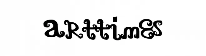
A whimsical, decorative font with bold, rounded letterforms and playful embellishments.
 Scaricare 528 Downloads@WebFont
 -
( Fonts by Billy Argel - www.billyargel.com - Personal-use only. For commercial use please contact owner. )
A bold, expressive script font with dynamic, flowing strokes.
![Weekend Flower Hunters Personal Use font caratteri gratis]() Scaricare 528 Downloads@WebFont
Scaricare 528 Downloads@WebFont -
( Fonts by Daniel Zadorozny - www.iconian.com )
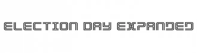
A modern, geometric font with expanded outlines and a tech-inspired aesthetic.
![Election Day Expanded font caratteri gratis]() Scaricare 528 Downloads@WebFont
Scaricare 528 Downloads@WebFont -
( Fonts by Ben Weiner - www.readingtype.org )
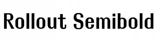
A bold, modern sans-serif font with clean lines and strong presence.
![Rollout Semibold font caratteri gratis]() Scaricare 528 Downloads@WebFont
Scaricare 528 Downloads@WebFont -
( Fonts by Daniel Zadorozny - www.iconian.com )
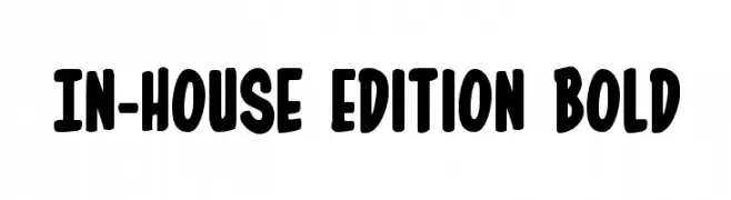
A bold, playful font with rounded edges and a hand-drawn feel.
![In-House Edition Bold font caratteri gratis]() Scaricare 528 Downloads@WebFont
Scaricare 528 Downloads@WebFont -
-
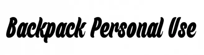
( Måns Grebäck - www.mansgreback.com )
A bold, dynamic script font with smooth curves and strong presence.
![Backpack Personal Use font caratteri gratis]() Scaricare 528 Downloads@WebFont
Scaricare 528 Downloads@WebFont -
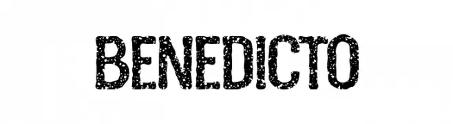
( Fonts by woodcutter Manero - www.woodcutter.es - Personal-use only. For commercial use please contact owner. )
A bold, textured font with a distressed, vintage appearance.
![Benedicto font caratteri gratis]() Scaricare 528 Downloads@WebFont
Scaricare 528 Downloads@WebFont -
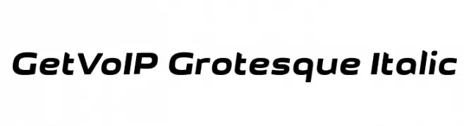
![GetVoIP Grotesque Italic font caratteri gratis]() Scaricare 528 Downloads@WebFont
Scaricare 528 Downloads@WebFont -
( Fonts by Weape Studio )
A bold, playful font with rounded, thick letters and a cohesive style.
![Jalibar font caratteri gratis]() Scaricare 528 Downloads@WebFont
Scaricare 528 Downloads@WebFont -
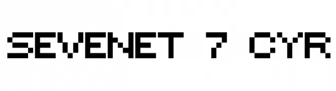
![Sevenet 7 Cyr font caratteri gratis]() Scaricare 528 Downloads@WebFont
Scaricare 528 Downloads@WebFont


Quali sono i font più popolari adesso?
Poppins, Roboto, Montserrat, Open Sans e Lato sono molto usati per le forme pulite e l'ampia applicabilità — dall'identità di marca alle landing page e ai poster.
Quali font si usano spesso nei loghi?
Le sans serif geometriche (es. Poppins, famiglie in stile Gotham) sono scelte comuni per un branding pulito e scalabile. Per un tocco personale restano valide script e stili manoscritti. Abbina un display deciso per i titoli a un corpo testo neutro per riconoscibilità ed equilibrio.
Ogni quanto si aggiorna la lista?
Con regolarità, in base ai download e all'attività reale. Torna spesso per scoprire in anticipo le nuove preferite.
💡 Consiglio: aggiungi ai preferiti — le tendenze cambiano in fretta e i font top di oggi possono ispirare il rebranding di domani.