Benvenuto nelle Font Più Popolari — dove popolarità e qualità si incontrano. Qui trovi i font più scaricati e usati dell'anno. Se cerchi scelte sicure per logo, web o social, inizia da qui.
Ogni font top si distingue per equilibrio, leggibilità e versatilità. Troverai sans serif moderne, script eleganti, serif vintage e display minimalisti.
-
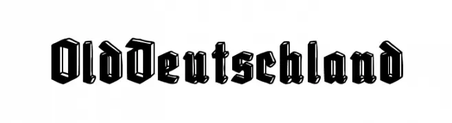
( Fonts by Woodcutter )
A bold, decorative Blackletter-style font with intricate, gothic elements.
 Scaricare 526 Downloads@WebFont
 -
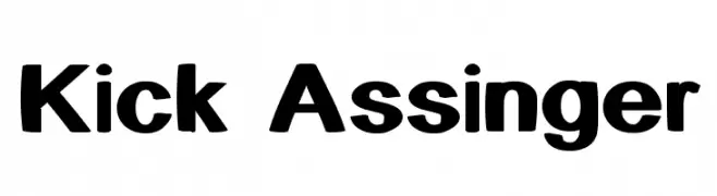
( Fonts by Graham Meade - GemFonts )
A bold, modern font with thick, rounded strokes and a strong visual impact.
![Kick Assinger font caratteri gratis]() Scaricare 526 Downloads@WebFont
Scaricare 526 Downloads@WebFont -
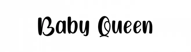
( Fonts by Graphicxell )
A playful, bold, and rounded font with a hand-drawn feel.
![Baby Queen font caratteri gratis]() Scaricare 526 Downloads@WebFont
Scaricare 526 Downloads@WebFont -
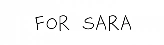
( Fonts by Geronimo )
A playful, handwritten font with a casual and friendly style.
![for sara font caratteri gratis]() Scaricare 526 Downloads@WebFont
Scaricare 526 Downloads@WebFont -
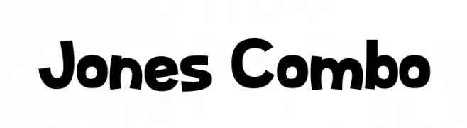
( Fonts by Dan P. Lyons - Personal-use only. For commercial use please contact owner. )
A playful, bold font with exaggerated curves and a whimsical style.
![Jones Combo font caratteri gratis]() Scaricare 526 Downloads@WebFont
Scaricare 526 Downloads@WebFont -
-
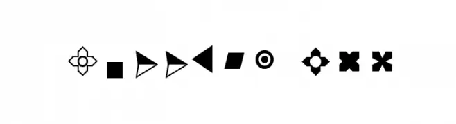
( Fonts by Arkandis Digital Foundry )
A diverse collection of geometric and symbolic bullet designs for decorative use.
![Bullets ADF font caratteri gratis]() Scaricare 526 Downloads@WebFont
Scaricare 526 Downloads@WebFont -
Caratteri di spideraysfonts. For commercial use please contact the owner.
( The Astonishing Ant-Man )
A bold, modern font with decorative symbols inside each character.
![THE ASTONISHING ANT-MAN font caratteri gratis]() Scaricare 526 Downloads@WebFont
Scaricare 526 Downloads@WebFont -
( Fonts by David Kerkhoff - www.hanodedphotography.com )
A dynamic, expressive handwritten font with fluid strokes.
![DKKusukusu font caratteri gratis]() Scaricare 526 Downloads@WebFont
Scaricare 526 Downloads@WebFont -
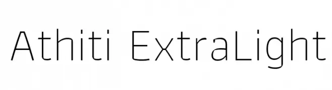
( Copyright (c) 2015, Cadson Demak (info@cadsondemak.com) )
A clean, modern typeface with uniform stroke width and rounded edges.
![Athiti ExtraLight font caratteri gratis]() Scaricare 526 Downloads@WebFont
Scaricare 526 Downloads@WebFont -
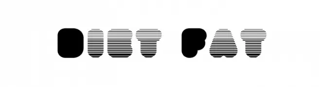
![Diet Fat font caratteri gratis]() Scaricare 526 Downloads@WebFont
Scaricare 526 Downloads@WebFont


Quali sono i font più popolari adesso?
Poppins, Roboto, Montserrat, Open Sans e Lato sono molto usati per le forme pulite e l'ampia applicabilità — dall'identità di marca alle landing page e ai poster.
Quali font si usano spesso nei loghi?
Le sans serif geometriche (es. Poppins, famiglie in stile Gotham) sono scelte comuni per un branding pulito e scalabile. Per un tocco personale restano valide script e stili manoscritti. Abbina un display deciso per i titoli a un corpo testo neutro per riconoscibilità ed equilibrio.
Ogni quanto si aggiorna la lista?
Con regolarità, in base ai download e all'attività reale. Torna spesso per scoprire in anticipo le nuove preferite.
💡 Consiglio: aggiungi ai preferiti — le tendenze cambiano in fretta e i font top di oggi possono ispirare il rebranding di domani.