Benvenuto nelle Font Più Popolari — dove popolarità e qualità si incontrano. Qui trovi i font più scaricati e usati dell'anno. Se cerchi scelte sicure per logo, web o social, inizia da qui.
Ogni font top si distingue per equilibrio, leggibilità e versatilità. Troverai sans serif moderne, script eleganti, serif vintage e display minimalisti.
-
( Fonts by Haksen Studio )
Casual handwritten script with tall, flowing strokes and variable thickness.
 Scaricare 88 Downloads@WebFont
 -
( Noto is a trademark of Google Inc. Noto fonts are open source. All Noto fonts are published under the SIL Open Font License, Version 1.1 )
Modern sans-serif font for Khmer script UI.
![Noto Sans Khmer UI Medium font caratteri gratis]() Scaricare 88 Downloads@WebFont
Scaricare 88 Downloads@WebFont -
( Noto is a trademark of Google Inc. Noto fonts are open source. All Noto fonts are published under the SIL Open Font License, Version 1.1 )
A light, modern sans-serif font with clean lines and excellent readability.
![Noto Sans Devanagari Light font caratteri gratis]() Scaricare 88 Downloads@WebFont
Scaricare 88 Downloads@WebFont -
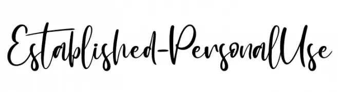
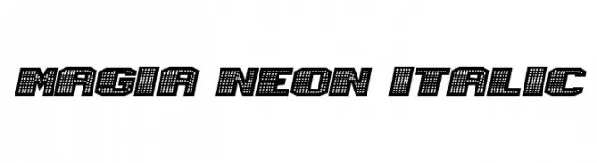
( Fonts by Vladimir Nikolic - https://www.creativefabrica.com/product/educated-deers/ref/144265/ - Personal-use only. For commercial use please contact owner. )
A bold, italicized decorative font with a neon light-inspired dotted pattern.
![Magia Neon Italic font caratteri gratis]() Scaricare 88 Downloads@WebFont
Scaricare 88 Downloads@WebFont -
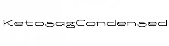
( gluk - Grzegorz l - www.glukfonts.pl )
A modern, condensed font with geometric shapes and clean lines.
![Ketosag Condensed font caratteri gratis]() Scaricare 88 Downloads@WebFont
Scaricare 88 Downloads@WebFont -
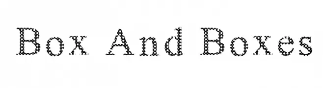
( Nouman )
A decorative font with box-patterned letters, offering a modern and whimsical style.
![Box And Boxes font caratteri gratis]() Scaricare 88 Downloads@WebFont
Scaricare 88 Downloads@WebFont -
( Fonts by Scratchones )
A bold, playful font with rounded characters and a hand-drawn feel.
![Night Winter font caratteri gratis]() Scaricare 88 Downloads@WebFont
Scaricare 88 Downloads@WebFont -
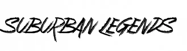
( Fonts by Jonathan S. Harris - www.tattoowoo.com. Personal-use only. For commercial use please contact owner. )
A bold, energetic script font with a hand-drawn, graffiti-like style.
![Suburban Legends font caratteri gratis]() Scaricare 88 Downloads@WebFont
Scaricare 88 Downloads@WebFont -
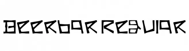
( Fonts by Rajesh Kumar )
A bold, angular font with a geometric, hand-drawn style.
![Beerbar Regular font caratteri gratis]() Scaricare 88 Downloads@WebFont
Scaricare 88 Downloads@WebFont -
( Fonts by dcoxy - Greg Medina - Personal-use only. For commercial use please contact owner. )
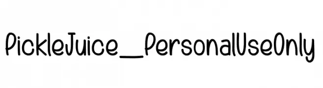
A playful, handwritten font with rounded edges and a casual, friendly style.
![Pickle Juice_PersonalUseOnly font caratteri gratis]() Scaricare 88 Downloads@WebFont
Scaricare 88 Downloads@WebFont -
( weknow - Wino S Kadir - www.creativefabrica.com/designer/weknow/ )
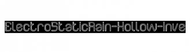
A futuristic, geometric font with hollow, outlined characters.
![Electro Static Rain-Hollow-Inve font caratteri gratis]() Scaricare 88 Downloads@WebFont
Scaricare 88 Downloads@WebFont -
( Fonts by PutraCetol Studio )
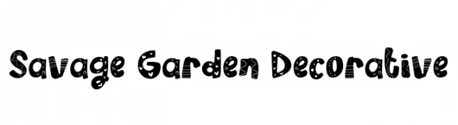
A bold, decorative font with playful patterns and embellishments.
![Savage Garden Decorative font caratteri gratis]() Scaricare 88 Downloads@WebFont
Scaricare 88 Downloads@WebFont -
( Fonts by Daniel Zadorozny - www.iconian.com - Free for personal use )
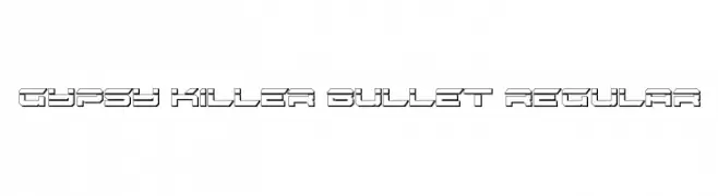
A bold, futuristic font with a three-dimensional, geometric design.
![Gypsy Killer Bullet Regular font caratteri gratis]() Scaricare 88 Downloads@WebFont
Scaricare 88 Downloads@WebFont -
( Fonts by Noah Type - noahtype.com - Personal-use only. For commercial use please contact owner. )
A geometric, modern font with clean lines and a futuristic design.
![Free Stop Demo font caratteri gratis]() Scaricare 88 Downloads@WebFont
Scaricare 88 Downloads@WebFont -
![BRACELLET font caratteri gratis]() Scaricare 88 Downloads@WebFont
Scaricare 88 Downloads@WebFont -
( Fonts by Wino S Kadir - weknow - www.revolge.com/shop/weknow/ - Personal-use only. For commercial use please contact owner. )
A bold, jagged font with an icy, distressed appearance.
![FREEZER font caratteri gratis]() Scaricare 88 Downloads@WebFont
Scaricare 88 Downloads@WebFont -
( Xerographer Fonts - Max Infeld - xerographer.blogspot.com )
A bold, geometric font with rounded edges and sharp angles for a modern look.
![MastumBold font caratteri gratis]() Scaricare 88 Downloads@WebFont
Scaricare 88 Downloads@WebFont -
( Fonts by Billy Argel - www.billyargel.com - Personal-use only. For commercial use please contact owner. )
A bold, stencil-like font with a modern, industrial style.
![HYERBA font caratteri gratis]() Scaricare 88 Downloads@WebFont
Scaricare 88 Downloads@WebFont -
( Fonts by Vacatype Co. - Vacatype - Personal-use only. For commercial use please contact owner. )
A bold, gothic-inspired font with sharp, angular edges.
![QuivanaPersonalUse-Regular font caratteri gratis]() Scaricare 88 Downloads@WebFont
Scaricare 88 Downloads@WebFont -
( Fonts by Sharkshock - Dennis Ludlow - Personal-use only. For commercial use please contact owner. )
A bold, Western-style font with thick strokes and pronounced serifs.
![Cowboys 2.0 font caratteri gratis]() Scaricare 88 Downloads@WebFont
Scaricare 88 Downloads@WebFont -
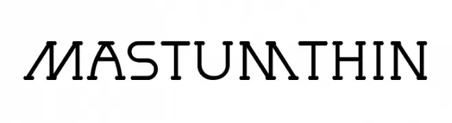
( Xerographer Fonts - Max Infeld - xerographer.blogspot.com )
A modern, geometric font with consistent stroke width and a sleek design.
![MastumThin font caratteri gratis]() Scaricare 88 Downloads@WebFont
Scaricare 88 Downloads@WebFont -
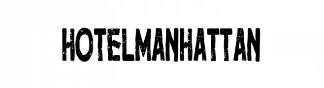
( Fonts by Woodcutter )
A bold, distressed font with a vintage, rugged appearance.
![Hotel Manhattan font caratteri gratis]() Scaricare 88 Downloads@WebFont
Scaricare 88 Downloads@WebFont -
( Roiyani Teungku - creativemarket.com/artisans )
An elegant, flowing script font with ornate, interconnected characters.
![AqualitaItalic font caratteri gratis]() Scaricare 88 Downloads@WebFont
Scaricare 88 Downloads@WebFont -
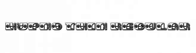
( Fonts by Vladimir Nikolic )
A bold, geometric font with decorative circular patterns and double outlines.
![Hypno Thin Regular font caratteri gratis]() Scaricare 88 Downloads@WebFont
Scaricare 88 Downloads@WebFont -
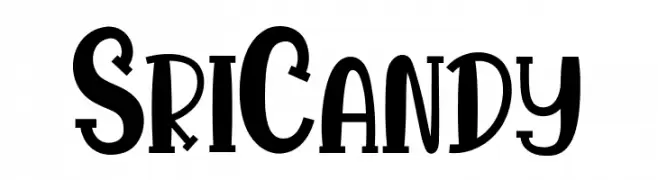
( Fonts by StringLabs )
A bold, playful font with whimsical curves and a modern decorative style.
![Sri Candy font caratteri gratis]() Scaricare 88 Downloads@WebFont
Scaricare 88 Downloads@WebFont -
( Fonts by Septo Adi Wicaksono )
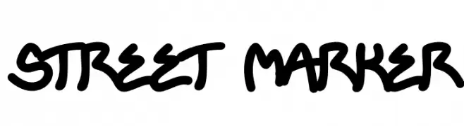
A bold, graffiti-inspired font with a dynamic, hand-drawn style.
![STREET MARKER font caratteri gratis]() Scaricare 88 Downloads@WebFont
Scaricare 88 Downloads@WebFont -
( Fonts by Zane Studio - Personal-use only. For commercial use please contact owner. )
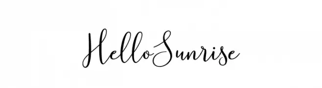
A playful and elegant cursive script font with ornate uppercase and smooth lowercase letters.
![HelloSunrise font caratteri gratis]() Scaricare 88 Downloads@WebFont
Scaricare 88 Downloads@WebFont -
( Xerographer Fonts - Max Infeld - xerographer.blogspot.com )
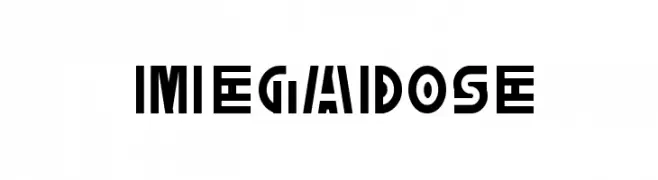
A bold, geometric font with angular shapes and a modern, industrial feel.
![MegaDose font caratteri gratis]() Scaricare 88 Downloads@WebFont
Scaricare 88 Downloads@WebFont -
( Fonts by Woodcutter )
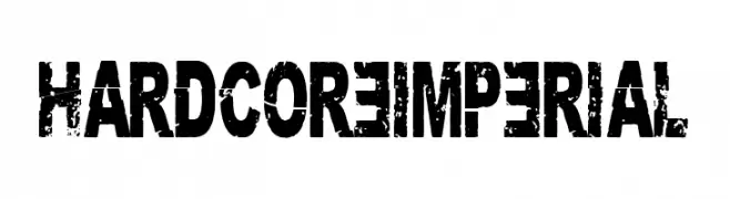
A bold, distressed font with a rugged, grunge texture.
![Hardcore Imperial font caratteri gratis]() Scaricare 88 Downloads@WebFont
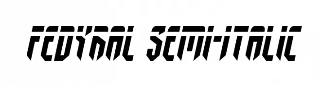
Scaricare 88 Downloads@WebFont -
![Fedyral Semi-Italic font caratteri gratis]() Scaricare 88 Downloads@WebFont
Scaricare 88 Downloads@WebFont -
( Fonts by Louise Dib )
A whimsical, decorative font featuring cartoon-like illustrations within each letter.
![viok font caratteri gratis]() Scaricare 88 Downloads@WebFont
Scaricare 88 Downloads@WebFont -
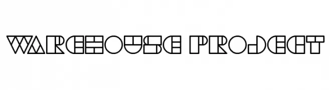
( Fonts by Wino S Kadir - weknow - www.revolge.com/shop/weknow/ - Personal-use only. For commercial use please contact owner. )
A bold, geometric font with a modern and impactful design.
![WAREHOUSE PROJECT font caratteri gratis]() Scaricare 88 Downloads@WebFont
Scaricare 88 Downloads@WebFont -
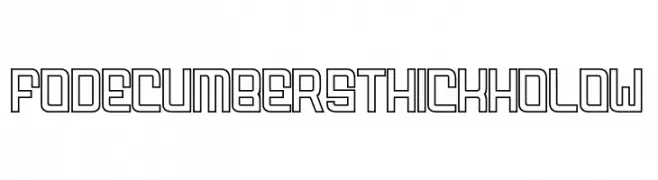
( Fonts by zamjump - Ahmad Zamzami - Personal-use only. For commercial use please contact owner. )
A bold, geometric font with a hollow interior and a modern, digital look.
![FODECUMBERS THICK HOLOW font caratteri gratis]() Scaricare 88 Downloads@WebFont
Scaricare 88 Downloads@WebFont -
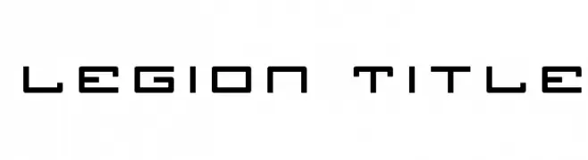
( Iconian Fonts - Daniel Zadorozny - www.iconian.com )
A futuristic, angular font with geometric shapes and sharp edges.
![Legion Title font caratteri gratis]() Scaricare 88 Downloads@WebFont
Scaricare 88 Downloads@WebFont -
( Fonts by CalligraphyFonts - Personal-use only. For commercial use please contact owner. )
Elegant serif font with an italic slant, ideal for sophisticated designs.
![Trackwalker Demo Italic font caratteri gratis]() Scaricare 88 Downloads@WebFont
Scaricare 88 Downloads@WebFont


Quali sono i font più popolari adesso?
Poppins, Roboto, Montserrat, Open Sans e Lato sono molto usati per le forme pulite e l'ampia applicabilità — dall'identità di marca alle landing page e ai poster.
Quali font si usano spesso nei loghi?
Le sans serif geometriche (es. Poppins, famiglie in stile Gotham) sono scelte comuni per un branding pulito e scalabile. Per un tocco personale restano valide script e stili manoscritti. Abbina un display deciso per i titoli a un corpo testo neutro per riconoscibilità ed equilibrio.
Ogni quanto si aggiorna la lista?
Con regolarità, in base ai download e all'attività reale. Torna spesso per scoprire in anticipo le nuove preferite.
💡 Consiglio: aggiungi ai preferiti — le tendenze cambiano in fretta e i font top di oggi possono ispirare il rebranding di domani.