Benvenuto nelle Font Più Popolari — dove popolarità e qualità si incontrano. Qui trovi i font più scaricati e usati dell'anno. Se cerchi scelte sicure per logo, web o social, inizia da qui.
Ogni font top si distingue per equilibrio, leggibilità e versatilità. Troverai sans serif moderne, script eleganti, serif vintage e display minimalisti.
-
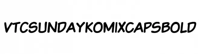
( Fonts by Vigilante Typeface Corporation Larry Yerkes. Personal-use only. For commercial use please contact owner. )
A bold, comic-style font with a playful and informal design.
 Scaricare 75 Downloads@WebFont
 -
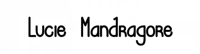
( Fonts by Greg Medina - www.dcoxy.com - Personal-use only. For commercial use please contact owner. )
A playful, rounded font with consistent stroke width and a whimsical style.
![Lucie Mandragore font caratteri gratis]() Scaricare 75 Downloads@WebFont
Scaricare 75 Downloads@WebFont -
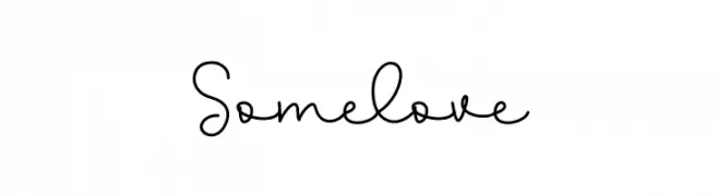
( Fonts by Letterafa Studio )
Casual handwritten script with tall, narrow, and rounded characters.
![Somelove font caratteri gratis]() Scaricare 75 Downloads@WebFont
Scaricare 75 Downloads@WebFont -
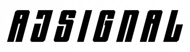
( Fonts by Linecreative - ARI JUANDA - Personal-use only. For commercial use please contact owner. )
A bold, slanted font with a dynamic and modern style.
![AJ Signal font caratteri gratis]() Scaricare 75 Downloads@WebFont
Scaricare 75 Downloads@WebFont -
( Fonts by DmLetter31 - Dimas Prasetyo - Personal-use only. For commercial use please contact owner. )
A playful, handwritten font with tall, narrow letters and a whimsical style.
![Secret Love font caratteri gratis]() Scaricare 75 Downloads@WebFont
Scaricare 75 Downloads@WebFont -
-
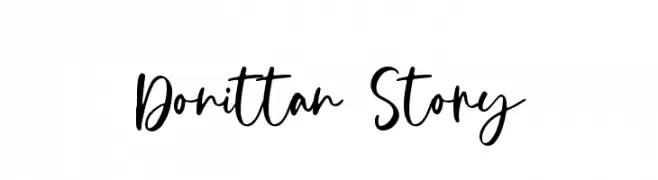
( Fonts by Kotak Kuning Studio - kotakkuning.com - Personal-use only. For commercial use please contact owner. )
A playful, handwritten font with dynamic strokes and a modern, whimsical style.
![Donittan Story font caratteri gratis]() Scaricare 75 Downloads@WebFont
Scaricare 75 Downloads@WebFont -
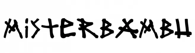
( Fonts by www.woodcutter.es - woodcutter Manero - Personal-use only. For commercial use please contact owner. )
A bold, hand-drawn font with a playful and energetic style.
![mister bambu font caratteri gratis]() Scaricare 75 Downloads@WebFont
Scaricare 75 Downloads@WebFont -
( Fonts by Vladimir Nikolic - Personal-use only. For commercial use please contact owner. )
A bold, geometric font with a three-dimensional, shadowed design.
![Vidal Black Regular font caratteri gratis]() Scaricare 75 Downloads@WebFont
Scaricare 75 Downloads@WebFont -
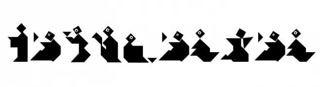
( Fonts by Manfred Klein. Free for private and charity use. Free for commercial with donation to organizations )
A bold, geometric font inspired by tangram puzzles, ideal for artistic projects.
![TangramBam font caratteri gratis]() Scaricare 75 Downloads@WebFont
Scaricare 75 Downloads@WebFont -
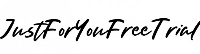
( Fonts by Type Factory )
A lively, handwritten font with fluid, cursive strokes and a dynamic appearance.
![Just For You Free Trial font caratteri gratis]() Scaricare 75 Downloads@WebFont
Scaricare 75 Downloads@WebFont -
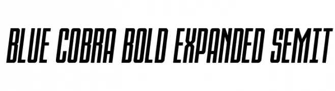
( Fonts by Daniel Zadorozny - www.iconian.com - Personal-use only. For commercial use please contact owner. )
A bold, expanded, semi-italic font with a modern and dynamic style.
![Blue Cobra Bold Expanded SemIt font caratteri gratis]() Scaricare 75 Downloads@WebFont
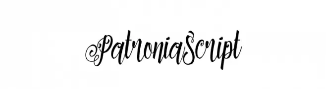
Scaricare 75 Downloads@WebFont -
![PatroniaScript font caratteri gratis]() Scaricare 75 Downloads@WebFont
Scaricare 75 Downloads@WebFont -
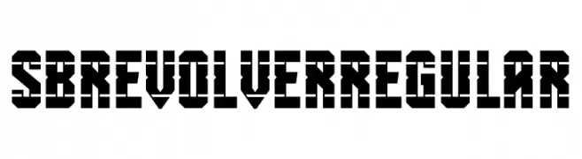
( Fonts by SelfBuild Type Foundry )
A bold, geometric stencil font with an industrial feel.
![SB Revolver Regular font caratteri gratis]() Scaricare 75 Downloads@WebFont
Scaricare 75 Downloads@WebFont -
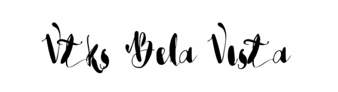
( Fonts by douglas vitkauskas - Personal-use only. For commercial use please contact owner. )
A whimsical, cursive font with elegant loops and dynamic contrast.
![Vtks Bela Vista font caratteri gratis]() Scaricare 75 Downloads@WebFont
Scaricare 75 Downloads@WebFont -
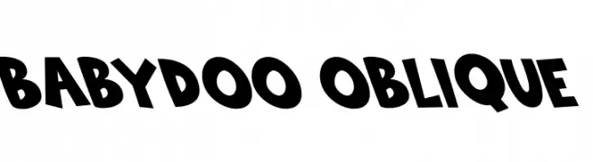
( Fonts by Kong Font )
A bold, playful font with exaggerated, oblique letterforms and a whimsical style.
![Babydoo Oblique font caratteri gratis]() Scaricare 75 Downloads@WebFont
Scaricare 75 Downloads@WebFont -
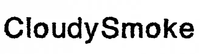
( Fonts by Ptp - Personal-use only. For commercial use please contact owner. )
A textured, bold font with a smoky, organic appearance.
![CloudySmoke font caratteri gratis]() Scaricare 75 Downloads@WebFont
Scaricare 75 Downloads@WebFont -
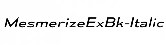
( Typodermic Fonts - Ray Larabie - www.typodermicfonts.com/ )
A sleek, modern italic font with smooth curves and clean lines.
![MesmerizeExBk-Italic font caratteri gratis]() Scaricare 75 Downloads@WebFont
Scaricare 75 Downloads@WebFont -
( Fonts by Haksen Studio - Sarwo Edhi Prayitno - Personal-use only. For commercial use please contact owner. )
A modern serif font with elegant lines and balanced proportions.
![ALBERO font caratteri gratis]() Scaricare 75 Downloads@WebFont
Scaricare 75 Downloads@WebFont -
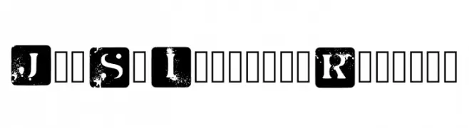
( Fonts by Marcus Melton )
A bold, distressed font with uppercase letters in black squares, featuring a grunge texture.
![Jot Sp Inverted Regular font caratteri gratis]() Scaricare 75 Downloads@WebFont
Scaricare 75 Downloads@WebFont -
![Ny Stormning Halvfet font caratteri gratis]() Scaricare 75 Downloads@WebFont
Scaricare 75 Downloads@WebFont -
![SnackPatrolDEMO font caratteri gratis]() Scaricare 75 Downloads@WebFont
Scaricare 75 Downloads@WebFont -
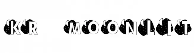
( Fonts by Kat`s Fun Fonts - Personal-use only. For commercial use please contact owner. )
A whimsical, celestial-themed decorative font with bold, starry characters.
![KR Moonlit font caratteri gratis]() Scaricare 75 Downloads@WebFont
Scaricare 75 Downloads@WebFont -
![Through The Black Wide font caratteri gratis]() Scaricare 75 Downloads@WebFont
Scaricare 75 Downloads@WebFont -
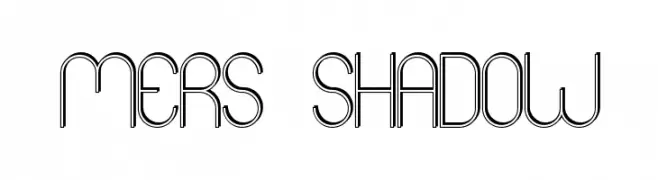
( Fonts by skomii - Personal-use only. For commercial use please contact owner. )
A modern, geometric font with a double-line shadow effect.
![Mers Shadow font caratteri gratis]() Scaricare 75 Downloads@WebFont
Scaricare 75 Downloads@WebFont -
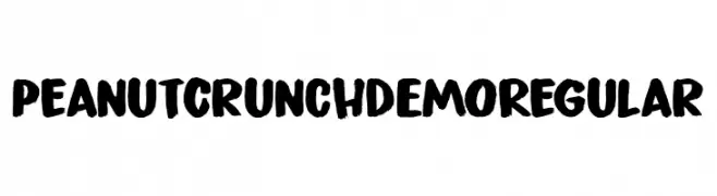
( Fonts by Hanoded - David Kerkhoff - Personal-use only. For commercial use please contact owner. )
A bold, hand-painted style font with a textured, brush-like appearance.
![Peanut Crunch DEMO Regular font caratteri gratis]() Scaricare 75 Downloads@WebFont
Scaricare 75 Downloads@WebFont -
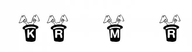
( Fonts by Kat`s Fun Fonts - Personal-use only. For commercial use please contact owner. )
A playful, decorative font with letters emerging from magician hats with rabbit ears.
![KR Magic Rabbit font caratteri gratis]() Scaricare 75 Downloads@WebFont
Scaricare 75 Downloads@WebFont -
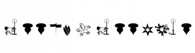
( Dingbat Crazy - dingbatcrazy.fateback.com/ )
Eclectic dingbat font with diverse symbols and decorative motifs.
![FreeMix Freeware font caratteri gratis]() Scaricare 75 Downloads
Scaricare 75 Downloads -
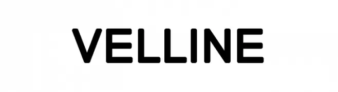
( Fonts by All About Design - Personal-use only. For commercial use please contact owner. )
A bold, modern sans-serif font with geometric influences.
![VELLINE font caratteri gratis]() Scaricare 75 Downloads@WebFont
Scaricare 75 Downloads@WebFont -
( Sahirul Iman - creativemarket.com/nami_studio )
A bold, handwritten font with a dynamic and energetic style.
![TURQOISE font caratteri gratis]() Scaricare 75 Downloads@WebFont
Scaricare 75 Downloads@WebFont -
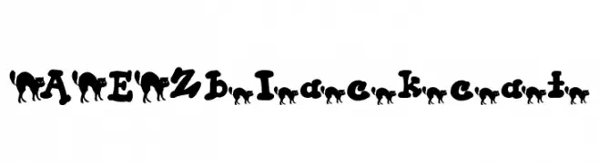
( Fonts by Adult Ramblings - Anastacia E. Zittel - Personal-use only. For commercial use please contact owner. )
A whimsical font with black cat silhouettes integrated into each character.
![AEZ black cat font caratteri gratis]() Scaricare 75 Downloads@WebFont
Scaricare 75 Downloads@WebFont -
( Fonts by Arendx Studio - Personal-use only. For commercial use please contact owner. )
A playful, handwritten cursive font with elegant, flowing characters.
![Whistle font caratteri gratis]() Scaricare 75 Downloads@WebFont
Scaricare 75 Downloads@WebFont -
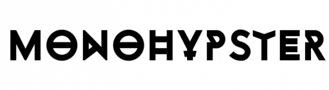
( Monofonts - www.monofonts.com )
A bold, geometric font with a futuristic and tribal aesthetic.
![Monohypster font caratteri gratis]() Scaricare 75 Downloads@WebFont
Scaricare 75 Downloads@WebFont -
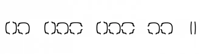
( Dingbat Dungeon )
The image does not depict a valid font.
![Maze Maker Cavern Level 1F font caratteri gratis]() Scaricare 75 Downloads@WebFont
Scaricare 75 Downloads@WebFont -
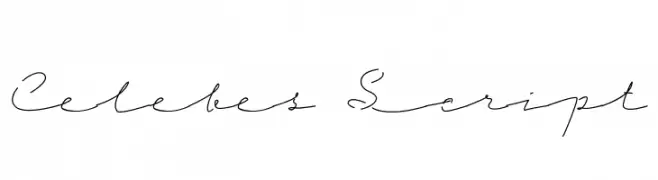
( Fonts by Riljs )
A graceful and fluid script font with a natural handwriting style.
![Celebes Script font caratteri gratis]() Scaricare 75 Downloads@WebFont
Scaricare 75 Downloads@WebFont -
( Fonts by www.junkohanhero.com - Personal-use only. For commercial use please contact owner. )
A playful, hand-drawn font with bold outlines and irregular shapes.
![Redhair font caratteri gratis]() Scaricare 75 Downloads@WebFont
Scaricare 75 Downloads@WebFont


Quali sono i font più popolari adesso?
Poppins, Roboto, Montserrat, Open Sans e Lato sono molto usati per le forme pulite e l'ampia applicabilità — dall'identità di marca alle landing page e ai poster.
Quali font si usano spesso nei loghi?
Le sans serif geometriche (es. Poppins, famiglie in stile Gotham) sono scelte comuni per un branding pulito e scalabile. Per un tocco personale restano valide script e stili manoscritti. Abbina un display deciso per i titoli a un corpo testo neutro per riconoscibilità ed equilibrio.
Ogni quanto si aggiorna la lista?
Con regolarità, in base ai download e all'attività reale. Torna spesso per scoprire in anticipo le nuove preferite.
💡 Consiglio: aggiungi ai preferiti — le tendenze cambiano in fretta e i font top di oggi possono ispirare il rebranding di domani.