Benvenuto nelle Font Più Popolari — dove popolarità e qualità si incontrano. Qui trovi i font più scaricati e usati dell'anno. Se cerchi scelte sicure per logo, web o social, inizia da qui.
Ogni font top si distingue per equilibrio, leggibilità e versatilità. Troverai sans serif moderne, script eleganti, serif vintage e display minimalisti.
-
( Ronosa )
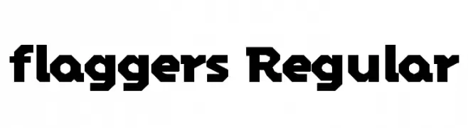
A bold, geometric font with a modern, industrial aesthetic.
 Scaricare 87 Downloads@WebFont
 -
( Fonts by a Max Infeld - XEROGRAPHER FONTS - xerographer.blogspot.com . Personal-use only. For commercial use please contact owner. )
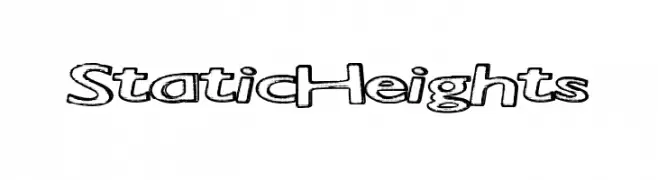
A bold, outlined font with a playful and dynamic style.
![StaticHeights font caratteri gratis]() Scaricare 87 Downloads@WebFont
Scaricare 87 Downloads@WebFont -
( Noto is a trademark of Google Inc. Noto fonts are open source. All Noto fonts are published under the SIL Open Font License, Version 1.1 )
No valid font sample is visible; only placeholder glyphs are shown.
![Noto Sans Lao UI SemiCondensed Thin font caratteri gratis]() Scaricare 87 Downloads@WebFont
Scaricare 87 Downloads@WebFont -
( Fonts by Allouse Studio - Personal-use only. For commercial use please contact owner. )
A bold, expressive handwritten font with dynamic strokes and a brush-like texture.
![Hogback Demo Version font caratteri gratis]() Scaricare 87 Downloads@WebFont
Scaricare 87 Downloads@WebFont -
( Fonts by Bolt Cutter - www.boltcutterdesign.com - Personal-use only. For commercial use please contact owner. )
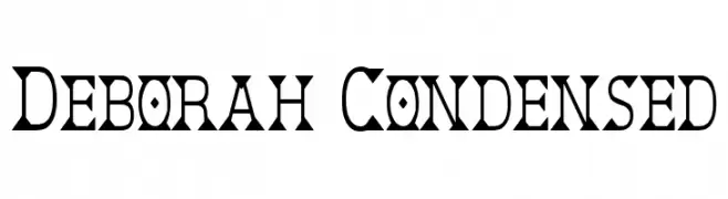
A bold, angular serif font with a condensed and geometric style.
![Deborah Condensed font caratteri gratis]() Scaricare 87 Downloads@WebFont
Scaricare 87 Downloads@WebFont -
( Fonts by wep - Wahyu Eka Prasetya - Personal-use only. For commercial use please contact owner. )
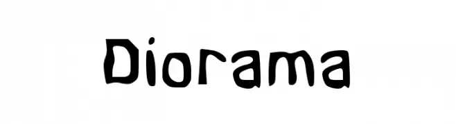
A playful, hand-drawn font with bold, rounded strokes and an organic feel.
![Diorama font caratteri gratis]() Scaricare 87 Downloads@WebFont
Scaricare 87 Downloads@WebFont -
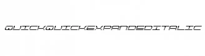
![QuickQuick Expanded Italic font caratteri gratis]() Scaricare 87 Downloads@WebFont
Scaricare 87 Downloads@WebFont -
( Fonts by Kong Font )
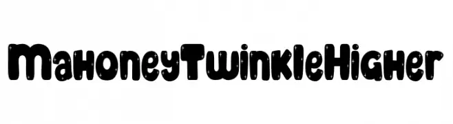
A bold, playful font with a starry texture and rounded characters.
![Mahoney Twinkle Higher font caratteri gratis]() Scaricare 87 Downloads@WebFont
Scaricare 87 Downloads@WebFont -
( Fonts by briZoft - Personal-use only. For commercial use please contact owner. )
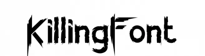
A jagged, distressed font with sharp, irregular strokes for a chaotic look.
![KillingFont font caratteri gratis]() Scaricare 87 Downloads@WebFont
Scaricare 87 Downloads@WebFont -
( Fonts by Adrián Yanes )
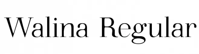
A classic serif font with elegant strokes and sharp serifs.
![Walina Regular font caratteri gratis]() Scaricare 87 Downloads@WebFont
Scaricare 87 Downloads@WebFont -
( Iconian Fonts - Daniel Zadorozny - www.iconian.com )
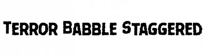
A bold, rugged font with jagged edges and a distressed, hand-drawn style.
![Terror Babble Staggered font caratteri gratis]() Scaricare 87 Downloads@WebFont
Scaricare 87 Downloads@WebFont -
( Fonts by Craft Supply Co - Personal-use only. For commercial use please contact owner. )
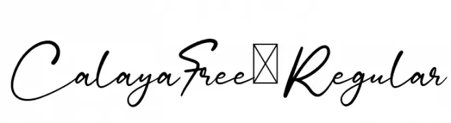
An elegant, flowing script font with smooth, cursive letterforms.
![CalayaFree-Regular font caratteri gratis]() Scaricare 87 Downloads@WebFont
Scaricare 87 Downloads@WebFont -
( Fonts by StringLabs - stringlabscreative.com - Personal-use only. For commercial use please contact owner. )
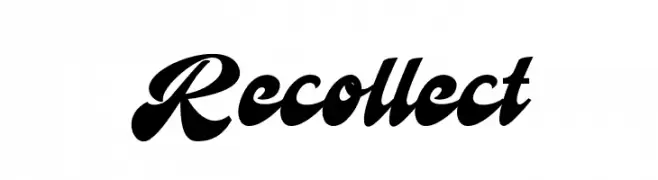
A bold, flowing script font with elegant curves and a handwritten feel.
![Recollect font caratteri gratis]() Scaricare 87 Downloads@WebFont
Scaricare 87 Downloads@WebFont -
( Fonts by imagex - Personal-use only. For commercial use please contact owner. )
A playful, textured font with a chalk-like, hand-drawn appearance.
![Right Chalk font caratteri gratis]() Scaricare 87 Downloads@WebFont
Scaricare 87 Downloads@WebFont -
( CONORGREEN - cnrgrn.tumblr.com )
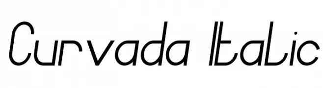
A modern, italic font with elongated, flowing characters and a sleek design.
![Curvada Italic font caratteri gratis]() Scaricare 87 Downloads@WebFont
Scaricare 87 Downloads@WebFont -
( Fonts by 177Studio )
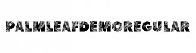
A bold, decorative font with intricate palm leaf patterns in each character.
![Palm Leaf Demo Regular font caratteri gratis]() Scaricare 87 Downloads@WebFont
Scaricare 87 Downloads@WebFont -
( Anchor Fonts - Eric Mueller - www.anchorfonts.com )
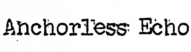
A bold, distressed font with a grunge, hand-drawn style.
![Anchorless Echo font caratteri gratis]() Scaricare 87 Downloads@WebFont
Scaricare 87 Downloads@WebFont -
( DV82 - David Alcañiz - www.behance.net/dalcaniz )
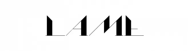
A modern, geometric font with sharp angles and a futuristic aesthetic.
![Lame font caratteri gratis]() Scaricare 87 Downloads@WebFont
Scaricare 87 Downloads@WebFont -
( weknow - Wino S Kadir - www.creativefabrica.com/designer/weknow/ )
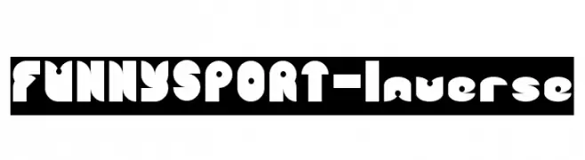
A bold, playful font with rounded, geometric shapes and a lively design.
![FUNNY SPORT-Inverse font caratteri gratis]() Scaricare 87 Downloads@WebFont
Scaricare 87 Downloads@WebFont -
( Fonts by Andi Moz )
A playful, textured font with bold, rounded characters and a stone-like appearance.
![Stone Wall font caratteri gratis]() Scaricare 87 Downloads@WebFont
Scaricare 87 Downloads@WebFont -
( Fonts by Daniel Zadorozny - www.iconian.com - Personal-use only. For commercial use please contact owner. )
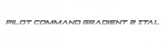
A futuristic, slanted font with a gradient line effect, exuding speed and modernity.
![Pilot Command Gradient 2 Ital font caratteri gratis]() Scaricare 87 Downloads@WebFont
Scaricare 87 Downloads@WebFont -
( Fonts by Fikryal studio - Fikry Alif - Personal-use only. For commercial use please contact owner. )
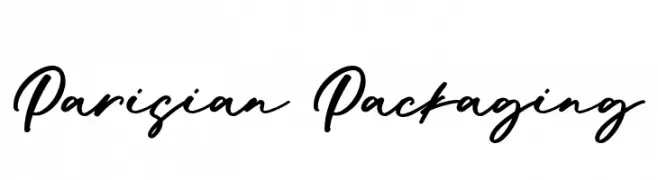
A bold, cursive script font with a dynamic and expressive style.
![Parisian Packaging font caratteri gratis]() Scaricare 87 Downloads@WebFont
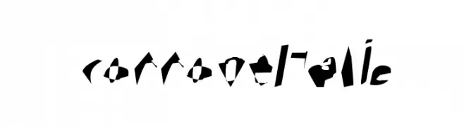
Scaricare 87 Downloads@WebFont -
![Corrode Italic font caratteri gratis]() Scaricare 87 Downloads@WebFont
Scaricare 87 Downloads@WebFont -
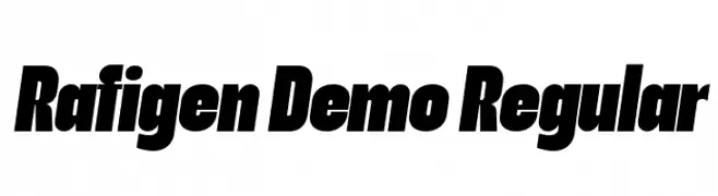
( Fonts by surotype - Adil Budianto - Personal-use only. For commercial use please contact owner. )
A bold, slanted font with a strong, modern presence.
![Rafigen Demo Regular font caratteri gratis]() Scaricare 87 Downloads@WebFont
Scaricare 87 Downloads@WebFont -
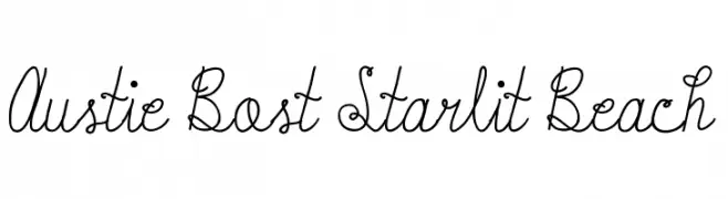
( Austie Bost Fonts - Austin Owens - austiebost.com )
A whimsical script font with flowing, interconnected letters and a playful style.
![Austie Bost Starlit Beach font caratteri gratis]() Scaricare 87 Downloads@WebFont
Scaricare 87 Downloads@WebFont -
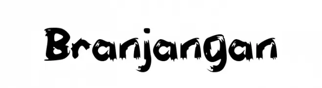
( Fonts by wep - Wahyu Eka Prasetya - Personal-use only. For commercial use please contact owner. )
A bold, distressed font with jagged edges and a grunge-like appearance.
![Branjangan font caratteri gratis]() Scaricare 87 Downloads@WebFont
Scaricare 87 Downloads@WebFont -
( Fonts by Mozyen Studio - Personal-use only. For commercial use please contact owner. )
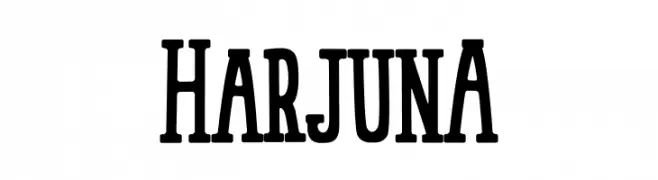
A bold, condensed font with strong verticality and uniform weight.
![HarjunA font caratteri gratis]() Scaricare 87 Downloads@WebFont
Scaricare 87 Downloads@WebFont -
( Fonts by Locomotype - Arwan Sutanto - Personal-use only. For commercial use please contact owner. )
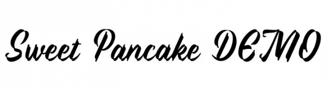
A bold, flowing script font with elegant cursive letterforms.
![Sweet Pancake DEMO font caratteri gratis]() Scaricare 87 Downloads@WebFont
Scaricare 87 Downloads@WebFont -
( Fonts by Kat`s Fun Fonts - Personal-use only. For commercial use please contact owner. )
A decorative font with wedding-themed illustrations instead of letters.
![KR Wedding font caratteri gratis]() Scaricare 87 Downloads@WebFont
Scaricare 87 Downloads@WebFont -
( Fonts by Adega Design - Anisio Dega - Personal-use only. For commercial use please contact owner. )
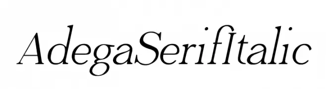
An elegant serif font with a classic italic style and refined appearance.
![Adega Serif Italic font caratteri gratis]() Scaricare 87 Downloads@WebFont
Scaricare 87 Downloads@WebFont -
( Fonts by Paulo Cunha Jr. - tutano.zip.net - Personal-use only. For commercial use please contact owner. )
A playful, bold font with rounded edges and a hand-drawn feel.
![Parla font caratteri gratis]() Scaricare 87 Downloads@WebFont
Scaricare 87 Downloads@WebFont -
( Iconian Fonts - Daniel Zadorozny - www.iconian.com )
A bold, 3D italic font with a playful and dynamic style.
![Mister Twisted 3D Italic font caratteri gratis]() Scaricare 87 Downloads@WebFont
Scaricare 87 Downloads@WebFont -
( Fonts by shark_of_the_tale - Personal-use only. For commercial use please contact owner. )
A playful, bold, and rounded font with smooth letterforms.
![Margariney Words Bold font caratteri gratis]() Scaricare 87 Downloads@WebFont
Scaricare 87 Downloads@WebFont -
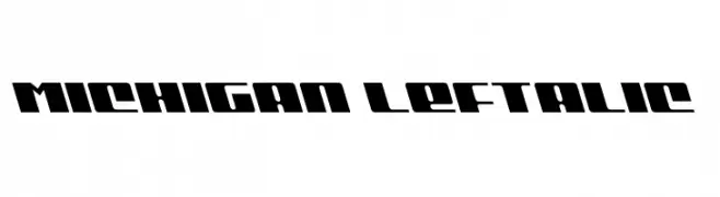
![Michigan Leftalic font caratteri gratis]() Scaricare 87 Downloads@WebFont
Scaricare 87 Downloads@WebFont -
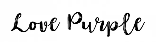
( Fonts by lyanatha - Ana Natalia - Personal-use only. For commercial use please contact owner. )
A lively, cursive handwritten font with fluid strokes and medium contrast.
![Love Purple font caratteri gratis]() Scaricare 87 Downloads@WebFont
Scaricare 87 Downloads@WebFont


Quali sono i font più popolari adesso?
Poppins, Roboto, Montserrat, Open Sans e Lato sono molto usati per le forme pulite e l'ampia applicabilità — dall'identità di marca alle landing page e ai poster.
Quali font si usano spesso nei loghi?
Le sans serif geometriche (es. Poppins, famiglie in stile Gotham) sono scelte comuni per un branding pulito e scalabile. Per un tocco personale restano valide script e stili manoscritti. Abbina un display deciso per i titoli a un corpo testo neutro per riconoscibilità ed equilibrio.
Ogni quanto si aggiorna la lista?
Con regolarità, in base ai download e all'attività reale. Torna spesso per scoprire in anticipo le nuove preferite.
💡 Consiglio: aggiungi ai preferiti — le tendenze cambiano in fretta e i font top di oggi possono ispirare il rebranding di domani.