Benvenuto nelle Font Più Popolari — dove popolarità e qualità si incontrano. Qui trovi i font più scaricati e usati dell'anno. Se cerchi scelte sicure per logo, web o social, inizia da qui.
Ogni font top si distingue per equilibrio, leggibilità e versatilità. Troverai sans serif moderne, script eleganti, serif vintage e display minimalisti.
-
( Fonts by Iconian Fonts )
A bold, futuristic font with a geometric, blocky design.
 Scaricare 86 Downloads@WebFont
 -
( nalgames.com )
A bold, playful font with a dynamic, distorted style.
![Questrian font caratteri gratis]() Scaricare 86 Downloads@WebFont
Scaricare 86 Downloads@WebFont -
( Fonts by vilogsign - Nur Kholis - Personal-use only. For commercial use please contact owner. )
An elegant and fluid script font with a handwritten feel.
![Love Betteria Script DEMO font caratteri gratis]() Scaricare 86 Downloads@WebFont
Scaricare 86 Downloads@WebFont -
( Fonts by a Max Infeld - XEROGRAPHER FONTS - xerographer.blogspot.com . Personal-use only. For commercial use please contact owner. )
A bold, textured font with a hand-painted, artistic style.
![AquaColor font caratteri gratis]() Scaricare 86 Downloads@WebFont
Scaricare 86 Downloads@WebFont -
( weknow - Wino S Kadir - www.creativefabrica.com/designer/weknow/ )
A futuristic hollow font with a geometric and modern style.
![RAYNALIZ-Hollow font caratteri gratis]() Scaricare 86 Downloads@WebFont
Scaricare 86 Downloads@WebFont -
( Fonts by Perspectype Studio - Personal-use only. For commercial use please contact owner. )
A bold, energetic script font with a handwritten style.
![Amigate Endgame font caratteri gratis]() Scaricare 85 Downloads@WebFont
Scaricare 85 Downloads@WebFont -
( Fonts by Situjuh Nazara - 7ntypes.com - Personal-use only. For commercial use please contact owner. )
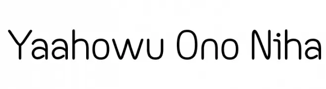
A modern, rounded font with uniform stroke width and excellent readability.
![Yaahowu Ono Niha font caratteri gratis]() Scaricare 85 Downloads@WebFont
Scaricare 85 Downloads@WebFont -
( Fonts by VPcreativeshop - Vladimir Fedotov - Personal-use only. For commercial use please contact owner. )
A bold, high-contrast decorative font with a modern flair.
![Slang font caratteri gratis]() Scaricare 85 Downloads@WebFont
Scaricare 85 Downloads@WebFont -
( Caveras - Cliff Modes - caveras.net )
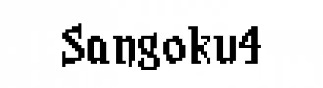
A bold, pixelated font with a retro video game aesthetic.
![Sangoku4 font caratteri gratis]() Scaricare 85 Downloads@WebFont
Scaricare 85 Downloads@WebFont -
( Fonts by Eko Bimantara - Personal-use only. For commercial use please contact owner. )
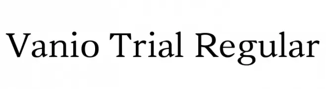
A classic serif font with elegant strokes and pronounced serifs.
![Vanio Trial Regular font caratteri gratis]() Scaricare 85 Downloads@WebFont
Scaricare 85 Downloads@WebFont -
( Fonts by Suamzu Art - Personal-use only. For commercial use please contact owner. )
A flowing, cursive font with elegant curves and playful sophistication.
![Revania Regular font caratteri gratis]() Scaricare 85 Downloads@WebFont
Scaricare 85 Downloads@WebFont -
( Fonts by Trim Studio - Deri Kurnia - Personal-use only. For commercial use please contact owner. )
A geometric, bold font with a modern, square-like design.
![Square [demo ver.] font caratteri gratis]() Scaricare 85 Downloads@WebFont
Scaricare 85 Downloads@WebFont -
( Fonts by Madatype Studio - Andri Ardianto - Personal-use only. For commercial use please contact owner. )
An elegant, flowing script font with smooth, cursive strokes.
![Losteria font caratteri gratis]() Scaricare 85 Downloads@WebFont
Scaricare 85 Downloads@WebFont -
( Fonts by CannotIntoSpaceFonts - KineticPlasma Fonts - Personal-use only. For commercial use please contact owner. )
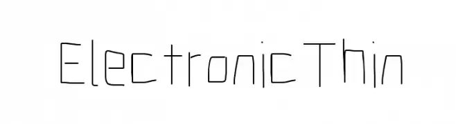
A thin, geometric font with a minimalist and modern design.
![Electronic Thin font caratteri gratis]() Scaricare 85 Downloads@WebFont
Scaricare 85 Downloads@WebFont -
( pointlab studio - creativemarket.com/pointlab )
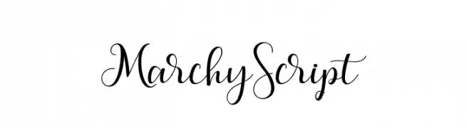
An elegant, flowing script font with ornate flourishes and smooth cursive lines.
![MarchyScript font caratteri gratis]() Scaricare 85 Downloads@WebFont
Scaricare 85 Downloads@WebFont -
( Fonts by Achmad Yani )
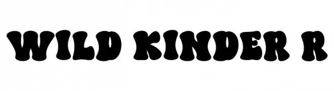
A bold, playful font with rounded, bubbly characters ideal for fun, retro designs.
![WILD KINDER Regular font caratteri gratis]() Scaricare 85 Downloads@WebFont
Scaricare 85 Downloads@WebFont -
( Fonts by Vladimir Nikolic - https://www.creativefabrica.com/product/educated-deers/ref/144265/ - Personal-use only. For commercial use please contact owner. )
A bold, geometric font with Art Deco-inspired octagonal frames around each character.
![Capitalismo 11 Regular font caratteri gratis]() Scaricare 85 Downloads@WebFont
Scaricare 85 Downloads@WebFont -
( Fonts by Peter Wiegel - www.peter-wiegel.de - Personal-use only. For commercial use please contact owner. )
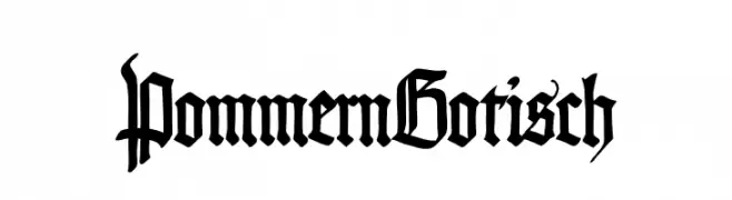
A bold, intricate Blackletter font with ornate details.
![PommernGotisch font caratteri gratis]() Scaricare 85 Downloads@WebFont
Scaricare 85 Downloads@WebFont -
( Fonts by Attype Studio - Fadli Ramadhan Iskandar - Personal-use only. For commercial use please contact owner. )
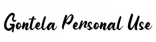
A bold, expressive script font with a dynamic and playful flow.
![Gontela Personal Use font caratteri gratis]() Scaricare 85 Downloads@WebFont
Scaricare 85 Downloads@WebFont -
( pointlab studio - creativemarket.com/pointlab )
A playful, whimsical script font with a hand-drawn, cursive style.
![pequescript font caratteri gratis]() Scaricare 85 Downloads@WebFont
Scaricare 85 Downloads@WebFont -
( Misti's Fonts - mistifonts.com/ )
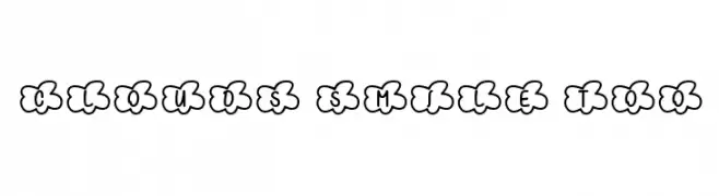
A playful font with characters enclosed in cloud shapes, ideal for cheerful designs.
![Clouds Smile Too font caratteri gratis]() Scaricare 85 Downloads@WebFont
Scaricare 85 Downloads@WebFont -
( Fonts by Dmitry Astakhov - www.behance.net/adonis-abe1e - Personal-use only. For commercial use please contact owner. )
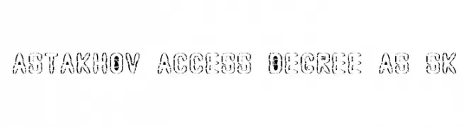
A bold, distressed decorative font with a rugged, stencil-like appearance.
![Astakhov Access Degree AS Sk font caratteri gratis]() Scaricare 85 Downloads@WebFont
Scaricare 85 Downloads@WebFont -
( Rob Watts - robwattsdesign.com/ )
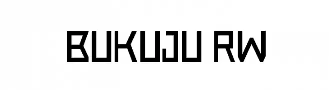
A bold, geometric font with a futuristic and angular design.
![Bukuju RW font caratteri gratis]() Scaricare 85 Downloads@WebFont
Scaricare 85 Downloads@WebFont -
( Iconian Fonts - Daniel Zadorozny - www.iconian.com )
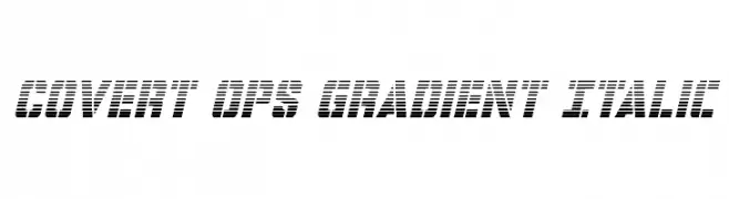
A bold, italicized font with a gradient effect and futuristic style.
![Covert Ops Gradient Italic font caratteri gratis]() Scaricare 85 Downloads@WebFont
Scaricare 85 Downloads@WebFont -
( Fonts by cove703 - 703 Type ( Cundrawan ) - Personal-use only. For commercial use please contact owner. )
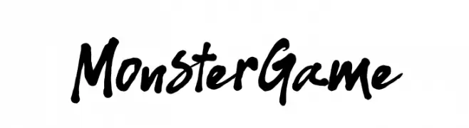
A bold, energetic handwritten font with a playful and casual style.
![Monster Game font caratteri gratis]() Scaricare 85 Downloads@WebFont
Scaricare 85 Downloads@WebFont -
( Fonts by Vladimir Nikolic )
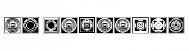
A decorative font with intricate geometric patterns and optical illusion effects.
![Enfeite Regular font caratteri gratis]() Scaricare 85 Downloads@WebFont
Scaricare 85 Downloads@WebFont -
( Fonts by a Max Infeld - XEROGRAPHER FONTS - xerographer.blogspot.com . Personal-use only. For commercial use please contact owner. )
A bold, jagged font with a horror-themed, distressed appearance.
![SummerScare font caratteri gratis]() Scaricare 85 Downloads@WebFont
Scaricare 85 Downloads@WebFont -
( Fonts by Situjuh Nazara - 7ntypes.com - Personal-use only. For commercial use please contact owner. )
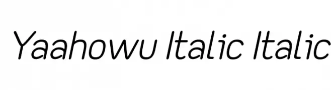
A modern, italicized font with smooth curves and a sleek appearance.
![Yaahowu Italic Italic font caratteri gratis]() Scaricare 85 Downloads@WebFont
Scaricare 85 Downloads@WebFont -
( Fonts by Typhoon Type - Suthi Srisopha - Personal-use only. For commercial use please contact owner. )
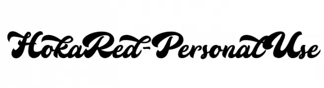
A bold, cursive font with elegant, interconnected characters and high contrast.
![HokaRed-PersonalUse font caratteri gratis]() Scaricare 85 Downloads@WebFont
Scaricare 85 Downloads@WebFont -
( Fonts by Bruce Turner )
A decorative and abstract font with geometric and futuristic elements.
![MeowsPhone_MkIII font caratteri gratis]() Scaricare 85 Downloads@WebFont
Scaricare 85 Downloads@WebFont -
( Fonts by Daniel Zadorozny - www.iconian.com - Free for personal use )
A bold, italicized font with a futuristic and dynamic style.
![League Wars Italic font caratteri gratis]() Scaricare 85 Downloads@WebFont
Scaricare 85 Downloads@WebFont -
( Fonts by Daniel Zadorozny - www.iconian.com )
A bold, 3D italic font with a futuristic and dynamic design.
![Gemina 2 3D Italic font caratteri gratis]() Scaricare 85 Downloads@WebFont
Scaricare 85 Downloads@WebFont -
( Fonts by Rvandtype - Randi Irvan - Personal-use only. For commercial use please contact owner. )
A playful, handwritten font with a casual and friendly style.
![HolidayFunday font caratteri gratis]() Scaricare 85 Downloads@WebFont
Scaricare 85 Downloads@WebFont -
( Fonts by wep - Wahyu Eka Prasetya - Personal-use only. For commercial use please contact owner. )
A bold, hand-painted style font with an expressive and artistic appearance.
![Dempul font caratteri gratis]() Scaricare 85 Downloads@WebFont
Scaricare 85 Downloads@WebFont -
( JibbaJabba Fonts - Jibba Jabba - pages.suddenlink.net/jasonarthur/ )
A vintage, distressed typewriter-style font with a rough, textured appearance.
![RoughTypewriter font caratteri gratis]() Scaricare 85 Downloads@WebFont
Scaricare 85 Downloads@WebFont


![Square [demo ver.] font caratteri gratis](https://d144mzi0q5mijx.cloudfront.net/img/S/Q/Square-demo-ver.webp)


Quali sono i font più popolari adesso?
Poppins, Roboto, Montserrat, Open Sans e Lato sono molto usati per le forme pulite e l'ampia applicabilità — dall'identità di marca alle landing page e ai poster.
Quali font si usano spesso nei loghi?
Le sans serif geometriche (es. Poppins, famiglie in stile Gotham) sono scelte comuni per un branding pulito e scalabile. Per un tocco personale restano valide script e stili manoscritti. Abbina un display deciso per i titoli a un corpo testo neutro per riconoscibilità ed equilibrio.
Ogni quanto si aggiorna la lista?
Con regolarità, in base ai download e all'attività reale. Torna spesso per scoprire in anticipo le nuove preferite.
💡 Consiglio: aggiungi ai preferiti — le tendenze cambiano in fretta e i font top di oggi possono ispirare il rebranding di domani.