Benvenuto nelle Font Più Popolari — dove popolarità e qualità si incontrano. Qui trovi i font più scaricati e usati dell'anno. Se cerchi scelte sicure per logo, web o social, inizia da qui.
Ogni font top si distingue per equilibrio, leggibilità e versatilità. Troverai sans serif moderne, script eleganti, serif vintage e display minimalisti.
-
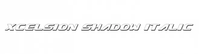
( Fonts by Daniel Zadorozny - www.iconian.com - Free for personal use )
A bold, italicized font with a shadow effect for a dynamic, modern look.
 Scaricare 513 Downloads@WebFont
 -
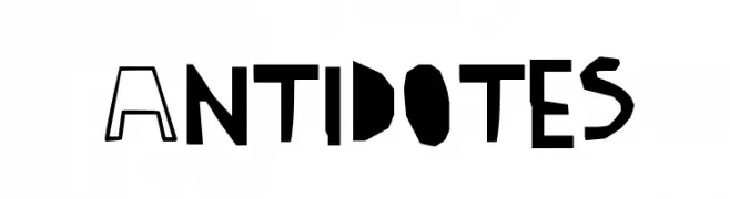
![Antidotes font caratteri gratis]() Scaricare 513 Downloads@WebFont
Scaricare 513 Downloads@WebFont -
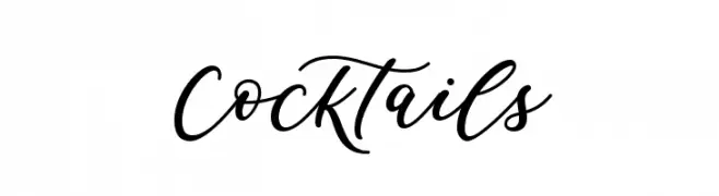
( Fonts by Graphix Line Studio )
A lively and elegant script font with flowing, cursive letterforms.
![Cocktails font caratteri gratis]() Scaricare 513 Downloads@WebFont
Scaricare 513 Downloads@WebFont -
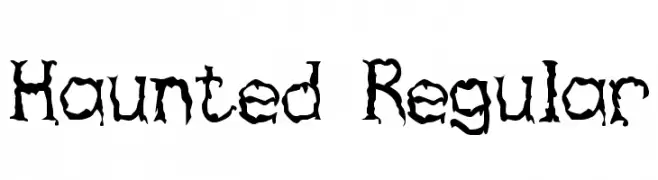
![Haunted Regular font caratteri gratis]() Scaricare 513 Downloads@WebFont
Scaricare 513 Downloads@WebFont -
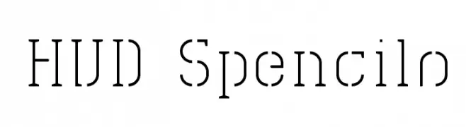
![HVD Spencils font caratteri gratis]() Scaricare 513 Downloads@WebFont
Scaricare 513 Downloads@WebFont -
-
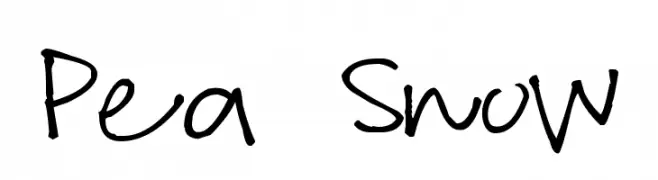
( Free for a personal use. For a commercial use please visit www.kevinandamanda.com )
A playful, informal handwritten font with a casual and friendly vibe.
![Pea Snow font caratteri gratis]() Scaricare 513 Downloads@WebFont
Scaricare 513 Downloads@WebFont -
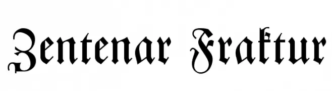
( Fonts by Dieter Steffmann )
A traditional Blackletter font with intricate and ornate strokes, ideal for historical themes.
![Zentenar Fraktur font caratteri gratis]() Scaricare 513 Downloads@WebFont
Scaricare 513 Downloads@WebFont -
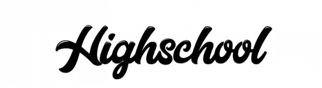
( Fonts by Cat.B - Agathe M.Joyce - Personal-use only. For commercial use please contact owner. )
A bold, flowing script font with elegant, cursive letterforms.
![Highschool font caratteri gratis]() Scaricare 513 Downloads@WebFont
Scaricare 513 Downloads@WebFont -
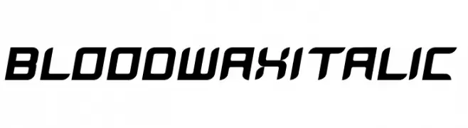
![BloodWaxItalic font caratteri gratis]() Scaricare 513 Downloads@WebFont
Scaricare 513 Downloads@WebFont -
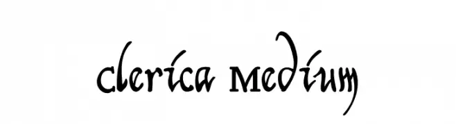
( Paul Lloyd Fonts )
A decorative serif font with calligraphic flourishes and artistic lowercase letters.
![Clerica Medium font caratteri gratis]() Scaricare 513 Downloads@WebFont
Scaricare 513 Downloads@WebFont
Quali sono i font più popolari adesso?
Poppins, Roboto, Montserrat, Open Sans e Lato sono molto usati per le forme pulite e l'ampia applicabilità — dall'identità di marca alle landing page e ai poster.
Quali font si usano spesso nei loghi?
Le sans serif geometriche (es. Poppins, famiglie in stile Gotham) sono scelte comuni per un branding pulito e scalabile. Per un tocco personale restano valide script e stili manoscritti. Abbina un display deciso per i titoli a un corpo testo neutro per riconoscibilità ed equilibrio.
Ogni quanto si aggiorna la lista?
Con regolarità, in base ai download e all'attività reale. Torna spesso per scoprire in anticipo le nuove preferite.
💡 Consiglio: aggiungi ai preferiti — le tendenze cambiano in fretta e i font top di oggi possono ispirare il rebranding di domani.