Benvenuto nelle Font Più Popolari — dove popolarità e qualità si incontrano. Qui trovi i font più scaricati e usati dell'anno. Se cerchi scelte sicure per logo, web o social, inizia da qui.
Ogni font top si distingue per equilibrio, leggibilità e versatilità. Troverai sans serif moderne, script eleganti, serif vintage e display minimalisti.
-
( LeChefRene - members.aol.com/lcrfonts/ )
An ornate decorative font with characters enclosed in rose baskets.
 Scaricare 85 Downloads@WebFont
 -
( Fonts by Vladimir Nikolic - www.creativefabrica.com/designer/vladimirnikolic/ - Personal-use only. For commercial use please contact owner. )
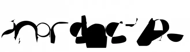
A bold, decorative font with a unique striped pattern and narrow, structured characters.
![Sabbia Regular font caratteri gratis]() Scaricare 85 Downloads@WebFont
Scaricare 85 Downloads@WebFont -
![FL Fancy Frames font caratteri gratis]() Scaricare 85 Downloads@WebFont
Scaricare 85 Downloads@WebFont -
( Noto is a trademark of Google Inc. Noto fonts are open source. All Noto fonts are published under the SIL Open Font License, Version 1.1 )
A condensed, geometric sans-serif font with clear, uniform strokes.
![Noto Sans Myanmar UI Condensed font caratteri gratis]() Scaricare 85 Downloads@WebFont
Scaricare 85 Downloads@WebFont -
( Fonts by Kevin Richey - Personal-use only. For commercial use please contact owner. )
A playful, hand-drawn font with irregular strokes and a whimsical style.
![Jean Sun Ho Bold font caratteri gratis]() Scaricare 85 Downloads@WebFont
Scaricare 85 Downloads@WebFont -
( Fonts by Daniel Zadorozny - www.iconian.com - Personal-use only. For commercial use please contact owner. )
A futuristic, geometric outline font with an italicized style.
![Earth Orbiter Outline Italic font caratteri gratis]() Scaricare 85 Downloads@WebFont
Scaricare 85 Downloads@WebFont -
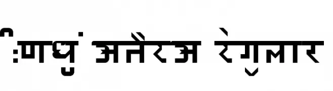
![HINDU MATERA Regular font caratteri gratis]() Scaricare 85 Downloads@WebFont
Scaricare 85 Downloads@WebFont -
( Fonts by Billy Argel - www.billyargel.com - Personal-use only. For commercial use please contact owner. )
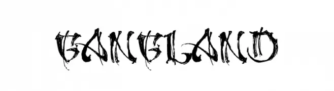
A bold, graffiti-inspired font with sharp, angular lines and a distressed texture.
![GANGLAND font caratteri gratis]() Scaricare 85 Downloads@WebFont
Scaricare 85 Downloads@WebFont -
( Fonts by Vladimir Nikolic - www.creativefabrica.com/designer/vladimirnikolic/ - Personal-use only. For commercial use please contact owner. )
A bold, 3D geometric font with a striking shadow effect.
![Education 3D Regular font caratteri gratis]() Scaricare 85 Downloads@WebFont
Scaricare 85 Downloads@WebFont -
( Fonts by Fivetype Studio - Personal-use only. For commercial use please contact owner. )
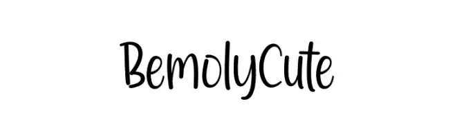
A playful, handwritten font with smooth, flowing characters and a whimsical style.
![Bemoly Cute font caratteri gratis]() Scaricare 85 Downloads@WebFont
Scaricare 85 Downloads@WebFont -
( Fonts by Kat`s Fun Fonts - Personal-use only. For commercial use please contact owner. )
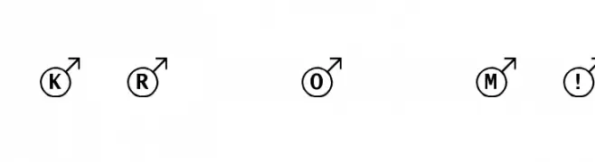
A decorative font with bold letters in circles, each with an upward arrow.
![KR Oh Man! font caratteri gratis]() Scaricare 85 Downloads@WebFont
Scaricare 85 Downloads@WebFont -
( Iconian Fonts - Daniel Zadorozny - www.iconian.com )
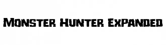
A bold, rugged font with thick, uneven strokes and a distressed look.
![Monster Hunter Expanded font caratteri gratis]() Scaricare 85 Downloads@WebFont
Scaricare 85 Downloads@WebFont -
( Noto is a trademark of Google Inc. Noto fonts are open source. All Noto fonts are published under the SIL Open Font License, Version 1.1 )
A clean and modern font with simple, clear lines and balanced spacing.
![Noto Sans Tamil UI Light font caratteri gratis]() Scaricare 85 Downloads@WebFont
Scaricare 85 Downloads@WebFont -
![SundaySneakerFun font caratteri gratis]() Scaricare 85 Downloads@WebFont
Scaricare 85 Downloads@WebFont -
( Fonts by Edric Studio - Personal-use only. For commercial use please contact owner. )
A bold, geometric font with a modern, stencil-like design.
![ALDITH DEMO font caratteri gratis]() Scaricare 85 Downloads@WebFont
Scaricare 85 Downloads@WebFont -
( Fonts by Creatype Studio - Rian Rahardi - Personal-use only. For commercial use please contact owner. )
A bold, expressive script font with flowing cursive letters and strong visual impact.
![Qalifony font caratteri gratis]() Scaricare 85 Downloads@WebFont
Scaricare 85 Downloads@WebFont -
( Fonts by Fontfabric - Svetoslav Simov - Personal-use only. For commercial use please contact owner. )
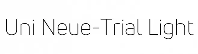
A modern, geometric sans-serif font with clean lines and uniform stroke widths.
![Uni Neue-Trial Light font caratteri gratis]() Scaricare 85 Downloads@WebFont
Scaricare 85 Downloads@WebFont -
( Fonts by Supersemar Letter - Arief Tri Sulistiyono - Personal-use only. For commercial use please contact owner. )
A playful and whimsical script font with bold, flowing characters.
![Intimatte font caratteri gratis]() Scaricare 85 Downloads@WebFont
Scaricare 85 Downloads@WebFont -
( Fonts by a Neale Davidson - www.pixelsagas.com. Personal-use only. For commercial use please contact owner. )
A bold, italic, geometric font with a futuristic, digital appearance.
![Silverball Bold Italic font caratteri gratis]() Scaricare 85 Downloads@WebFont
Scaricare 85 Downloads@WebFont -
( Fonts by Wino S Kadir - weknow - www.revolge.com/shop/weknow/ - Personal-use only. For commercial use please contact owner. )
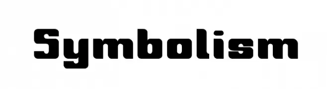
A bold, geometric font with rounded edges and a modern style.
![Symbolism font caratteri gratis]() Scaricare 85 Downloads@WebFont
Scaricare 85 Downloads@WebFont -
( Iconian Fonts - Daniel Zadorozny - www.iconian.com )
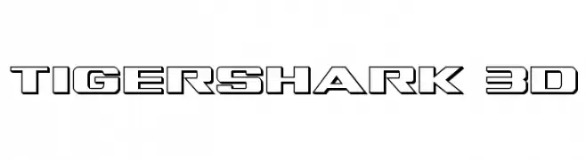
A bold, 3D geometric font with a futuristic and digital aesthetic.
![Tigershark 3D font caratteri gratis]() Scaricare 85 Downloads@WebFont
Scaricare 85 Downloads@WebFont -
( pallorFonts - Frank Lawrence - www.pallorpublishing.com )
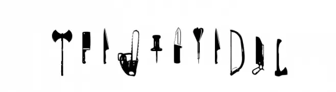
A display font made from weapon and tool silhouettes, bold and graphic.
![CutPointSTD font caratteri gratis]() Scaricare 85 Downloads@WebFont
Scaricare 85 Downloads@WebFont -
( Fonts by Geronimo Fonts - Personal-use only. For commercial use please contact owner. )
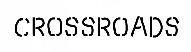
A bold, stencil-like font with geometric cutouts and a modern industrial style.
![Crossroads font caratteri gratis]() Scaricare 85 Downloads@WebFont
Scaricare 85 Downloads@WebFont -
( Fonts by Mans Greback - Personal-use only. For commercial use please contact owner. )
A bold, modern sans-serif font with a slightly condensed style.
![MollySansNPERSONAL-Medium font caratteri gratis]() Scaricare 85 Downloads@WebFont
Scaricare 85 Downloads@WebFont -
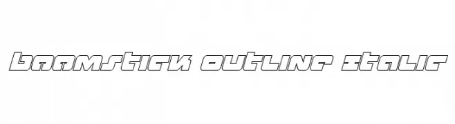
( Fonts by Iconian Fonts )
A bold, geometric outline font with an italic slant, offering a modern and dynamic look.
![Boomstick Outline Italic font caratteri gratis]() Scaricare 85 Downloads@WebFont
Scaricare 85 Downloads@WebFont -
( Fonts by belovestudio - Abdul Manan - Personal-use only. For commercial use please contact owner. )
A bold, geometric font with a modern and clean design.
![Quiqt font caratteri gratis]() Scaricare 85 Downloads@WebFont
Scaricare 85 Downloads@WebFont -
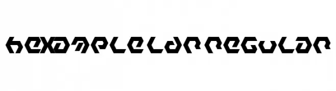
( Fonts by Neoqueto - Personal-use only. For commercial use please contact owner. )
A bold, geometric font with a futuristic and angular design.
![Hexample LDR Regular font caratteri gratis]() Scaricare 85 Downloads@WebFont
Scaricare 85 Downloads@WebFont -
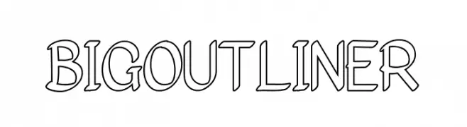
( Fonts by Fajar Abdul Fattah - https://fontbundles.net/sibelumpagi-studio - Personal-use only. For commercial use please contact owner. )
A bold, outlined font with a modern and playful aesthetic.
![Bigoutliner font caratteri gratis]() Scaricare 85 Downloads@WebFont
Scaricare 85 Downloads@WebFont -
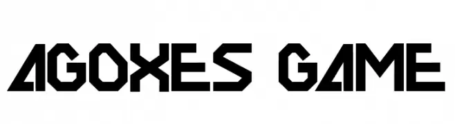
( Fonts by Sealoung - Saiful Anwar - Personal-use only. For commercial use please contact owner. )
A bold, geometric font with sharp angles and a futuristic style.
![AGOXES GAME font caratteri gratis]() Scaricare 85 Downloads@WebFont
Scaricare 85 Downloads@WebFont -
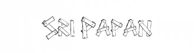
( MatNowRock - www.facebook.com/matnowrock )
A playful, hand-drawn font resembling wooden planks assembled into letters.
![Sri Papan font caratteri gratis]() Scaricare 85 Downloads@WebFont
Scaricare 85 Downloads@WebFont -
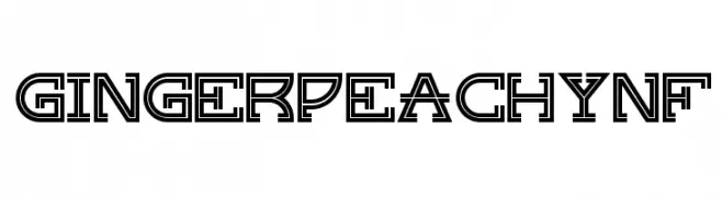
( Fonts by Nick Curtis - Personal-use only. For commercial use please contact owner. )
A bold, geometric font with a double-line structure and futuristic appeal.
![GingerPeachyNF font caratteri gratis]() Scaricare 85 Downloads@WebFont
Scaricare 85 Downloads@WebFont -
( Fonts by www.selawetype.com - Personal-use only. FOR DONATION https://www.paypal.me/selawe . For commercial use please contact owner. )
A bold, geometric font with a modern and edgy style.
![BrightFriday font caratteri gratis]() Scaricare 85 Downloads@WebFont
Scaricare 85 Downloads@WebFont -
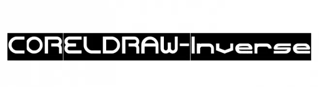
( Fonts by weknow - Wino S Kadir - Personal-use only. For commercial use please contact owner. )
A modern, geometric font with bold, clean lines and a futuristic style.
![CORELDRAW-Inverse font caratteri gratis]() Scaricare 85 Downloads@WebFont
Scaricare 85 Downloads@WebFont -
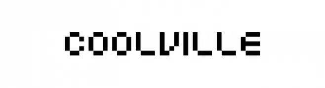
( Fonts by Tyler Finck - Personal-use only. For commercial use please contact owner. )
A bold, pixelated font with a retro digital aesthetic.
![Coolville font caratteri gratis]() Scaricare 85 Downloads@WebFont
Scaricare 85 Downloads@WebFont -
( Fonts by CannotIntoSpaceFonts - KineticPlasma Fonts - Personal-use only. For commercial use please contact owner. )
A chaotic, abstract font with fragmented and distorted letterforms.
![AnarchicType font caratteri gratis]() Scaricare 85 Downloads@WebFont
Scaricare 85 Downloads@WebFont


Quali sono i font più popolari adesso?
Poppins, Roboto, Montserrat, Open Sans e Lato sono molto usati per le forme pulite e l'ampia applicabilità — dall'identità di marca alle landing page e ai poster.
Quali font si usano spesso nei loghi?
Le sans serif geometriche (es. Poppins, famiglie in stile Gotham) sono scelte comuni per un branding pulito e scalabile. Per un tocco personale restano valide script e stili manoscritti. Abbina un display deciso per i titoli a un corpo testo neutro per riconoscibilità ed equilibrio.
Ogni quanto si aggiorna la lista?
Con regolarità, in base ai download e all'attività reale. Torna spesso per scoprire in anticipo le nuove preferite.
💡 Consiglio: aggiungi ai preferiti — le tendenze cambiano in fretta e i font top di oggi possono ispirare il rebranding di domani.