Benvenuto nelle Font Più Popolari — dove popolarità e qualità si incontrano. Qui trovi i font più scaricati e usati dell'anno. Se cerchi scelte sicure per logo, web o social, inizia da qui.
Ogni font top si distingue per equilibrio, leggibilità e versatilità. Troverai sans serif moderne, script eleganti, serif vintage e display minimalisti.
-
( Fonts by The Font Emporium )
A bold, playful font with a bubbly, cartoonish style and thick, rounded edges.
 Scaricare 513 Downloads@WebFont
 -
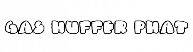
( Fonts by Daniel Zadorozny - www.iconian.com - Free for personal use )
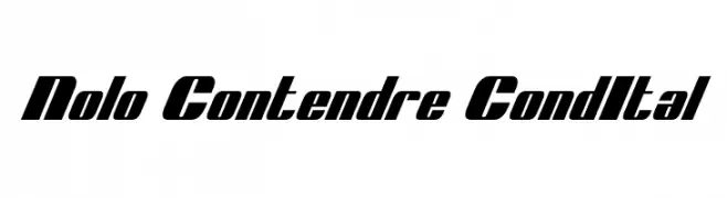
A bold, italic, and condensed font with high contrast and a modern style.
![Nolo Contendre CondItal font caratteri gratis]() Scaricare 513 Downloads@WebFont
Scaricare 513 Downloads@WebFont -
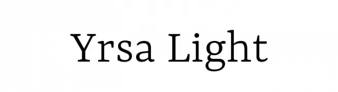
( Copyright (c) 2015 by Rosetta Type Foundry s.r.o. (info@rosettatype.com). )
A clean and elegant serif font with a light weight and balanced proportions.
![Yrsa Light font caratteri gratis]() Scaricare 513 Downloads@WebFont
Scaricare 513 Downloads@WebFont -
( Fonts by Graziano Capelli - Personal-use only. For commercial use please contact owner. )
A casual, playful handwritten font with rounded edges and a slight slant.
![Graziano font caratteri gratis]() Scaricare 513 Downloads@WebFont
Scaricare 513 Downloads@WebFont -
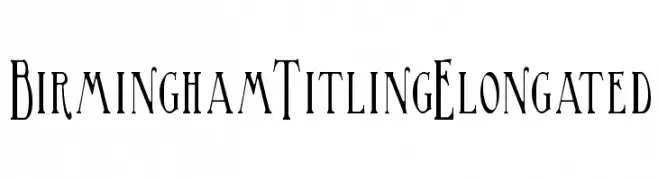
( Fonts by Paul Lloyd )
An elongated, elegant font with decorative elements and refined letterforms.
![BirminghamTitlingElongated font caratteri gratis]() Scaricare 513 Downloads@WebFont
Scaricare 513 Downloads@WebFont -
-
( Aulia Al Farabi )
A bold, cursive font with a smooth, flowing style.
![Vladiviqo font caratteri gratis]() Scaricare 513 Downloads@WebFont
Scaricare 513 Downloads@WebFont -
( Fonts by ingoFonts. http://www.ingofonts.de )
A bold, clean sans-serif font with geometric shapes and uniform strokes.
![DieUeberSchrift-Halbfettreduced font caratteri gratis]() Scaricare 513 Downloads@WebFont
Scaricare 513 Downloads@WebFont -
![Promotion Script font caratteri gratis]() Scaricare 513 Downloads@WebFont
Scaricare 513 Downloads@WebFont -
( Fonts by Daniel Gauthier )
A bold, playful font with jagged, hand-drawn edges and a cartoonish style.
![TheThreeStoogesFont font caratteri gratis]() Scaricare 513 Downloads@WebFont
Scaricare 513 Downloads@WebFont -
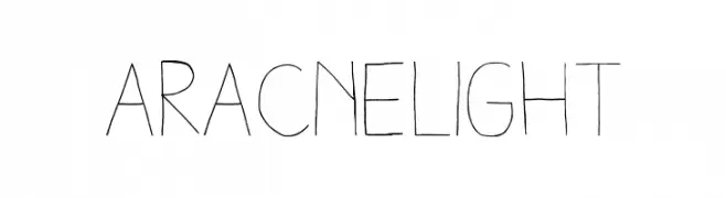
Caratteri di antipixel. For commercial use please contact the owner.
![AracneLight font caratteri gratis]() Scaricare 513 Downloads@WebFont
Scaricare 513 Downloads@WebFont

Quali sono i font più popolari adesso?
Poppins, Roboto, Montserrat, Open Sans e Lato sono molto usati per le forme pulite e l'ampia applicabilità — dall'identità di marca alle landing page e ai poster.
Quali font si usano spesso nei loghi?
Le sans serif geometriche (es. Poppins, famiglie in stile Gotham) sono scelte comuni per un branding pulito e scalabile. Per un tocco personale restano valide script e stili manoscritti. Abbina un display deciso per i titoli a un corpo testo neutro per riconoscibilità ed equilibrio.
Ogni quanto si aggiorna la lista?
Con regolarità, in base ai download e all'attività reale. Torna spesso per scoprire in anticipo le nuove preferite.
💡 Consiglio: aggiungi ai preferiti — le tendenze cambiano in fretta e i font top di oggi possono ispirare il rebranding di domani.